
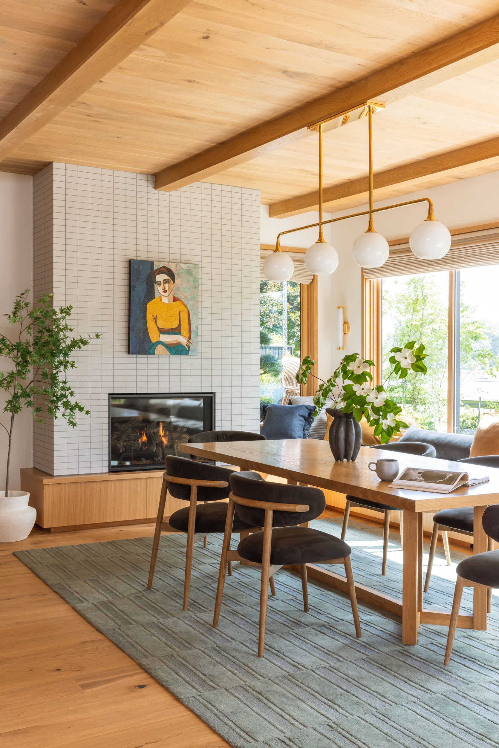
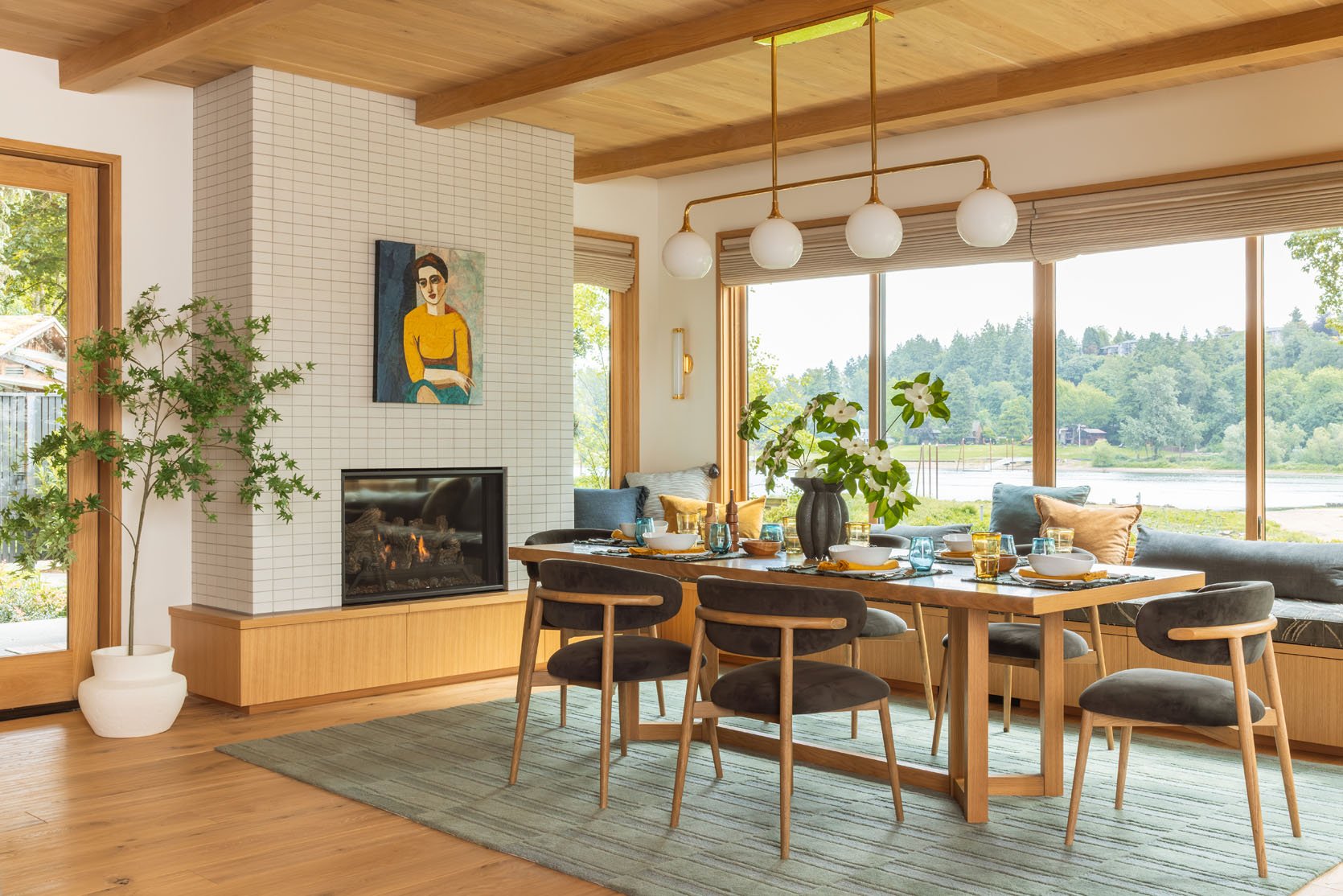
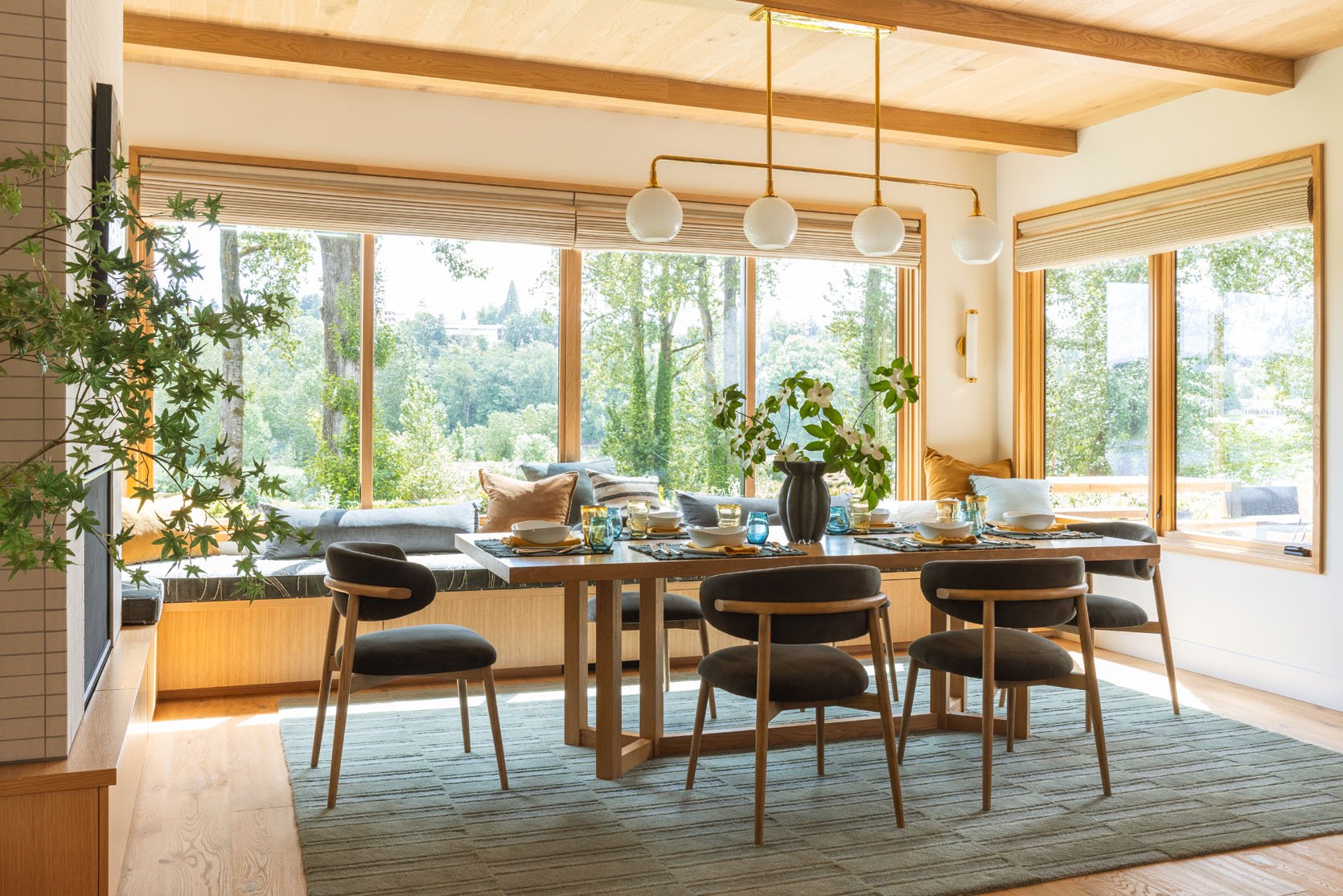
Welcome to the river house dining room reveal – such a warm and inviting landing spot with the prettiest views, a cozy fireplace, and a painting that my brother still doesn’t know if he’s into (but he hasn’t taken it down yet!!). It’s adjacent to the kitchen, with a shared color palette, and I layered it to be so warm and textural.
The Tile
Tile | Grout
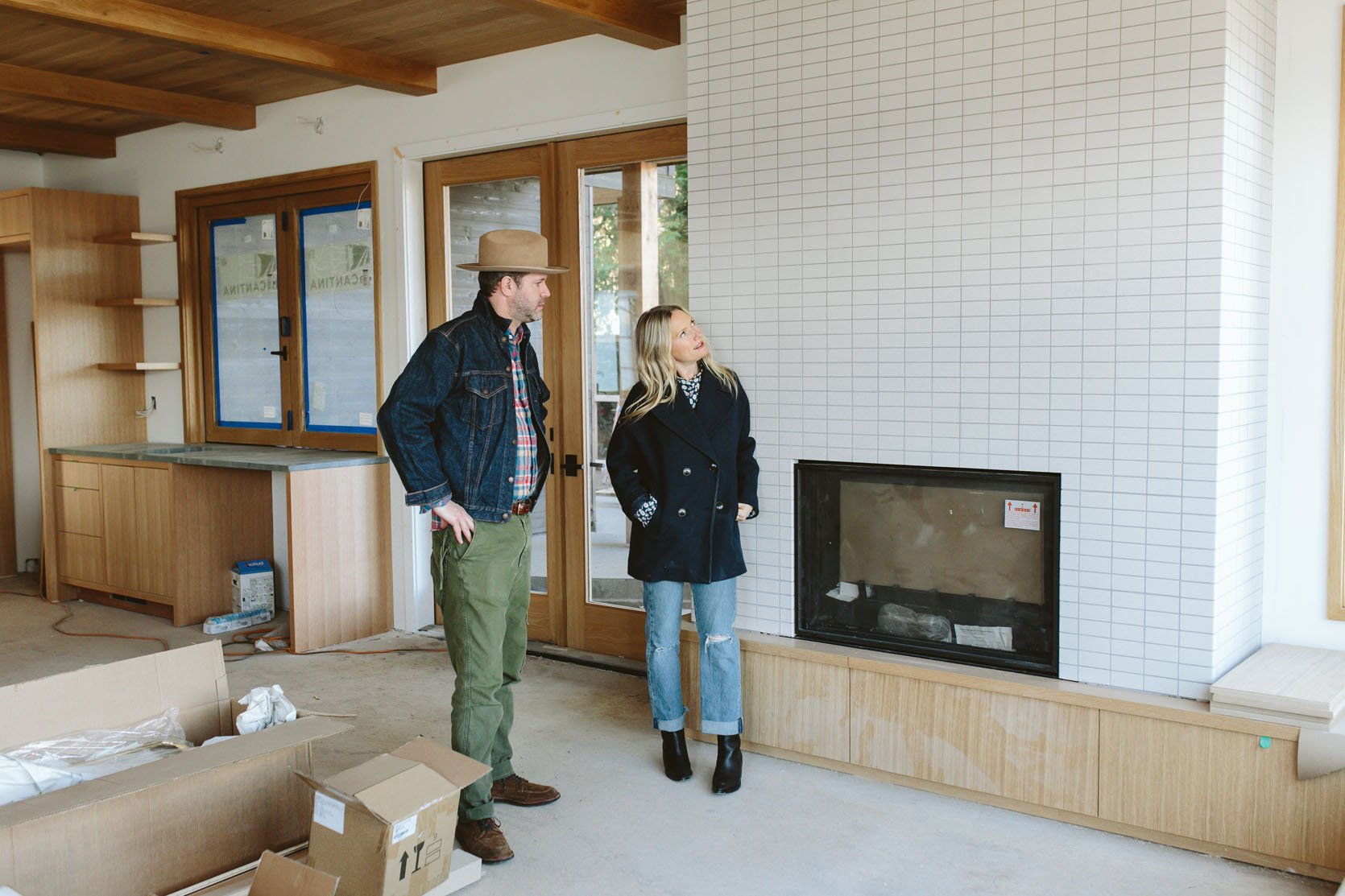
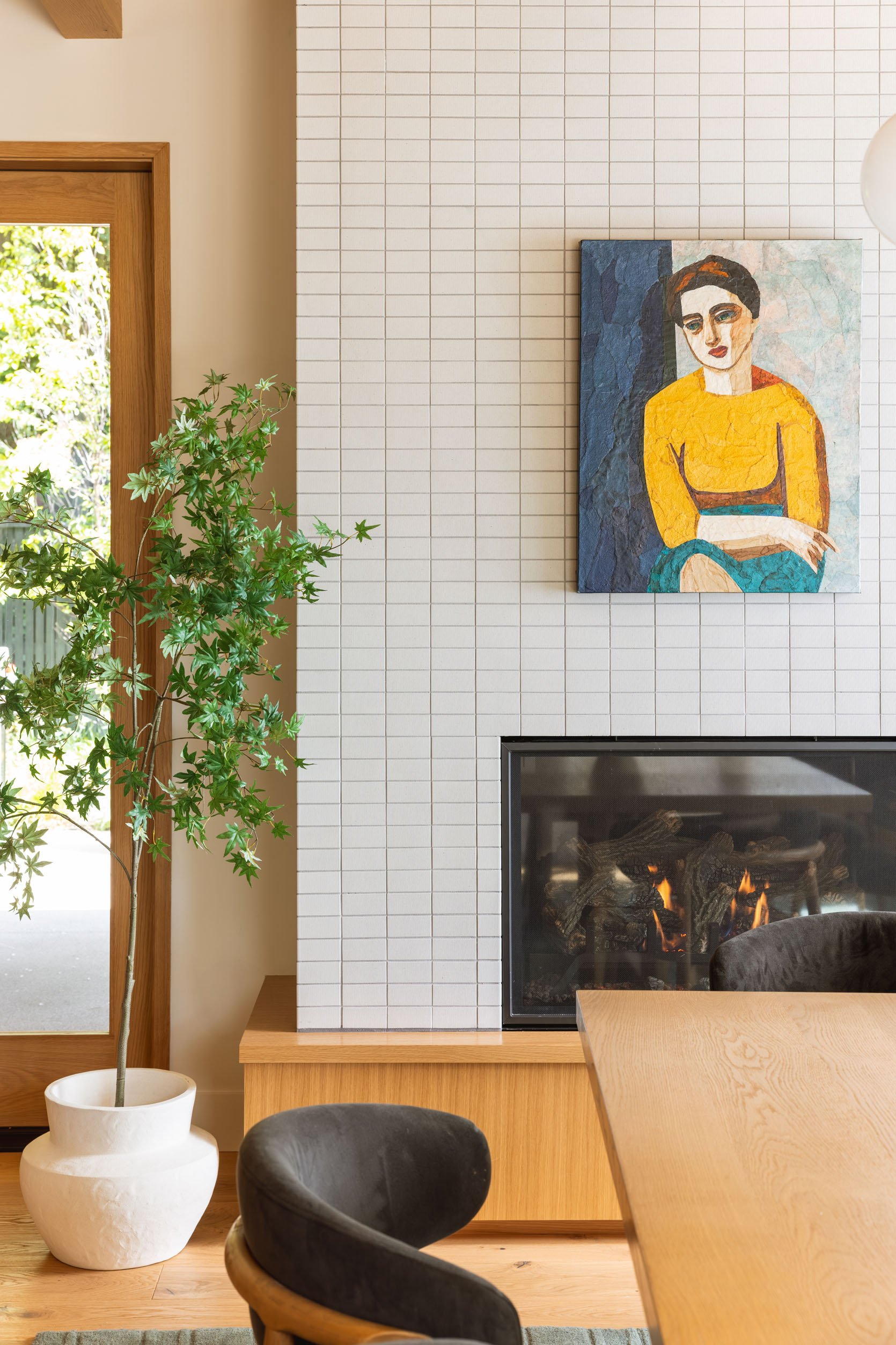
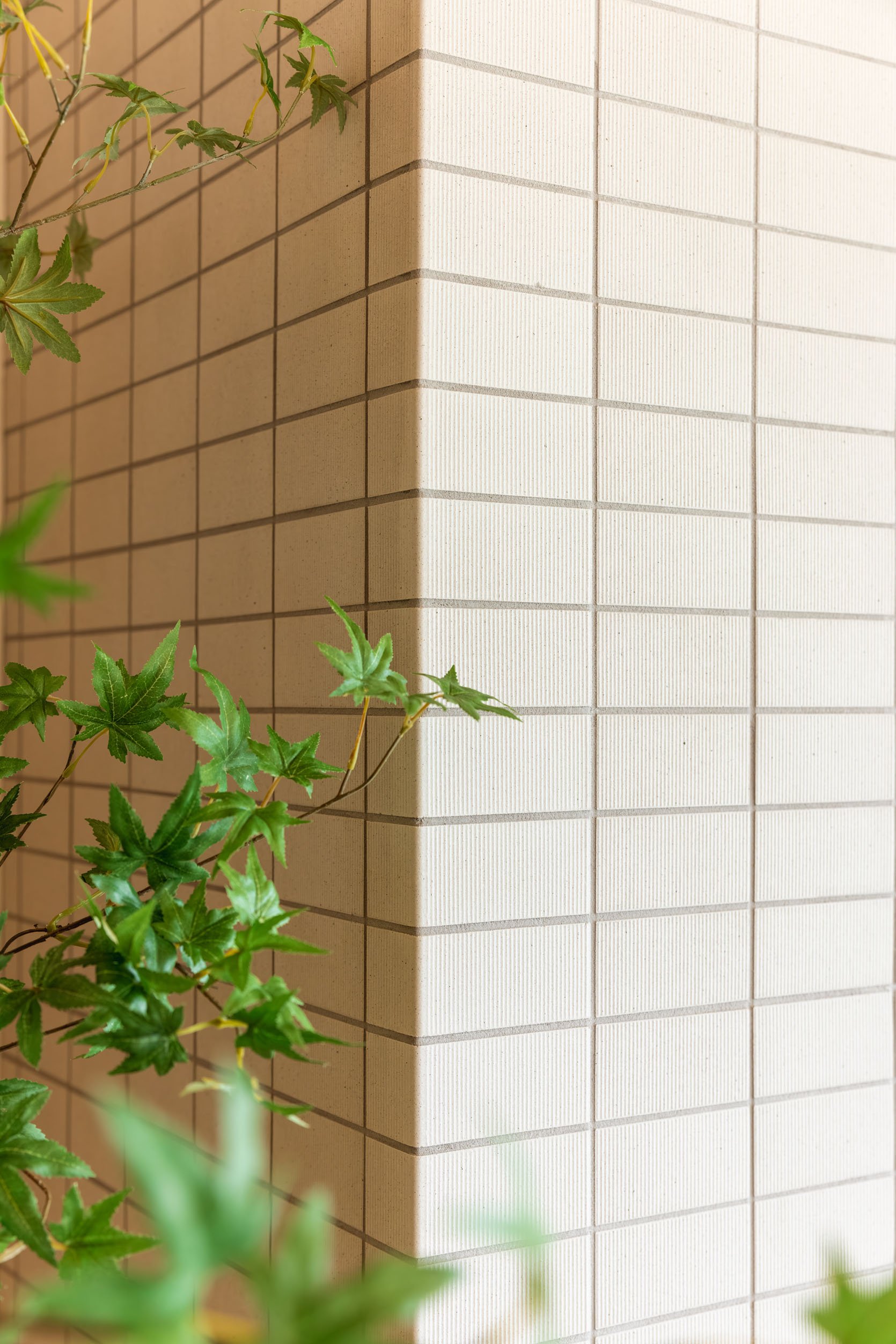
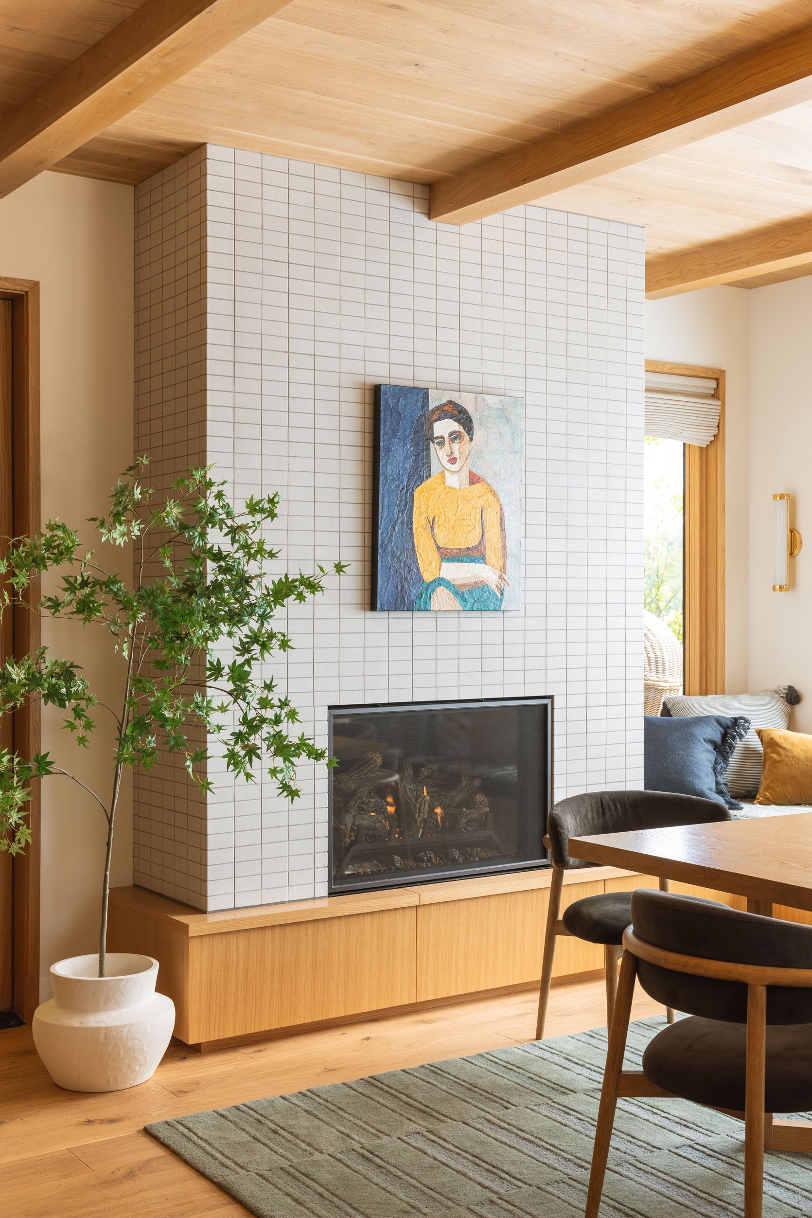
Three years ago, Max and I picked out the tile from Ann Sacks, a really simple but textural, smaller brick tile that we stacked horizontally to create a big, quiet focal point with even a mid-century vibe. My sister in law likes neutrals and didn’t want to go bold at all, and fell in love with this simplicity (and didn’t want to take away from the view).
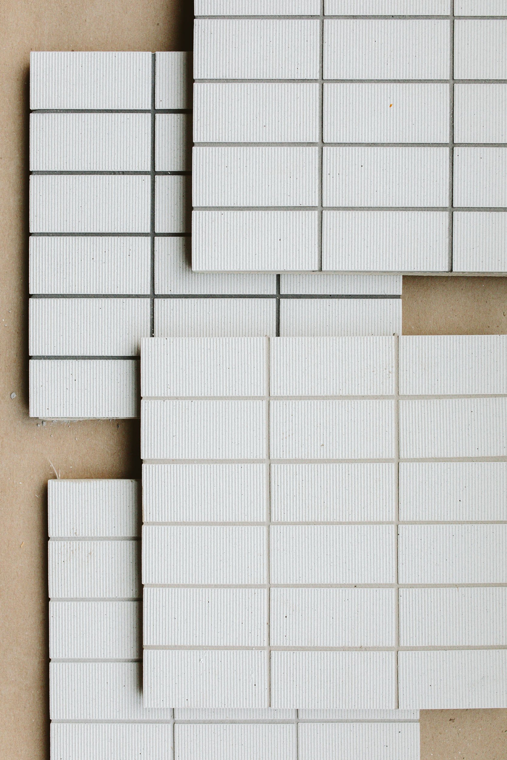
We couldn’t decide on the grout color – for good reason, grout is a stressful decision because it changes the look of the tile and the room, and is really hard to reverse. We ended up choosing the top right – a medium gray with slightly green undertones that created depth and a pattern, but not too dark or stark. Remember that choosing a lighter grout can work, but often you lose the idea of the stacking grid effect – so it can look more like a wall of texture rather than a more graphic geometric pattern. We wanted the pattern 🙂
One of my most favorite details is how Ann Sacks sells these corner pieces so that you don’t have to miter the edges – see below. It’s just so pretty!
You’ll notice that the tile is exactly the width of the fireplace, meaning no awkward, smaller pieces on either end. This was due to JP (our contractor) doing the math with the tiler (grout size has to be factored in) and essentially building out the structure underneath to make sure that it was exactly 19 across. These details make such a difference to those of us/you with a design eye.
Faux Tree & Planter | Artwork | Rug
We finished off the interior box with black Schluter that you can’t really see. Oh, and no, I don’t know what brand the firebox is, and yes, it was legal to put it on wood (they passed full inspections, so I think the specs of that box were fine!).
The piece of art is actually a collage of a really famous painting called “Portrait of Hanne Wilhelm Hansen” by Vilhelm Lundstrøm. An artist in LA recreates these with paper collages, and she gifted me one years ago that I have been hoarding for the right place. The colors are so perfect in here!! We used a command strip, so we didn’t drill into the tile or anything. My brother and SIL were on the fence about it – I think they like it as a piece of art, but it just didn’t feel like them and felt a bit intense in here, which I fully understood. I told them to live with it for a bit and, let’s just say, it’s still there!
The Layout
Chairs | Table (no longer available) | Vase | Mug (similar) | Rug
Anne Usher, the architect, designed and laid out the room with bench seats along the window and a fireplace – not only for warmth, but to add some design elements so it wasn’t just a box with windows. So then furnishing it was pretty dang simple. At the time that rug was in my collection and pulled the greens from the living room (which I can’t wait to show you), and used our 9×12 here. Then I was slow-moving to get them a table and chairs, so Katie found this table from Rejuvenation on clearance (and was available for local pickup). She sent me a link, and I said, “Go for it”.
The Dining Chairs
Chairs
I found these chairs online that checked all our boxes:
- Upholstered seats and back – Not only did they want for comfort reasons, but this room needed softness and texture to make it feel warm and inviting.
- Large scale and sturdy – My brother does NOT like chairs that are giving fragile or dinky, these needed to be side and comfy (but we didn’t want all armchairs either).
- Kid-friendly, i.e., not a light fabric – The color also had to work with the stools and the furniture in the living room, since it’s a big open space.
There is a real hole in the market for colorful dining chairs, but I think that’s mostly for design-forward folks (meaning, maybe there is a hole for a reason – because most people are scared of that level of color commitment. At one point, I almost just had them buy my green dining chairs from Crate and Barrel (with a different rug), but I loved the backs on these, adding a pretty line and shape. They bought 8 of them, but didn’t want all 8 out on a normal day, so they have two in the family room that they can bring in here when needed.
The Window Shades
Decorview
We partnered with Decorview on the entire house for window treatments, and everyone was excited to use their motorized shades in here. The style of the entire house is pretty minimal, so we chose a soft, warm texture that worked well with the wood and wall color. They are all on one remote that is so easy to open and close (which they do, daily).
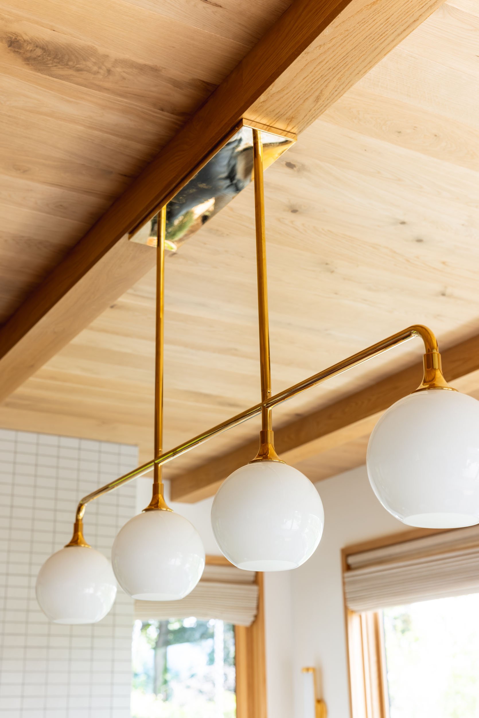
The Light Fixtures
Chandelier | Sconces
We worked with Rejuvenation on the light fixtures and chose this lovely linear and graphic chandelier that gave them ample light (no recessed lights in here) but wasn’t so busy that it would take away from the views behind it. Fun fact is that at first we had clear glass shades because I thought that would allow us to see the view even more, but it actually looked much busier (I think the bulbs inside and all the reflection were just distracting in this case). Once we swapped out the glass (Rejuvenation’s customer service was very nice), all of us said it was so much better.
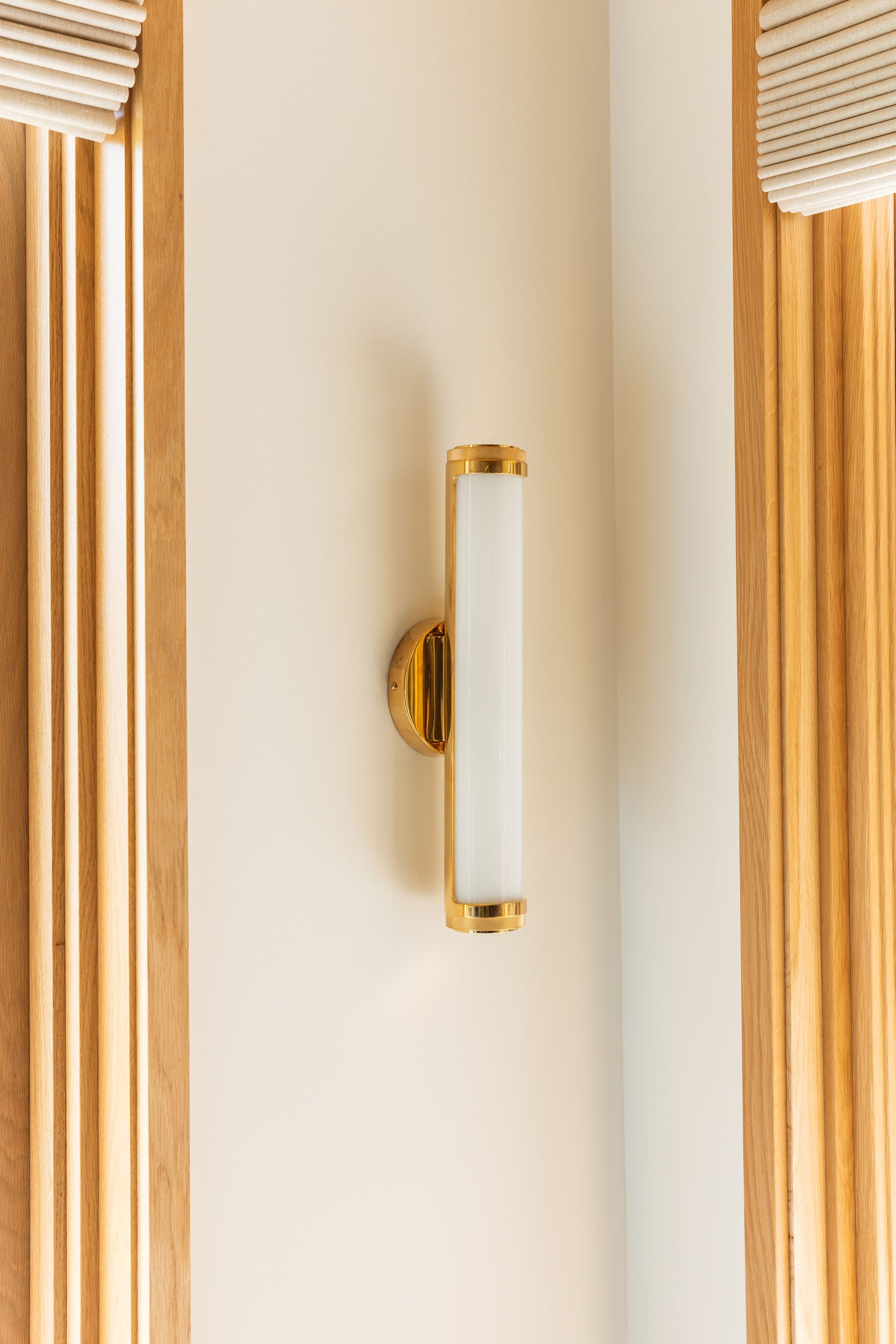
Chandelier | Sconces
The sconces are actually vanity lights that can go horizontal or vertical, but since we had such a slim area, we thought they would look great here (and they do). Both fixtures are in the unlaquered brass, so they’ll patina a bit over time in a good way, but look pretty quiet in the room. At one point, I regretted not doing a contrasting finish (like black metal) for both, but now that the entire project is done, it really just feels simple and seamless, holistically. This look isn’t right for all styles of house, mind you (a more traditional house might want more contrast in finishes), but for this style, I love how all the finishes are simple, leaving the attention to the wood and views.
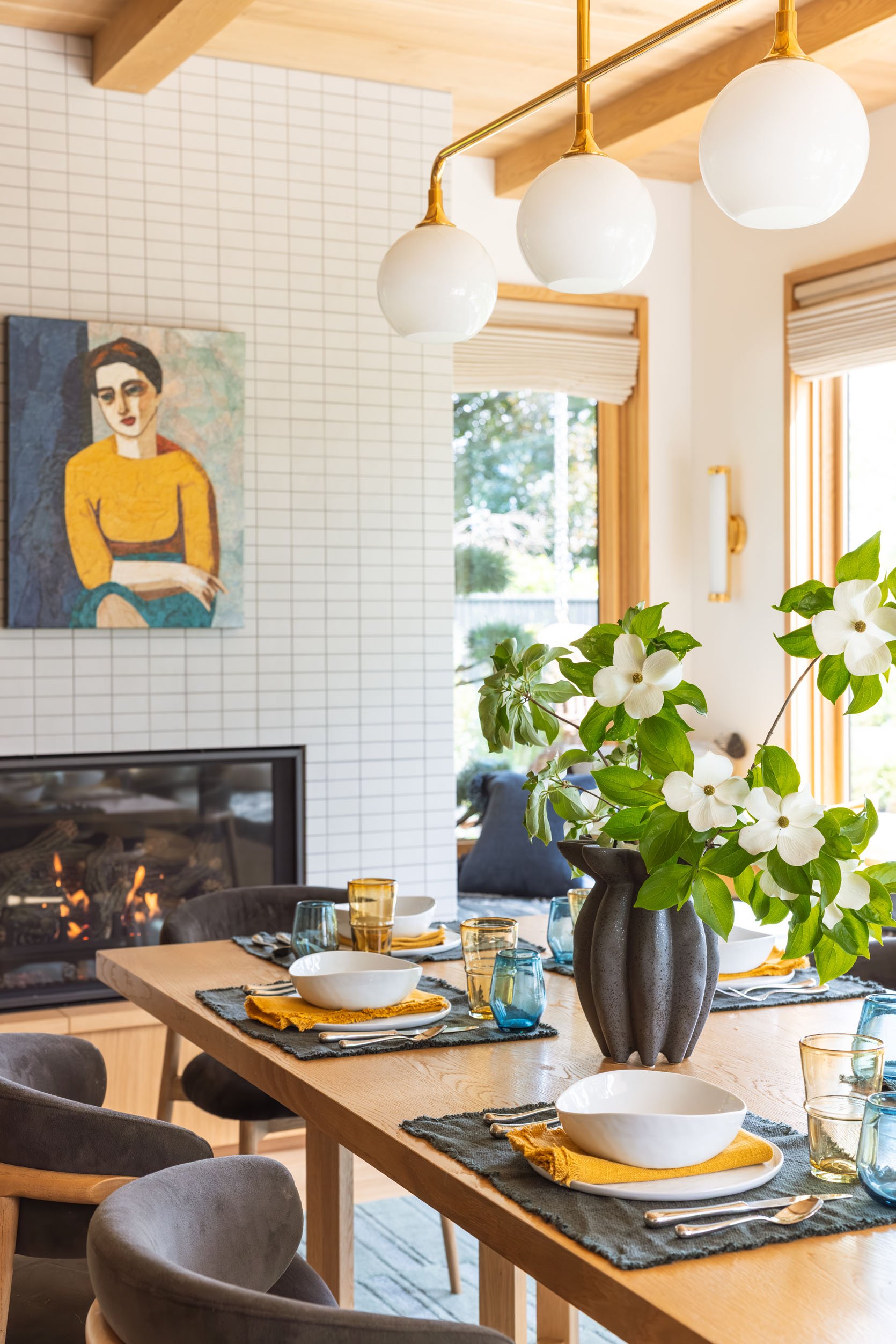
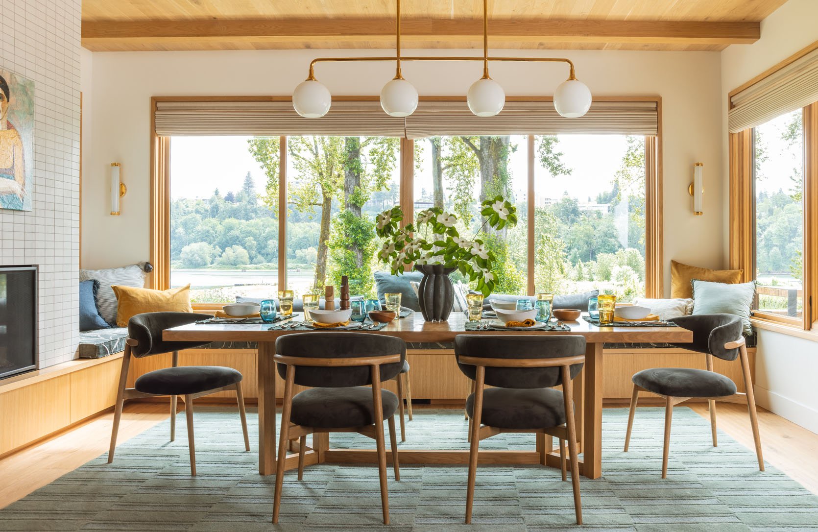
Bowls | Napkins | Plates | Placemat (no longer available) | Glasses | Wine Glasses | Flatware
The Bench Seat!
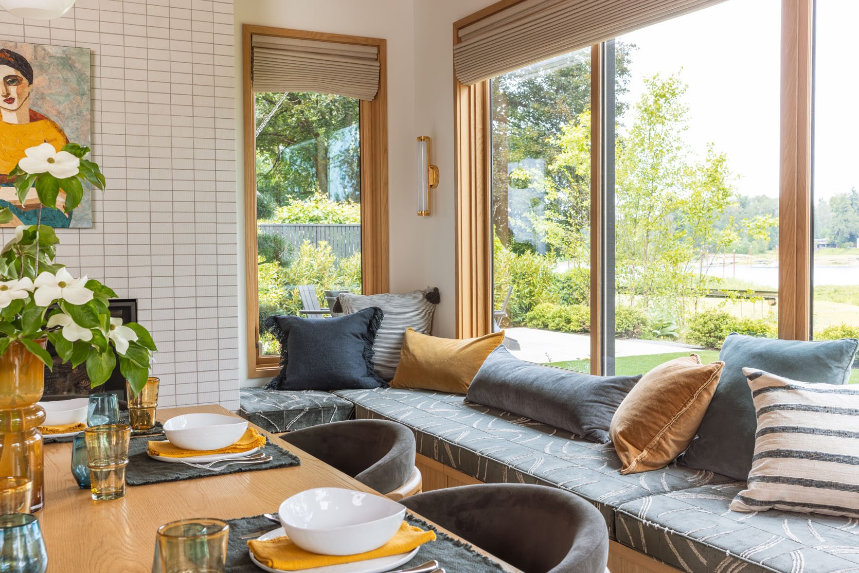
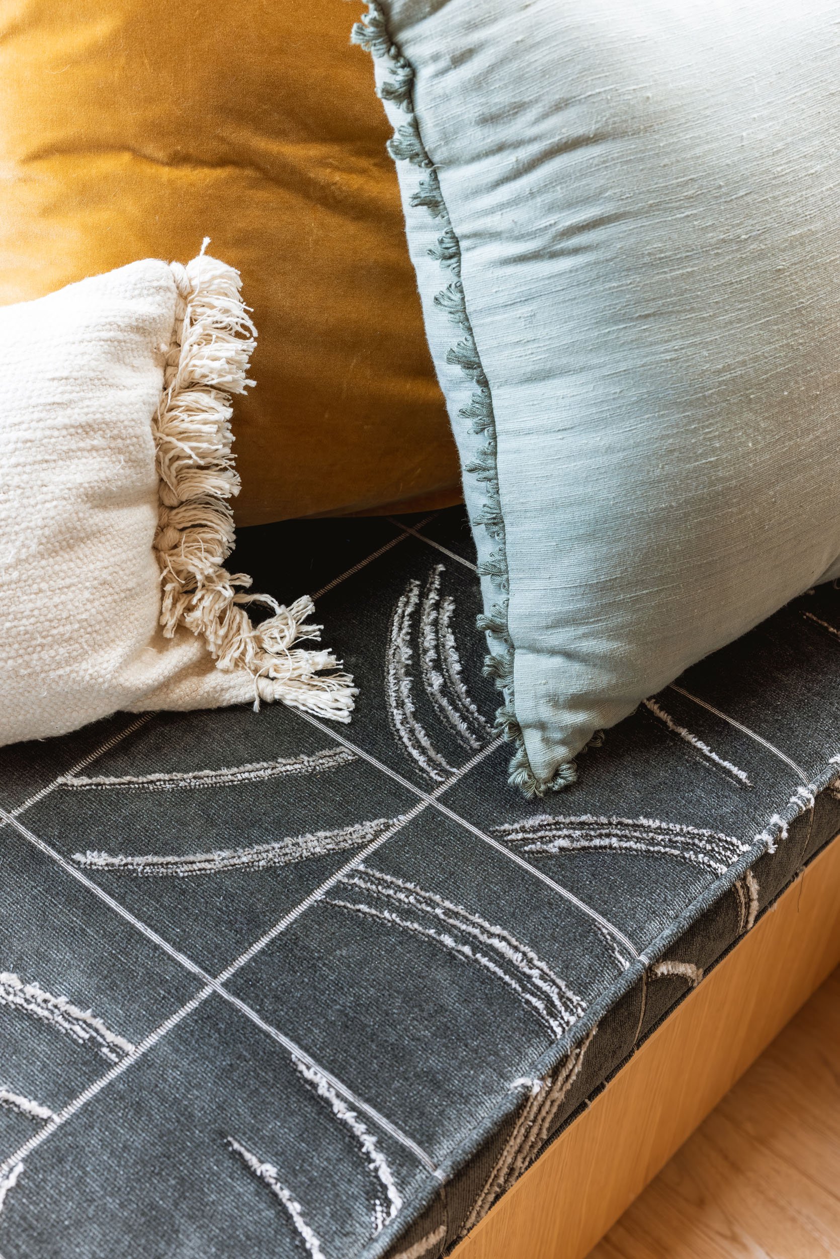
Pollack Fabric | Pillows Left to Right: Blue Fringe | Stripe Tassel (similar) | Gold Velvet | Long Lumbar (from Room Service sofa) | Gold | Blue (similar) | Big Stripe
This house has a hilarious amount of bench seats. And we even nixed two upstairs. Was this one needed? Not really, but boy is it fun to sit there and stare out the window, plus for me it was an opportunity to add some color and pattern (otherwise the room would have been just wood and cream). So I was really glad that they designed them into the plan. I used this opportunity to push Pollack fabric on them – the velvets are just so beautiful in patterns that really edged up the room. Then I styled them with pretty simple pillows to add even more texture and warmth.
Pollack Fabric | Cream Pillow | Gold Velvet | Blue Fringe (similar)
I love how they turned out! Oh, and yes, all of the bench seats are in fact storage drawers. I didn’t want them to have hardware so that they would just read more simple (and not just look like dressers all over their house), but fun fact – it’s a push mechanism that your heel hits perfectly and you accidentally open them all. the. time. I hope this is more funny than annoying 🙂
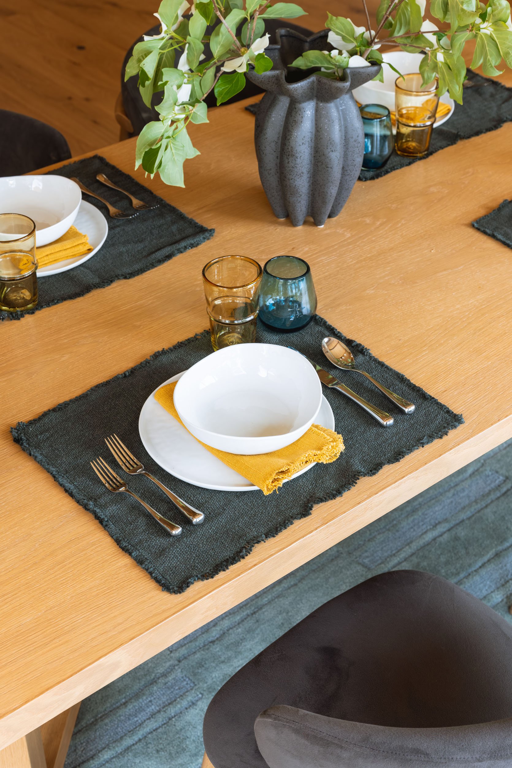
Vase | Bowls | Napkins | Plates | Placemat (no longer available) | Glasses | Wine Glasses | Flatware
We thought this was a pretty opportunity to set the table and add a lot more color, texture, and warmth. They ended up keeping everything (most were from World Market and Crate and Barrel) so they could recreate when they had nicer dinners.
Faux Tree & Planter
The faux tree in the corner is excellent (from West Elm!) and added a bit of softness and color on the left. The room really connects so well with the kitchen and the living room – all the finishes, colors, and textures share similarities, but it still feels customized and special.
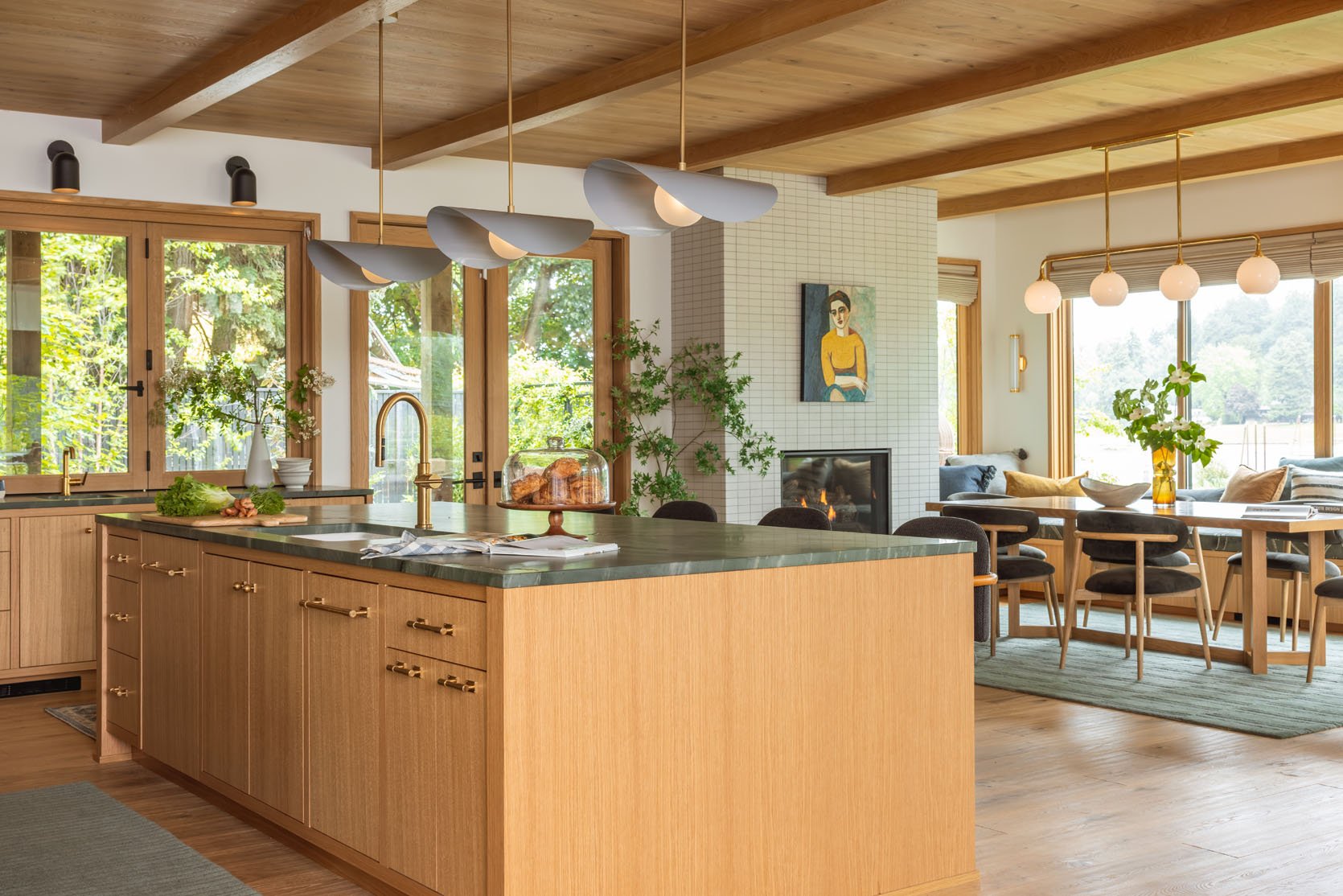
You can see here how it all flows together with the kitchen. Designing open spaces from scratch is actually a lot harder because of this. You don’t want everything to match (so boring), but it needs to make sense together. I love how all the lights work together, the colors (green island, green rug), and the pops of black in the lights and charcoal seating.
Don’t forget to play with the sliders to see how it looked before we furnished and styled it 🙂
![]()
![]()
I personally think that all the fabrics, colors, and styling really made this room come alive. I was definitely worried at a certain point that we didn’t make enough strong, bold choices (which we didn’t really), but now that it’s all done, I am reminded that a neutral palette is so easy to layer on to make it what you want.
Dining Room Resources:
Tile: Ann Sacks
Benches: Custom
Bench Fabric: Pollack
Main Wall Color: Alabaster by Sherwin-Williams
Sconces and Chandelier: Rejuvenation
Faux Tree: West Elm
Chairs: AllModern
Rug: Rugs USA
Window Shades: Decorview
Windows by Marvin Windows and Doors
Flooring: Stuga
*Architect: Anne Usher
**General Contractor: JP Macy of Sierra Custom Construction
***Interior Designers: Emily Henderson (me!) and Max Humphrey
****Styling: Emily Henderson (me!)
*****Photos by Kaitlin Green