
NITEX is not just another fashion-tech company. Their mission is to redefine the supply chain for fashion – bringing speed, sustainability, and intelligence to a traditionally rigid process. Their platform spans the entire workflow: design, trend forecasting, material sourcing, production, and logistics. In short, they offer a seamless, end-to-end system for brands who want to move faster and smarter.
When NITEX approached us, the challenge was clear: they needed more than a website. They needed a platform that could translate their vision into an experience that worked for multiple audiences – brands seeking services, investors looking for clarity, factories wanting partnerships, and talent exploring opportunities.
The project took shape over several months, moving from brand definition to UX architecture, UI design, and technical development. The turning point came with the realization that a single, linear site could not balance storytelling with action. To resolve this, we developed a dual-structure model: one path for narrative and inspiration, and another for practical conversion. This idea shaped every design and technical decision moving forward.
Crafting the Hybrid Identity
NITEX’s identity needed to reflect a unique duality: part fashion brand, part technology company. Our approach was to build a system that could flex between editorial elegance and sharp technical clarity.
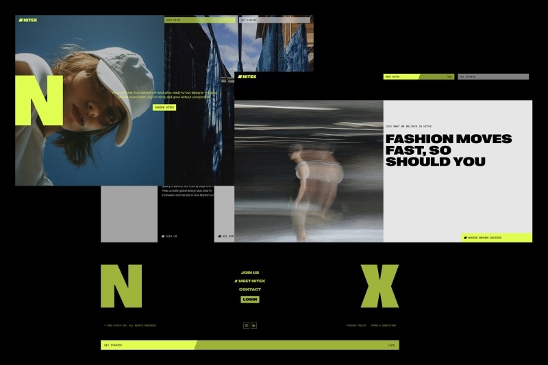
At the heart of the identity sits the NITEX logo, an angular form created from a forward-leaning N and X. This symbol is more than a mark – it acts as a flexible frame. The hollow center creates a canvas for imagery, data, or color, visualizing collaboration and adaptability.
This angular geometry informed much of the visual language across the site:
- Buttons expand or tilt along the logo’s angles when hovered.
- The progress bar in navigation and footer fills in the same diagonal form.
- Headlines reveal themselves with angled wipes, reinforcing a consistent rhythm.
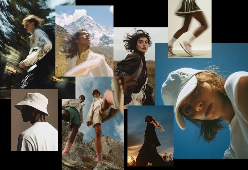
Typography was kept bold yet minimal, with global sans-serif structures that feel equally at home in high fashion and digital environments. Imagery played an equally important role. We chose photography that conveyed motion and energy, often with candid blur or dynamic framing. To push this further, we incorporated AI-generated visuals, adding intensity and reinforcing the sense of momentum at the core of the NITEX story. The result is a brand system that feels dynamic, flexible, and scalable – capable of stretching from streetwear to luxury contexts while always staying rooted in clarity and adaptability.
Building the Engine
A complex brand and experience required a strong technical foundation. For this, our developers chose tools that balanced performance, flexibility, and scalability:
- Frontend: Nuxt
- Backend / CMS: Sanity
- Animations & Motion: GSAP and the Web Animations API
The heavy reliance on native CSS transitions and the Web Animations API ensured smooth performance even on low-powered devices. GSAP was used to orchestrate more complex transitions while still keeping load times and resource use efficient. A key architectural decision was to give overlays their own URLs. This meant that when users opened deep-dive layers or content modules, those states were addressable, shareable, and SEO-friendly. This approach kept the experience immersive while ensuring that content remained accessible outside the narrative scroll.
Defining the Flow
Several features stand out in the NITEX site for how they balance storytelling with functionality:
- Expandable overlays: Each narrative chapter can unfold into deep-dive layers – showing case studies, workflow diagrams, or leadership perspectives without breaking the scroll.
- Dynamic conversion flows: Forms adapt to the user’s audience type – brands, investors, talent, or factories – showing tailored fields and next steps.
- Calendar integration: Visitors can book demos or design lab visits directly, streamlining the lead process and reinforcing immediacy.
This mix of storytelling modules and smart conversion flows ensured that every audience had a pathway forward, whether to be inspired, informed, or engaged.
Bringing It to Life
NITEX’s brand identity found its fullest expression in the motion and interaction design of the site. The site opens with scroll-based storytelling, each chapter unfolding with smooth transitions. Page transitions maintain energy, using angled wipes and overlays that slide in from the side. These overlays carry their own links, allowing users to dive deep without losing orientation. The angular motion language of the logo carries through:
- Buttons expand dynamically on hover.
- Rectangular components tilt into angular forms.
- The dual-image module sees the N and X frame track the viewport, dynamically revealing new perspectives.
This creates a consistent visual rhythm, where every motion feels connected to the brand’s DNA. The imagery reinforces this, emphasizing speed and creativity through motion blur, candid composition, and AI-driven intensity. Importantly, we kept the overall experience modular and scalable. Each content block is built on a flexible grid with clear typographic hierarchy. This ensures usability while leaving room for surprise – whether it’s an animated reveal, a bold image transition, or a subtle interactive detail.
Under the Hood
From a structural standpoint, the site was designed to scale as NITEX grows. The codebase follows a modular approach, with reusable components that can be repurposed across sections. Sanity’s CMS allows editors to easily add new chapters, forms, or modules without breaking the system.
The split-entry structure – narrative vs. action – was the architectural anchor. This allowed us to keep storytelling immersive without sacrificing usability for users who came with a clear transactional intent.

Looking Back
This project was as much about balance as it was about creativity. Balancing brand storytelling with user conversion. Balancing motion and expressiveness with speed and performance. Balancing multiple audience needs within a single coherent system.
One of the most rewarding aspects was seeing how the dual-experience model solved what initially felt like an unsolvable challenge: how to serve users who want inspiration and those who want action without building two entirely separate sites.
The deep-dive overlays also proved powerful, letting NITEX show rather than just tell their story. They allowed us to layer complexity while keeping the surface experience clean and intuitive.
Looking ahead, the NITEX platform is built to evolve. Future possibilities include investor dashboards with live performance metrics, brand-specific case modules curated by industry, or interactive workflow tools aligned with NITEX’s trend-to-delivery logic. The foundation we built makes all of this possible.
Ultimately, the NITEX project reflects the company’s own values: clarity, adaptability, and speed. For us, it was an opportunity to merge brand design, UX, UI, and development into a single seamless system – one that redefines what a fashion-tech platform can look and feel like.