
We meet again! I first just want to give you all the biggest thank you for all of the kind comments on my living room. I’ve been walking on a cloud for two straight days. You’d think after six-ish reveals that the nerves wouldn’t get to you, but surprise, they never do. But maybe that’s not a terrible thing, I would hate to lose the excitement that comes with baring your design soul to the world, ha. So today we have round two, and dare I say the more intimate of the duo? Today’s the day I invite you into my bedroom, a space I love so much, and that helps to calm down and recharge me.
Where It All Began…
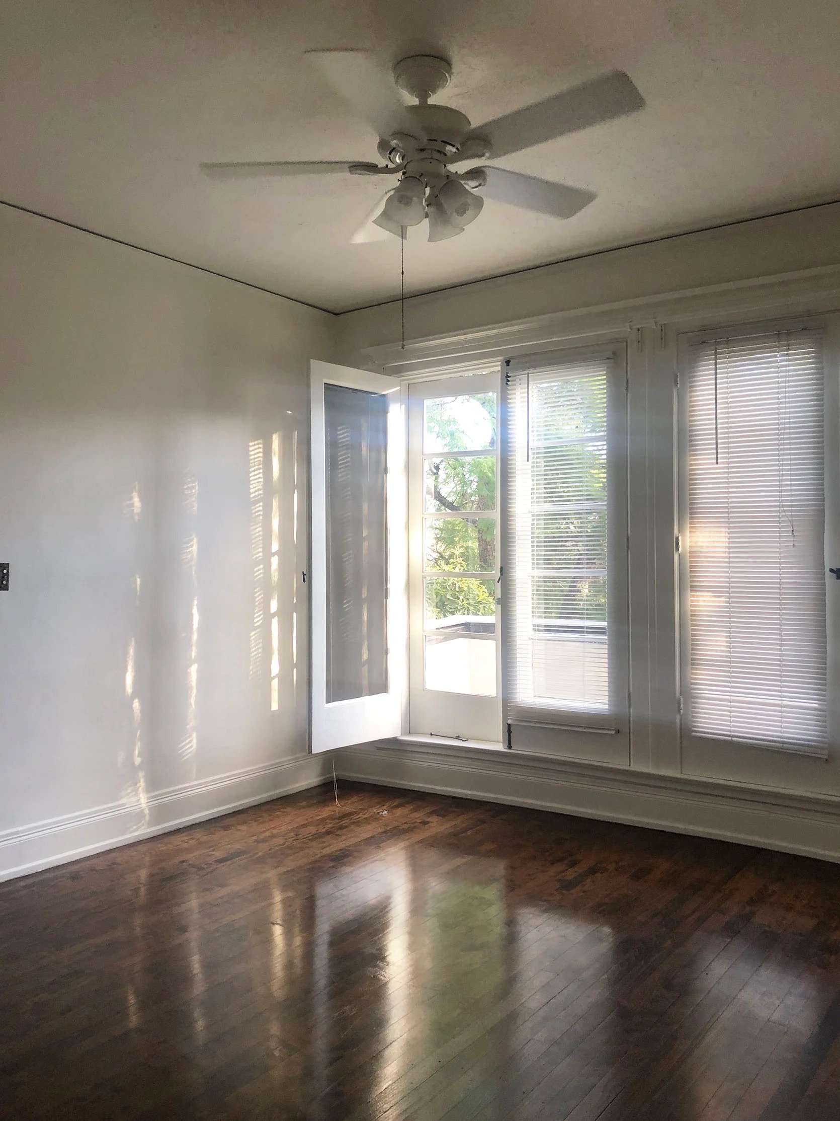
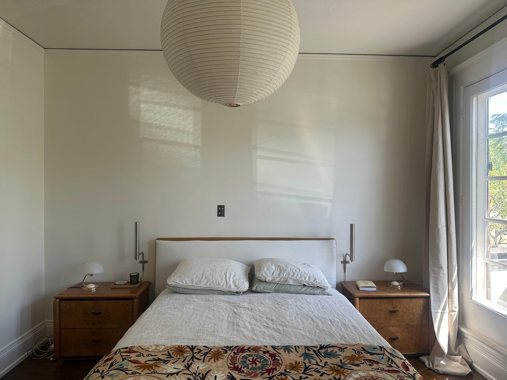
The first time my cousin saw my bedroom, shortly after I moved in, she said it was like a princess’s room. And that really is how it feels! The French door windows that lead out to the balcony are what really have me pinching myself every day. It will take a very special circumstance to eventually leave this magical room/home.
But as you can see, it had a beautiful base, but it needed some help. The ceiling fan was the first to go. I guess it could be worse, but I hated it. My AC unit is in the bathroom, which connects to my bedroom, so I really don’t have to worry about staying cool during the night. See ya, fan!
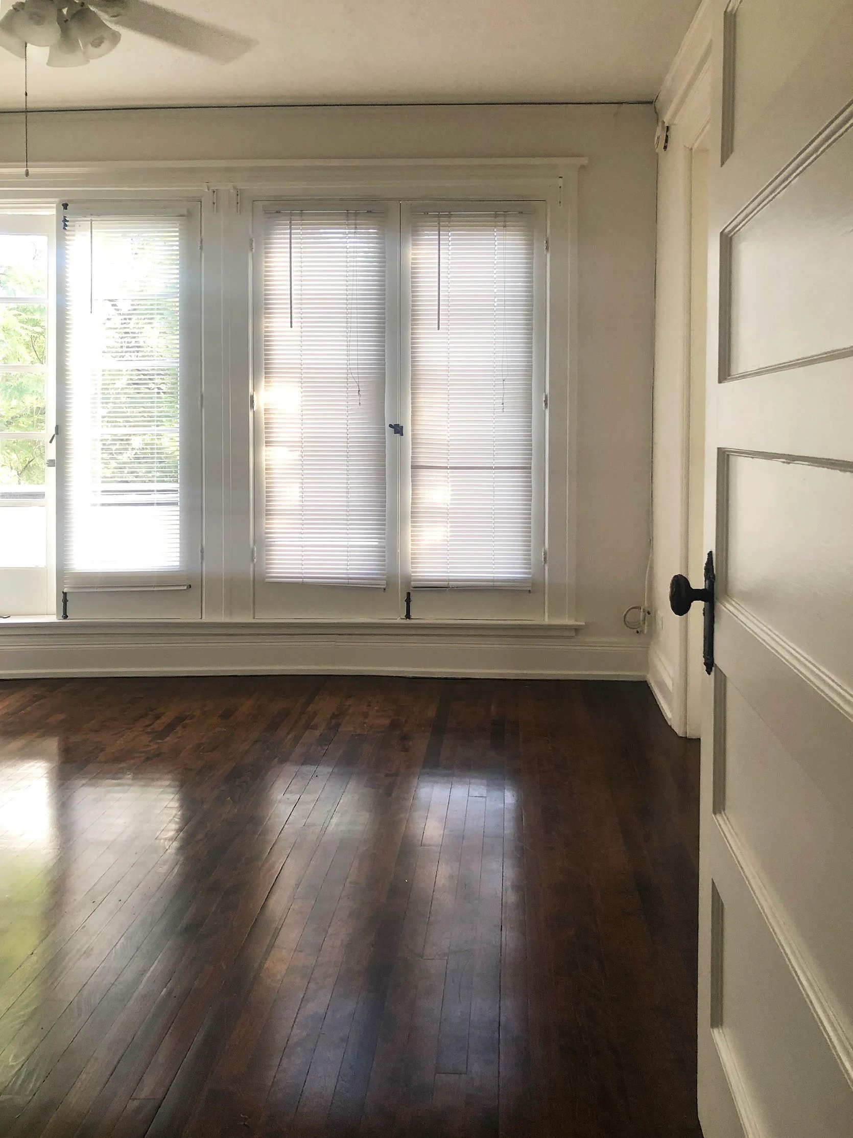
Those blinds were next on the list. I have heard that legally, landlords need to provide privacy on windows, but curtains would be good enough for me. Those blinds were far too sad and generic for this room. But boy, is that moulding so special!
Oops! I Designed My Balcony First:)
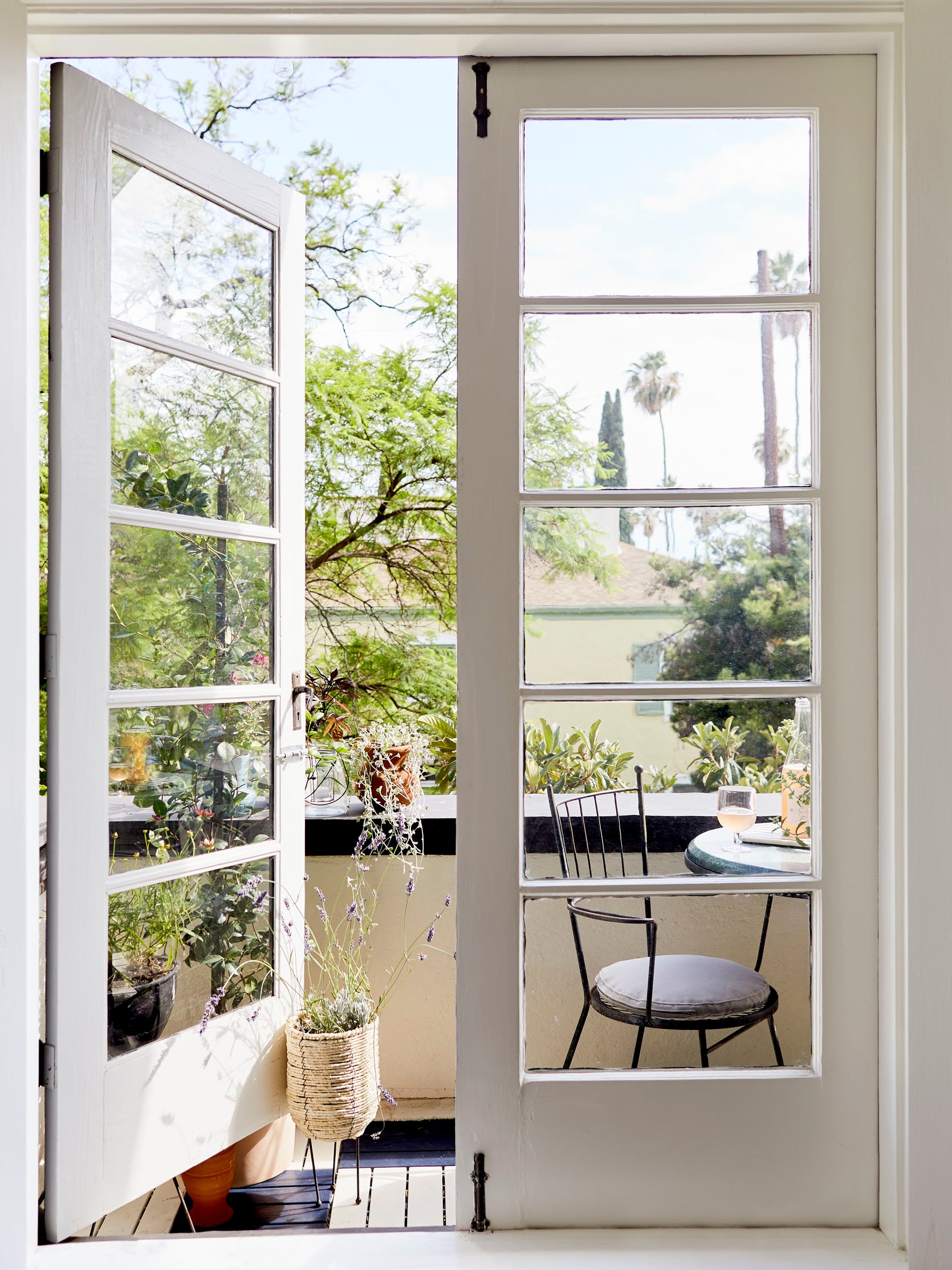
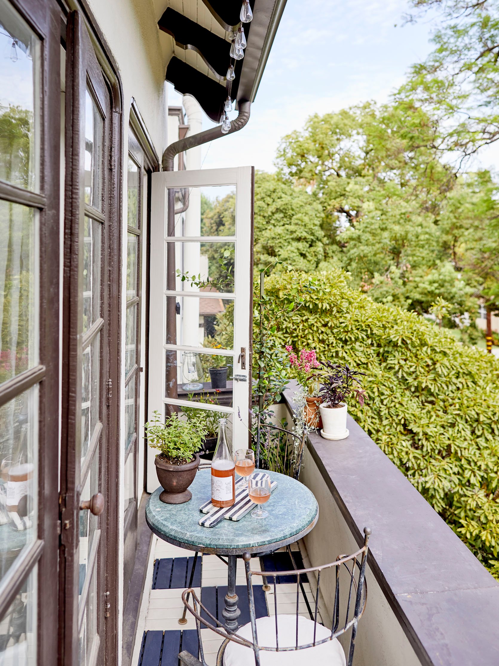
And just for fun, here’s a little reminder of what the balcony looks like. I did have to spruce it up for the shoot, just in case (aka re-spray paint some of the tiles with a makeshift cardboard barrier). As proof that there’s always one DIY per reveal that nearly does me in, for this balcony, it was these tiles. But after I was done, I was thankfully so in love with how they turned out. While I didn’t totally consider the design of the balcony when designing the bedroom, I have to say I think they work pretty well together – a little vintage, a little new, and a checkered pattern:)
Ok, back to the room at hand!
The Layout
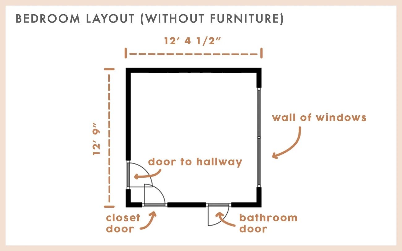
This is the layout with some measurements in case you were curious. How I was going to lay the bed out was always pretty clear since there are only two usable walls, and only one where I could have two nightstands. Having two nightstands was my dream because this was my last “bedroom”…
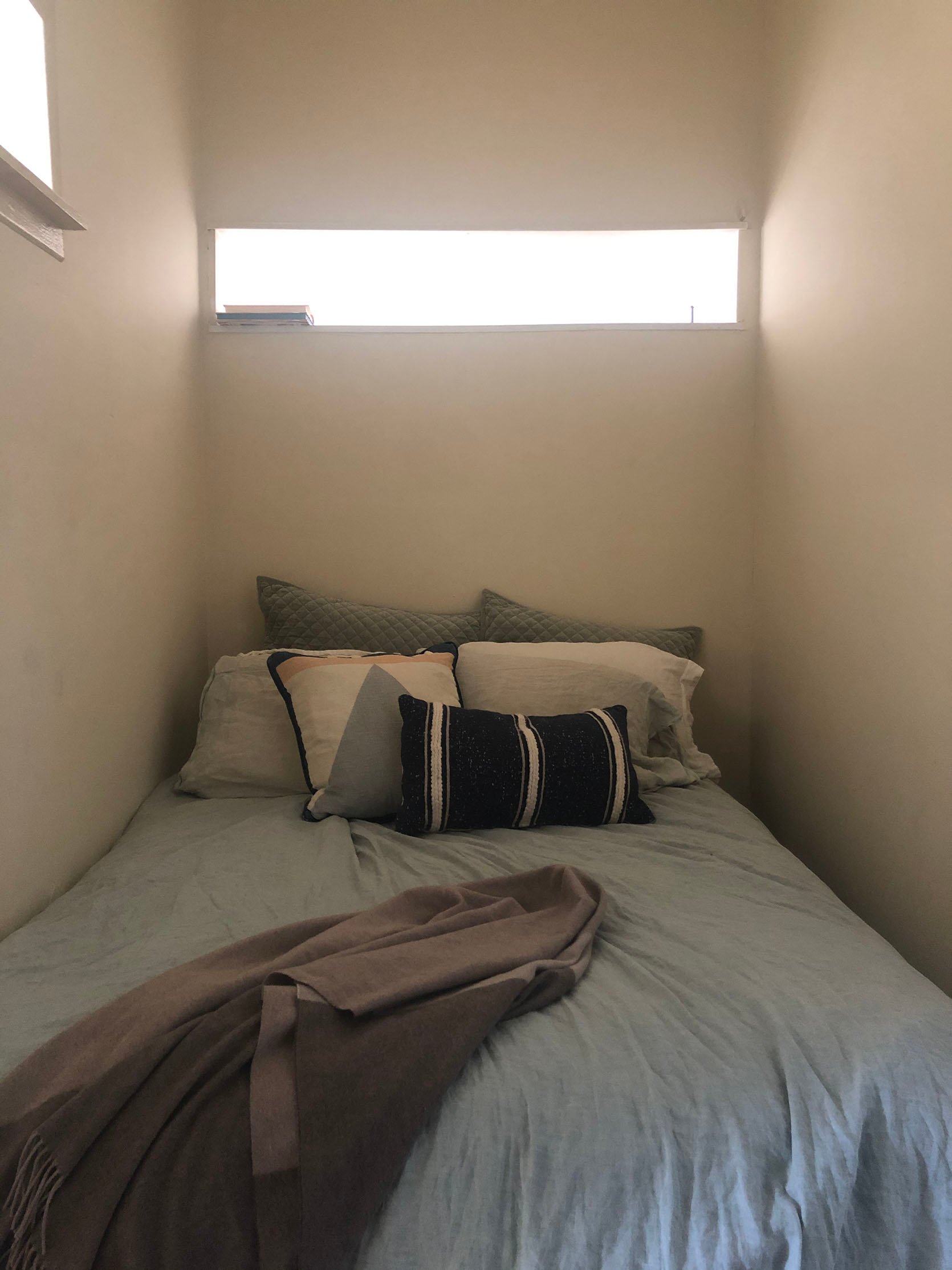
My full-sized mattress slid right into this little nook in this apartment. It was “quirky” for sure, but honestly, I was so grateful that my studio had a layout in which I could pretend to have a sectioned off “bedroom”. But now you can see why the idea of nightstands and even a queen-sized bedroom was THRILLING.
The First Big Idea
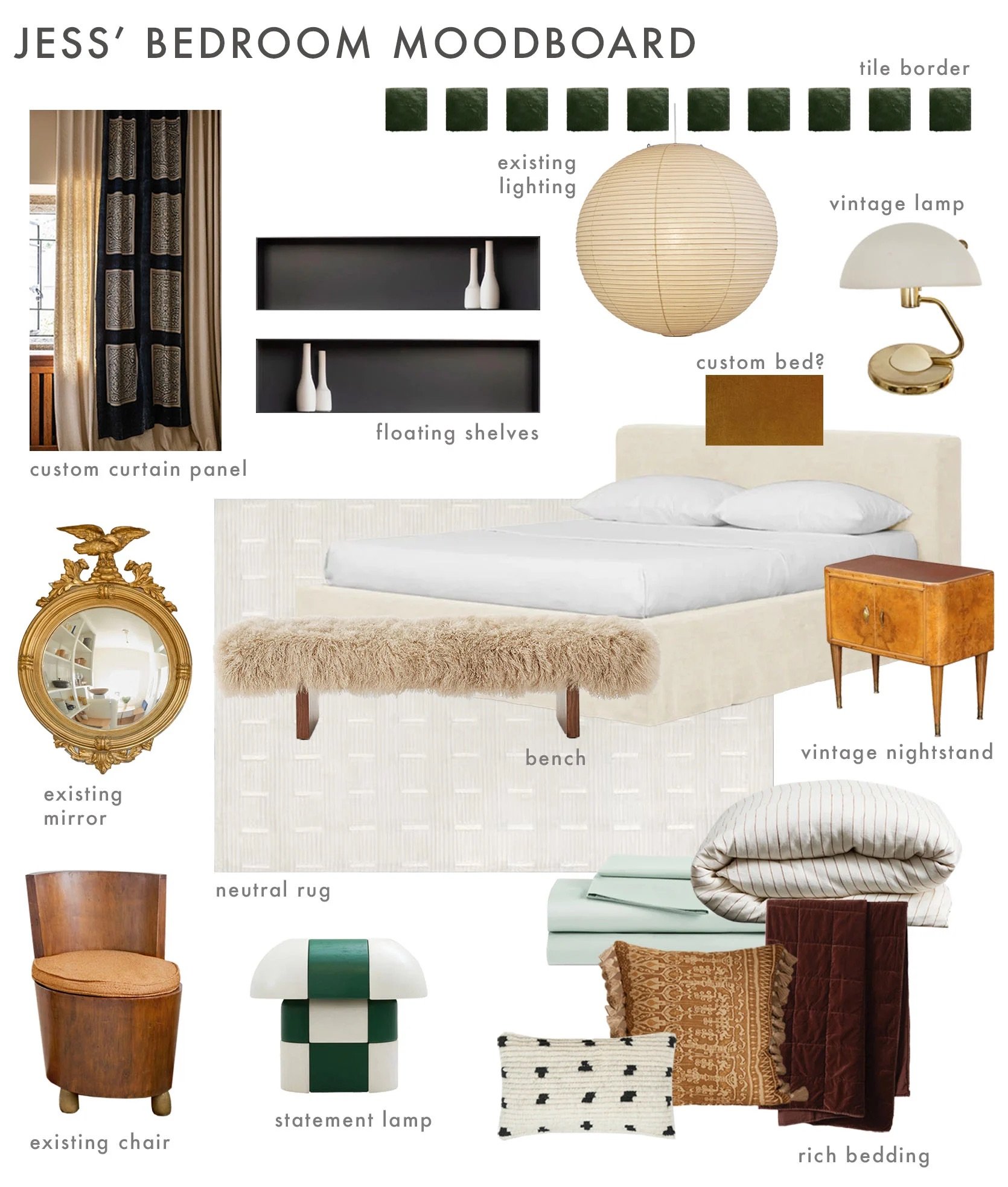
This was my first mood board. One thing you should know about me is that, for myself, I want a fairly simple bedroom. Mostly light neutralish colors, some pattern, but nothing too intense. Everyone is different, and for me, I feel calmest in a grounded yet airy bedroom. But the tricky thing about designing a bedroom that will go on the World Wide Web is that those kinds of rooms don’t always read well. And while none of us here ever “design for the internet,” I think it’s natural to want to make sure your room doesn’t feel too boring, to have ideas that are a little unique. It’s kind of a specific issue, but it was hard not to have that on my mind. That’s where those green tiles in the mood board above came in.
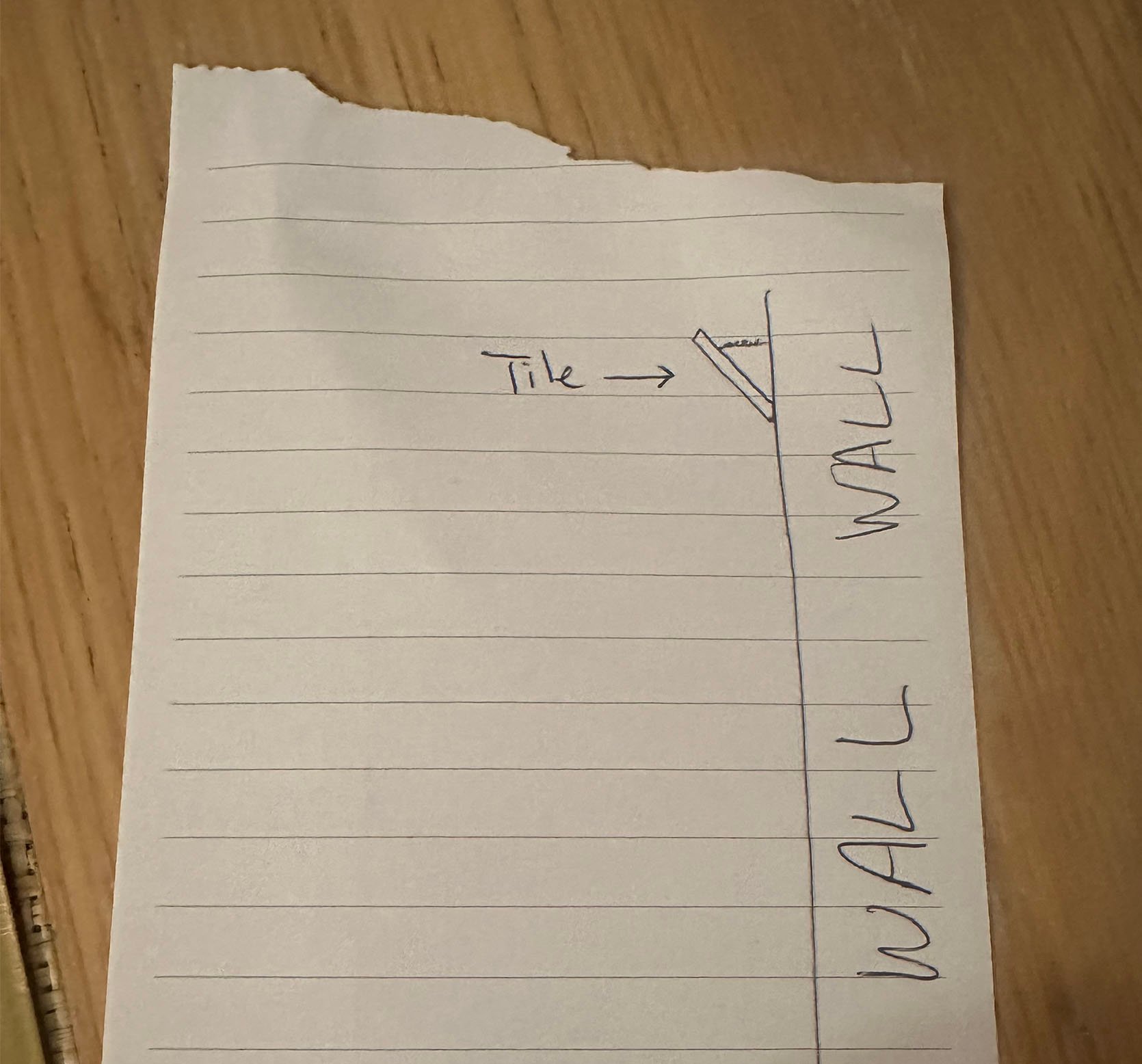
My thought was that I could create an individually installed tile border underneath the crown moulding. Oh, and they would be angled down (see silly drawing for the gist). It would be a creative visual punch, but not too colorful or overstimulating for my eyes. I was PUMPED! Then I talked to my dad about it. I think you know where this is going…anyone else thinking about a certain fireplace cover?? We walked through a few different options that either changed my vision too much and I didn’t like it, or I needed to attach them in a way that wasn’t renter-friendly. A dead end. I was pretty bummed because I didn’t have another idea that I was equally as excited about. More on that later.
Baby’s First Queen Mattress
This is how my bedroom looked for at least three years. Yes, a full-grown, design-obsessed adult was sleeping on the floor. I just didn’t want to get something I didn’t love or choose something before I really pulled a design plan together that ultimately didn’t work. Did I tell myself, “Jess, it’s kind of an airy, sexy, loft-chic look,” aka a totally made-up style to make myself feel better? Yes. But was I any better than the headboardless men my friends and I try to avoid? No. No, I was not…until…
…step one! A bigger mattress from Tuft & Needle! After hearing about the other EHD members rave about their mattresses, I went to their Glendale store and tried them all. Mal came too! The Mint Hybrid in a Queen size was the winner!!! It was the best option for me because I’m a side sleeper who deals with minor back pain. I needed a mattress that had good support (aka firmness), but was also really comfortable. This one fit the bill! It was also my first time getting a mattress in a box. It’s shockingly fun to open up. Not a mattress requirement but a bonus nonetheless 🙂
The Mint Hybrid
Here she is on the bed!! Now, when I was ordering, a few of my friends were in the king-size mattress camp. Could I have fit one? Yes. But it would have been tiiiight. Also, my parents were always of the belief that they didn’t need or want any bed bigger than a queen because they didn’t want that much space between them. I know that is not everyone’s feeling for multiple reasons, and I totally get that. However, I have always loved that sentiment so much. And given that, for the foreseeable future, this bed would just be for little ole me, and it would fit better in my room, a queen was the obvious choice. If I meet someone who can’t comfortably sleep in a queen-size bed, we can maybe talk about it, ha.
The Nightstands!
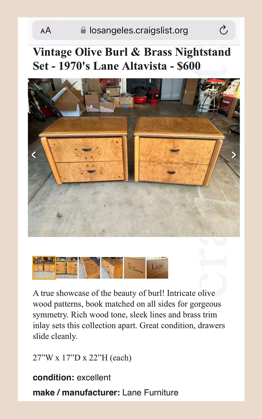
I did write about the nightstand search saga here if you want to fully go on that journey. But ultimately, I had my heart set on vintage to help give some more soul to the room. I searched high and low and then came across this beautiful burl wood 1970s set. I was able to get them at $550 and am so happy I did. I, of course, have to give a huge thanks to Julie again for coming with me (safety first, but also the seller was so lovely) and for helping me bring them upstairs to my apartment. I really owe her a fully paid vacation at this point for all the help she’s given me over the years. These beauties are hefty but give the perfect amount of weight to the room.
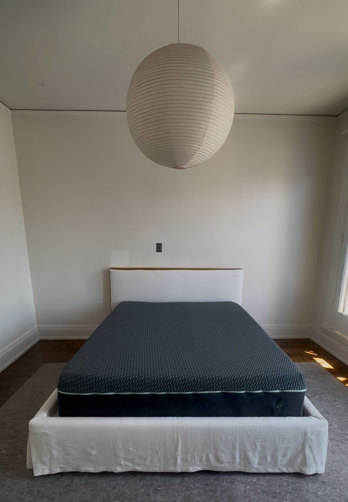
The Custom Bed Of My Dreams
I think it’s time to talk about the bed:)
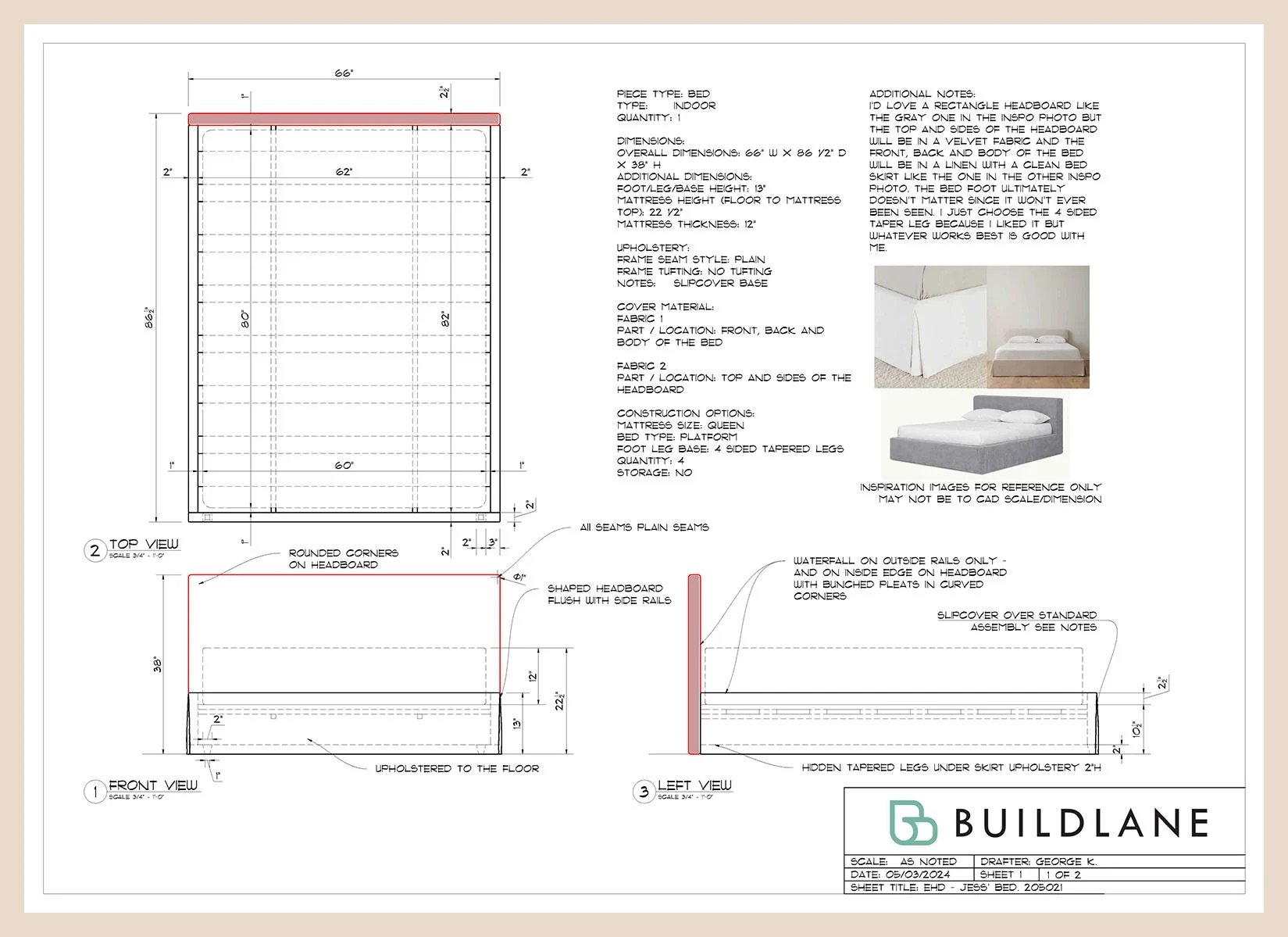
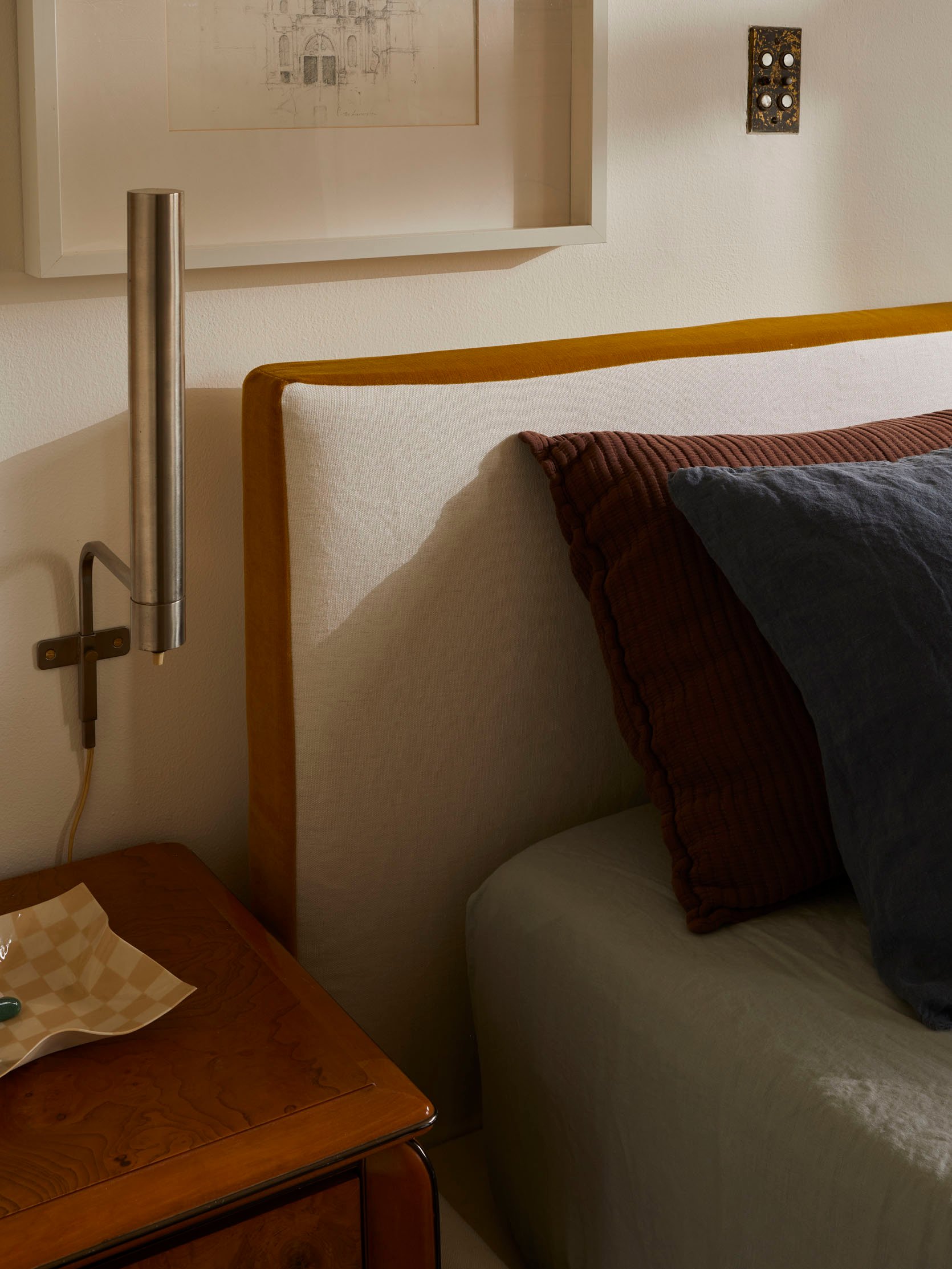
BuildLane graciously accepted my near plea to build me a bed. I didn’t want anything wild, but I also wasn’t seeing what I was looking for on the market. I mean, this was going to be the first real bedframe (with a headboard) I was going to own since college? I wanted it to be both special but also something I could easily reuse for future bedrooms. So I put together the design above, a classic upholstered low, rectangle headboard, and a skirt with corner pleats. But what was going to set this sweet, fairly common-shaped bed apart, design-wise, were the fabrics:)
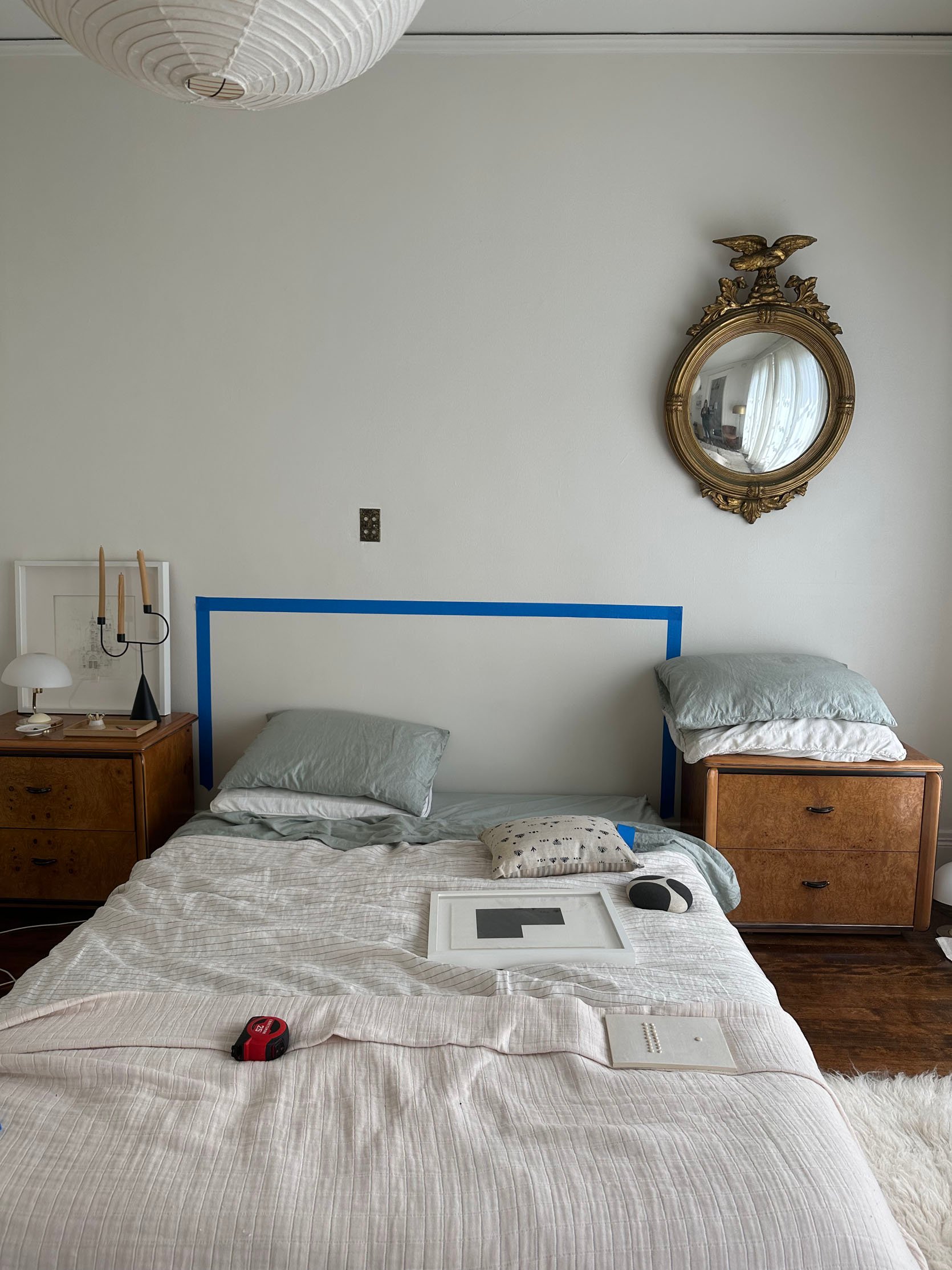
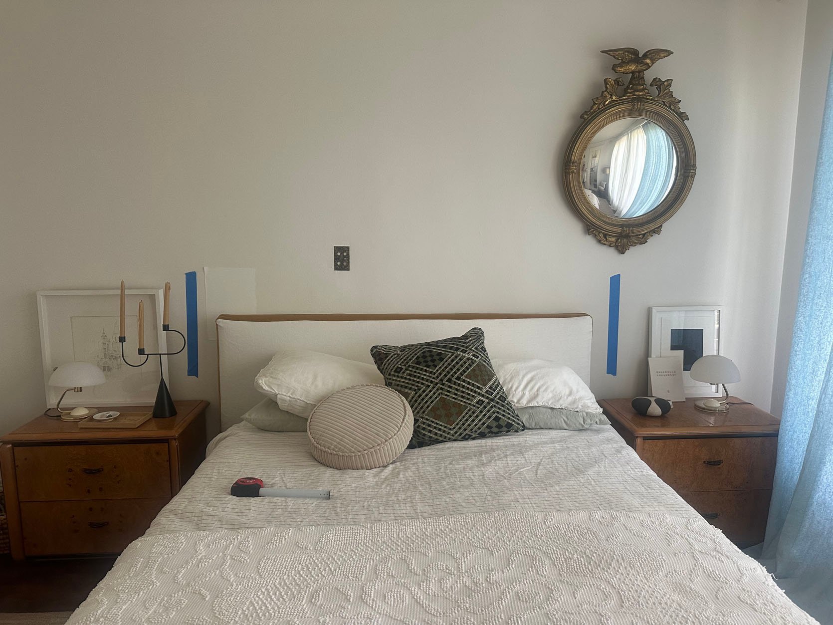
I think this was the most stressful part of the bed designing process, the height of the headboard. I wanted it low but not too low so that I could stack two sets of pillows, but still see some of the headboard at the top. So naturally, blue tape got involved. Thankfully, the height turned out perfect at 38″ from the floor to the top.
During the design process, Frank at BuildLane introduced me to the people at Kravet, who kindly agreed to gift me the fabric. I think it’s fair to say I was insanely excited and slightly overwhelmed to be in their showroom…
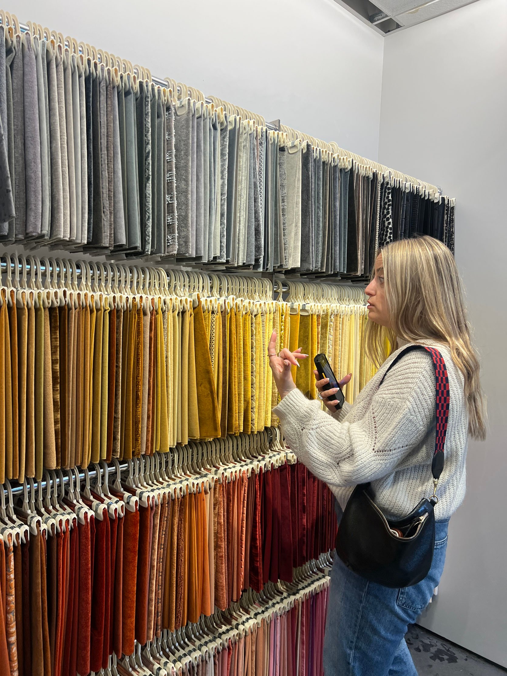
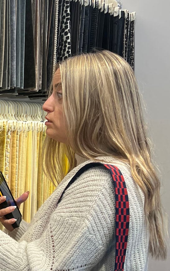
See what I mean?! My big eyes will always tell you everything. Choosing between all of these incredible options wasn’t going to be simple.
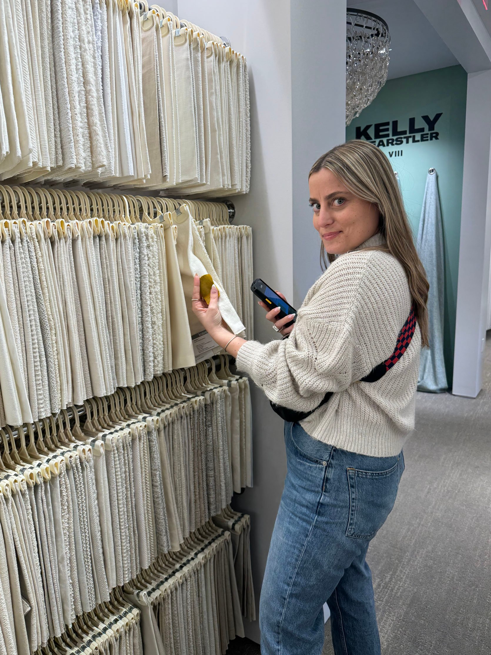
But like any design lover in a fabric showroom, I got the hang of it and found such special fabrics! Plus, that little phone-looking device that’s in my hand is a scanner. It’s like what I imagine wedding registry shopping to be like (or how the movies make it look), you scan, and then a beautiful little sample goes into your sample pile. Here’s what I initially chose…
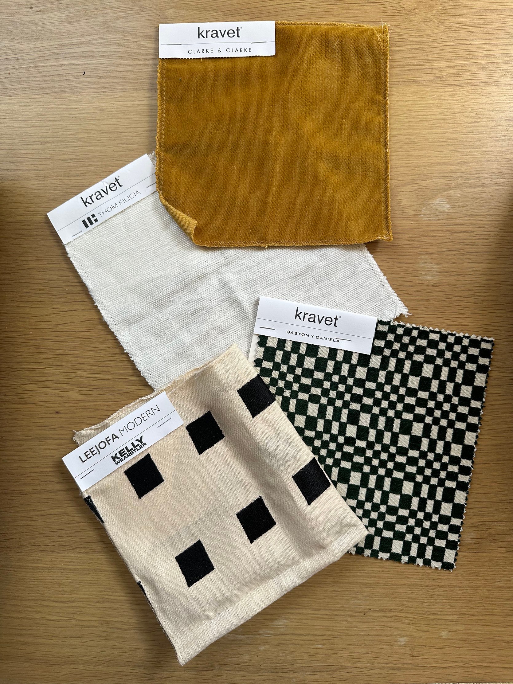
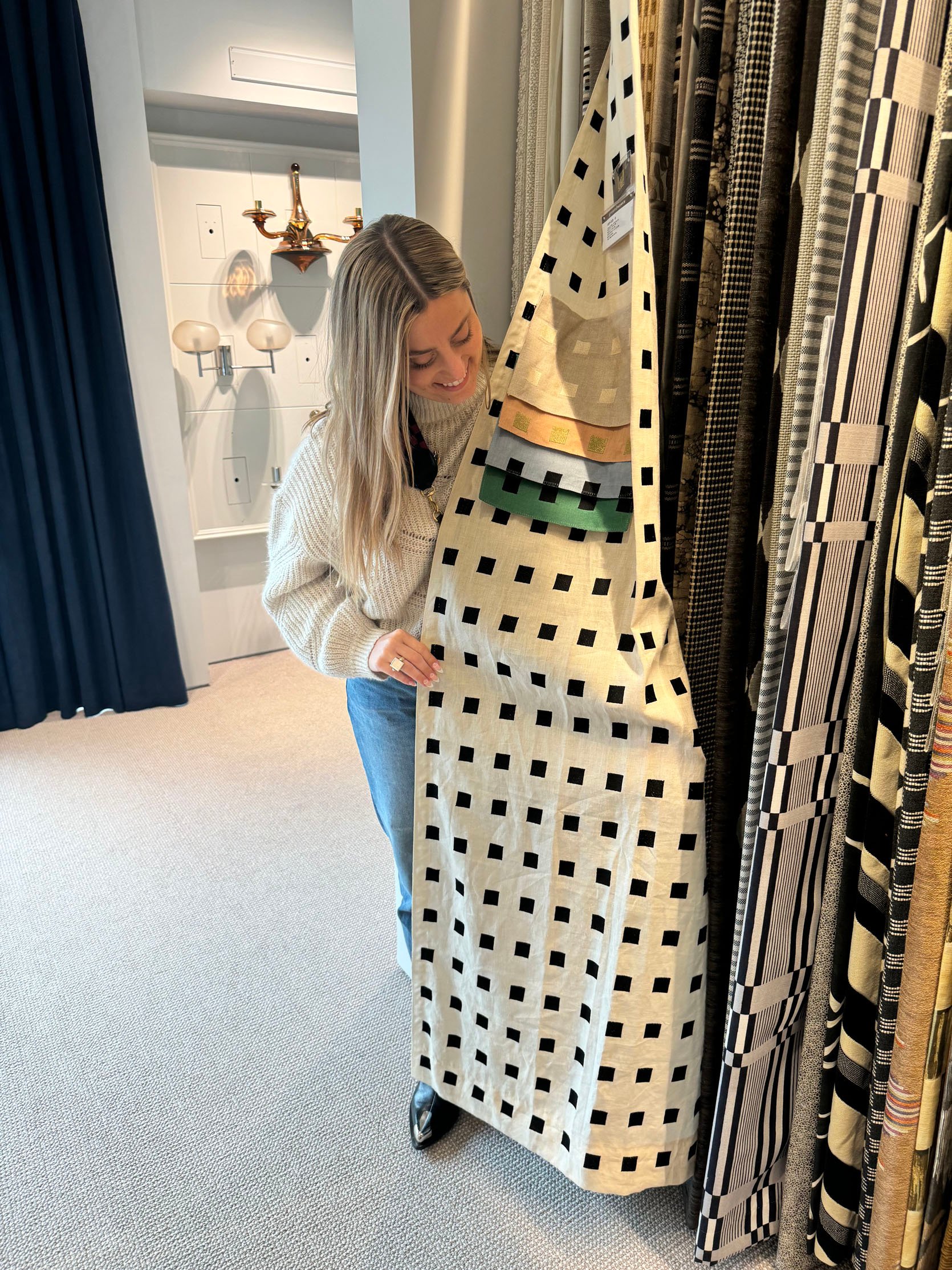
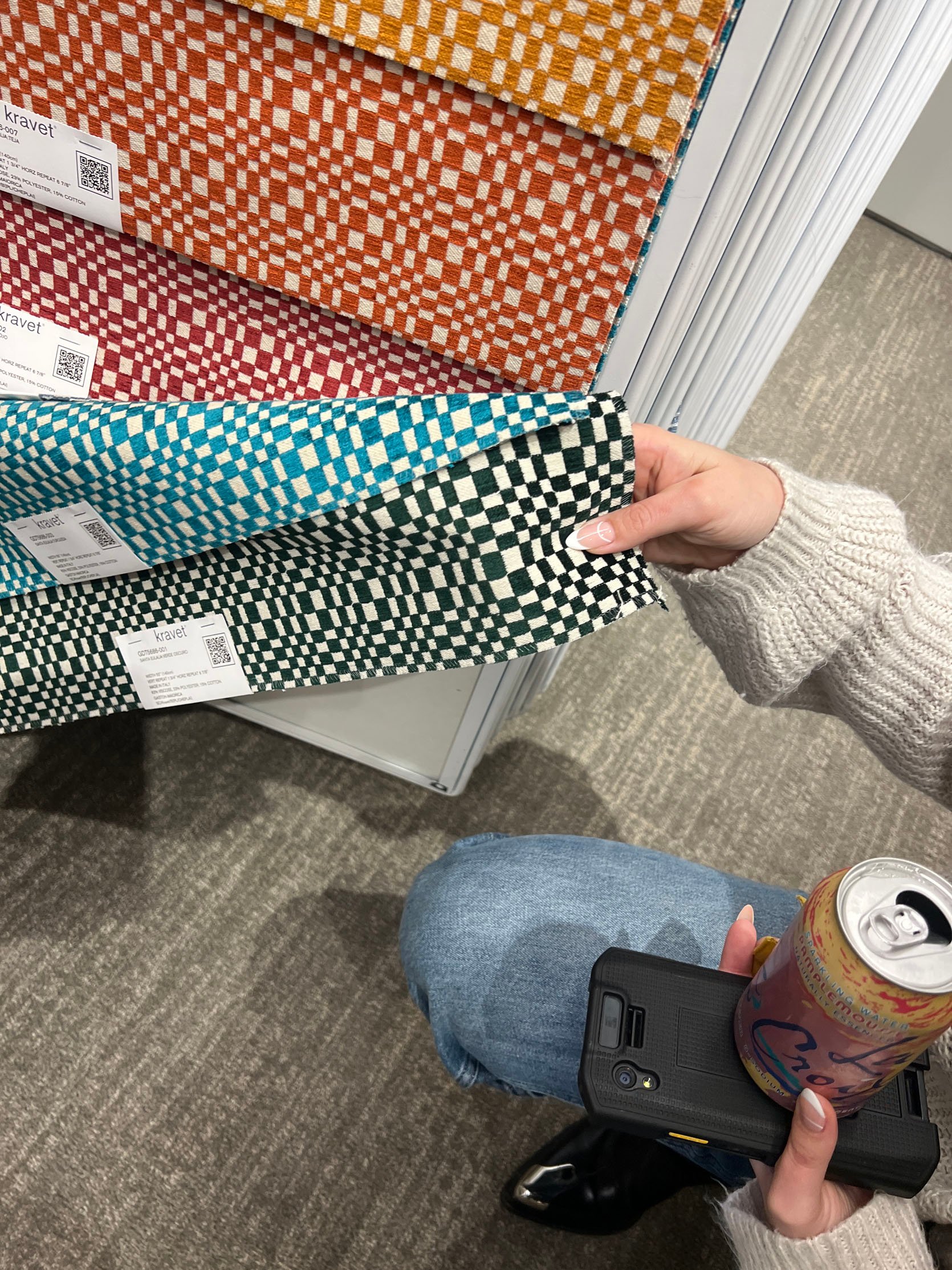
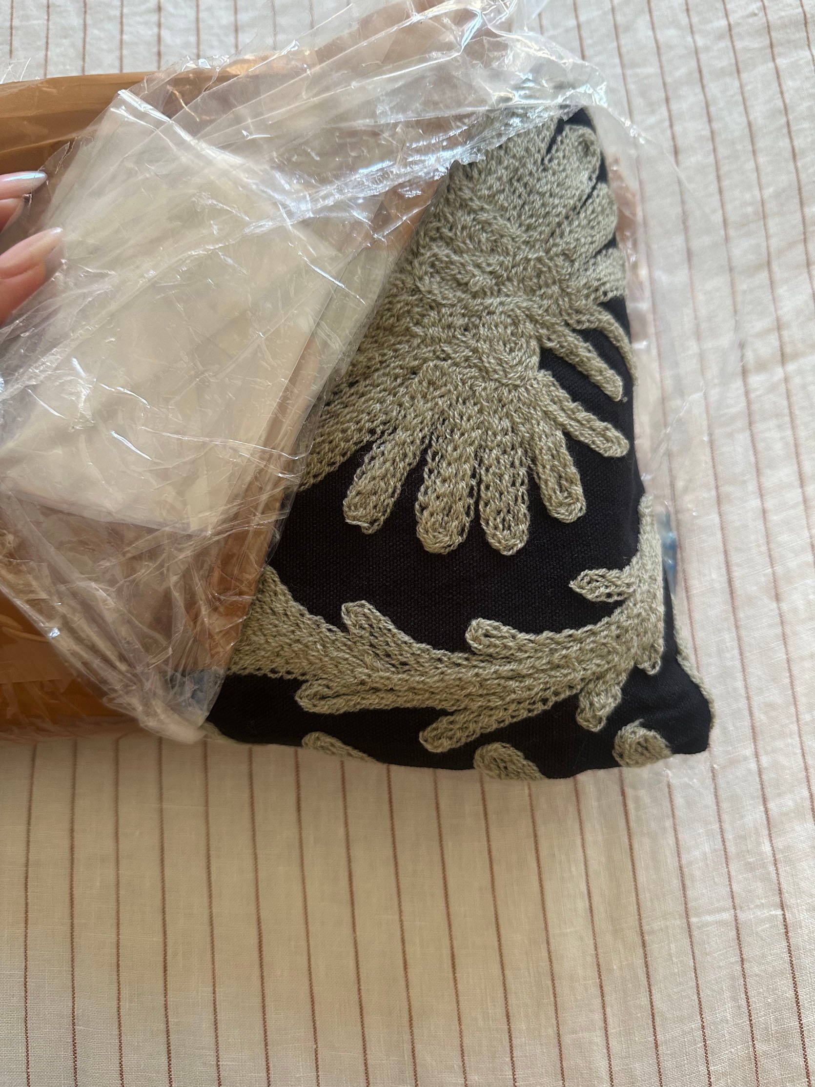
Man, I love looking at these all together. The solid linen (Kravet Basics x Thom Filicia in Sweeting – Ivory) and gold velvet (Clarke & Clarke in “Honey”) were for my bed, but the other two were for a bench that THE Katy Skelton offered to gift me. Another insane pinch me moment. So that bench has a fabric seat that’s customizable, which I took them up on. So the two “checkered” fabrics were for that. Unfortunately, the Kelly Wearstler embroidered square fabric (Chalet Emb – Ivory/Black) was backordered, so I decided to go with another solid linen (Kravet Basics). That way, I could have more freedom with the bedding by not choosing a different pattern. But what I loved about the Kelly Wearstler one was that it was neutral, textured, and a different scale than that perfect green fabric (Gaston Y Daniela – Santa Eulalia – Verde Oscuro). All of these are stunning in person.
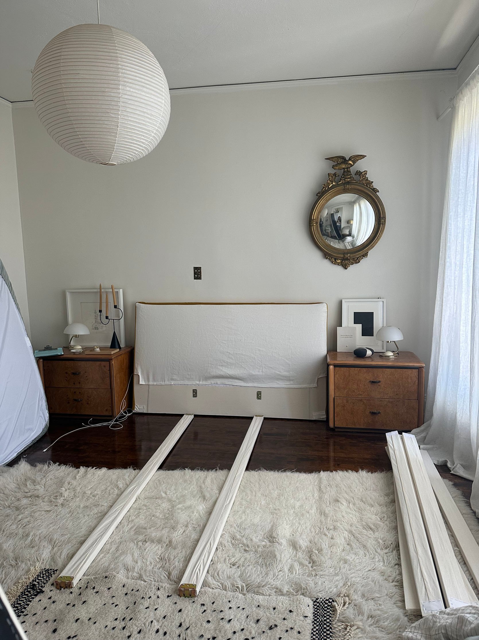
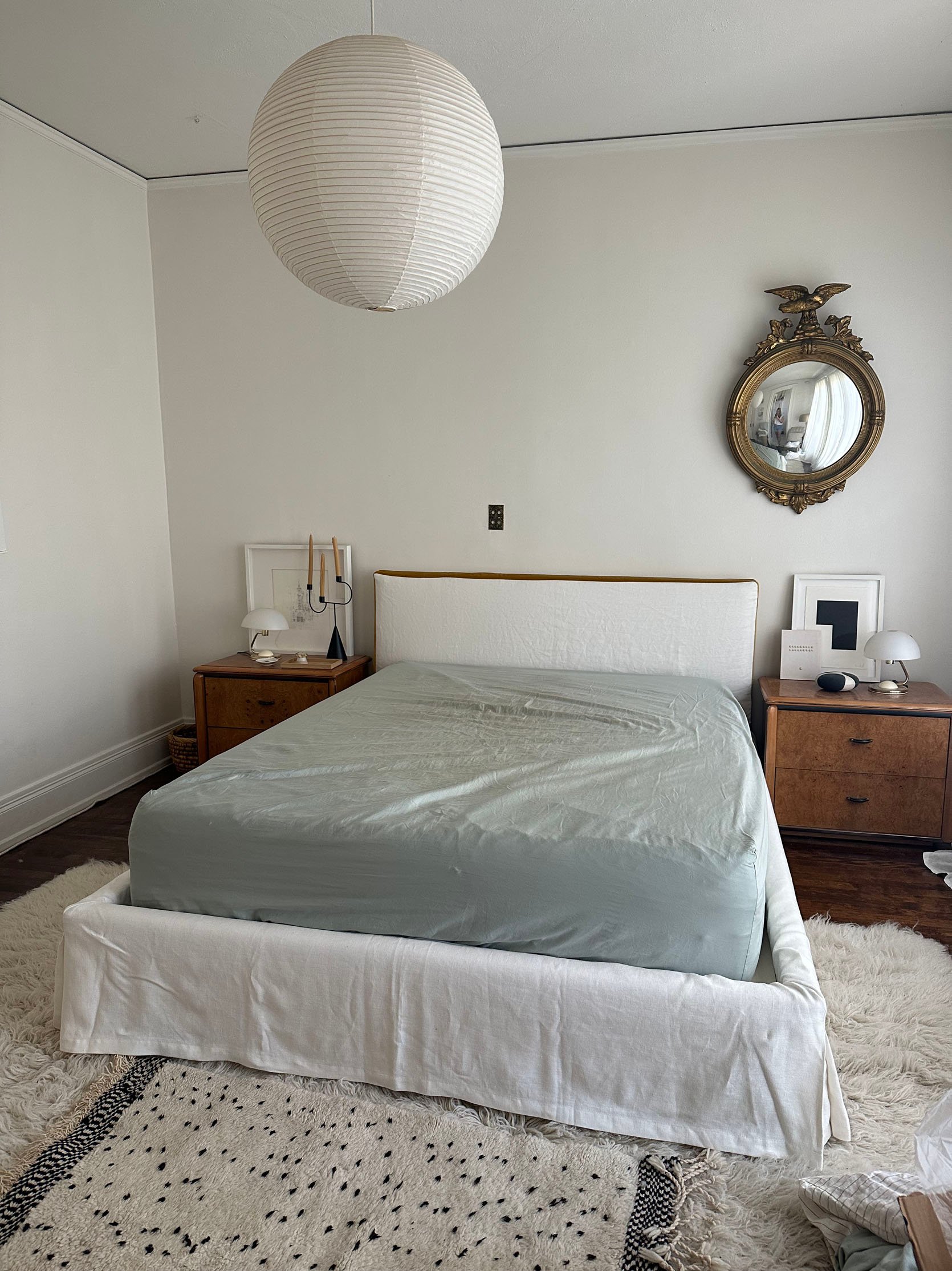
Here she is being built! And let me tell you, she is SOLID and heavy. The quality is so spectacular. Don’t worry, the fabric got tightened and steamed out:) I took this photo a little prematurely during the setup.
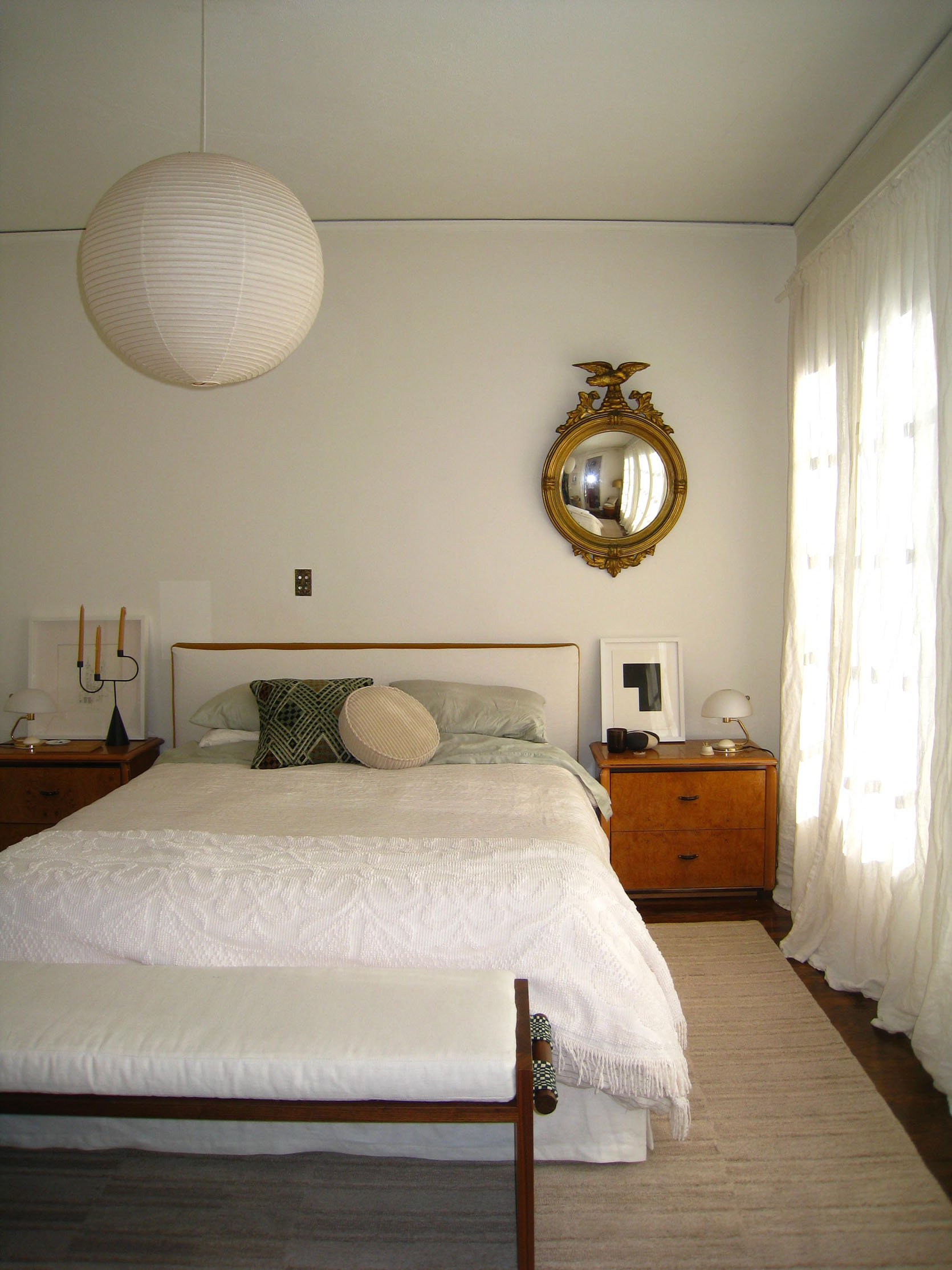
And this is when the bench got delivered! After these two pieces were in, I did call this room “50 Shades of Beige,” which would be rectified. I also think this shows that putting together a neutral room is an art. That’s not what I was really trying to do here (more of a temporary issue), but a good reminder that not all creams and whites in different textures automatically look good together. This room looked a bit sad to me, and I wanted to change that asap.
But one more shot of that amazing green checkered fabric and wood grain!
Bedside Table Lights – Part 1
Like the nightstands, I wanted vintage table lamps to sit on top of them. In the room, there are brass and crystal sconces, so it was important to me to get a more modern style nightstand lamp. These Italian MCM types were the ones I originally wanted, but most of them were either too expensive online or didn’t come in a set. It wasn’t looking great until I went to the Rose Bowl.
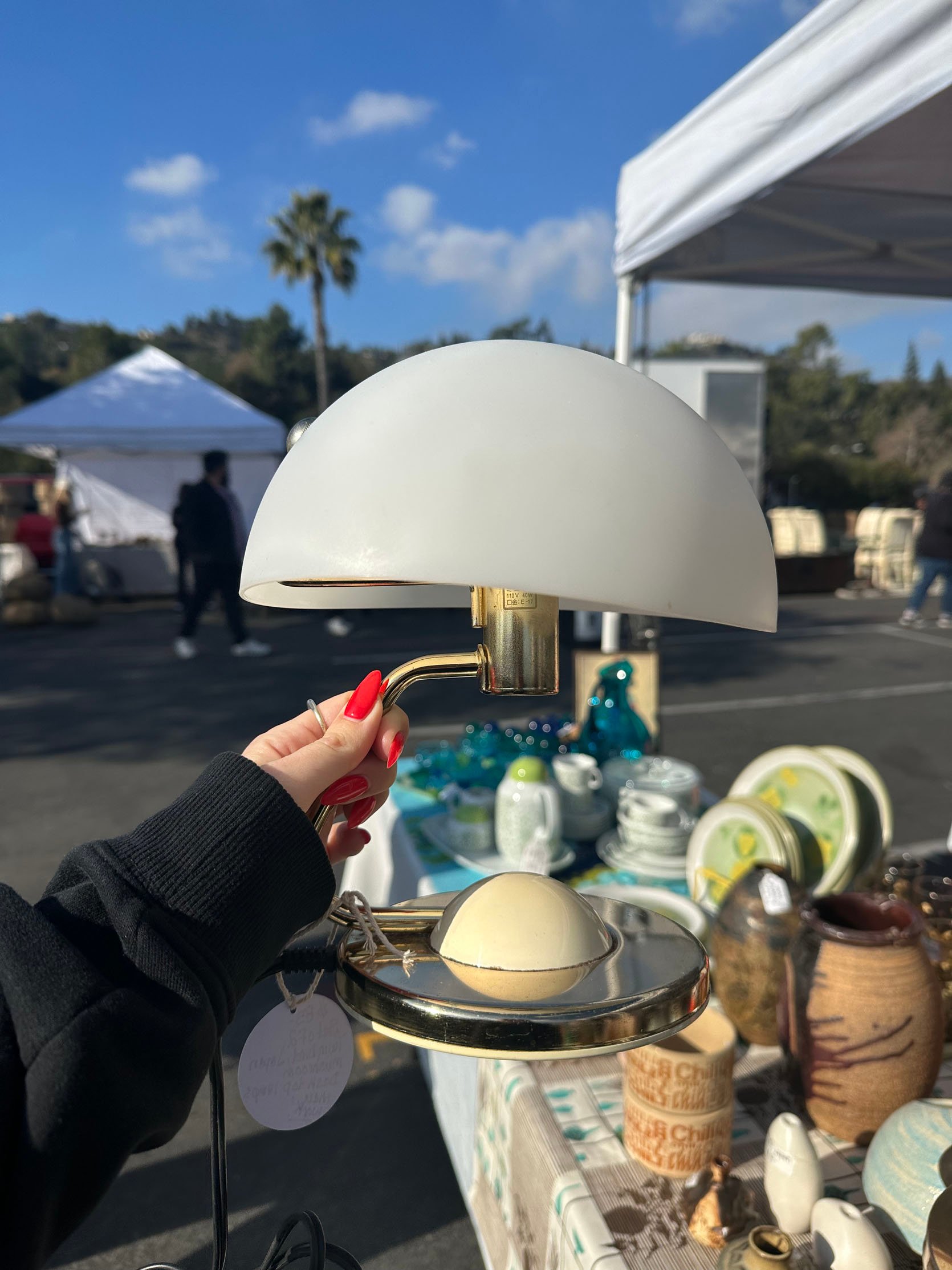
I happened upon these Japanese MCM table lamps for only $80 total! I fell for them immediately, paid the kind vendor, and the rest is history. The Rose Bowl is always a gamble. Sometimes you come home with nothing, sometimes you spend way too much money, and other times you find a truly great deal (At least it felt that way. Please don’t burst my bubble!) They give off the prettiest glow, and the shape is actually better for the room (helps offset all of the rectangles:)).
The “New” Wall Color
I believe I have the world’s kindest and most wonderful landlord. However, I am fairly certain this room did not get repainted before I moved in. The ceiling had a discoloration spot, and overall, it just needed a fresh coat. I emailed her, asking if I paid for the paint, would she be willing to pay for the labor. I showed her the areas of concern, promised her it would be another white (lol) as to not do anything crazy/non renter-friendly, and she kindly agreed. PHEW. Next stop was getting my Samplize paint stickers.
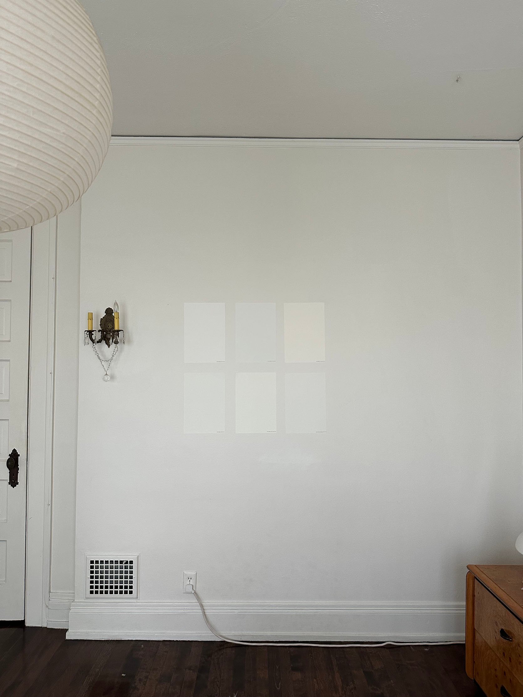
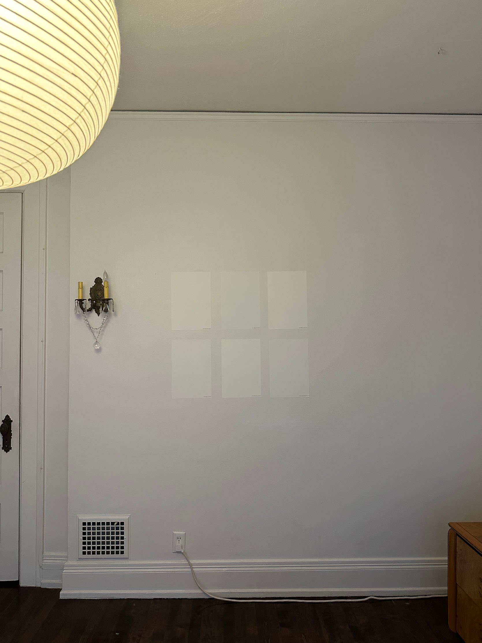
Here they are – one in bright daylight and one much later in the day. It still shocks me that a color can look like a fairly standard white on a paint fan deck, but then you get it in the soon-to-be-painted room and it completely transforms. Those “whites” range from white to blue to green to yellow. Let this be a reminder lesson to test your paint before you buy. Paint (especially trim paint) is not cheap. My bank account will tell you! So if you can, we truly love Samplize, and they will help you make the best decision with zero mess. The dream, right?
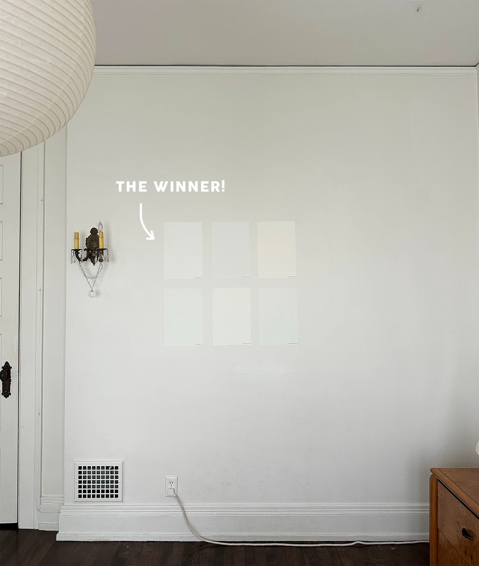
And this is my best decision – White Flour by Sherwin-Williams.
Understandably, some of you might be thinking I’m a crazy woman – “Jess, is that new white going to make that big of a difference to spend $300?” I can tell you emphatically that it made a HUGE difference. But this was also a lesson in timelines. I really wanted the bed in the room before I finalized the paint color. I wanted to feel 10000% confident that the color of the paint would look beautiful with the color of the nearly white linen. After seeing this, I was.
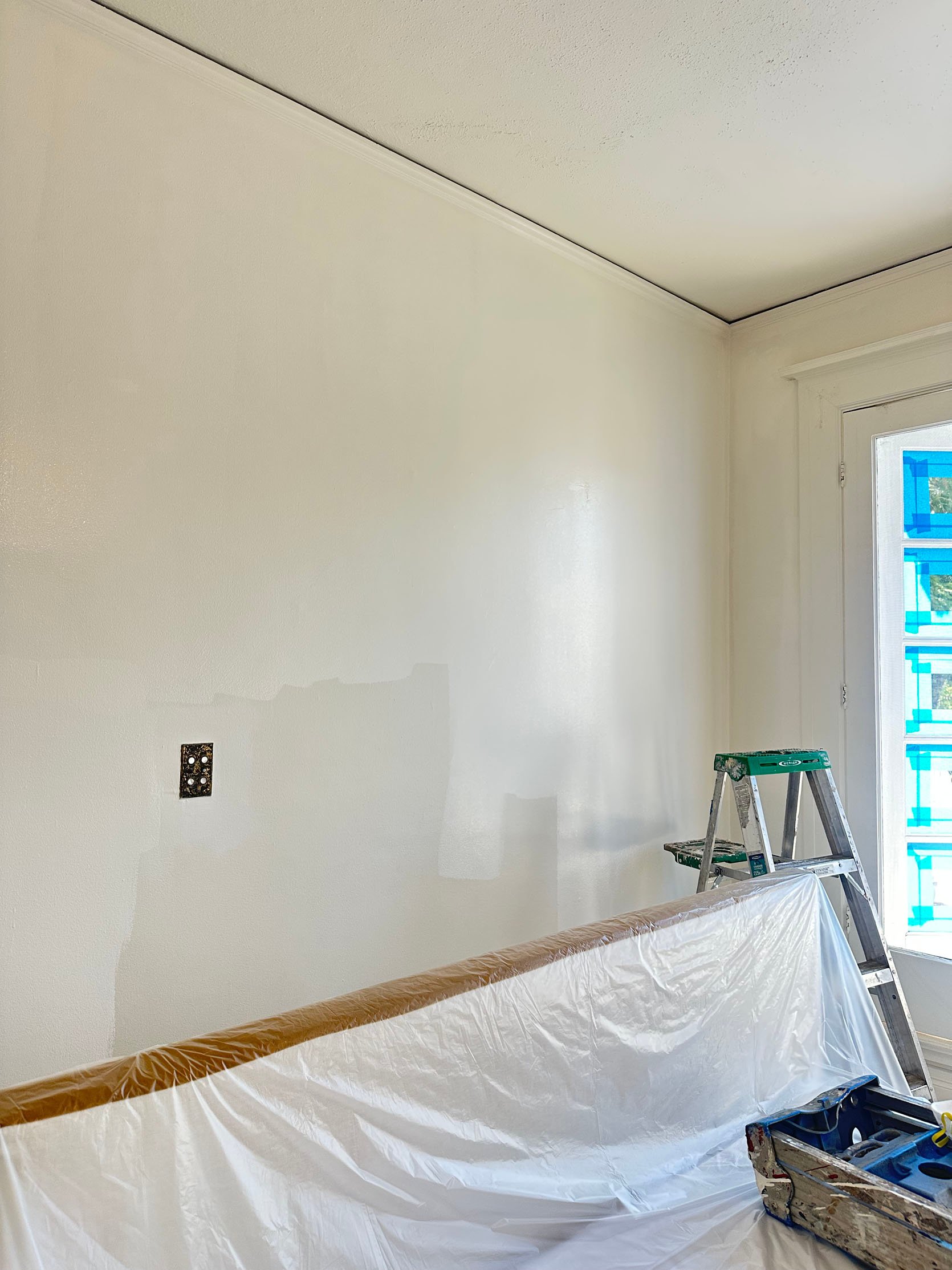
And see! Those two whites are pretty freaking different. Can you tell I’m really trying to justify my decisions? 😉
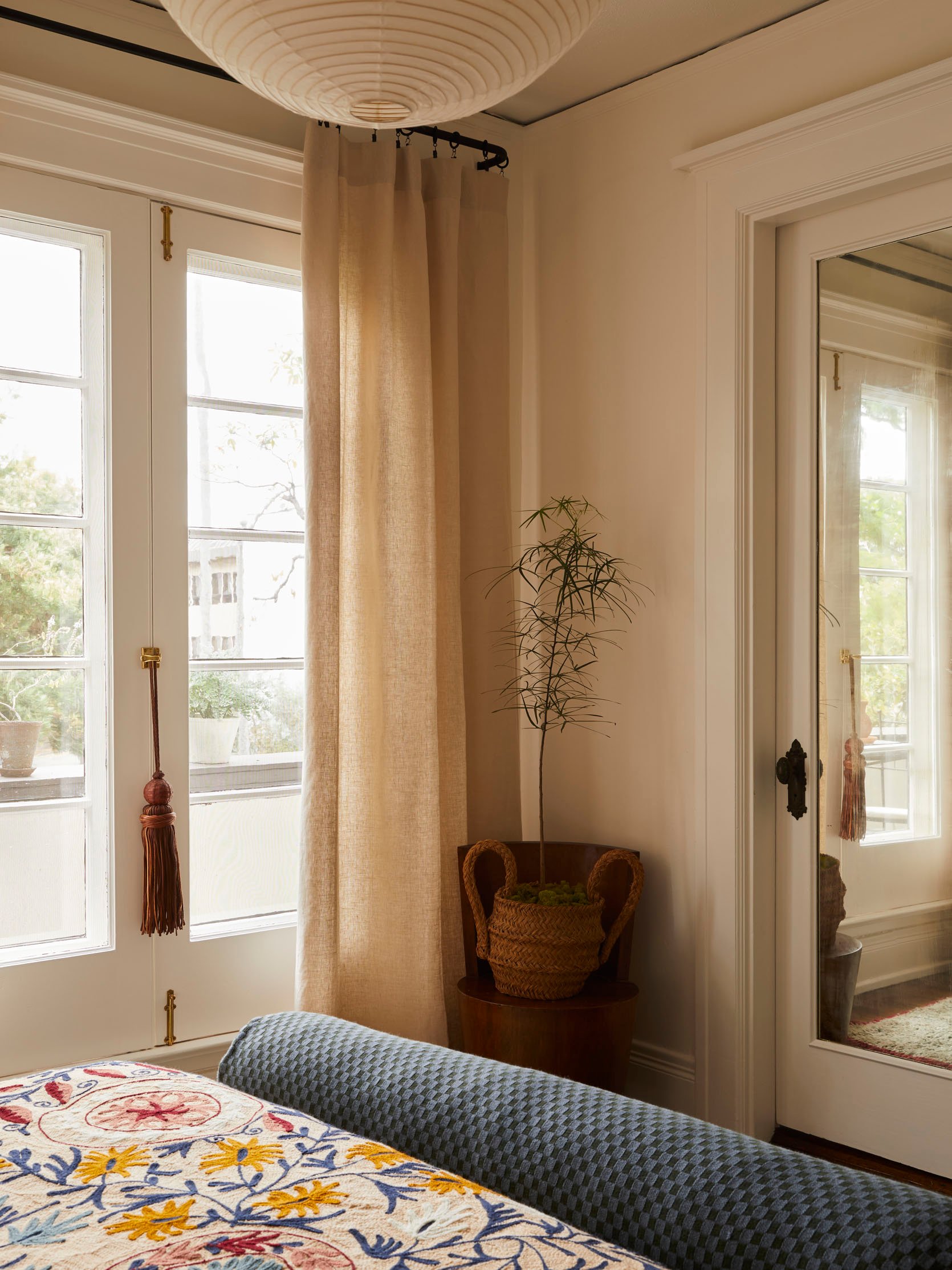
Curtain (And Rod) Call
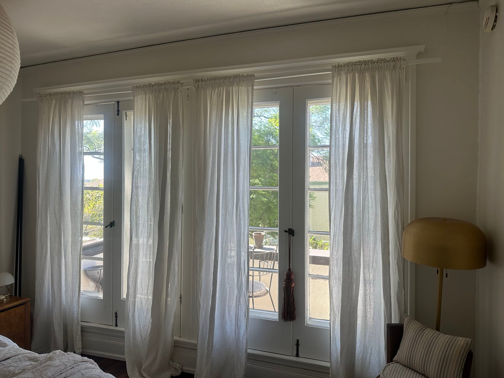
Next up is the wall of French doors and the curtains that cover them. The blinds that were up when I moved in came down within the first couple of days. I kept up the curtain rod that was there, but knew I would at least be replacing it with something nicer. Those curtains were also my IKEA ones that are sadly no longer in stock, to be a placeholder. They now live in my storage unit because good, affordable curtains aren’t easy to find.
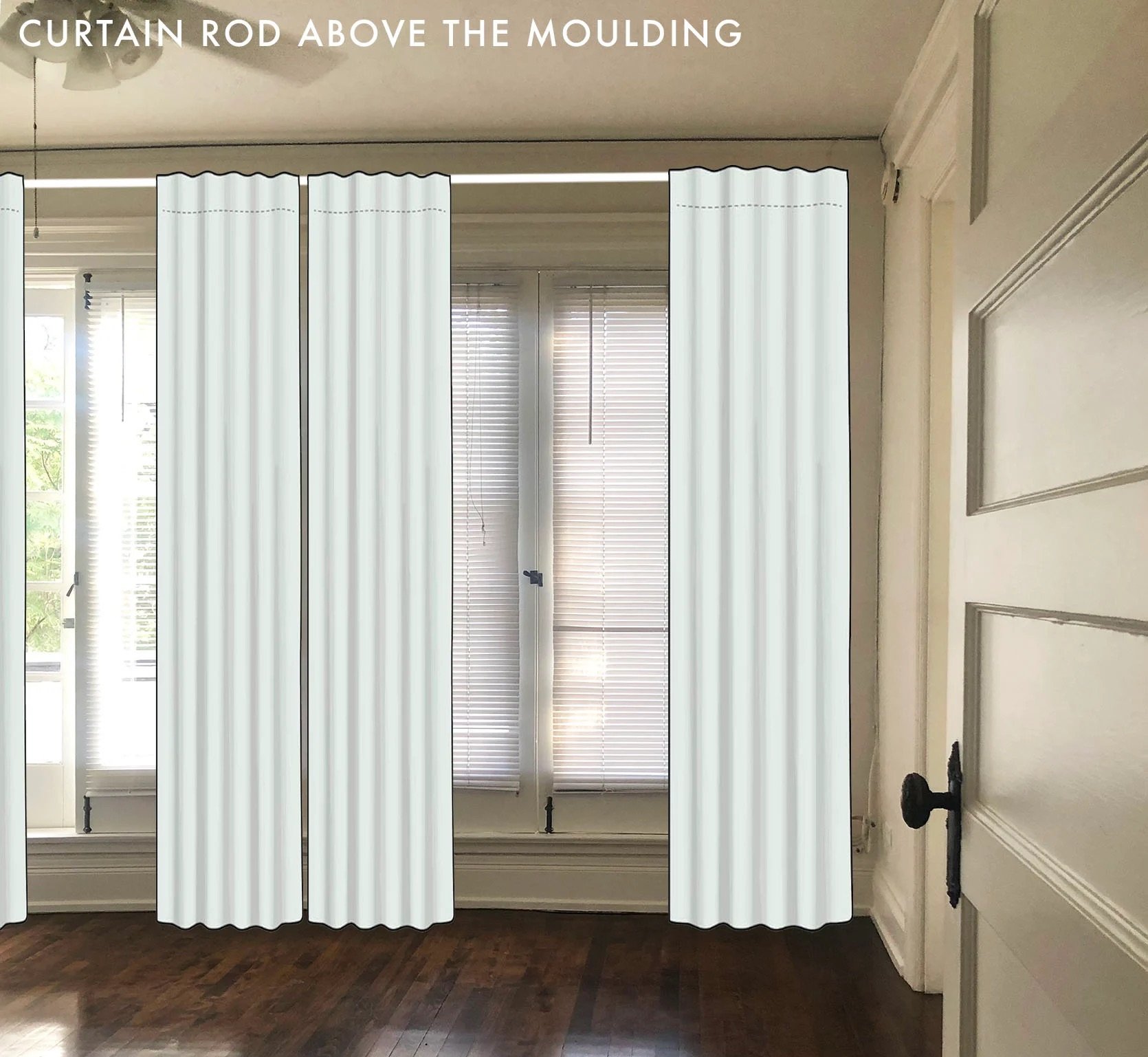
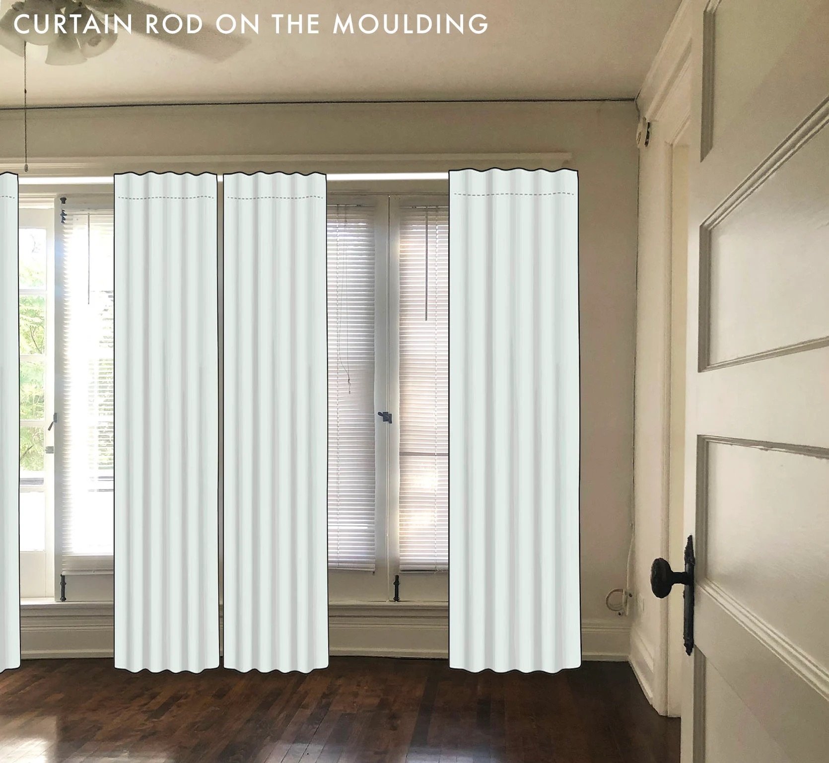
The next question was rod placement. I felt pretty sure I wanted to go higher/above the door moulding, but just to be 100%, I did this little mock-up. I knew the room would feel taller if I went higher, so this helped me confirm that.
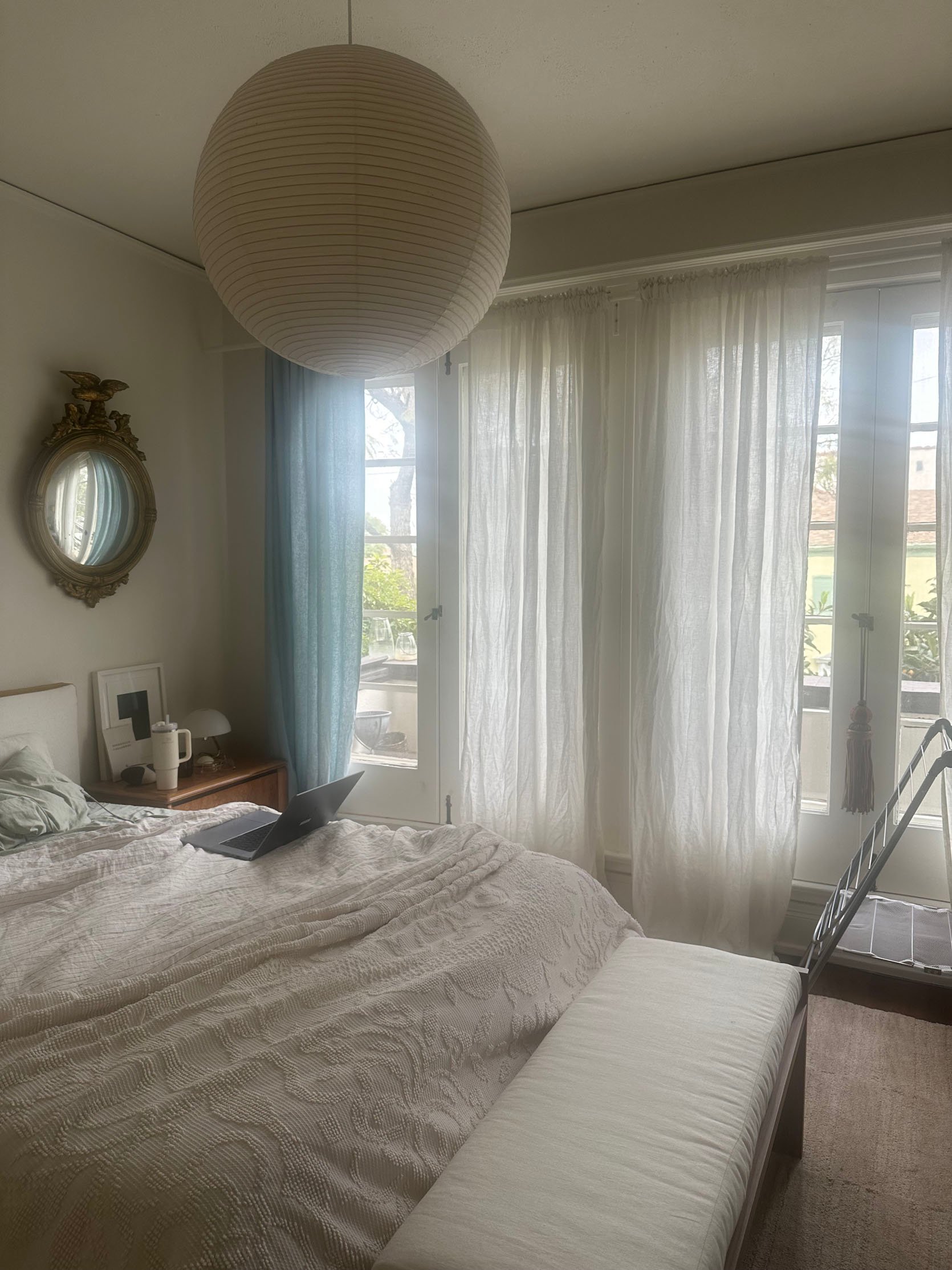
In addition, I was trying to find the right curtains. I had the urge to try a light blue. Sure, it’s on trend, but curtains can be perfect for that. Plus, light blue wouldn’t be that intense, right?? Well, I ordered this panel from Quince to test out. While I was impressed with the quality, the color wasn’t 100% what I was looking for. Also, it would have been one thing if I had one smaller window or two windows flanking my bed, giving the curtains some breathing room. That would not have been the case in my room. I feared it would look like a wall of light blue coming at you, overwhelming your eye, and taking all the attention in an otherwise light neutral room.
So, What Curtains Did You Choose??
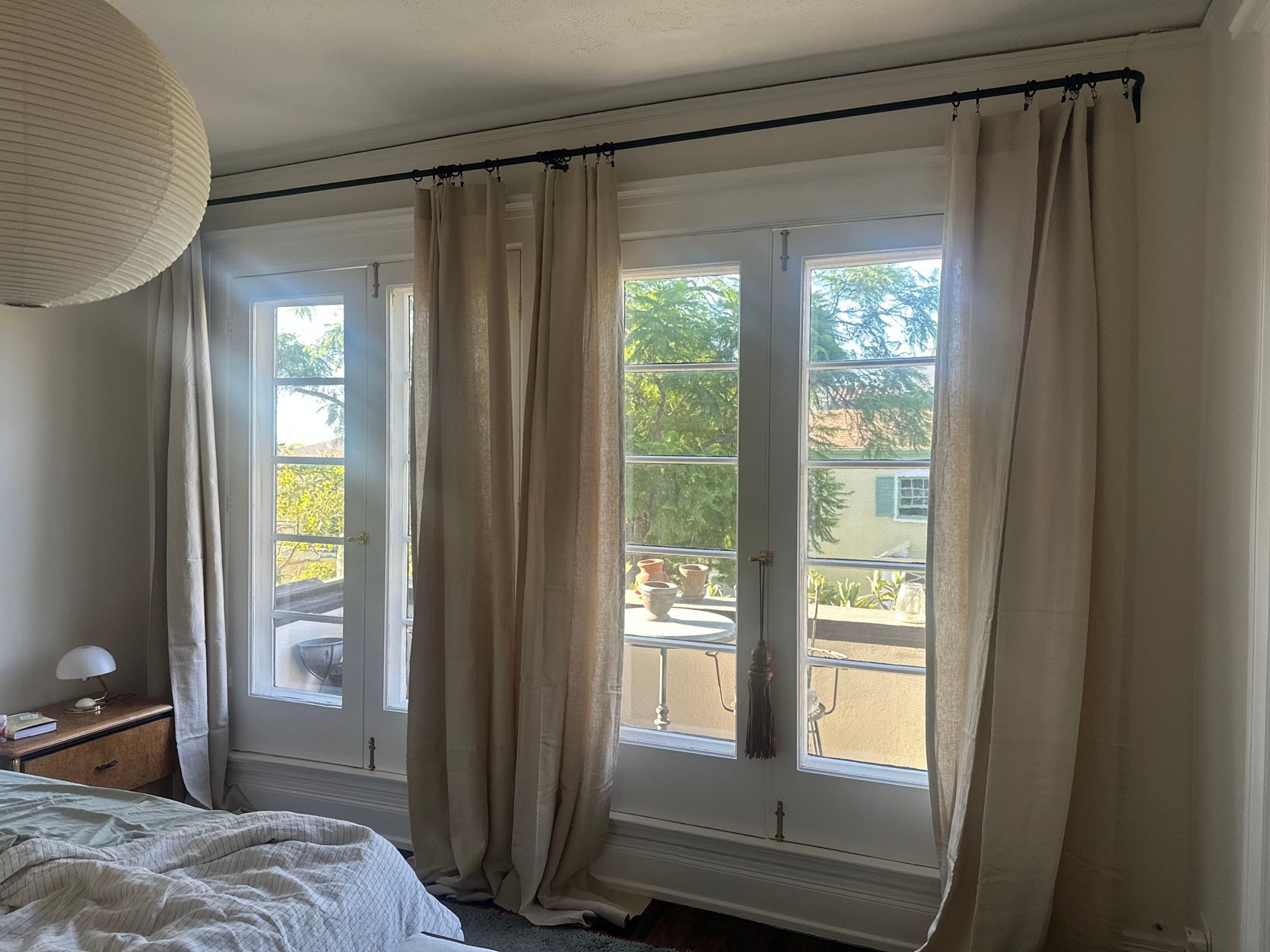
I found the perfect “natural” linen curtains from Anthro, who also gifted them! I was so grateful! I did, as you can see, need to get them hemmed. The next size down was too short, so I marched them over to my very wonderful dry cleaner to fix them up. Fun fact, my ceilings and/or floor are slanted, so I had to give them three different length measurements. Second, it did cost me around $300. Linen is hard to hem, FYI, so I knew it wouldn’t be cheap. But now they look great with the custom-length curtain rod I had to get. This room may look simple when you see the pretty photos (and boy did Sara outdo herself), but this room added up QUICK.
Also, a big ole thank you to my wonderful friends who helped me put this curtain rod up. There are certain things you simply need more than one set of hands for. This and that ceiling medallion were two of them:)
Bedside Table Lights – Part 2
Before we get to the pretty bedding, I want to talk about my other MCM sconces. I was feeling that this room needed a little more modern edge. I wanted softness, I wanted a sprinkle of a traditional feel, but I also wanted freshness, and that’s what these sconces gave me.
I found them on Facebook Marketplace and asked my design sounding board what they thought. I knew I wanted them, but they were *gulp* $400 (down from $475), so I needed some confidence boosting. They all agreed they were cool, so I just did it, and I’m so glad I did. Again, blue tape really comes in handy for measuring! Aryn was the person who came over to help me decide on the ideal height. But they are vertically adjustable!
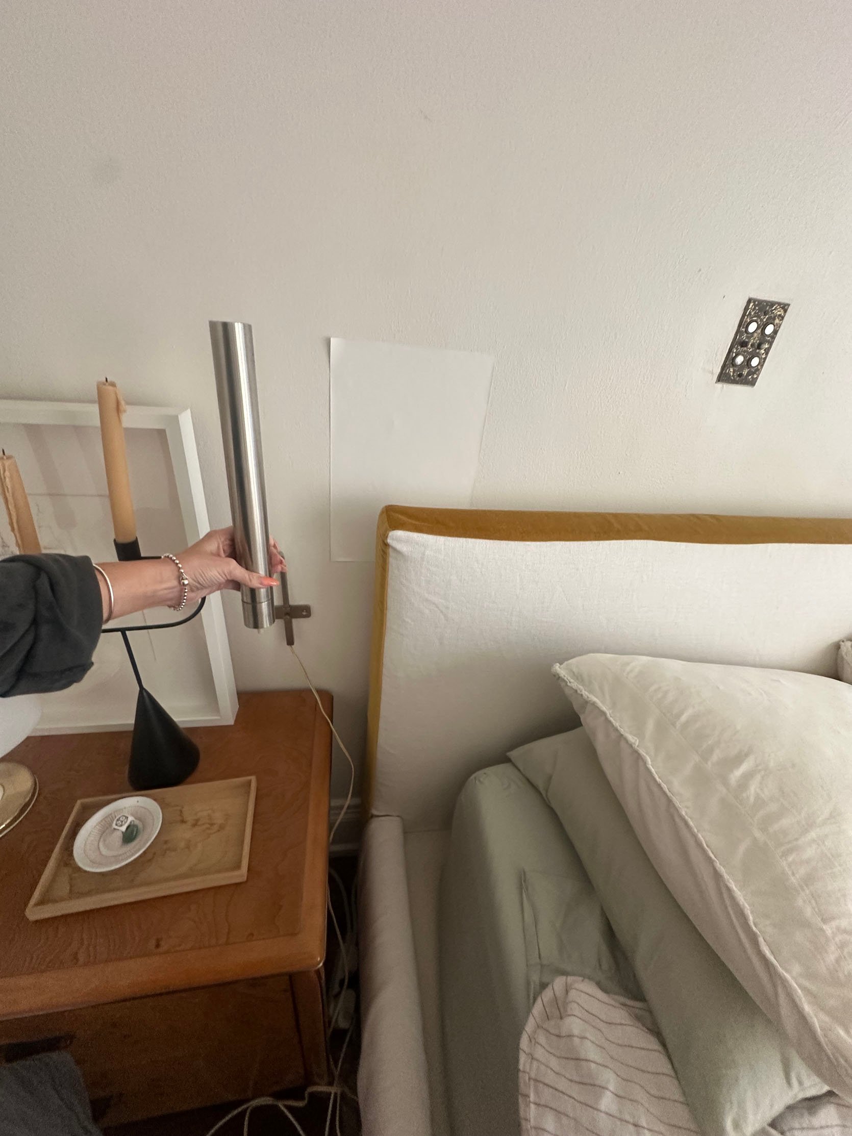
You may also be wondering why I needed two lights on each nightstand. Well, I didn’t, but I wanted them all for two reasons. Reason one is that I knew it would look great. Reason 2 is that the Japanese ones can be a little annoying to turn off and on since they look best on the outer part of the nightstand and the cords come out from the back of them. This means the switch is kinda far when you’re in bed. As I write this, I know it sounds pathetic, but I also look at lamps as sculptures/art, so if nothing else, I have 4 pieces of functional art that look great together. In case you are trying to count, I have seven lights in my singular bedroom. I tell you in every post I write about lighting that I’m obsessed, so at least you know I’m telling the truth and really walk the walk, ha.
Finding Bedding That Isn’t “Neutral”
Y’all might remember that I really wanted to get light mint colored sheets. When used well, mint is so exquisite yet extremely cool. Well, that didn’t happen for me because the way the color palette was going, it was not going to work. I bought three sets of sheets, and because I took so long finding the bedspread, I just sold them in a garage sale for a fraction of the value. Lesson learned, again!
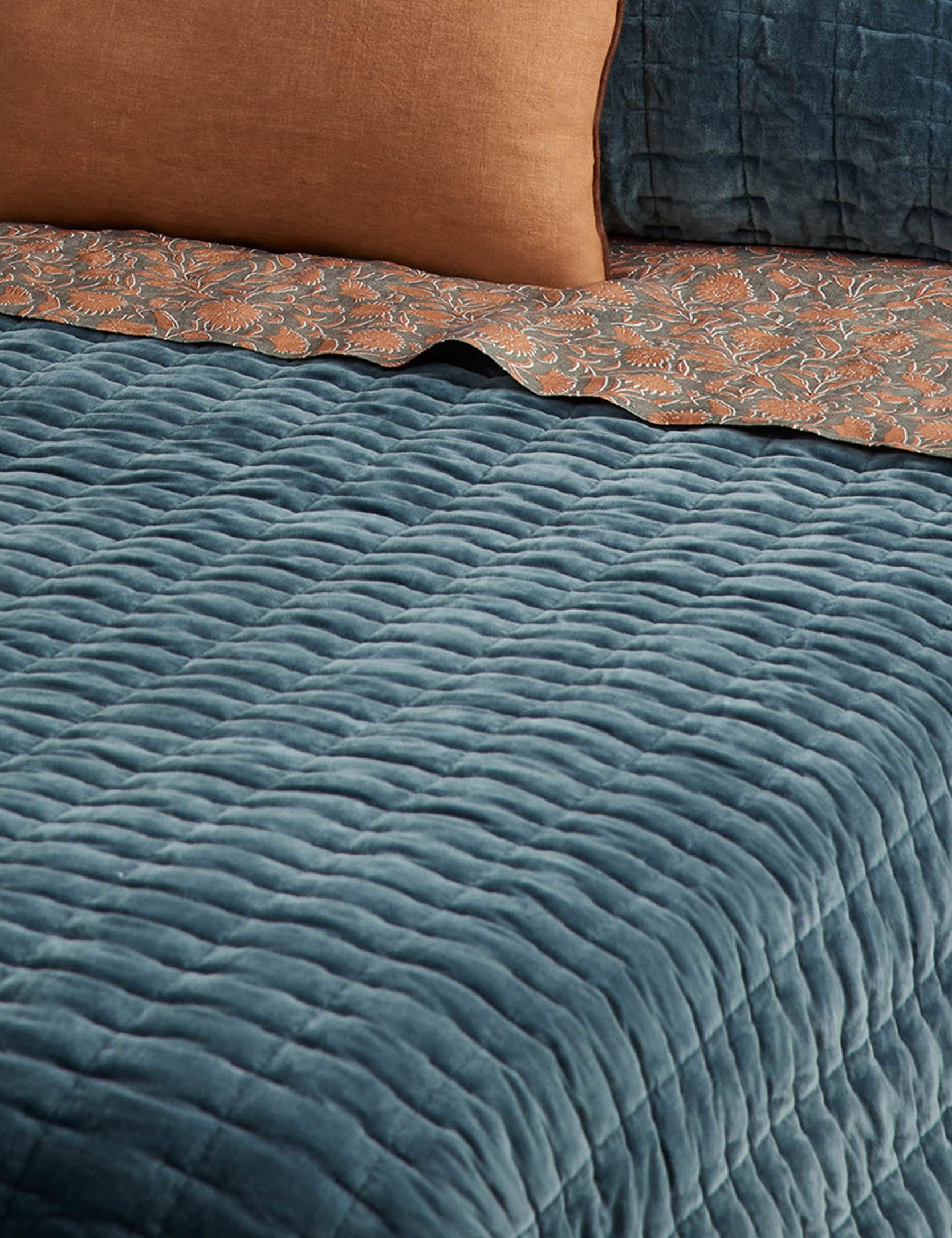
Another purchase, not by me, was the wonderful quilt in the photos above. I had a very similar one from my mom’s side of the family that I used when I lived in NYC, but I haven’t been able to track it down since my big move a decade ago. I asked my dad again, who also hadn’t seen it, but also happened to be at an estate sale and found a very similar one for $50! I really thought I wanted to use it, but I really needed color.
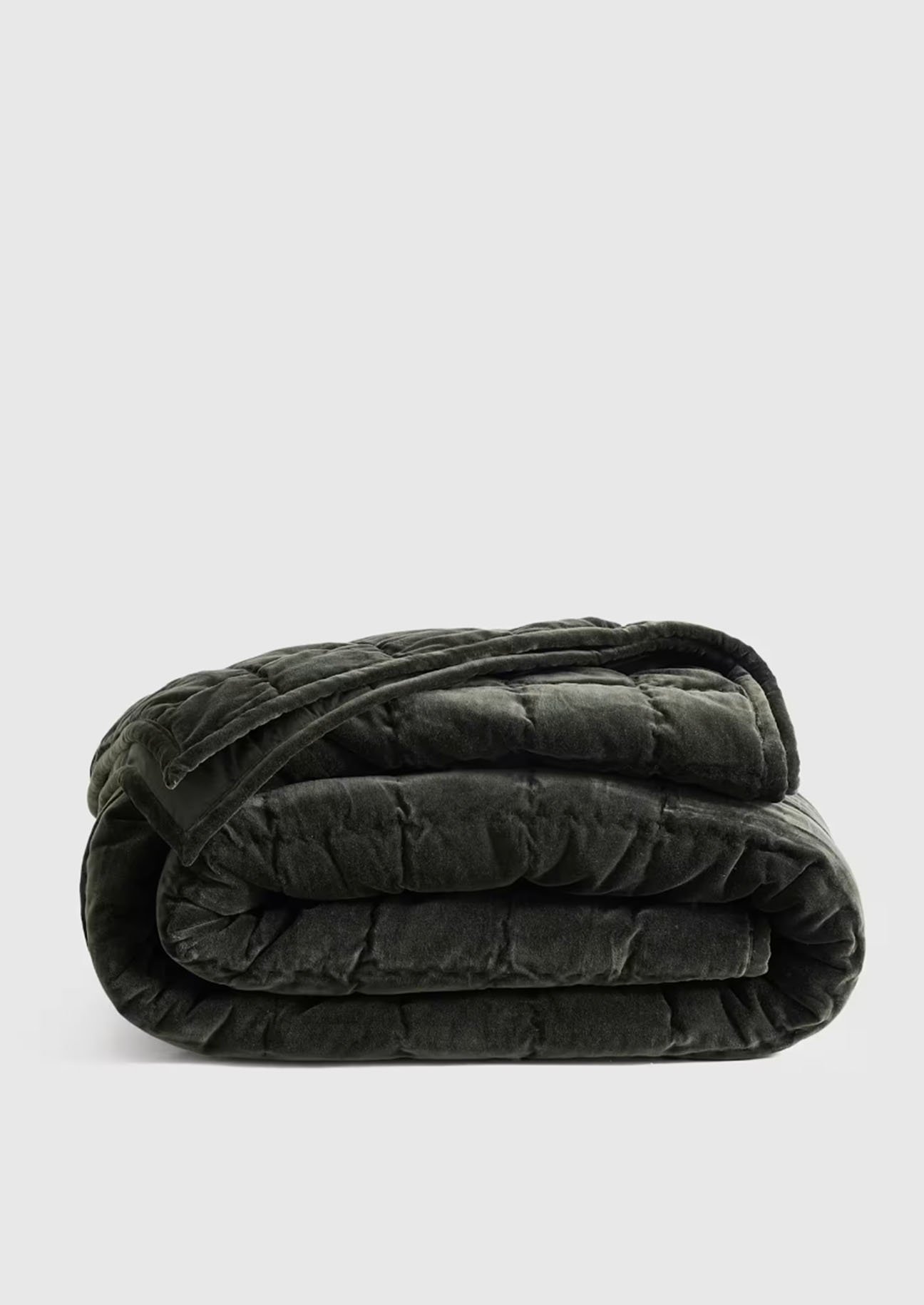
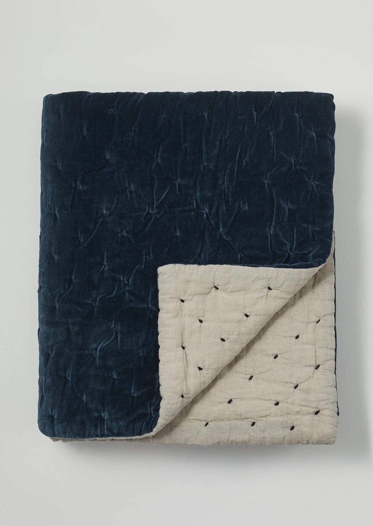
Cotton Velvet Quilt | Large Hand Quilted Velvet Throw
Anderson Velvet Quilt | Hand Stitched Velvet Quilt
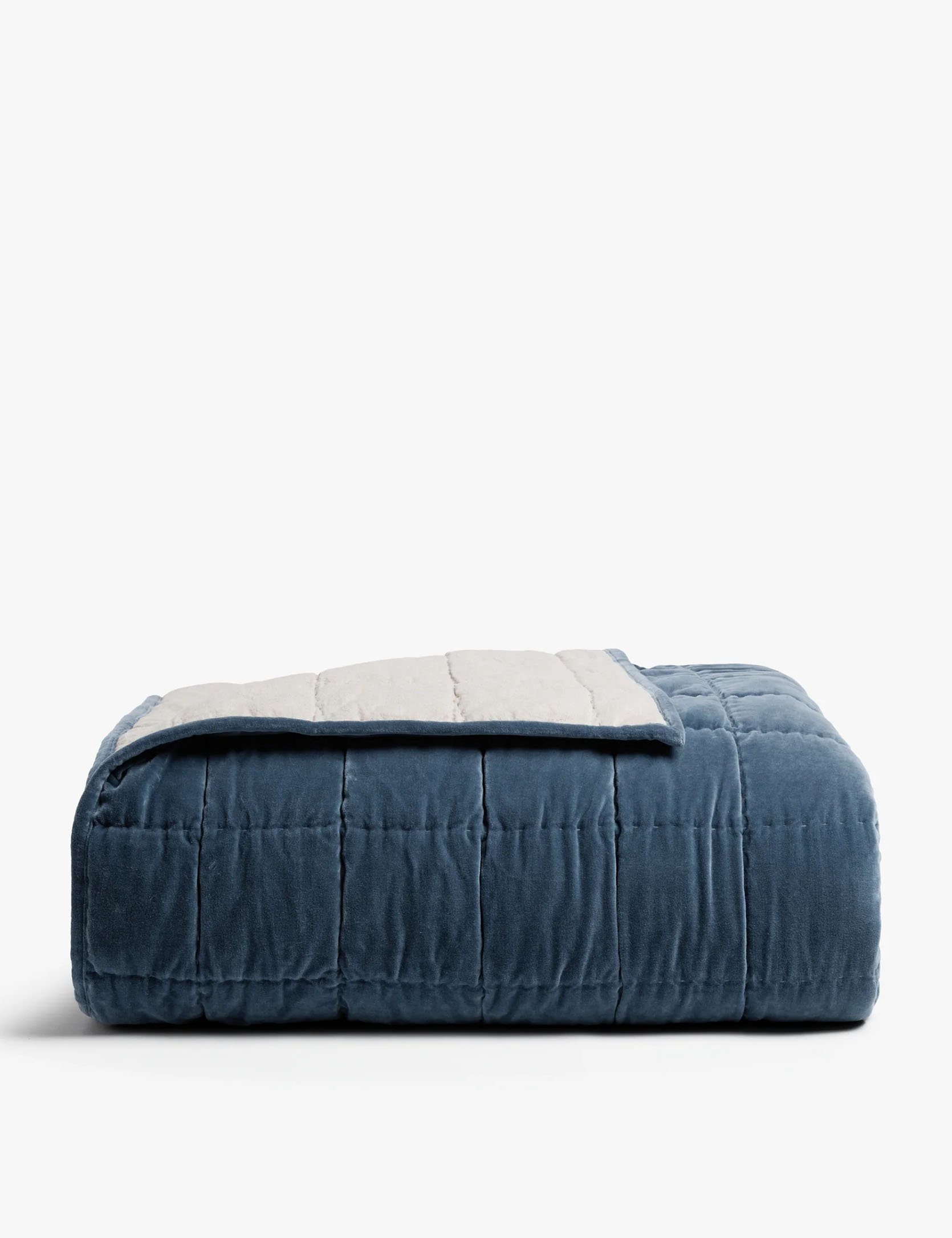
At first, I had my heart set on a velvet quilt. The one in my mood board was, of course, no longer available in the color I wanted, so I thought maybe a blue? My heart wasn’t as into it, but I was getting desperate. These were the top contenders I was considering. I’m happy to see that more places are making good-looking velvet quilts. I smell a trend coming:)
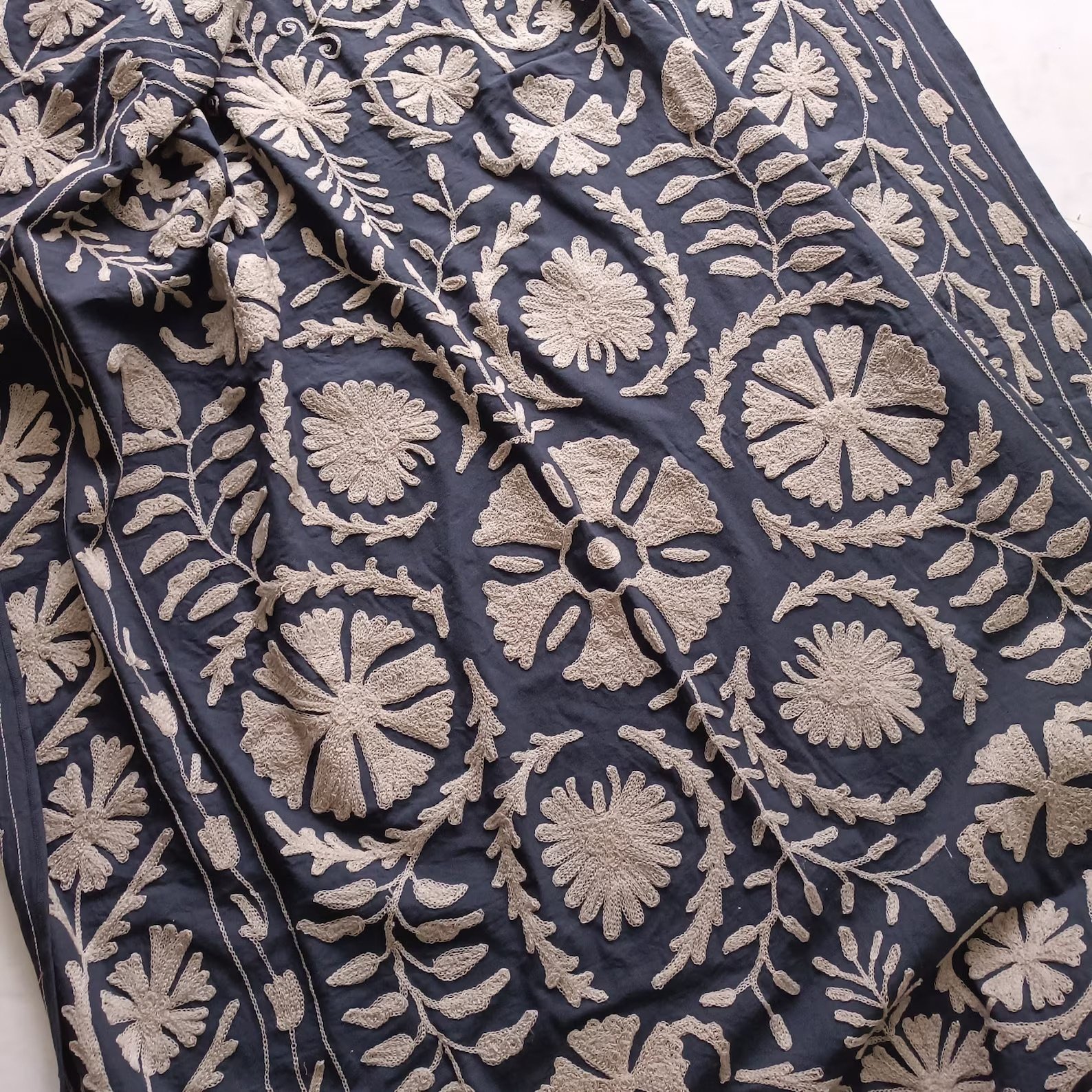
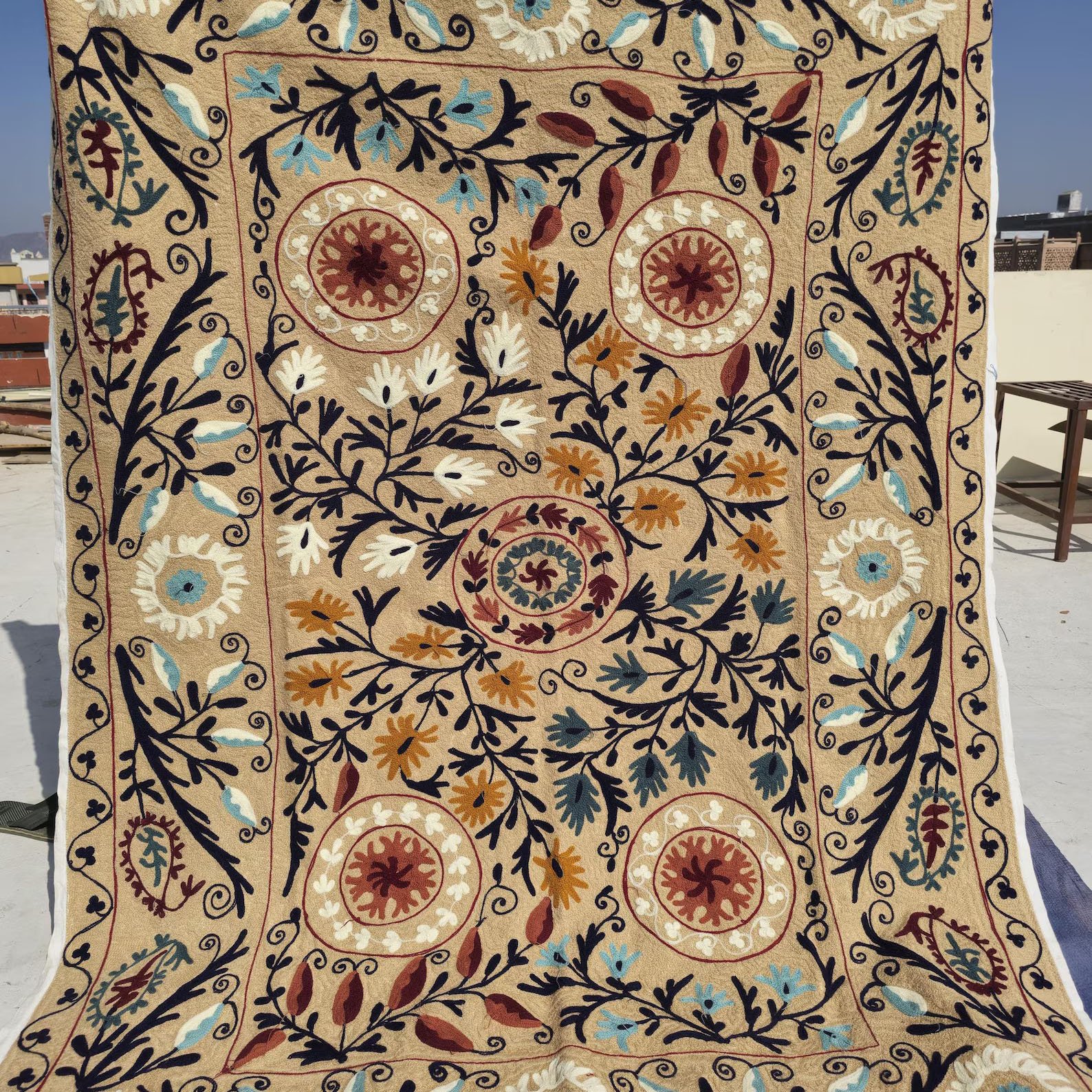
Indian Black Suzani Cotton Handmade Floral Bedspread | Hand Embroidered Suzani Wall Hanging
But then I decided to look at Suzani blankets on Etsy. I’ve loved these for a long time and thought this was potentially a better and more exciting direction to go in. I bought these two to see, and they both looked a bit different in person.
The description of this one said black, but the photos gave it sort of a gray-blue undertone. Let’s just say it was very black, and the embroidered part was much grayer than in the photo. I knew it wasn’t a fit. But the other was actually perfect, like spookily perfect. I will say it’s much brighter and warmer-toned in person, in case you want to order one.
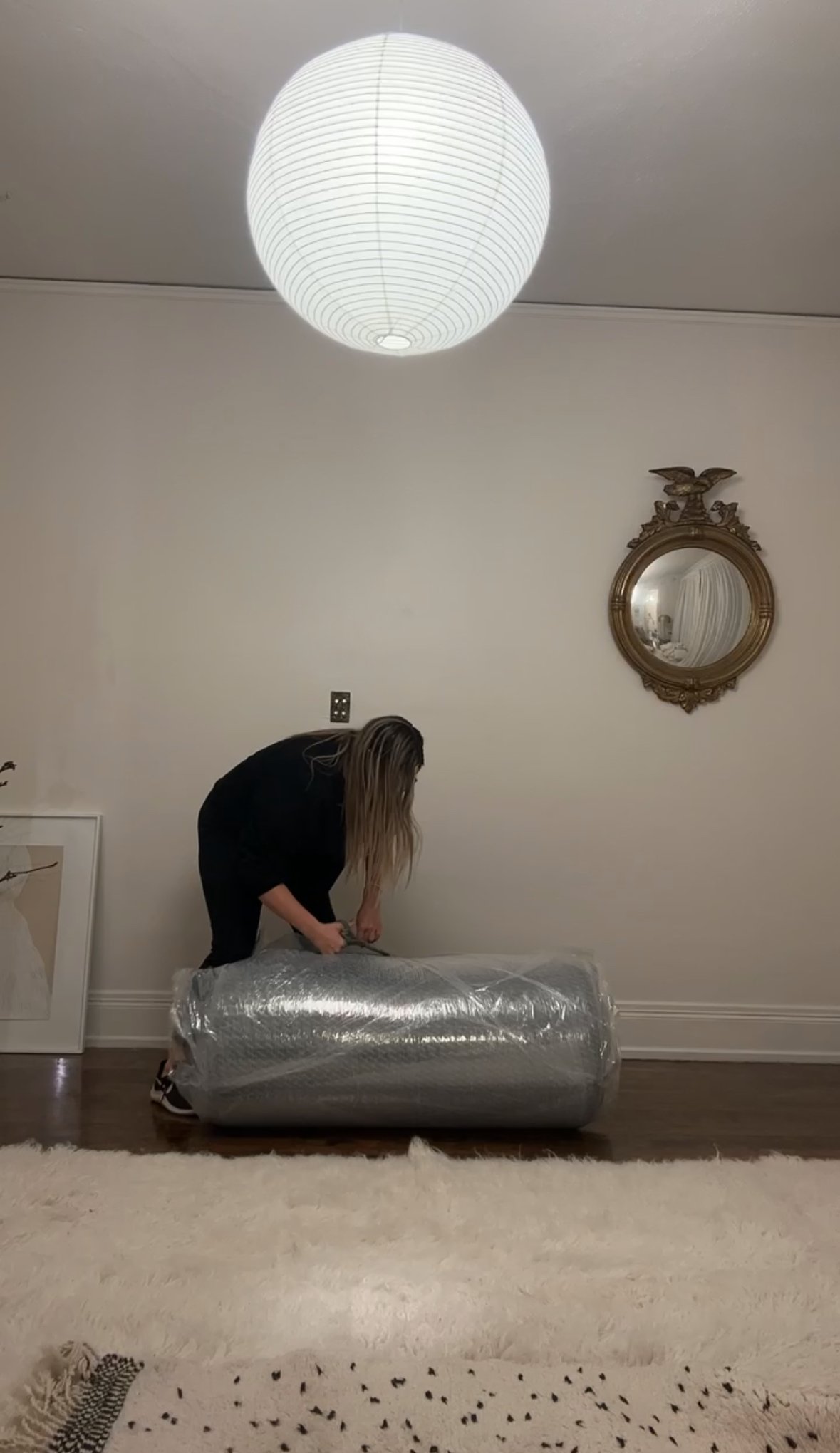
The Rug(s)
As I said in yesterday’s post, I tried the Greek Long Hair Flokati rug, but it wasn’t it. Plus, I didn’t put a rug pad under it, and I almost slipped and took myself out a handful of different times. Then we had our collaboration with RugsUSA, so naturally I really wanted to make one of those work. I decided to be safe to go with…a beige Starke. I love the rug, but it also wasn’t right. So when the partnership ended, I decided to peek at Etsy, and boy, did I find the MOST magical rug. There’s a sneak peek below!
I also had to ask my other kind neighbor (with also my best friend because we needed 3 people) to help me get these rugs out and then back under this very beautiful but very heavy bed. I’m afraid he’s now probably even more excited and motivated to buy his first home. Needy neighbors are so annoying, huh?
Blank Walls No More
Since my cool tile idea was in the trash, I needed to come up with something I liked but didn’t feel too much for these walls. Oh, and if you’re curious about the little plate above my bed, I think it was some kind of call system when this building was a single-family home. So cool.
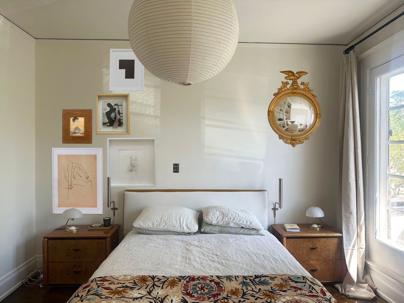
I decided to do a vertical galley wall. I needed to do at least some kind of gallery wall in this house:) So I laid it all out on Photoshop, and it’s honestly pretty realistic!
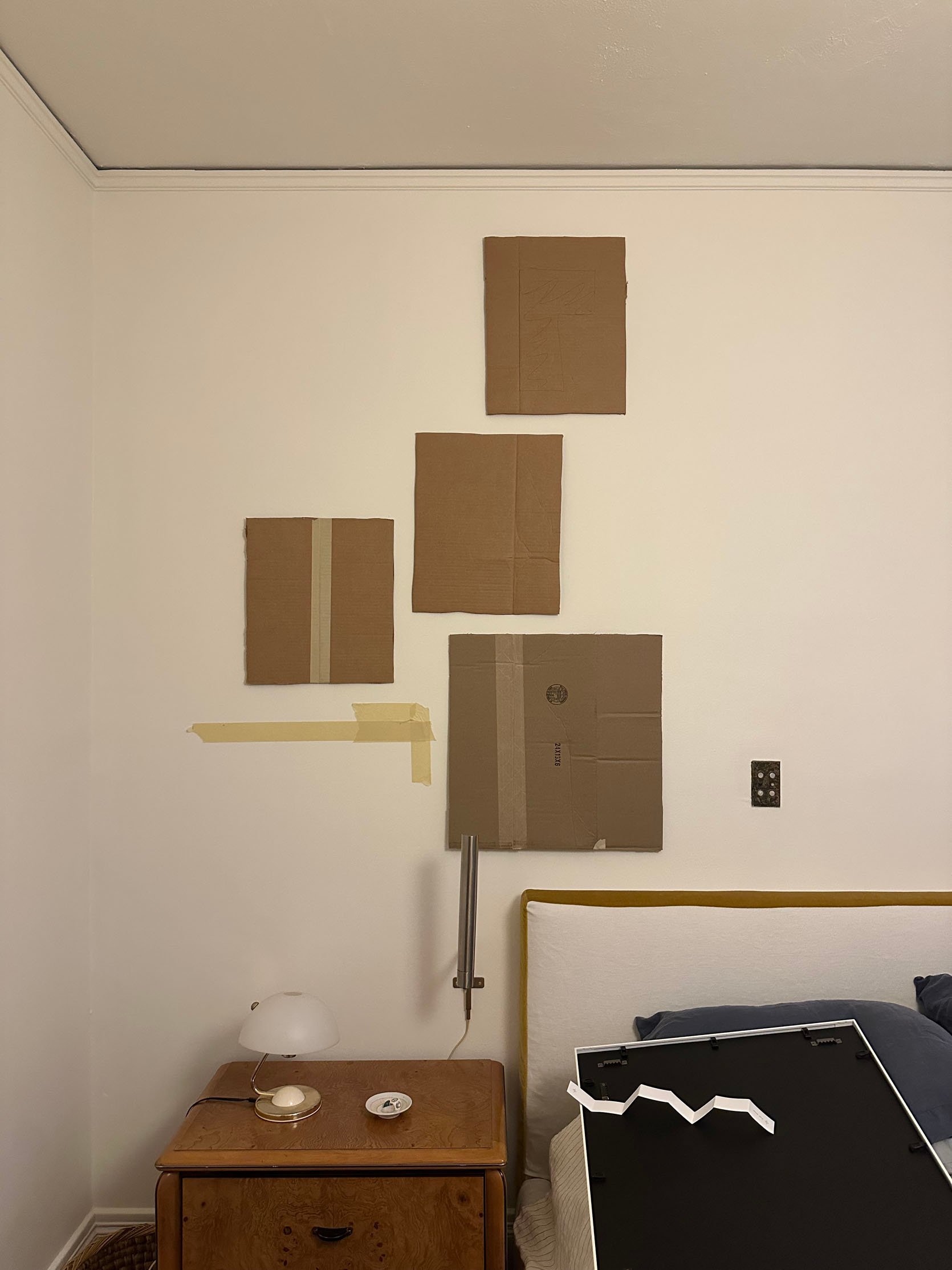
My sweet cousin came to help me again (she was my co-art hanger in my last living room), so this only felt right. Her sweet, perfect baby simply did not need her more than I did in this moment:) But before she came over, I made nearly exact cardboard cutout sizes of the pieces I wanted to use, so it was really easy to visualize. If you don’t have too many pieces and you’re putting together a gallery wall, I highly recommend this method.
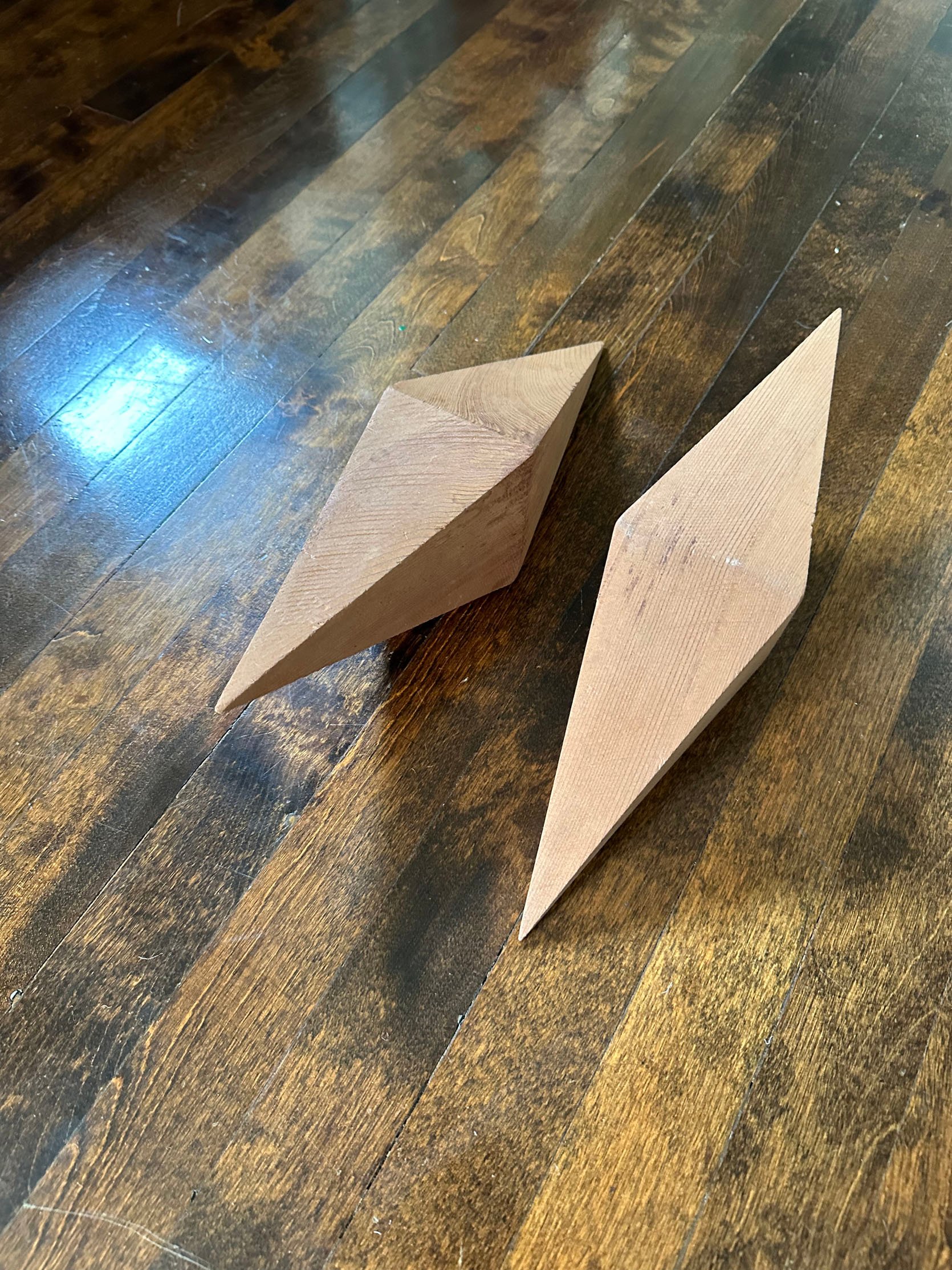
I just wanted to give a special call out to these wooden shapes I bought at a Downtown Modernism flea market, and really wanted to hang them in this room. Actually, above my bed (but kinda low), off to the left. It wasn’t ultimately the best design decision, but there will be a future home I will definitely use them in.
The DIY That Nearly Killed Me
You may have clocked the hardware that’s on my French doors. I didn’t mind the finish, but some of them had paint on them from years of old paint jobs. I decided to soak all the good ones (some had missing parts that I would try to replace) that just had paint on them…
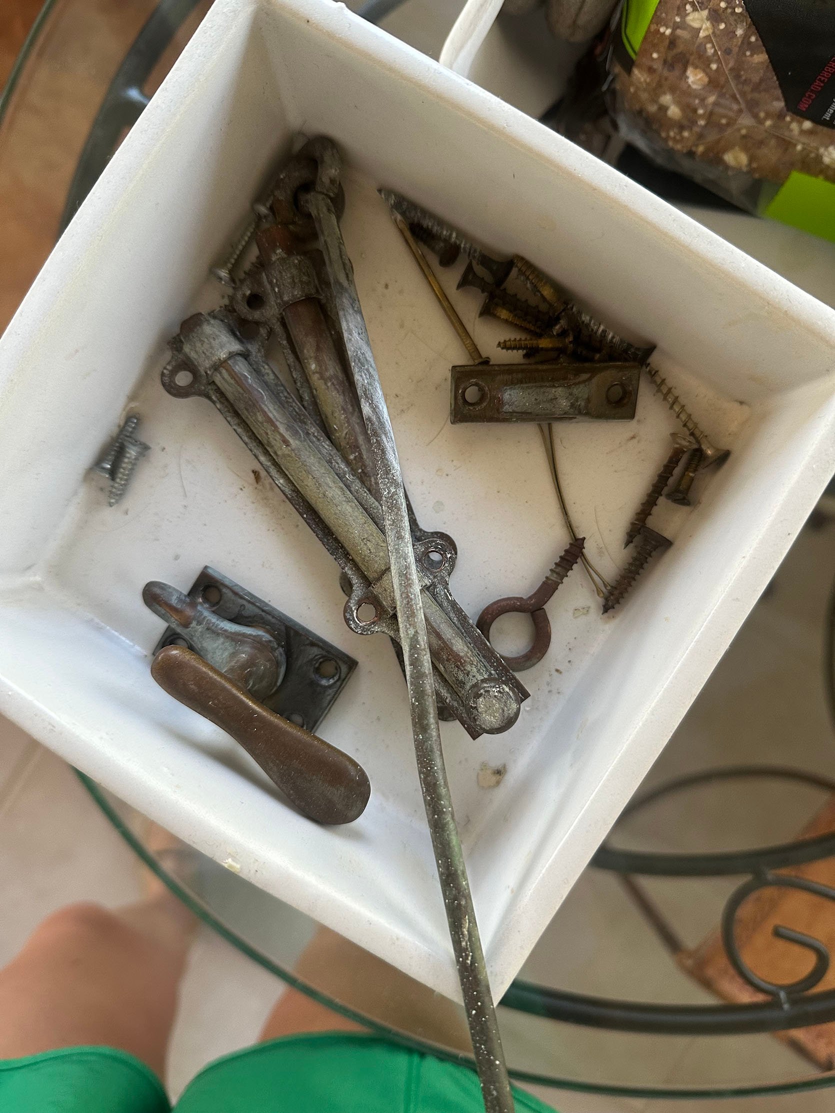
…and they turned out worse! I was able to get the paint off, but I realized I needed to polish them since they look so dingy now. I just could have never imagined what I would uncover.
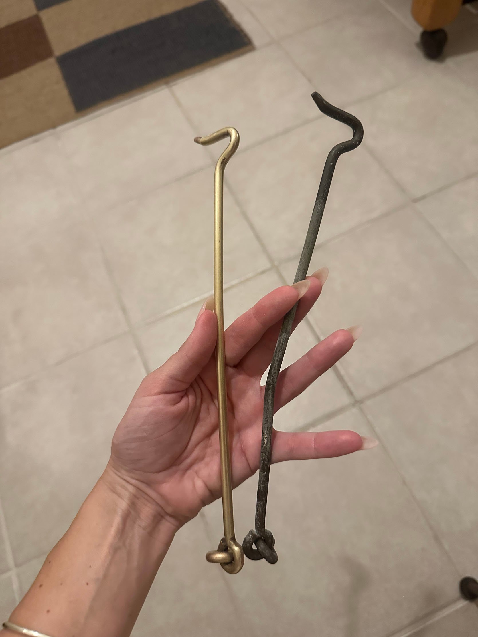
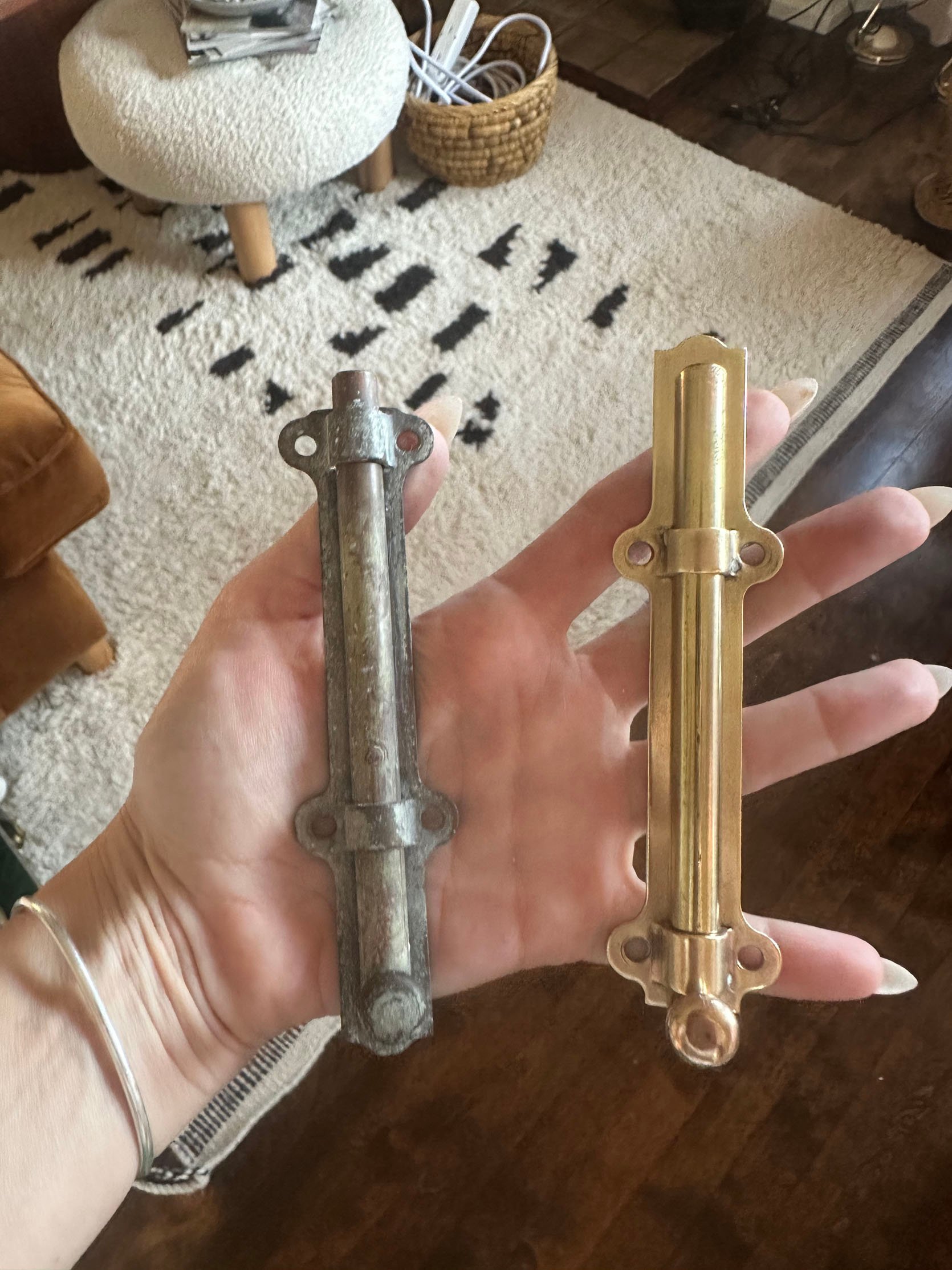
Unlauquered brass! I guess I thought they were a dark bronze, but as I polished those long arms, it was clear it wasn’t bronze. Actually, at first I thought they were copper, which was not the look I wanted and I was kind of panicked. But I kept going and all of a sudden that gorgeous brass came through! Then I did a couple more pieces, and they were all brass. What freaking luck. Look at those transformations!
What I will say, though, is that it took at least 9 hours over a few days of constant polishing to get these all done. Those door locks were THE WORST because they didn’t come apart. I just had to keep doing the best I could. I used almost two bottles of Brasso, this buffing kit that attaches to a drill, this Metal Cleaning Compound Set, a lot of rags, and cotton swabs.

I knew my landlord shopped at Pasadena Architectural Salvage, so I stopped by to see if they could help with a few missing pieces I needed. Lucky for me, they had exactly what I needed. Less lucky for me, they were $55 each. I had to get three, if I remember correctly. But also, this is an old, special house that I am part of being a keeper of. While I’ll put my style twist on some things, for the real “house” details, I want to make sure I’m being really thoughtful and will leave it better than when I moved in. And don’t worry, I still had to polish the new additions too.
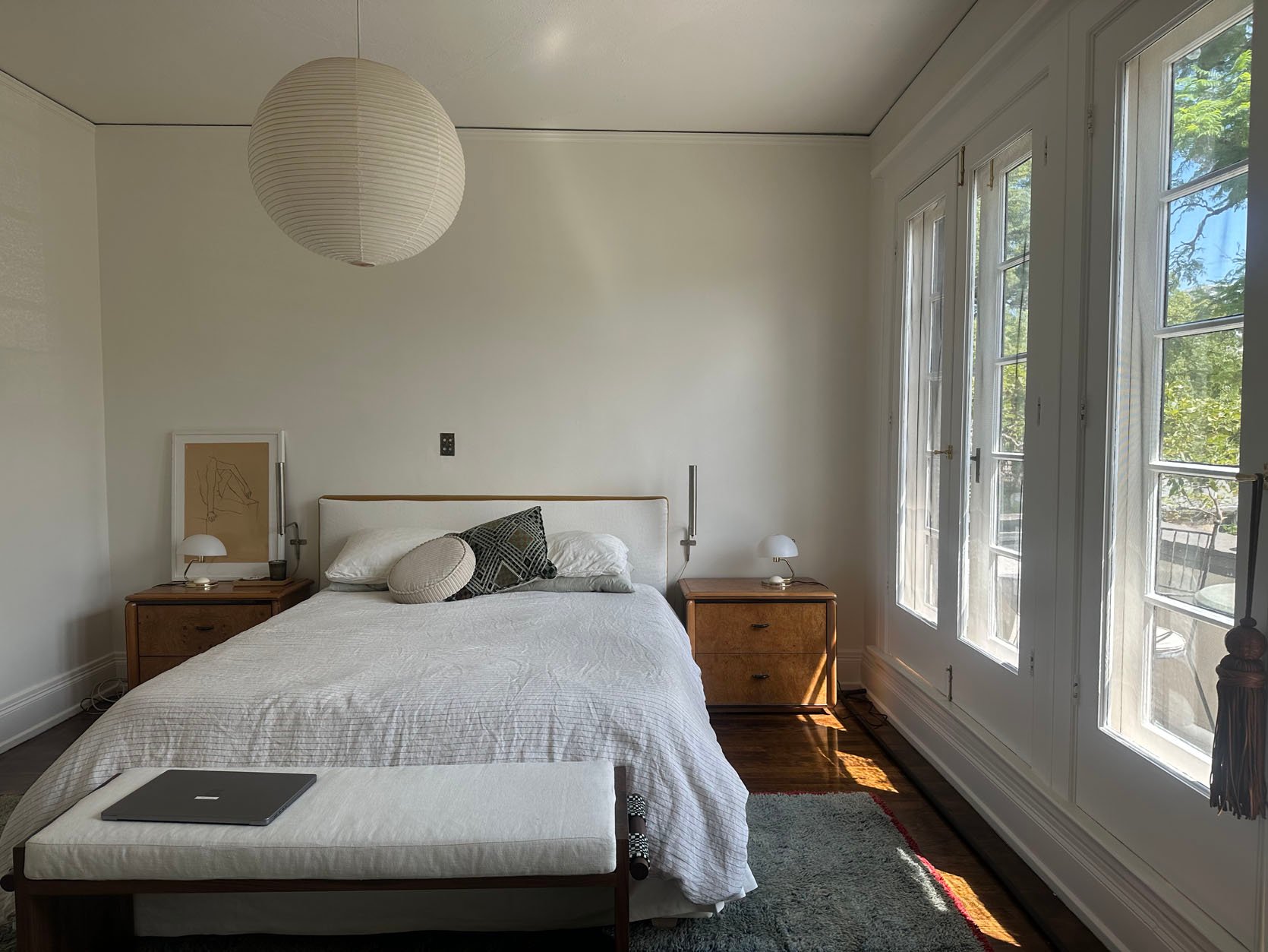
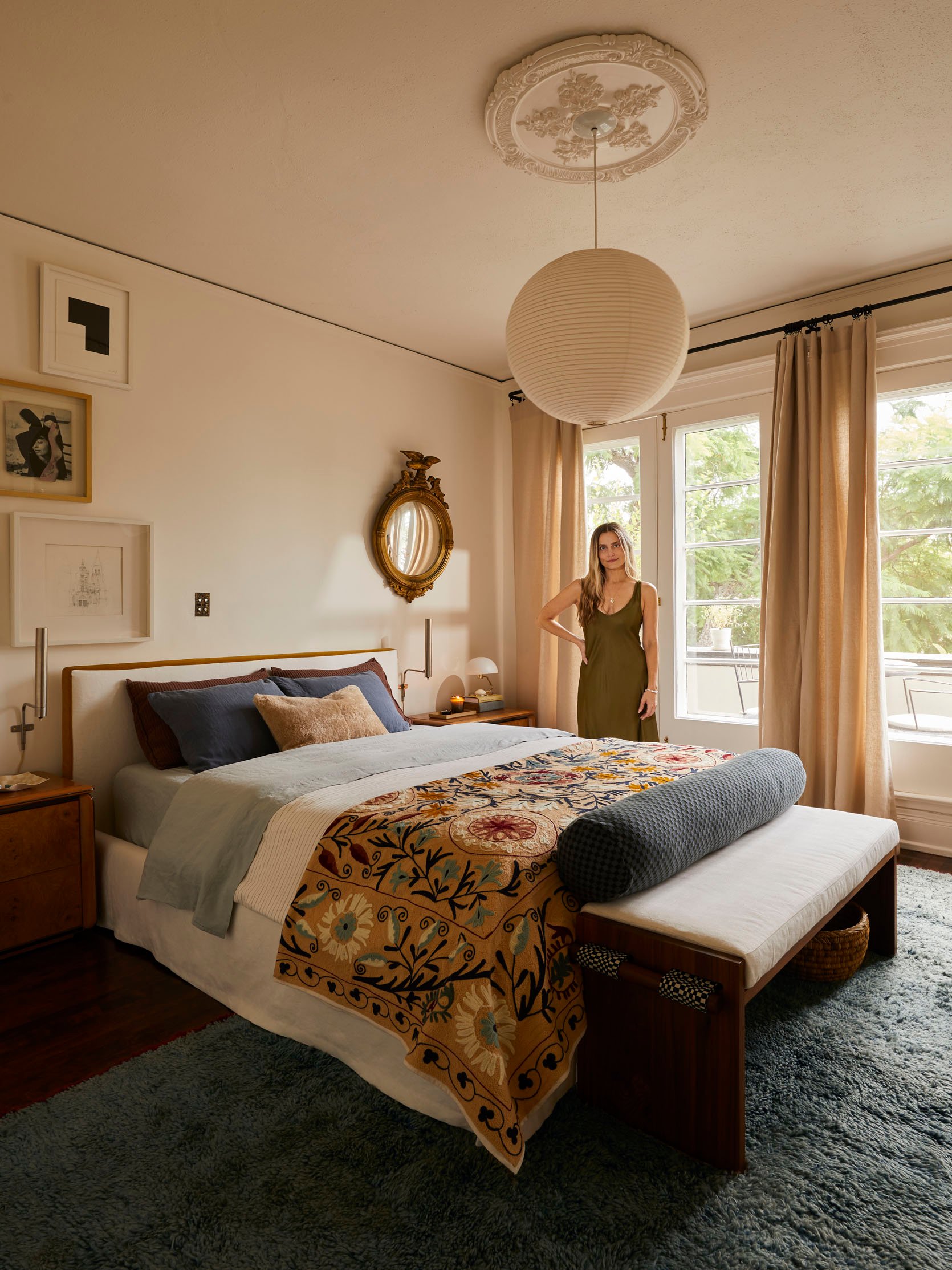
I think it’s time we finally see these finished photos.
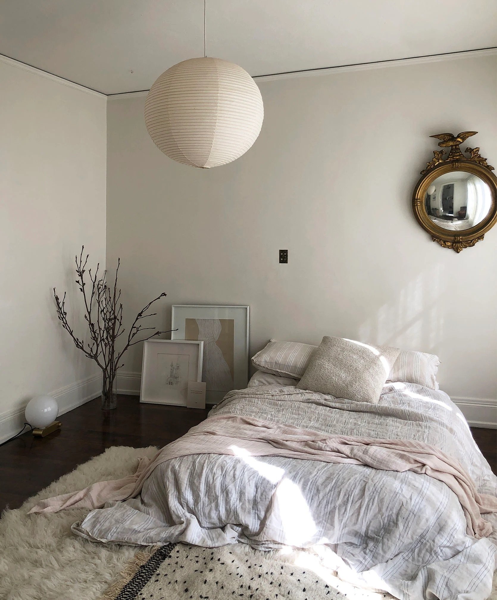
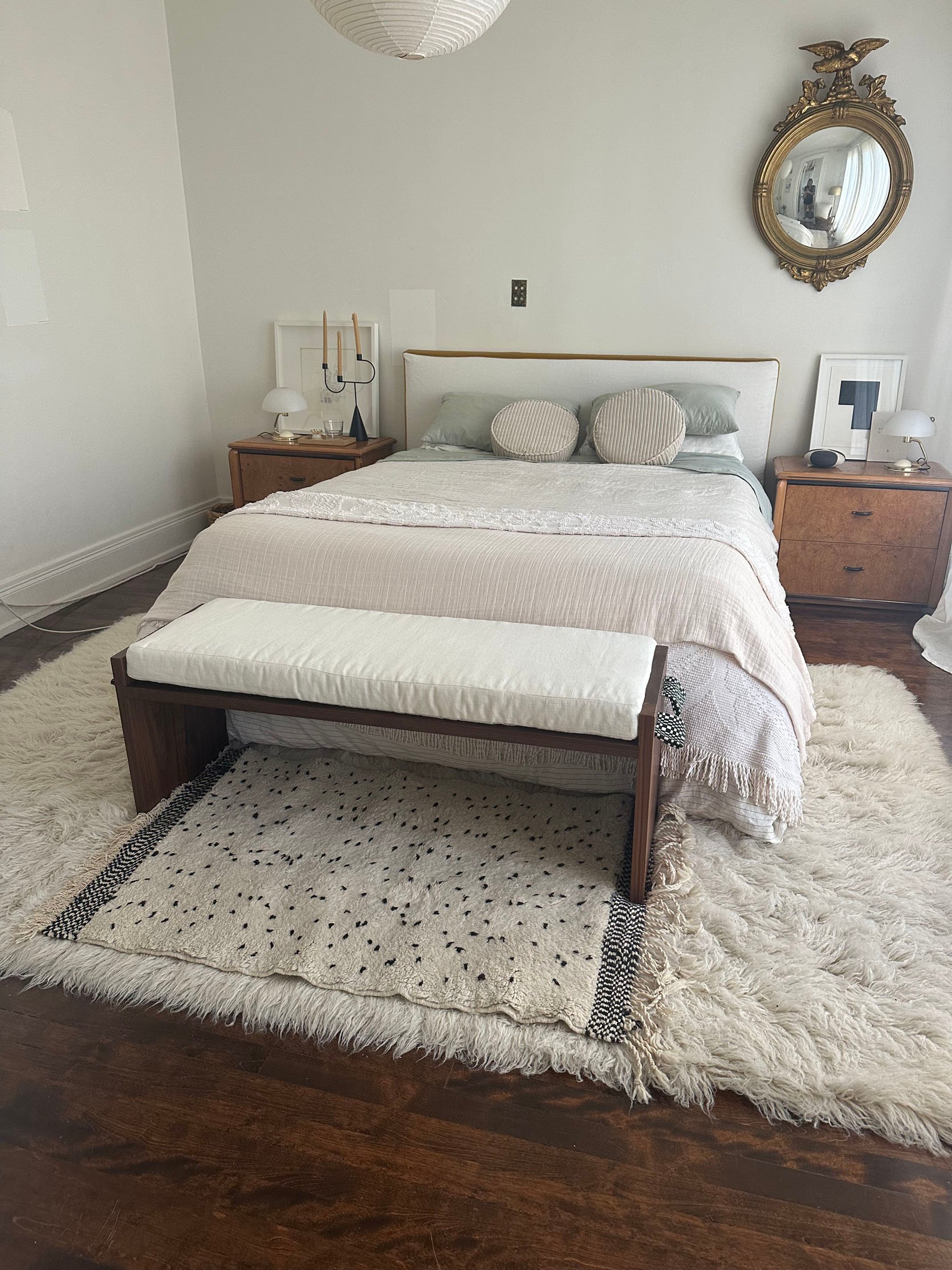
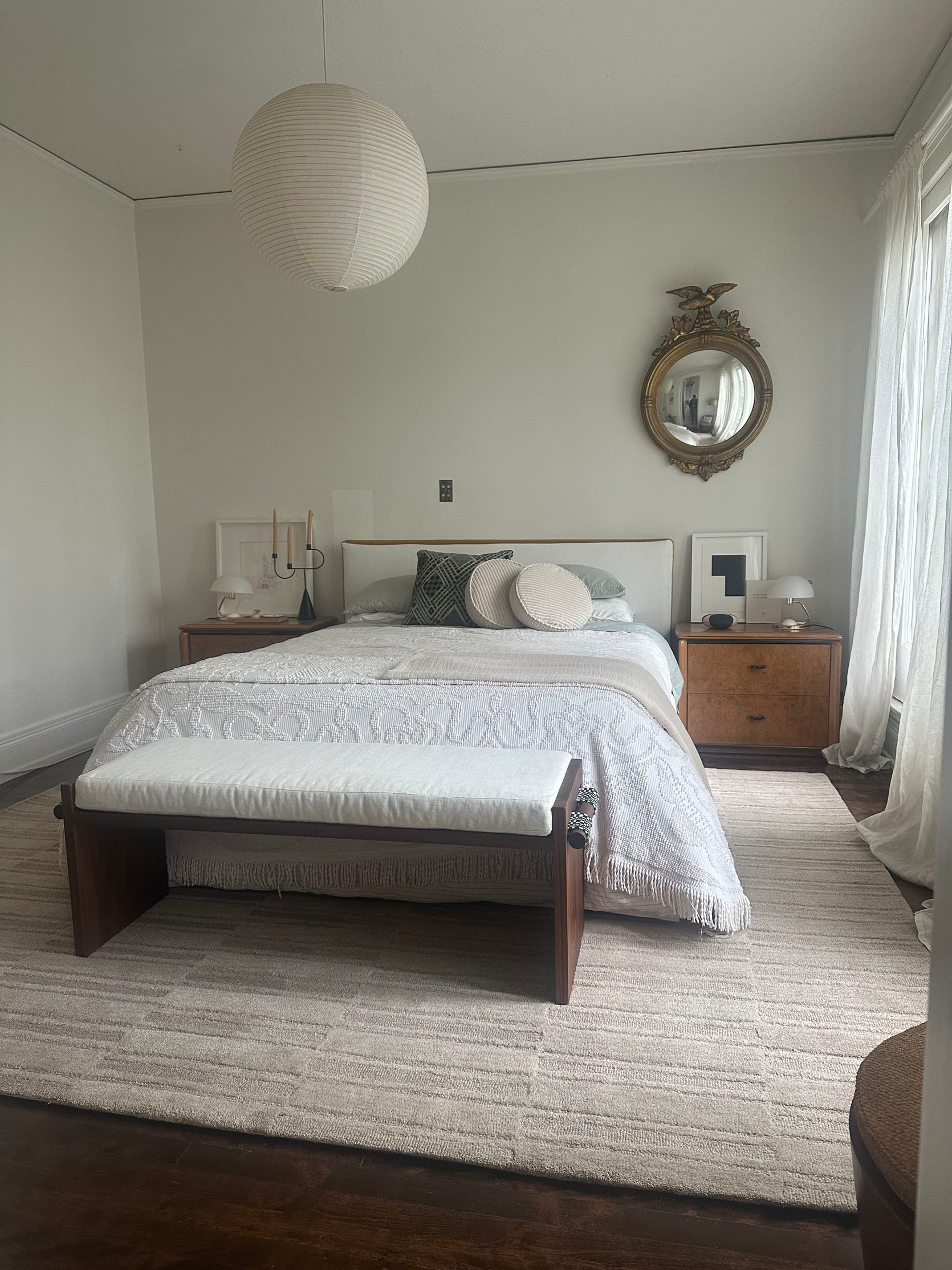
The Reveal
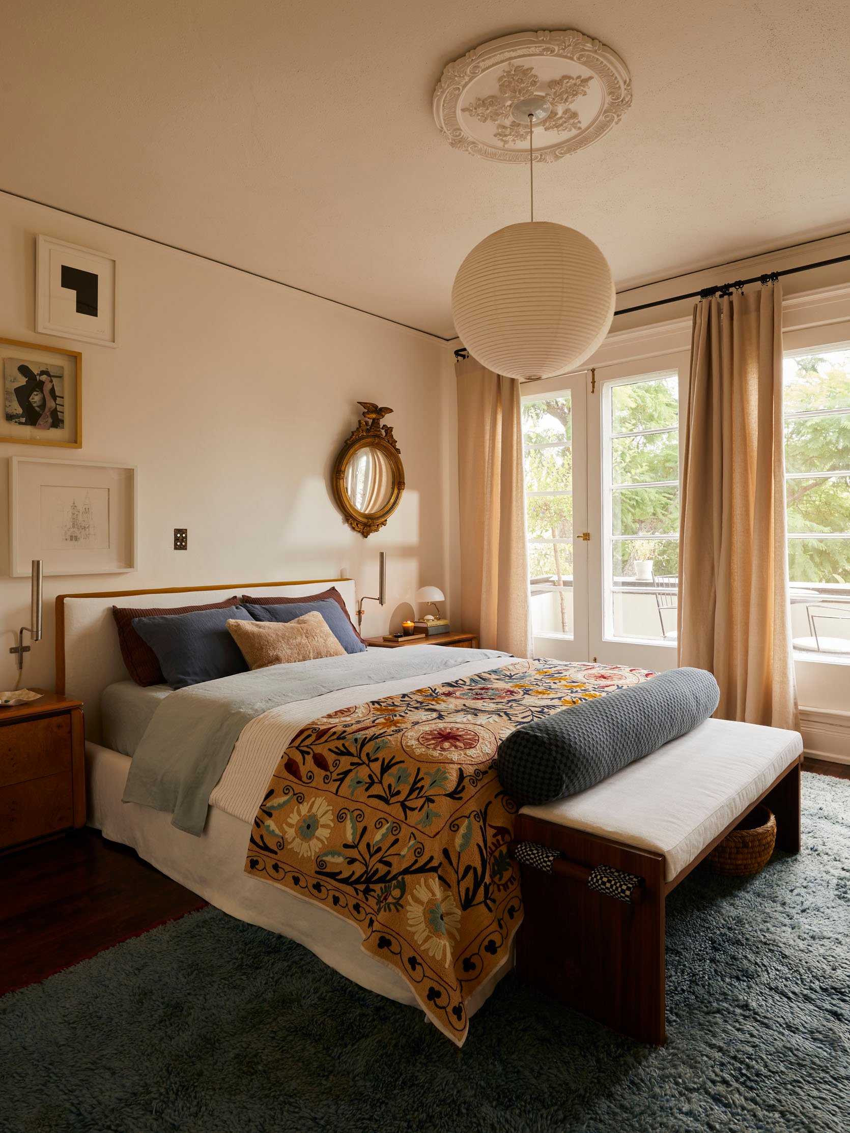
Custom Bed | Bed Linen Fabric | Bed Velvet Fabric | Custom Bench | Bench Linen Fabric | Bench Checkered Fabric | Nightstands (vintage) | Sconces (vintage) | Table Lamps (vintage) | Pendant Lamp | Ceiling Medallion | Rug (vintage) | Curatin Rod | Curtain Rings | Curtains
It really doesn’t matter how many transformations you do or see; I’m still in shock every time. It really did feel like it came together all of a sudden…after years of slowly figuring it out. So, from “50 Shades of Beige” to this makes me feel beyond proud and so so so lucky.
I have to also say that I found that vintage rug first, and then when the Suzani blanket came, I was practically in shock at how perfectly they worked together. And in case you are unfamiliar with Suzani patterns, Arlyn wrote a beautiful post about the meanings behind popular fabrics. Here’s a little excerpt from her post:
“Suzanis are elaborate embroidered textiles whose name stems from the Persian word suzan, or ‘needle,’ as I mentioned earlier. They emerged from the nomadic cultures of Central Asia, mostly what is modern-day Uzbekistan, Tajikistan, and Kazakhstan, where embroidery was a key expression of identity and artistry. There aren’t many surviving older textiles, as these groups were nomadic and lived on the move; most of the original and authentic suzanis we have today date back only to the 18th and 19th centuries, though some believe the art form goes as far back as the 15th century.”
Before we move on, I need ot talk about the ceiling medallion! Can you believe it’s from Anthro? I knew that a medallion would look so beautiful in this room, so when I saw this one on their site, it was a done deal. Well, it was actually a done deal when they agreed to gift it to me. Oh, and the painters painted it with the wall paint, so it matched perfectly!
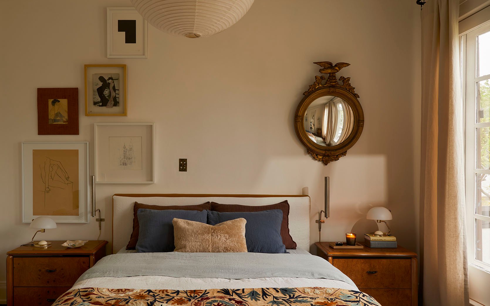
Sham Pillows (unavailable) | Blue Pillowcases (in Dusk) | Pillow Inserts | Sherling Lumbar Pillow | Sheet Set (in Mist) | Duvet Cover (similar) | Duvet Insert | Suzani Blanket
Let’s first talk about the bedding. My duvet cover is actually the one that Arlyn also used in her bedroom reveal, and I didn’t even clock it when I bought it on a Black Friday sale a couple of years ago! Great minds, as they say:) It has a very delicate rust colored stripe. The touch of warmth is perfect. I am also sorry it’s not available. The sheets are actually linen from Quince. Here’s what I’ll say. The color is stunning, the price is great, but they aren’t the softest linen sheets I’ve ever tried. Marlee really loves hers, so maybe after more washes, it gets softer? But if you’re sensitive, be wary of these. The blue linen pillowcases are from Parachute, and you immediately notice the difference. It’s a classic “you get what you pay for,” but I’m not upset with the Quince sheets! I just want to give an honest review. So in conclusion, they are good, but not great. The raisin colored shams were Bowser’s and are old Parachute. Why they don’t sell the color still is insane. BRING IT BACK. I did a little search and was able to find just the simple linen pillowcases in that color on Poshmark (a little hack from me to you), so my bed still practically looks like this. And that tan shearling lumbar pillow is everything. I was planning on returning it because it wasn’t cheap, but I couldn’t bear to part with it. It’s also just so soft and adds some needed brightness and texture.
Bolster Cover | Bolster Insert
I’m sure people who actually design with lots of color will give a little smirk and a side eye with this next statement, but y’all, this feels like a color breakthrough for me. This might be the most colorful rug I’ve ever owned, and I might only get colorful rugs going forward. In a perfect world, it would be a little bigger, but it’s vintage, so those sizes aren’t always standard. It’s a 6×10, and I was willing to make it work because it’s just perfect.
So a fun story about that long bolster. Bowser came over a few weeks before the shoot so we could make sure I had time to order any extra things if needed. Well, I thought I wanted a patterned throw pillow for the bed, so she found this one and we both loved it. I ordered and picked it up that day. I was fully in love with it, but I felt it was a little too tall to work, and the blue was the exact same blue as the pillowcases. I decided to keep it till the shoot because Bowser is magic, and I would have been happy to be wrong. Well, she agreed it wasn’t a fit at the top of the bed, but I had been keeping it on top of that amazing bench, and we both decided it should stay there. It almost acts as a back to the bench and adds the perfect extra punch of pattern. I love that the colors work with both the blanket and the green on the dowel fabric. Serendipitous if you ask me:)
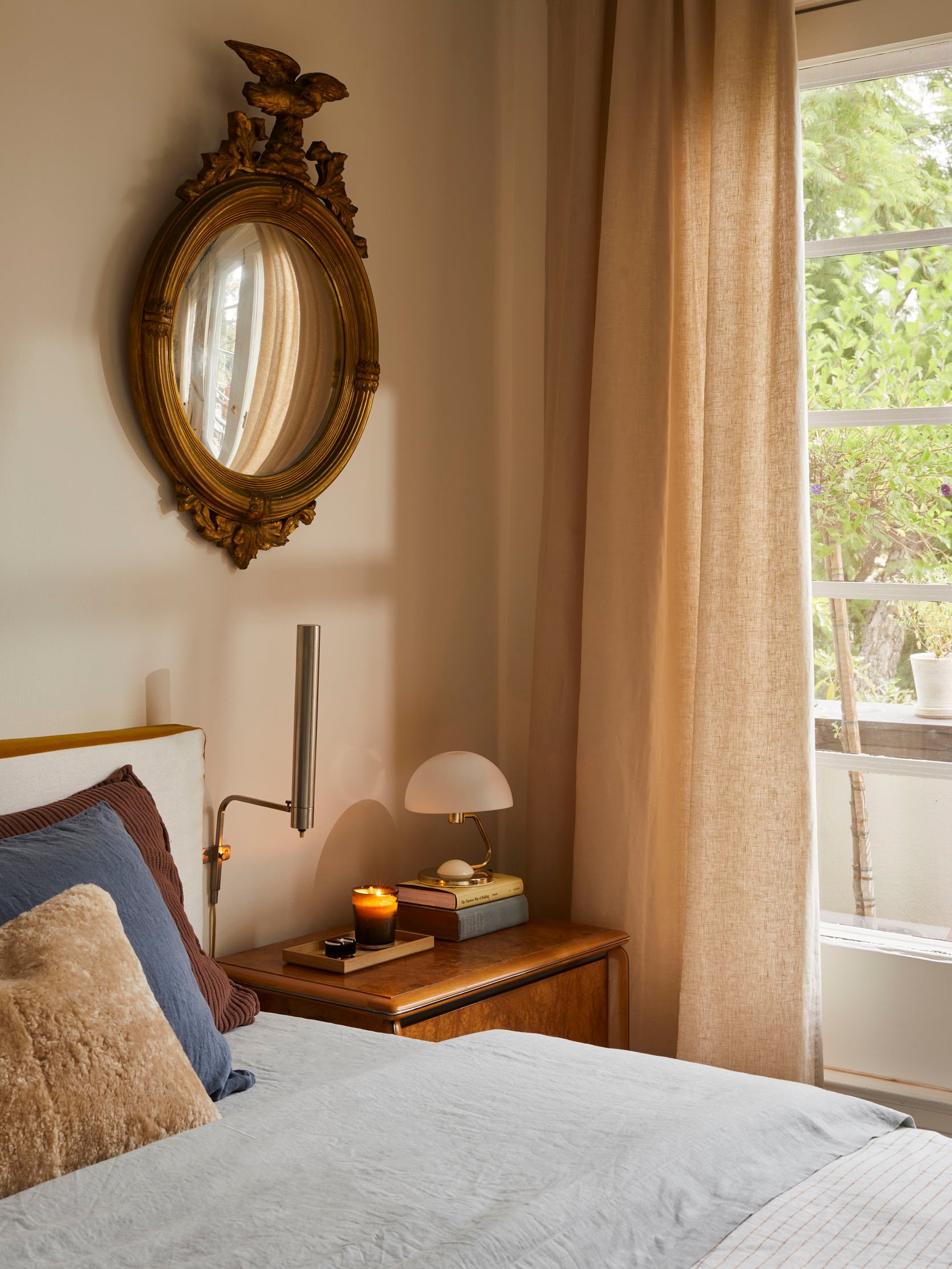
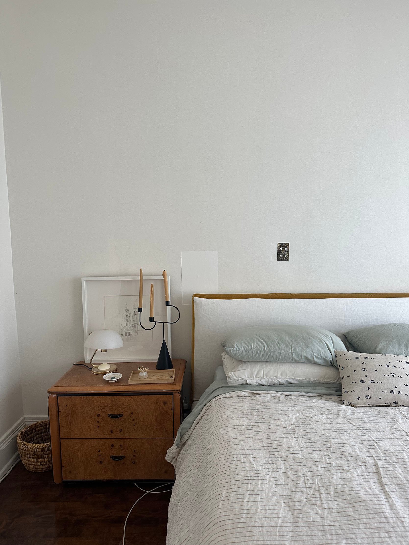
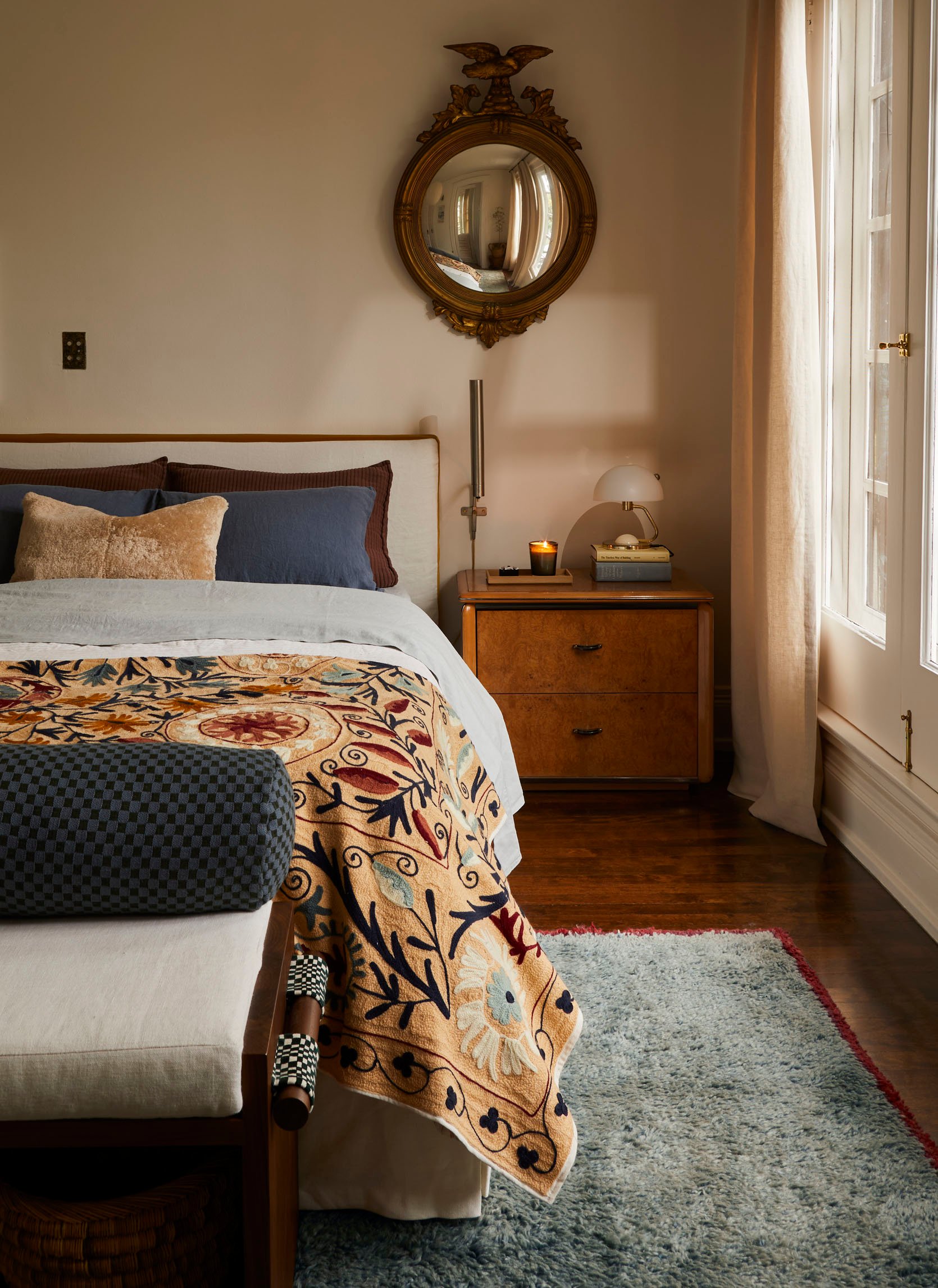
Mirror (vintage) | Sconce (vintage) | Acyrlic Box | Candle | Wood Tray | Table Lamp (vintage)
Welcome to my side of the bed. That mirror has been in my family for at least of few generations and was in our home growing up. You might remember I had it in my last kitchen🙂 But it felt right in here. I also have to sing the praises of that garden mint candle by Tatine that Sara introduced me to 6 years ago? It’s so fresh, so potent (but in the good way), and I don’t even have to light it to get those amazing moments when I breathe in, and it’s all I can smell. That sweet little box is hard to see, but I got it at the Pierce and Ward shop. The tray was from Emily, and how cool is that sconce?
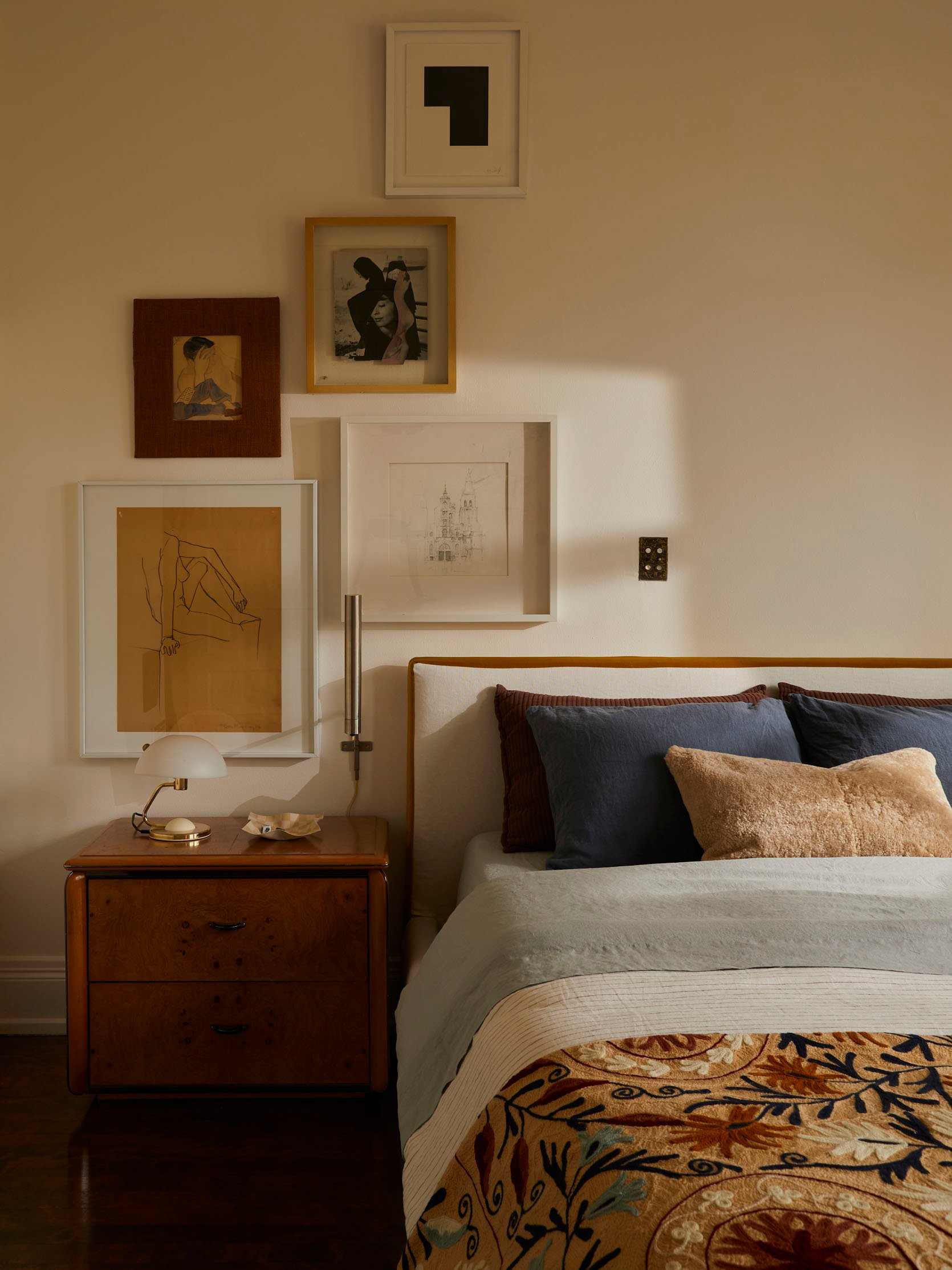
Black and White Abstract by Inka Bell | Vintage Collage by Steve Tierney | Man Painting (vintage) | Figure Drawing (vintage) | Cathedral Sketch (unavailable) | Table Lamp (vintage) | Checkered Dish (unavailable)
And this is how my vertical gallery wall turned out, and I’m so happy with it! Three of the pieces (the top and the bottom two) I had. The vintage collage was from a trip I took in Oaxaca, and I found it at a gallery called El Tinglado Gráfico. I just felt immediately connected to it, so I brought her home:) The man painting was from that sale Bowser did last December, and the frame is a grasscloth, which I LOVED.
Now, I don’t think I’ve told this story before, but that cathedral sketch was a piece my dad bought for me at this small local outdoor art show in the town I grew up in when I was home from college in probably 2007. I just really loved it. Fast forward to me living in LA, looking more closely at the sketch, and putting a lot of money on it being a drawing of the Santiago de Compostela. For those of you who aren’t familiar, that’s the cathedral you end at when you complete the Camino de Santiago, a pilgrimage route in Spain. My dad, brother, and I did the Camino back in 2015, which was 8 years after I got this drawing. It was a very special and important trip for the three of us, not in the religious sense but in the reconnecting after my mom’s death. I felt very overwhelmed in a good way, and that buying this sketch was almost like a bittersweet, if not a positive, omen for the future I didn’t know would happen. I will have it forever.
Custom Bed | Bed Linen Fabric | Bed Velvet Fabric
Here’s a closer shot of the bed and fabric. It’s truly exactly how I imagined it. Perfect.
Cailtin gifted me that checkered dish a few years ago for my birthday. I love that it has a permanent spot in my bedroom. Thank you again, sweet Caitlin!
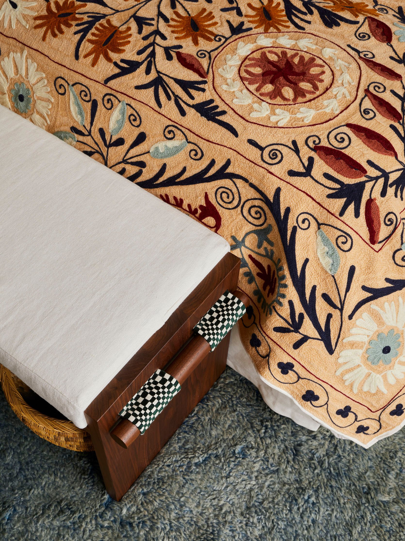
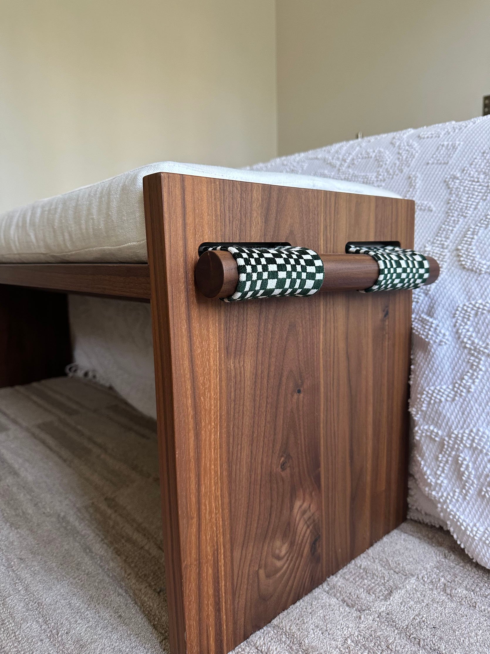
Custom Bench | Bench Linen Fabric | Bench Checkered Fabric
I just don’t know how I got so lucky. That bench is so special. When Katy emailed me asking if I’d be interested in this bench, I’m sure my jaw dropped to my desk. A Katy Skelton piece is a forever piece.
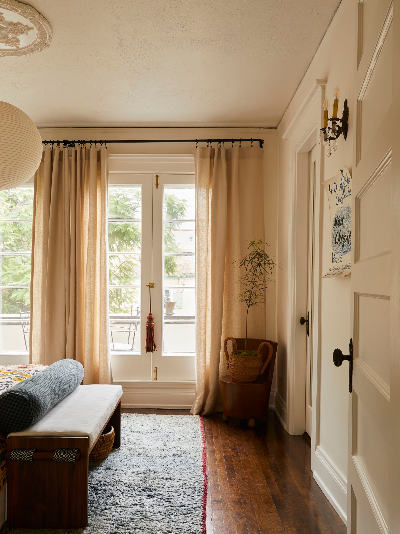
Pendant Lamp | Ceiling Medallion | Rug (vintage) | Curatin Rod | Curtain Rings | Curtains | Hardware | Leather Tassel (unavailable) | Bolster Cover | Bolster Insert | Chair (vintage) | Basket (vintage) | Chagall Poster (vintage)
And another shot I LOVE. That chair you might recognize from my last living room. It was a Rose Bowl find for $100! It’s definitely a better plant stand than a chair:) See how warm and beautiful those tan/taupe curtains are? When I wrote about the taupe curtain trend, I had already been inspired…especially after the blue curtain fail. Oh, and that large leather tassel was from our team retreat in Todos Santos! I promise I don’t only travel to Mexico lol. But it is my favorite country, so I travel there more than anywhere else<3
I have a funny story about the basket. There’s a big antique mall where I grew up, and the last time I was there, I found this basket and the metal orb planter holder that’s on my balcony. As I was checking out, the woman who worked there looked at my loot and said, “You sure like weird stuff.” I just smiled and laughed to myself. If only she knew all the other “weird” things I’ve picked up, she’d be STUNNED.
Well, this is where I leave you (for today), staring at you in a dress that I didn’t clock til we shot these portraits, kinda looks like a night gown, ha. Again, thank you for all of your support, your kind words, and the fun stories you share with me in the comments. I hope this post was as entertaining as the last, because if you can believe (which I’m sure you can if you’re still reading), it’s actually longer than the living room post. OOPS!
Love you, mean it.
*Design by Jess Bunge (me!)
**Styled by Emily Bowser
**Photos by Sara Ligorria-Tramp