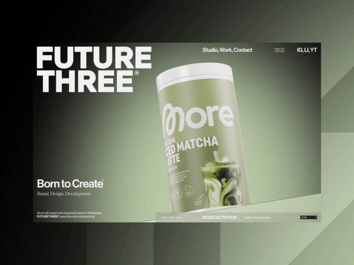
FUTURE THREE® is a design studio specializing in brand creation and web design.
In 2023, we founded FUTURE THREE®, Hassam Khan and I, Samet Cubuk. Back then, we were 23 years old and started with a simple yet uncompromising belief: design must convert, and conversion requires outstanding design. Dream clients? Not at first. What came instead were countless lessons, iterations, and brutally honest retrospectives.
By the end of 2024, we had moved into our dream office and were working full-time on our vision. Client projects were running with perfectionist precision, but our own company didn’t feel like us. By early 2025, it became clear: we needed a relaunch. And we needed a team that could reflect us, challenge us, and accelerate us.
What the relaunch had to achieve
This was never about “just another website.” We built an entirely new brand, officially registered across Europe. We aimed for a fresh perception, a new market, a sharper marketing concept, a clearly defined audience, new internal processes, and most importantly: a team that truly understands us.
In short, the goals of our FUTURE THREE® rebrand were:
- Correct external perception
- Clarification of our process
- Building a strong team
- Strengthening the brand
- Evolving our design process
In April 2025, we partnered with Jason Harvey from Somefolk®. Together, we set out not only to redesign FUTURE THREE® but to create projects that are unique and award-worthy. And that’s exactly what we did, from moodboards and wireframes to design direction and final visuals. Weeks of planning, iterating, and refining.


Bringing the design to life
Once the design was in place, the real challenge began: bringing it to life. For that, we collaborated with Eduard Bodak, one of the best web developers out there. Our ambition was clear: highly efficient code, seamless motion, and a digital experience that lingers. Not a generic portfolio, but a studio you remember.
While our team focused on the development and overall integration, Eduard dedicated himself to crafting the motion language of the site, the kind of animations that turn static layouts into living experiences. From page transitions and button or link hovers to scroll-based parallax effects, his work was all about injecting movement, rhythm, and emotion into every interaction.
The entire project was developed in Webflow, where we pushed the platform to its limits, combining custom code and GSAP to achieve a smooth and consistent performance across the site.

1. Button & Link Interactions
A lot of websites use similar staggered text animations on hover but we re-engineered it for precision and uniqueness. By using SplitText from GSAP with the option propIndex: true, each split character receives its own CSS variable:
new SplitText('.link', { type: 'chars', propIndex: true });That means every character in the element has a style like:
<span style="--char: 1;">F</span>
<span style="--char: 2;">U</span>
<span style="--char: 3;">T</span>
...
This allowed us to create a smooth stagger animation directly in CSS:
.link span {
  transition: transform 0.5s calc((var(--char) - 1) * 0.024s) var(--basic-ease);
}
.link:hover span {
  transform: translateY(-2px);
  text-shadow: 0 1px 4px rgba(255, 50, 50, 0.8);
}
When hovering out, the delay is skipped to make the interaction snappier, giving the motion a natural, reactive feel.
2. Intro Animation & Page Transition
The intro sequence combines GSAP and Lottie.
While the Lottie loader plays, scroll is disabled. Once finished, it triggers the page transition, starts Lenis (smooth scrolling), and activates text animations.
lottieAnimation.addEventListener('complete', () => {
  gsap.to('.loader', { autoAlpha: 0 });
  document.documentElement.classList.add('is-ready');
  lenis.start();
});
When the class is-ready is added to <html>, elements with data-mask-animation-in start their reveal animation using CSS clip-path transitions:
[data-mask-animation-in] {
  transform: translate3d(0, 100%, 0);
  clip-path: inset(-100% -10% 102% -10%);
  transition: clip-path 0.5s var(--natural-ease), transform 0.5s var(--natural-ease);
}

html.is-ready [data-mask-animation-in] {
  transform: translate3d(0, 0, 0);
  clip-path: inset(0% -10% -10% -10%);
}
By delaying some elements slightly, a subtle stagger effect emerges, producing a cinematic entry sequence without heavy scripting.
3. Project Hover Interaction
Hovering over a project preview reveals a secondary image with a short transition delay.
The idea: avoid abrupt image changes, but also prevent sluggish fade-ins.
.project:hover .preview-secondary {
  opacity: 1;
  transform: translateY(0);
  transition: transform 0.5s 0.1s var(--basic-ease), opacity 0.2s ease-out;
}
.project .preview-secondary {
  opacity: 0;
  transform: translateY(10px);
}
The exit animation is slightly faster (0.4s), so the hover feels responsive and lightweight.
4. Parallax Scroll Effect
Instead of using heavy scroll libraries, we built the parallax effect purely with GSAP ScrollTrigger:
let tl = gsap.timeline({
  scrollTrigger: {
    trigger: '.project-image',
    start: 'top bottom',
    end: 'bottom top',
    scrub: 0
  }
});

tl.fromTo('.project-image', { yPercent: 0 }, { yPercent: -10, ease: 'none' });
To prevent gaps while scrolling, the images are wrapped in overflow-hidden containers and scaled slightly:
.project-image img {
  transform: scale(1.1);
  transform-origin: bottom;
}
This small touch adds depth and motion, a minimal but memorable layer of interactivity.
Every motion, transition, and interaction on the FUTURE THREE® site was designed to feel invisible yet intentional — the kind of refinement users might not consciously notice, but will always feel.
