
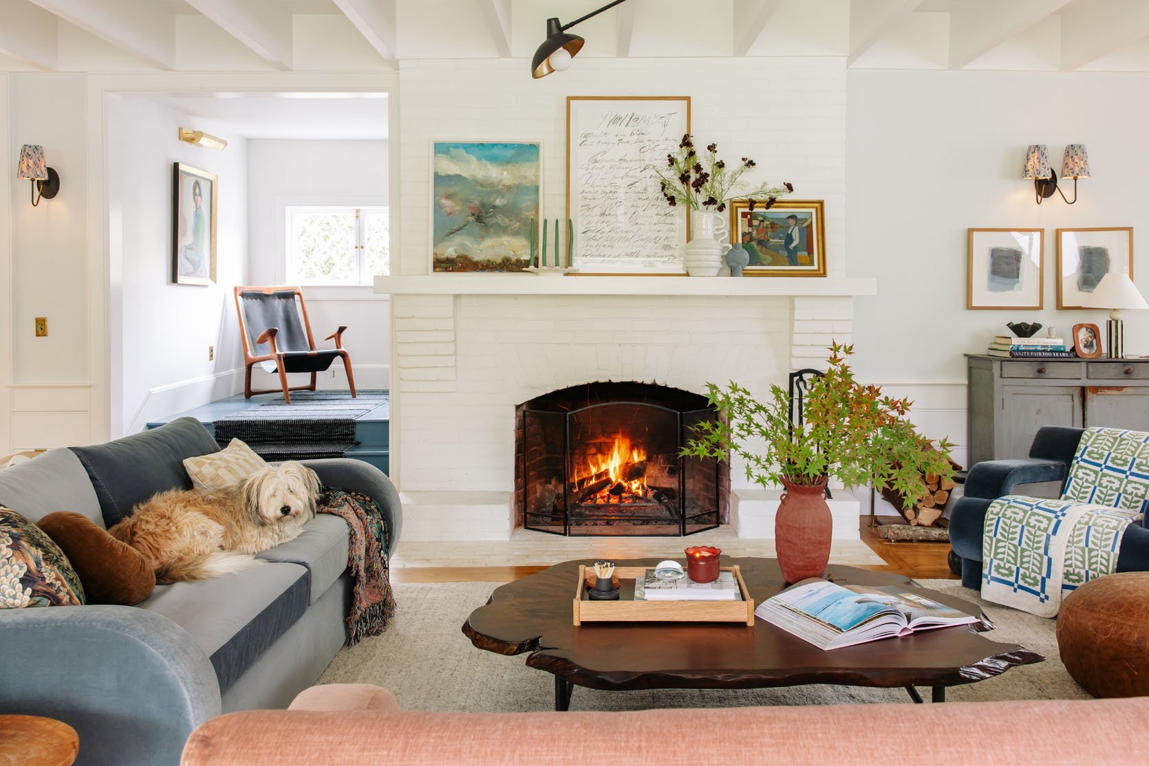
Y’ALL. What started as a “Let’s shoot the Barb sofas in here to give them some marketing love” turned into “oh dear!!! … is this actually the life I want to live???” (in a good way). A couple of weeks ago, I showed you the Alice sofas in here, which I literally designed for this room. Remember all the issues with balance and tones that we talked about? Well, they seemed to be solved here. I still love the Alice sofas, and yet I’m SHOCKED to say that I fear these work so much better in here!!! But you might not agree… (social media was mixed when polled). Here you go:
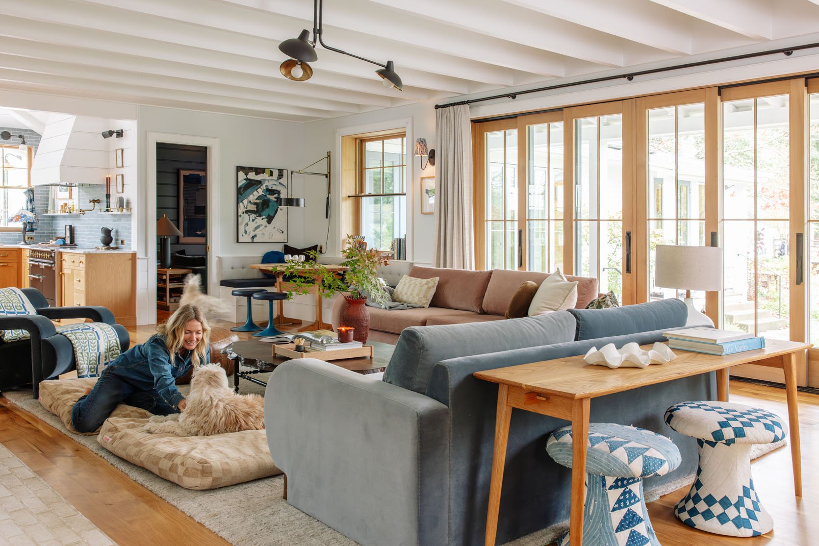
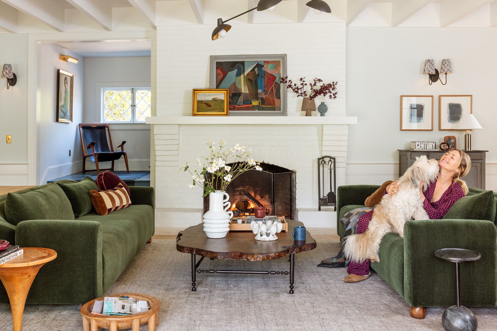
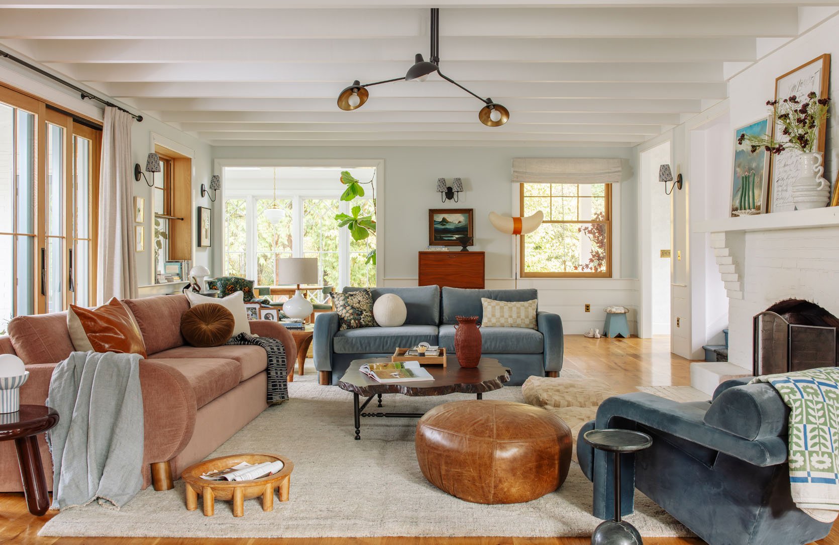
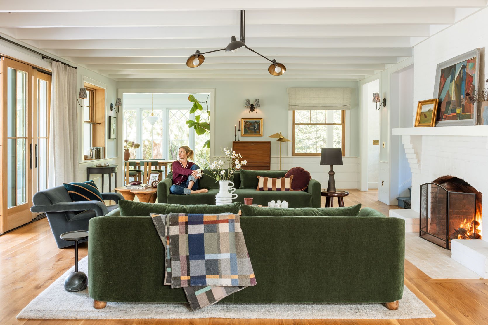
Going back and forth on the slider, it’s really just two very different vibes. The green feels richer, more high impact, more “design forward” in a way, but with that setup I felt that other things needed to change – the fireplace, the curtains, the wall color, and the rug. The balance of this intensity in the symmetrical sofas made the rest of the room feel unfinished (a lot of you had fantastic suggestions about mid-tones and more textiles, etc). But the second I got these two colors in here, in a non-symmetrical layout, the room gave a whole new good vibe. One that screamed invitation, and coziness, not to mention better scale and balance.
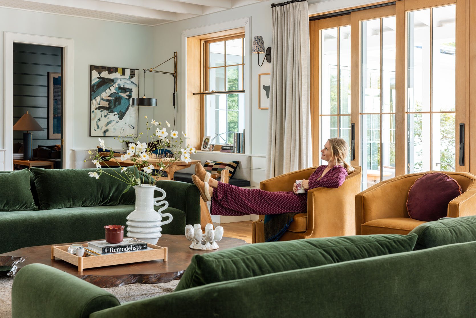
The tones, the warmth, the evenness of the vibe… the openness of the layout!! The lack of contrast really worked in a way that I should have known, but didn’t think it would work so well up in Oregon (that airy Scandi vibe worked so well in LA, but up here I thought not!). Strangely, the room feels warmer, despite being lighter? I might need a color scientist to weigh in on why that’s a thing. And I didn’t buy anything new for this, so I could still tweak it to make it better (like maybe lighter colored pillows on the dining nook?).
I think it’s just that all the softer colors played into this airy vibe, whereas the more intense colors might work better with darker walls (something I’ve known, but was just trying to make it work).
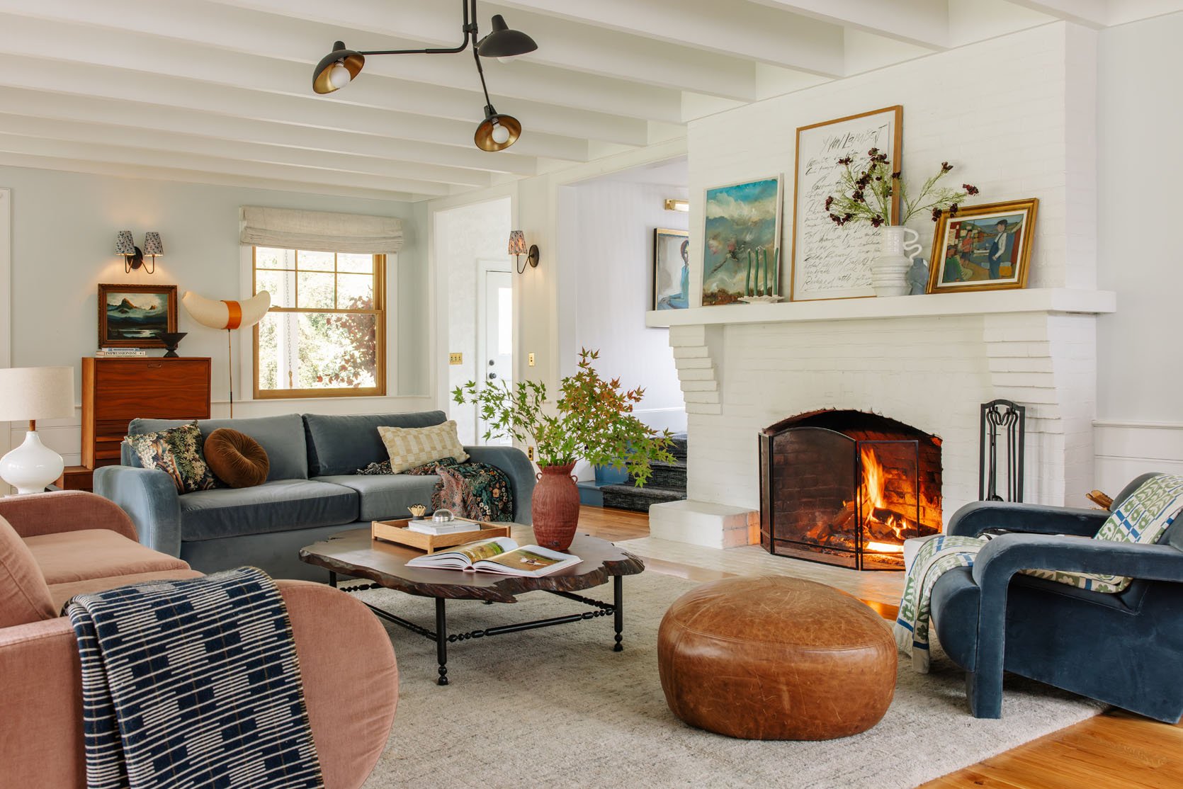
In this setup, I don’t even crave painting the fireplace or adding wallpaper. It feels just calm and cozy, with depth but not too much contrast. I mean, always room for improvements (again, I just pulled from my inventory and took like 3 hours to restyle), but walking into this room over the weekend over and over, I whispered “omg I love it” to myself.

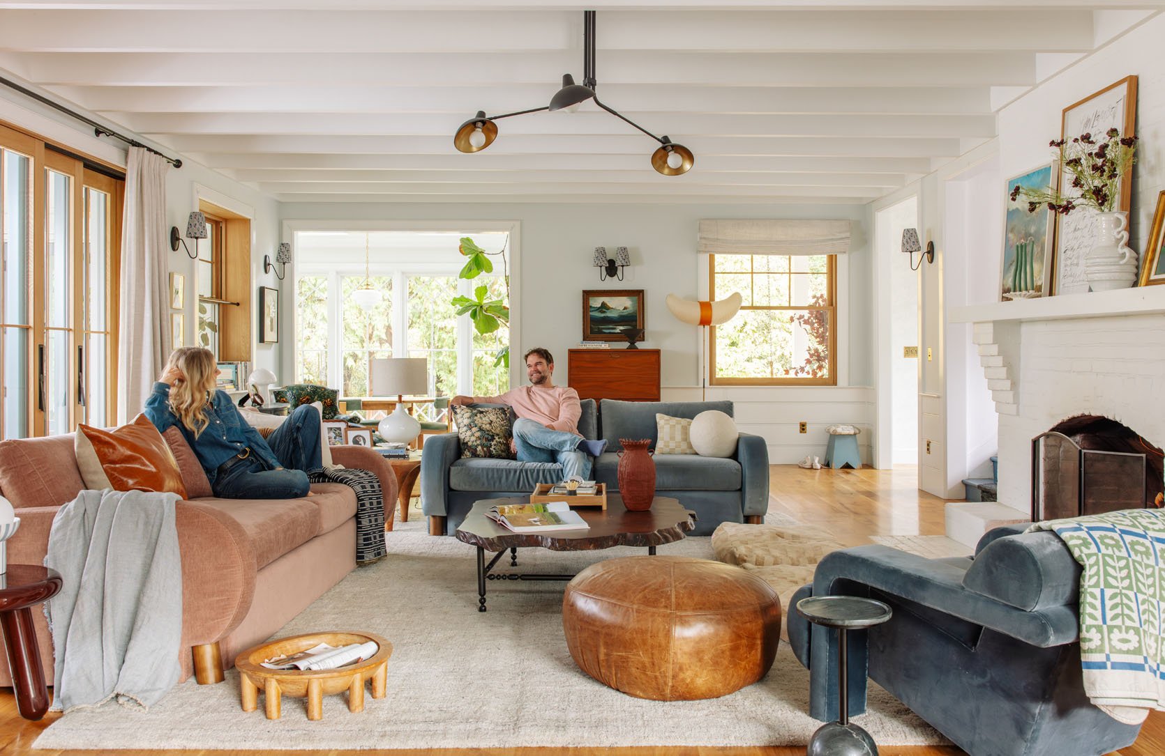
With the green, it pulls you in with the intensity, and with the blue/pink, it invites you in to relax. Brian and I both agreed that it felt more casual, which is way more us. Also, I think that the scale of the Barbs, which is big – she has big arms and a big back and a big base, it just works better in this big room. It could also be that I styled it in a more relaxing way?? No. It’s definitely the colors and layout.
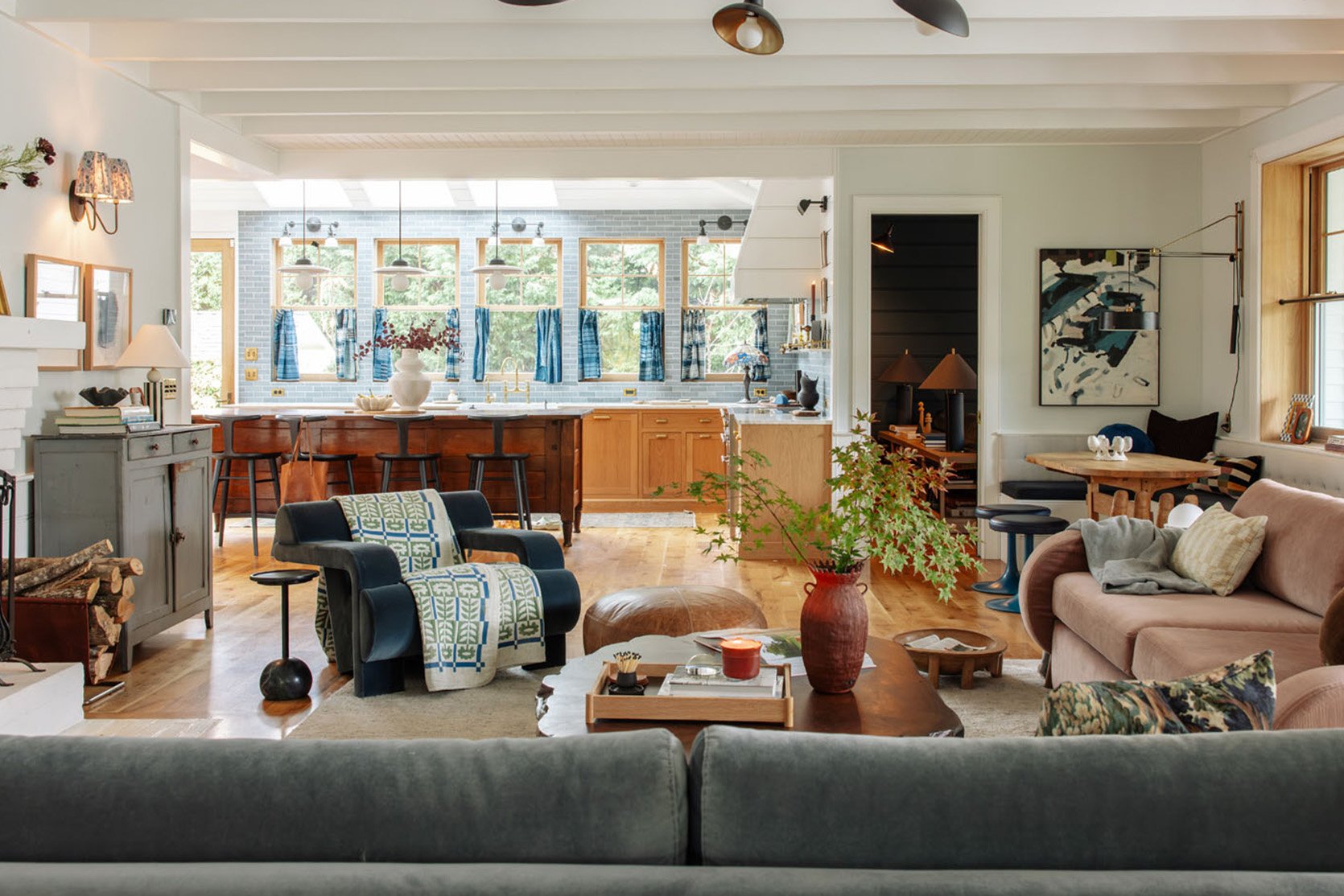
I loved sitting on the blue barb looking into the kitchen. I love that the blue/gray primitive French cabinet now looks more blue (less gray).
But Wait, Won’t The Dogs Sit On Top Of The Cushions Again?
NO!! I mean, this was literally why I didn’t put the Barbs here in the first place – I very much thought that our dogs would climb on up and make themselves at home. And they do…BUT it’s been a week with this setup, and they sit on the sofa bench, but not the top cushions. I think they are too high, and maybe the density of the foam (that is perfect, btw) doesn’t squoosh down enough like the down feather mix in the other sofas?
My Only Big Fear…
Go with me on this one. You know the women who wear the exact same hairstyle that they did when they were in their 20s/30s, that looks/feels dated now? Well, my theory is that they kept the hair the same from when they felt hottest, most beautiful, and youthful. I mean, I do that (I rarely stray from long blonde, wavy hair). This color palette is almost the exact same that I had in our Glendale house right before we moved out. See?
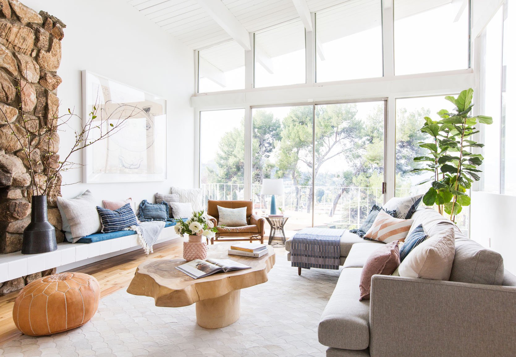
I actually still love that room, although there is something dated about it (it’s 10 years ago now). We stared at it and agreed that maybe it was the rug, maybe the type of photography (all white, super bright/airy, which was so 2014), maybe the pouf? So my fear is that I’m reverting to something dated, from a time when I felt like I was on top of my game. I know that warm Scandinavian design isn’t as in as it was then, but it’s always been what I’ve gravitated towards living in (with a dose of old-world Victorian flair). But the other way you could look at it is that these are my comfort colors and its just very me, regardless of how non-on trend it is (let me be clear, nothing about this is “dated” it’s just that it’s not part of what is super in right now which is layered old world patterns, moody colors, and European maximalism).
So, Which Will You Keep?
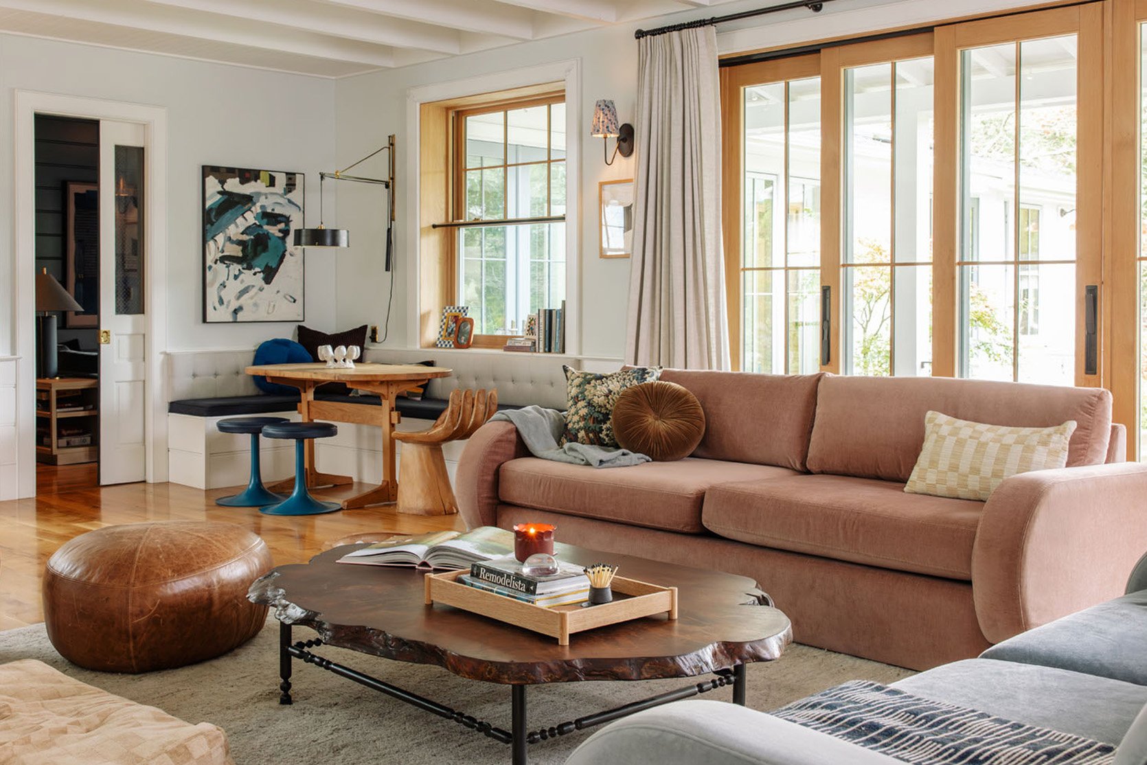
For now, we have the longer pink sofa and the blue barb flipped to face each other with our tree in the middle (opposite the fireplace), and I don’t love it as much (because they aren’t symmetrical, which kinda bugs me). But colorwise, vibe-wise, tonally… I love this more.
But Didn’t You Design The Alice Sofas Just For Your Living Room?
Sure did. And yeah, I feel kinda dumb not keeping them in here. Would I like the Alice in these colors instead? YES! But I think what’s working is also the layout, which we’ve had before; I didn’t love it as much.
But There Is One Thing I Don’t Love As Much…
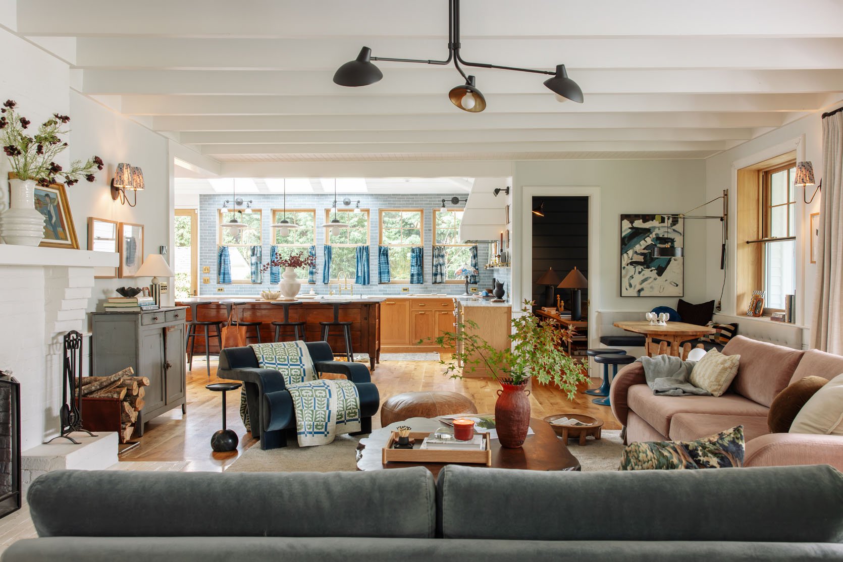
Brian pointed it out, and I had already felt it; seeing into the living room from the kitchen feels messier unless it’s really perfectly styled. This could be because we have more throw pillows that the dogs throw on the ground or smoosh down, and it looks messy. But the symmetry of two sofas facing each other is just a really clean look to make your eye feel calm. I still like it more, but since it’s more eclectic and non-symmetrical we’ll need to keep things in their place.
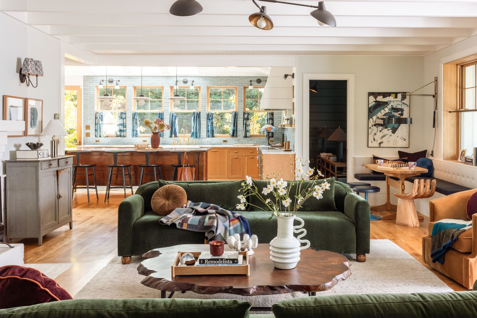
More to come. We also shot this room with a sectional, and get this – we have to shoot our house decorated for the holidays two different ways. One for this year for the blog and another for a magazine coming out in October 2026. To make them look unique, we are shooting the green sofas for the magazine, which I think will be so fun.
The truth is, I like them both a lot, but the pink/blue colorway flows better and calms the need to “fix” the rest of the balance issues (like paint the fireplace, wallpaper the walls, change the rug). But I’m genuinely curious what you guys think. I’m so close to it and my judgement is so clouded by, well, my own opinion and preferences 🙂 I’m not saying I’m going to comply with what the vote is, but genuinely curious which you like more (as-is) or if you would change/combine them at all???
*Photos by Kaitlin Green