
Codieum was gaining serious traction. The AI-powered developer tool was charting its own course in a crowded space, even before it had a brand to match. Momentum was building, but something felt missing.
After undergoing a naming exercise and landing on Windsurf, the team approached Metalab with one ask: “Reimagine us.”
Together, we embarked on a mission to craft a flexible brand system built to scale across their marketing site, product, and beyond. A system that doesn’t just showcase the product, it makes you feel it.

Setting the Scene
Inspired by wind and waves, our guiding idea was limitless flow. That point where blockers fade, creativity sparks, and deep work feels effortless. Windsurf wasn’t looking to fit in. They wanted a brand that disrupts.
Our vision was to create a system that’s expressive, built for real-world use, and unmistakably Windsurf. One that channels energy, clarity, and joy into every touchpoint.
We leaned into bold gestures and emotional resonance, shaping a brand that feels alive in a field that increasingly is looking safe, technical and similar.
The Journey
1. Taking Risks Over Staying Safe
When most AI brands play within the lines, Windsurf chose to go for something unexpected. That spirit, represented best in the words of their lead designer, “We’d rather take risks and go for it than settle for where we are,” set the tone for what came next.
2. Building the Metaphor
Flow had to feel real, not just visual. We tapped into the dynamism of waves and wind. The design system pulses with fluid gradients, precise typography, and motion that lands somewhere between technical and humane. It was a chance to blur the line between product and emotion.
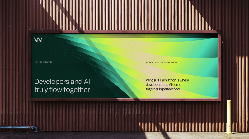
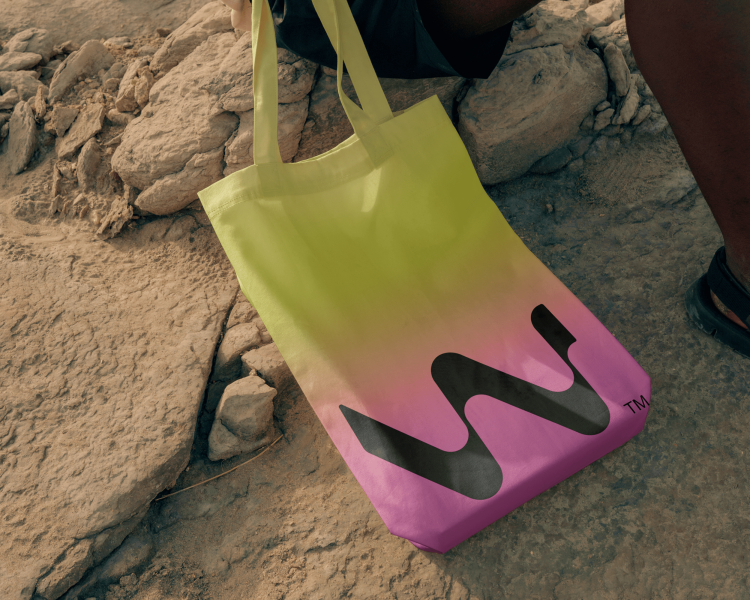
3. Stretching the System Across Touchpoints
We envisioned a brand that doesn’t just live online. It breathes.
- On-product UI feels grounded and intuitive, balancing trust with efficiency.
- Marketing and events lean into dramatic wave visuals and vibrant color.
- Community-facing assets, from animated stories to developer gear, felt like a movement more than a brand.
- We even explored how the brand could extend into the product. While early and conceptual, it hinted at how a future-state experience might take shape.
Breaking Down the Visual Language
1. Logo
The logo leads the way, embodying the essence of the brand in a single mark. A stylized “W” shaped by the motion of waves reflects the elegance of natural movement and the continuous flow developers experience when they’re in sync with their tools. Its dynamic curves speak to adaptability and progress. Never static. Always in motion.
2. Color Palette
The color palette draws from nature and the energy of the sport—sunsets, surf, and coastal light. Grounded neutrals create a calm foundation, while neon accents add sharp bursts of energy. This contrast mirrors the Windsurf experience: smooth, deliberate, and occasionally electric.
3. Iconography
Crafted with mono-line forms and dashed details, each icon echoes the broader system’s logic, creating a visual language that feels clear, cohesive, and intentionally in motion.
4. Typeface
We chose the typeface, Tomato Grotesk, paired with DM Sans and DM Mono, to balance personality and precision.
5. Wave
Centered around a wave motif, the system captures harnessed power and human potential, representing the flow Windsurf unlocks.
The Result
The new brand doesn’t just differentiate, it delivers. It’s not the brand you expect for an AI developer tool, and that’s exactly the point.
Windsurf now looks and feels unique, vibrant, and real. It’s a brand built to unlock creativity, not just show what the product does.
And just months after our rebrand launch, Windsurf was acquired by Google for $2.4 billion and later by Cognition. A powerful reminder of what happens when brand and product move in flow together.