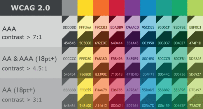
We’ve all been there. You spend hours crafting the perfect color palette, a harmonious blend of modern hues, subtle neutrals, and a pop of vibrant accent. It looks stunning in your mockups. But then, reality hits. A developer asks, “What’s the hex for the secondary button state?” A colleague points out the text is unreadable on that “pop” color. And an accessibility audit reveals your beautiful contrast ratios are failing.
The problem? You designed a palette, not a system.
A color palette is a collection of pretty swatches. A color system is a functional, scalable, and accessible framework that defines how those colors should be used. It’s the difference between having a pile of lumber and having the architectural blueprint for a house.
In this guide, we’ll move beyond the art and into the engineering of color, building a system that is not only beautiful but also robust, consistent, and inclusive for all users.
Why an Accessible Color System is Non-Negotiable
Before we dive into the “how,” let’s solidify the “why.”
- Inclusivity is a Core Responsibility: Over 300 million people live with color vision deficiency (CVD). Many more have low vision or use screens in bright glare. An accessible system ensures your product is usable by the broadest possible audience.
- It Saves Time and Money: A well-documented system eliminates guesswork for your team. Designers, developers, and content writers can all pull from the same source of truth, reducing back-and-forth and preventing costly redesigns.
- It Builds Brand Consistency: A system ensures your brand looks and feels the same everywhere, from your main app to your marketing site and email campaigns.
- It’s Future-Proof: A systematic approach makes it easy to add new features, create dark mode, or even rebrand down the line without starting from scratch.
The Step-by-Step Guide to Building Your System
Step 1: Define Your Core Semantic Colors
Forget names like “Electric Blue” or “Sunshine Yellow.” A functional system uses semantic names that describe the color’s purpose.
Start with these five core roles:
- Primary: Your brand’s main identity color. Used for key interactive elements like primary buttons, active states, and important links.
- Secondary: A supporting color for less prominent actions, like secondary buttons or informational elements.
- Neutral: Your grays. Used for text, backgrounds, borders, and shadows. This is the backbone of your UI.
- Success: A green (typically) for positive feedback, success messages, and completed states.
- Error: A red (typically) for errors, warnings, and destructive actions.
Pro Tip: Even your neutrals should be tested for accessibility. Pure black (#000000) on pure white (#FFFFFF) can create too much contrast for some users. Consider a very dark gray and an off-white.
Step 2: Build a Tone Scale for Each Color
A single shade of primary blue isn’t enough. You need a range of tints and shades for different contexts (hover states, disabled states, backgrounds).
A common approach is to create a scale from 50 (lightest) to 900 (darkest), with 500 as your base color.
- Primary-50: Very light, for subtle backgrounds.
- Primary-500: Your base brand color.
- Primary-700: A darker shade, perfect for hover states.
- Primary-900: The darkest shade, for text on a light background.
This scale ensures you always have a harmonious, accessible shade available for any situation.
Step 3: The Crucial Step – Establish Usage & Pairing Rules
This is where a palette becomes a system. You must define exactly how colors can be combined. The most critical rule governs text contrast.
The Golden Rule of Contrast:
The Web Content Accessibility Guidelines (WCAG) require a minimum contrast ratio of 4.5:1 for normal text and 3:1 for large text. For non-text elements (like icons and form borders), a ratio of 3:1 is recommended.
How to Enforce This:
- Create a Color Matrix: Build a simple table that shows which background colors can be paired with which text colors.BackgroundText (Primary)Text (Neutral-900)Text (White)Primary-500❌ Fails✅ Passes✅ PassesPrimary-100✅ Passes✅ Passes❌ FailsNeutral-50✅ Passes✅ Passes❌ Fails
- Define Interactive States: Document the color changes for hover, active, focus, and disabled states.
- Example: A primary button goes from
Primary-500toPrimary-700on hover. Its focus ring isPrimary-200.
- Example: A primary button goes from
Step 4: Test Relentlessly for Accessibility
Don’t just assume your colors work. Test them systematically.
- Automated Tools: Use browser extensions like Stark or Axe to check contrast directly in your design tool (Figma, Sketch) or in the browser.
- Simulate Color Blindness: Use the color blindness simulators in Stark or Figma to see your palette through the eyes of users with CVD. This often reveals fatal flaws in color-coded information.
- Manual Check: Don’t rely on color alone to convey meaning. Pair it with icons, labels, or patterns. For example, a red error state should have an icon and bold text, not just a red outline.
Step 5: Document and Socialize Your System
A system that no one uses is just a pretty document. Make it the single source of truth.
- Create a Living Document: Use Zeroheight, Storybook, or a dedicated page on your company’s intranet to document everything.
- What to Include:
- Color swatches with HEX, RGB, and (if you’re fancy) CSS custom property names (e.g.,
--color-primary-500). - Clear usage guidelines (the rules from Step 3).
- Visual examples of correct and incorrect usage.
- Code snippets for developers.
- Color swatches with HEX, RGB, and (if you’re fancy) CSS custom property names (e.g.,
Bringing It All Together
Building an accessible color system isn’t about limiting creativity. It’s about channeling that creativity into a structured framework that empowers your entire team and respects your users. It transforms color from a subjective aesthetic choice into an objective, functional component of your design language.
When you move beyond pretty palettes, you build products that are not just visually appealing, but truly usable, professional, and inclusive for everyone.

