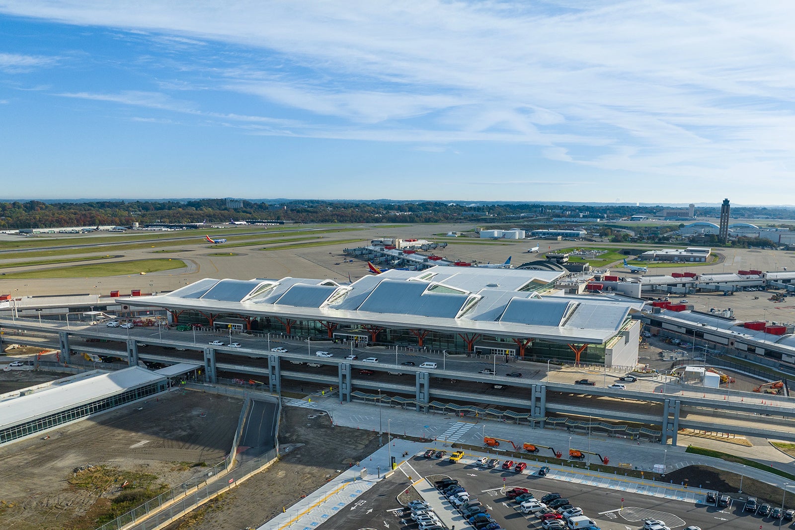
When the first travelers enter the new terminal at Pittsburgh International Airport (PIT) on Tuesday, they are going to notice more changes than just the spacious, gleaming new building that greets them.
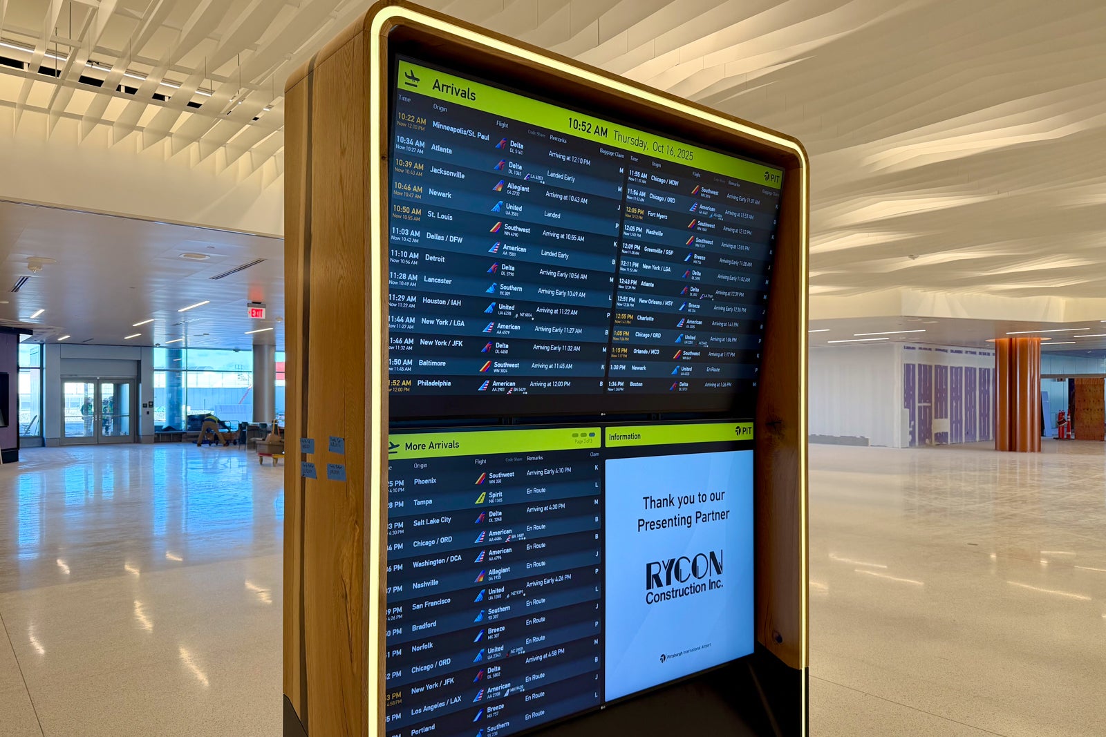
As part of the $1.7 billion makeover of the former US Airways hub in western Pennsylvania that opens Tuesday, PIT has undertaken a full refresh of its signage. Everything from the physical wayfinding to the flight information displays, known as “FIDS,” sports a new look and feel that is distinctly Pittsburgh.
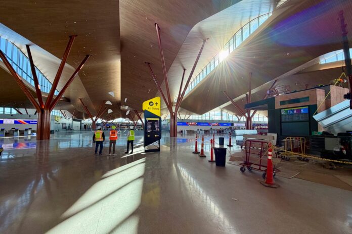
New black-and-yellow pylons — yes, they do draw inspiration from Pittsburgh’s sports teams — stand at the entries under the soaring wood-toned ceiling, directing travelers to their respective airline counter or security to catch their flight.
“The intent was to make them very highly visible,” said Siri Betts-Sonstegard, who oversees experience and design at the PIT operator, Allegheny County Airport Authority.
Or, in the words of Kristal Ernst, an environmental graphic designer at Gensler who worked on the PIT project, “bold and impactful.”
The refresh comes as airports across the country, and around the world, reevaluate their signage — and the information they present — for the digital age. Out are solely static signs that move travelers through an airport but do little beyond provide the basics: airline, flight, destination, gate and departure time. In is a mix of static and digital displays that aim to incorporate data from the data-rich world that we live in to improve the passenger experience.
“It’s about the ability to add more layers to the program and communicate things in additional ways on top of that core signage program, wayfinding program that you have to put in that is necessary for people to navigate the airport,” said Rob Daly, a principal at experiential design and signage firm Entro in Toronto, who has worked on airport signage projects around the world.
Dynamic and data-rich airport signage is being installed at airports across the country, from New York’s LaGuardia Airport (LGA) to Minneapolis-St. Paul International Airport (MSP) and San Francisco International Airport (SFO), with more on the way. Globally, it is already on display in places like Singapore Changi Airport (SIN).
The challenge for PIT was to design a “bold and impactful” signage system that did not subtract from the new terminal itself. That building rises more than three stories to its signature roof between two arms of the airport’s 30-plus-year-old concourse in the shape of an X. It replaces PIT’s 1992 terminal and the automated underground train that connected it to the concourses.

Reward your inbox with the TPG Daily newsletter
Join over 700,000 readers for breaking news, in-depth guides and exclusive deals from TPG’s experts

“The new building is so wide, so big and expansive, and has a great natural flow that it doesn’t need a lot of wayfinding,” said Ernst. “What it does need are larger, recognizable moments.”
While the most dramatic moment is certainly the Alexander Calder mobile that hangs in the center of the terminal, the yellow-and-black pylons and FIDS lined with locally sourced wood create their own moments — however brief — in the space.
Gensler worked with HDR and Luis Vidal + Architects on the design of the terminal.
PIT also refreshed how and what information is displayed as part of the signage overhaul. That job fell to Sascha Mombartz, a New York-based designer and digital product specialist.
“We’re trying to navigate people through a space,” he said. “It’s really a data [visibility] project.”
Mombartz, working with the team at PIT, came up with a hierarchy of information and how to display it on the FIDS. He drew inspiration from the flip signs — plastic strips with basic flight information that airline personnel could load on a pylon or remove — that used to be standard in airports across the country.
One can see the flip sign aesthetic on the FIDS display, where each flight effectively has its own digital information card.

Two of the biggest changes travelers will notice at PIT are the decision to list flights by departure time, rather than destination, and the inclusion of airline tails on the FIDS.
Sorting flights by departure time is common globally but not in the U.S., Mombartz said. PIT made the change in an effort to improve the process for travelers.
“You can see the things that are at the top are the [soonest],” he said. “It’s easy to find your flight because you’re just scanning the list by time — that makes things a lot easier.”
The test will be whether American travelers — particularly those who do not call Pittsburgh home — adjust to the change.
The inclusion of airline tails adds a uniform visual element to aid travelers’ search for their flights. The airline name is included next to the icon so flyers do not have to distinguish an American Airlines tail from a Southwest Airlines tail.
“If it has the tailfin and the name, that’s a good solution and really practical in this use case because you can create a layout that’s very uniform,” Mombartz said. “You want to be able to scan really quickly.”
The new gate pylons for PIT show — below the airline, destination and departure time — useful information like boarding time and codeshare flight numbers.

A bonus for mixing digital with static signage is that PIT can show other images — for example, photography highlighting the local area — on the displays when they are not needed for flight information.
All of these changes are on display for travelers as they pass through the new PIT terminal.
The first scheduled arrival at the terminal is United Airlines Flight UA794, which departs San Francisco International Airport (SFO) on Monday night and lands in PIT at 5:12 a.m. on Tuesday. And the first scheduled departure is Southwest Airlines Flight WN1841 from PIT to Denver International Airport (DEN) at 5:30 a.m.
Related reading:
