
This all started as an experiment just to see if I could do it.
I’m a designer who always wanted to make a game. Not a polished prototype concept or a cute interactive thing, but an honest-to-goodness game with animation, visual effects, scoring, and a meaningful narrative or theme tying it all together. The kind of project that usually requires a CS degree or a very patient developer friend.
I had neither (well, I have developer friends, but I wouldn’t put them through this torture). What I had instead: curiosity about AI development tools, a love of retro gaming, and a personal interest in diabetes education. So I decided to build Blood Sugar Battler using AI and Lovable.dev to fill the engineering gaps while I handled everything else.
Three months later, I shipped a mobile web game where you tap falling foods, manage a blood sugar meter, and rack up combos while maybe learning something about a condition millions live with. Why’d it take that long? Because I wanted a game that represents my creative vision and not a rushed, half-baked vibe-coded mess with minimal human input. Frankly, that would be boring.
This is a walkthrough of what turned out to be a fascinating, frustrating, and frequently chaotic process of using AI for game development.

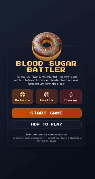
The Game: Tap Fast, Think Faster
Here’s the Loop.
- Rounds last one minute.
- Foods fall. You tap them. Your blood sugar meter reacts.
- Healthy food nudges it down and scores points. Junk food spikes it up, subtracts points, and breaks your combo chain.
- You’ve got two power-ups for emergencies: Exercise drops the meter by 50, Sugar Rush bumps it by 25. They’re limited, so timing matters.
- And speaking of, don’t forget the meter: if your sugar goes too low or high, that dramatically affects your overall performance too.

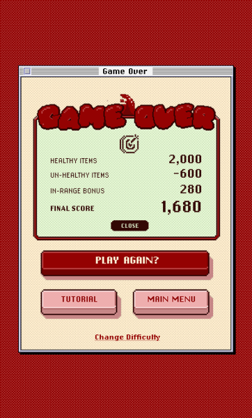
At the end, you get a score and a blood sugar average, which includes a percentage of time spent in the “healthy” range. Both points scored and the blood sugar average need to be decent for the game to give you a pat on the back. Low score but perfect blood sugar? Nope. High score but terrible glucose control? Also nope. The game makes you care about both.
The gameplay is short and snackable (pun intended). It sneaks in a bit of education about how food affects blood sugar through action and not lecture. That was kinda the whole point.
Starting With a Prompt (And Low Expectations)
I chose to build the app on Lovable, a no-code AI platform that’s not actually no-code once you want to do anything interesting. Also, unless specified otherwise, it will build your app on React, Tailwind, and Framer Motion. My first prompt was relatively concise:
"Develop a mobile touch game similar to fruit ninja, but the theme is a game for type 2 diabetes. And the score is a blood sugar meter that's affected by what the user selects in terms of healthy balanced options vs unhealthy. Develop a library of food items that will fly out with different nutrition levels. Aesthetic follows Google's material design expressive UI that's been revealed."
What came back was functional but ugly. Emoji foods flying around on a basic background. No sound. Scoring that just ticked upward. But it worked. Barely. That was the important part. I could make a thing that moved and responded to input without attempting to write the physics myself.


From there, I started building a wishlist of features and gameplay improvements. Interactive animations. Sound effects. Power-ups. A meter that felt more engaging. Combo multipliers that rewarded good choices. I iterated in prompts, testing each addition, figuring out what worked and what didn’t.
Ditching the Scaffolding
The early stages are fun. AI is great at scaffolding. It’s when you want something specific, something that matches a vision in your head, where things get a bit harder (more on that later).
Once I had proof that the concept worked, I moved away from the Fruit Ninja clone. I didn’t want food flying in from off-screen with slicing interactions. I wanted them to spawn in the middle and fall down, ready to explode by tapping or hovering. A bit more Whack-A-Mole. I wanted notifications that taught players without interrupting the flow. I wanted the meter to feel like something you had to actively manage, not just watch.
And I really wanted to ditch the Material Design aesthetic. Too many “vibe-coded” apps lean on it. I needed something that looked intentional with more personality.
But here’s the thing. AI can’t art direct. It can recognize an image you show it and attempt to approximate something similar mechanically, but it can’t design from taste. Figuratively, and well, literally. That part had to be me.
Art Direction: The Long, Tedious, Rewarding Part
Aesthetics matter
I stepped away from the code and focused on the visuals. I love 8-bit and 16-bit style games, so I taught myself pixel art for this project. Not because I’m a masochist, but because I wanted every food sprite to feel consistent and didn’t want to overly rely on just using third-party assets as is. That meant learning fundamentals and watching a lot of YouTube tutorials.


I used Aseprite for creating and editing almost all the art assets. Bought some third-party icon and animation packs from itch.io, then modified and recolored them to match my palette. I ended up using 79 food assets total for gameplay. All tedious as hell to edit. All the pixel-art animations you see were built as sprite sheets for easier control and manipulation in the code, with a few exceptions (sidenote, creating and syncing the cloud spawn effects with food items took like a week to figure out 🙃).
I also spent a few weeks sketching and then designing the logo, which frankly helped anchor the overall art direction moving forward.

The typography was important for the consistency of the theme. ChiKareGo2 and Lo-Res are both bitmap-based fonts designed to capture that late-90s operating system aesthetic, the kind of typesetting you’d see in system dialogs and app windows. They stay legible at small sizes while reinforcing the retro computing vibe throughout every screen and interaction. I used a web font converter for ChiKareGo2 to make it web font-ready, while Lo-Res was already available on Adobe fonts.
The shift to pixel art really pulled everything together thematically. It felt visually intentional, and less like a vibe-coded experiment (which…yeah, I guess it was).
Sound Design: Give Me a Beat!
The visuals were half the experience. Sound was the other half. I wanted every interaction to feel tactile and satisfying, like pressing a button on an arcade cabinet or a cassette player.
I spent weeks digging through itch.io, hunting for the right 8-bit music and UI sound effects. Not just any retro sounds, the ones that fit the tone. Upbeat background music that wouldn’t get annoying after repeated plays. Button clicks that felt crisp. Blast effects that matched the explosion animations. Power-up sounds that made you feel like you’d triggered something big.
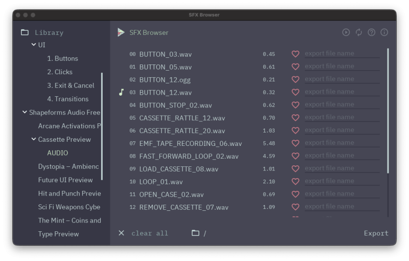
SFX:
Once I had the right SFX, the real work began. Getting sound to work reliably on mobile browsers is its own nightmare. This is where AI became very useful. I described what I needed (responsive audio that didn’t clip, sounds that played consistently across devices, music that could be muted without breaking everything), and we iterated on solutions together. AI helped build the audio architecture:
- Pooling systems for mobile browsers,
- deduplication logic so rapid taps didn’t create sound chaos,
- fallback mechanisms when
Web Audiowasn’t available. - The performance side was tricky too. Audio files needed specific formats (WAV for some things, OGG for others), normalized volumes, and trailing silence to prevent clipping.
AI guided the technical requirements while I made creative calls about how effects were triggered and implemented. Getting all of this right took longer than expected, but when you tap a food and hear that satisfying blast, the tactile button presses, or when the Sugar Rush power-up triggers with that warp effect, it reinforces the immersion.
Pulling it All Together in a Classic Mac OS
The art style was headed in the right direction, but it needed a frame. That’s when I committed to the vintage Mac OS concept. Everything outside the main game window would look like desktop icons. The game itself would have a title bar, pixel buttons, and all the window chrome you’d expect from a late-90s OS.

This did three things:
- First, it tapped into nostalgia instantly.
- Second, it gave me a visual language to design around instead of inventing UI patterns from scratch.
- Third, it made the experience feel approachable instead of clinical. Medical education wrapped in a playful throwback aesthetic.
I designed most of this in Figma, then used a Figma-to-React plugin in dev mode to export rough code. That code was a mess. I cleaned it up using Cursor and Copilot, manually tweaked what didn’t work, then brought it back into Lovable so the AI had better context for future iterations.
See the Pen
mac window by Alex Pierce (@alexpierce)
on CodePen.
Lovable is good at coding. It’s not good at designing. I learned that the hard way.
Working With AI Without Losing the Plot
My workflow looked like this: design in Figma and Aseprite, explain what I wanted in plain language, then ask the AI to output the needed code that aligned to my intent. When things broke, I asked why (which was frequent). When performance dipped or an unexpected behavior occurred, I asked how to fix it.

I learned to write better prompts by treating AI like a collaborator with limits. I focused on one task or feature at a time. I used ChatGPT to write better prompts based on Lovable’s best practices.
It could translate my intent into code. It could refactor my messy logic into something structured. It could suggest patterns I hadn’t considered. But it couldn’t make creative decisions. It couldn’t tell me if the game pacing felt on track or if the power-up animations were too slow.
That was on me.
Luckily, Lovable has two very useful features I relied on often:
- “Chat mode”, where your inputs/requests trigger the AI to write an implementation plan before executing—preventing unwanted rogue changes and encouraging refinement and specificity, though it burns through more credits. While that was vital during debugging and solving complex UX challenges, sometimes, if I wasn’t careful, I would overengineer the solution without realizing it and create more problems.
- This is where “Version History Control” comes in handy, allowing you to revert to any previous code change or just preview them. Though there are limits. You can revert, but it will only implement the last plan it generated, none previous. So if you have work that was done after that point, and you wanted to keep it, have that in mind.
Unlike a human, an AI doesn’t necessarily have the critical thinking skills to say no and K.I.S.S. (keep it simple, stupid). So I had to know when to cut my losses and pivot to alternative solutions.
Refining the Loop
Once the core worked, I focused on tuning. The original meter felt clunky and unclear. Point scoring was abstracted and basic. The gameplay lacked challenge and tension. I had the AI break everything into smaller systems to easily manage: spawning logic, scoring, and blood sugar range tracking. Each one needed real structure.
Gameplay Logic
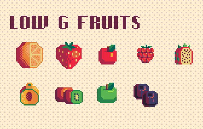
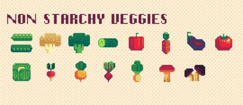
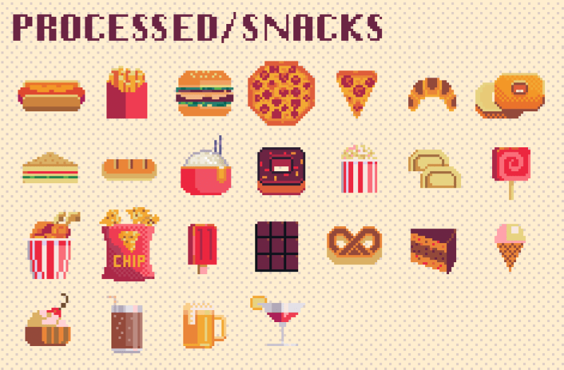
Every food item stored in the foodLibrary has a bloodSugarImpact value. I had the AI research general nutrition patterns (American Diabetes Association, other educational resources), personally validated its findings, then used creative license to approximate values that worked in a 60-second round.
- Non-starchy vegetables: -3 to +1 (broccoli, lettuce, peppers)
- Healthy fats: -2 to 0 (avocados, nuts, olives)
- Lean proteins: -1 to 0 (chicken, fish, eggs)
- Low-glycemic fruits: +2 to +5 (berries, apples, citrus)
- Complex carbs: +5 to +8 (beans, sweet potato, brown rice)
- High-glycemic fruits: +8 to +15 (bananas, grapes, mangoes)
- Refined carbs/processed foods: +16 to +40 (cake, pizza, soda)
- Dairy: +3 to +6 (milk, cheese)

To be clear, I’m not a medical doctor or researcher. I’m a nerd who likes games. I refined for clarity and simplicity of gameplay. The goal was fast feedback that teaches “healthy foods steady, refined carbs spike” without pretending to be medical advice.
Combos and Power-Ups
Combos became the secret ingredient. Hit several healthy foods quickly, and your score multiplier ramps up. Junk breaks the streak. That gave the game rhythm. That’s where the PowerUpSystem comes into play.
Balancing power-ups is a bit of a strategic mini-game itself. Early versions let players spam them. Later revisions limited each to three uses per round.
- Exercise became high-risk, high-reward: big meter drop, but easy to run out if you’re not paying attention to your blood sugar.
- Sugar Rush was the safety net: a small bump when you’re low, but easy to overcorrect.
I wanted big, splashy screens for power-ups, so I designed custom sprite animations with hand-edited typography. Hard to miss. Fun to trigger.
The transition effects were an example of something I had to tinker with outside of Lovable as the AI just wasn’t understanding the art direction. I built the screen wipes in Aseprite as sprite sheets, then worked on getting the JS and CSS close enough inside Cursor, before bringing it back to Lovable. Making sprite sheets responsive was sort of a nightmare in this context as well (aspect ratio scaling).
Difficulty Modes
I didn’t add difficulty settings until late. Family and friends tested the game, and I heard enough moaning and groaning to know I needed options.
- Normal and Hard modes adjust spawn rates, fall speeds, hints, and how often dual foods appear.
- I also rewrote the tutorial multiple times based on feedback and testing.
- Behind the scenes, I had the AI set up simple functions so that I could fine-tune settings on the fly in the code without its help.
const BASE_DIFFICULTY = {
  PHYSICS_TICK_MS: 20,
  CLOUD_TO_APPEAR_MS: 300,
  APPEAR_TO_VISIBLE_MS: 500,
  GRAVITY_PER_TICK: 0.5,
  TERMINAL_VY: 12,
} as const;

Scoring: Making Players Care
Lovable’s initial game-over screen was basic. To tie into the actual theme of the game, I needed players to care about the meter, not just points. So I restructured the scoring system to track time-in-range in real time. That percentage affects your final evaluation. Data-driven personalization.
Then I added a weighted bloodSugarAverage. Time in the normal zone counts at 1.0x. Warning zone: 1.8x. Critical zone: 2.5x. That way, drifting into danger affects your outcome even if you recover. It’s a useful consequence to keep players engaged and alert.
// Status-weighted average configuration (Option A)
export const BLOOD_SUGAR_AVG_WEIGHTS = {
  normal: 1.0,
  warning: 1.8,
  critical: 2.5,
} as const;

export const getStatusWeight = (status: BloodSugarStatus): number => {
  if (status === 'normal') return BLOOD_SUGAR_AVG_WEIGHTS.normal;
  if (status === 'warning-low' || status === 'warning-high') return BLOOD_SUGAR_AVG_WEIGHTS.warning;
  return BLOOD_SUGAR_AVG_WEIGHTS.critical; // too-low or too-high
};
Both metrics (score and blood sugar control) need to sync for a success message. Low score but excellent range? No good. High score but terrible average? Also, no good. I set up multiple end-game states with dynamic messages based on a score-category X sugar-category matrix.
The game evaluates you across 20ish possible outcome variations. Maybe it’s a bit much, but it reinforces the educational goal: managing blood sugar isn’t just about points.


What I learned
AI Collaboration
- Burning Credits: AI translates intent into code, but can’t make creative decisions or tell you if something feels good. Write clear instruction files early to define coding approach & methodology, define your tech stack early, and prevent AI from wandering into unapproved dependencies. Supplement expensive AI SaaS platforms like Lovable with ChatGPT or Copilot for debugging before burning credits (it definitely became a money pit near the end).
- Figma Integration: My translation from Figma to Lovable was a hot mess at the time. Since then, I’ve learned there are a number of AI integrations that better translate Figma to real code (Builder.IO, Figma Make, Figma MCP & Claude code, etc.). It may help save you time from a front-end design craft perspective. But honestly, the control and fidelity of Lovable is pretty competitive.
- Effort is still needed: AI can help supplement your technical skills, but the more advanced work you’re doing, the more involved you need to be. It can’t really replace a talented engineer with critical thinking skills.
Account for Mobile Browser UI
- The shifting address bar on iOS and Android gobbles up vertical space. I leaned on dynamic viewport units, safe-area padding, and a single compact HUD with big touch targets. No reliance on fullscreen. Just a layout that accommodates all that pesky browser UI.
- I also set up the game as a PWA, but I didn’t want to rely on people installing it to their homescreen. The experience needed to work in the browser first.
Please, Use GitHub From the Start
- Lovable doesn’t spell it out for you, but if you have a lot of creative assets and files for your project, there are limits to how and what you can upload directly in the chat interface. Lovable itself doesn’t account for the best file management (or at all, really). I made the mistake of externally hosting the majority of my static assets at first for convenience. Later, I realized syncing to a GitHub repository WILL make your life 10 times easier and you’ll avoid any cross-domain issues. Luckily, Lovable does make the process very easy for non-technical folks.

Performance and Assets
- This almost delayed the launch by a week. Early on, I didn’t plan for sprite sheets. Now the game was loading 79 individual assets concurrently (and externally). Even small files create performance issues when you’re making that many HTTP requests at once. Or worse, in my instance: multiple temporary IP bans from my service provider during development 😭 (as noted before, I had made the mistake of externally hosting all my assets before eventually integrating into GitHub for easier file syncs with Lovable).
- The solution: I added a styled instant loader that appears with minimal JavaScript. Then I warmed assets in tiers behind a start screen. Critical UI first, effects and less-seen sprites later, plus a lookahead system so incoming foods are decoded before they hit the screen. First paint feels fast. Later play feels smoother.
- Plan for HTTP request bottlenecks early. 79+ individual assets create performance issues regardless of file size, so use sprite sheets or over-engineer preloading if that’s not possible. Lock your animation engine to match your art strategy before you start building.
Audio and Cross-Platform Testing
- Mobile browser audio is weird and finicky, especially on iOS. Depending on how you’re using sound, you’ll likely need aggressive pooling, and sometimes dual encodings (WAV for iOS, OGG for others). Test constantly across a variety of browsers. I’m sure the AI will get better over time, solving this problem intuitively, but be prepared for audio bugs.
Creative Process
- Constraints force systematic thinking and create cohesive aesthetics. Focus on concepting the theme and art direction of your style. You probably don’t need to know this already if you’re a designer, but maybe sit down first and decide what the vision is before you go all in and start generating code. It’s harder to back-track later. The more context and vision you share with the AI in the beginning, the smoother it will be later on.
Wrapping Up
Blood Sugar Battler took three months to build. Most of that time was spent on craft: Making the pixel art, UI/UX, and overall creative direction.
AI made it possible for me to ship a whole game as a solo designer. But it didn’t make the creative decisions. It translated my intent into code, then I iterated until it matched the vision.
If you’ve ever wanted to make something outside your technical comfort zone, AI can help you bridge that gap if you’re patient. But you still have to know what you want and be willing to keep tinkering until it feels right. And it doesn’t hurt if you’re knowledgeable yourself.
The tools don’t (and shouldn’t) replace taste and critical thought. They amplify it.
Credits to Some Talented Artists
Modified Pixel Asset Sources (Itch.io)
- Kiddolink – VFX Set (Season 1)
- PiiiXL – Mega 1-Bit Icons & Food Pack
- Valentin – Hand Icons (Figma)
- Brian Levy – Classic Macintosh UI Kit (Figma)
Sound & Music (Itch.io)
- Halftone SFX Pack by Will Bedford
- Shapeforms SFX Library by Shapeforms
- Freesfx Pack by Kronbits
- “Out of Time” by Abstraction Music (Three Red Hearts)
And special shout-out to my wife, Jazmin, for putting up with all the “user” testing.