
It’s always fun arriving in a new city and getting to experience everything through a fresh lens. This excitement only lasts for so long, though, until you need to find your hotel or a place to eat. For this, you’ll need a map or guidance to get there; without directions, you may quickly get lost or frustrated and would just rather leave.
The same sentiment applies to website navigation. When a user clicks on your landing page, you want to ensure the website has everything they need to get their questions answered — and successfully sell your products or services. This includes providing good website navigation and clear navigation options that guide them effortlessly to your main navigation menu, as well as any other important pages across your site. A well-planned website navigation menu is vital for keeping visitors on your site and encouraging them to engage with your offerings.
Here’s a breakdown of navigation types, how to prepare your website for success and when you’ll know you’ve done all you can to orient your site visitors. Let’s dive in.
What Is Website Navigation?
If you haven’t heard of this term before, website navigation is a menu of internal links which allows users to access different parts of your website quickly and with a single click. An effective website navigation system is a cornerstone of good navigation and should align with your broader web design strategy. The navigation bar is typically placed on the top banner of the site when viewed on a computer. Mobile navigation may be a collapsible menu on the corner of a device, and this design approach ensures site visitors can find everything they need, regardless of device or screen size.
Some common names for website navigation include:
- Primary navigation.
- Home banner.
- Menu bar.
- Menu.
- Navigation bar.
- Navigation.
- Top links.
It’s where site visitors can find the home button and a few other quick links to important pages, which will vary depending on the company. It acts as a table of contents, offering general guidance on the basics of each landing page. A good website navigation menu can also help website users locate key sections, such as product categories, blog posts or contact information.
Subscribe to
The Content Marketer
Get weekly insights, advice and opinions about all things digital marketing.
Thanks for subscribing! Keep an eye out for a Welcome email from us shortly. If you don’t see it come through, check your spam folder and mark the email as “not spam.”
Domain Navigation and the User Experience
If you have more than one page on your website, then you need a navigation bar. You want your customers to find the information they need quickly and easily to avoid confusion or frustration. This ease of use and intuitive navigation system will improve the user experience (UX).
Poor UX drives customers away: 60% of consumers across the U.K. and the U.S. said they’d abandon a website altogether if it delivered bad UX, according to a Storyblok survey. With an improved website navigation design, customers are more likely to spend a little more time on your page digging into your products, reading blogs, downloading eBooks and more.
UX is more than just a nice-to-have, but a necessity for SEO success. Content marketing efforts also become more effective when website visitors can easily locate resources, since a tidy navigation structure helps guide them to articles, videos or case studies relevant to their interests.
Easy Web Navigation
A poor UX design can also put your SERP ranking at risk. Search engine algorithms “crawl” through your website to understand how well each page links together and if finding information is straightforward for the user — for Google, this is known as usability. The bots will click through each page as if they were a customer and come back with information on how crawlable your website is.
The easier it is to click through your website, the better your SERP score will be. This underscores why implementing a thoughtful navigation structure, including secondary navigation or even breadcrumb navigation, can significantly boost your visibility online.
Let’s start with an example:

This home page from Well&Good offers users a straightforward way to find the topics they want to read more about. As a lifestyle blog source, Well&Good wants to help their readers feel comfortable on their page, whether they’re just looking for the latest topics below the fold or are interested in something specific.
As you navigate through each section of their website, there are links to other pages, and each one is connected in some way — making navigation simple as pie. This is a prime example of good navigation because it guides people without confusing them, ensuring an overall user experience that feels cohesive.
On some sites, you may hover over a topic and then a drop-down menu will appear with further options. Alternatively, in the case of Well&Good, the links go straight to another landing page. Which is better? Well, that’ll depend on the needs of your customer and the content they find most valuable.
But for now, let’s dig a little deeper into website navigation terms.
What’s Below the Surface?
Improving the structure of your navigation menus can help support easy engagement. No matter what type of organization you are, users naturally have questions about your values, mission, services or products, and more — and they expect you to have answers.
Users may not understand the full breadth of your website all at once, and that’s OK. However, they should be able to find what they’re looking for without much effort. All of this lies in building site structure, also known as information architecture.
Building Information Architecture
There are a lot of complexities to consider as you build out this piece of your website design. Everything from the fonts and colours you choose to how you place your navigation elements impacts the website users’ overall experience. The relationship between each page in your site structure is one place to start.
You wouldn’t find eggs next to the nail polish at the grocery store, just like you wouldn’t put your service pages with your blog posts. The way each page works together further improves each visitor’s experience and is known as information architecture (IA). IA is the way your website is structured to be more accessible to users.
Website Navigation Structuring
To get a sense of how your internal pages work together, you may need to start with site mapping. This is a list of all your pages and how they interact with each other from your home page down to your contact page.
From here, you should set the hierarchies for each section of your site. The home page should reign supreme in this kingdom at the top of your sitemap, or the list of pages associated with your domain, and then the things that matter most to your customers as subpages. This planning also helps you identify where to place primary navigation and secondary navigation in your main navigation menu.
Here, you can see how each page relates to the others, all starting from the home page. The three sections on the second line may appear on your navigation bar and each subpage could either appear as a drop-down menu item or via a prompt to navigate to the next page. By mapping out these navigation items clearly, you help website users find what they need in fewer clicks, which can lead to effective website navigation.
Let’s uncover some examples so you can see the difference among types of website navigation structures as they relate to different industries.
6 Types of Website Navigation (With Examples)
Your navigation is specific to your industry, product and service. More importantly, it should represent the needs of your customers. Here are a few more common types of menu bars to give you a few ideas, along with real-world website navigation examples.
Global Website Navigation
Also called a horizontal navigation bar, global website navigation flies across the top of the screen and never changes, regardless of the page you’re currently viewing. This is where you’ll find a company’s ‘Products,’ ‘Blogs,’ ‘Portfolio’ and ‘Contact Us’ pages, but this will largely depend on the industry. Placing consistent navigation options in a fixed location helps maintain a clear navigation pattern for users.
HydroJug’s website is generally standard for an e-Commerce site with global navigation:

It gives shoppers a quick place to find their water bottle products via a drop-down menu under ‘Shop.’ This is followed by helpful links where site visitors can learn more about the industry on the blog or find out how to accessorize and customize their water bottles — all important pieces for a shopper. Incorporating simpler navigation elements in this top banner provides an effective website navigation experience.
Hierarchical Website Navigation
For some users, experiencing personalization as they move through the website is helpful and expected. With hierarchical website navigation, the menu bar changes depending on which links the user clicks on. This is typical for many newspaper and magazine websites, where there is a lot of different information all packed together.

For the CNN website, some subcategories would otherwise take over the entire page. As users click into a category, subcategories appear in their place, which keeps the website navigation menu focused on content that is contextually relevant.

This is a type of main navigation where readers can quickly dive into more niche topics. Without these categories and subpages, the homepage would overwhelm any reader. Instead, users can flip to their subject of interest — just like they would a physical newspaper — or read through the headlines on the home page.
Drop Down Menu
Drop-down menus are especially helpful for product pages with a fairly complex IA system. Listing product types horizontally would overwhelm the page and would require users to scroll down too far. However, by organizing products by type and/or use, site visitors can easily find what they need without much effort. This can be a critical piece of a website navigation best practice for retailers with large inventories.
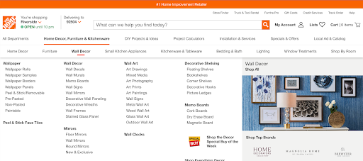
Home Depot’s site is a great example of a helpful drop-down menu style. If you’ve ever stepped foot inside one of these home improvement stores, you know the number of products and sections they have is enormous. The organization is key for these types of retailers to keep shoppers coming back and navigating both online and in-store. By strategically placing navigation link structures, such as expanded submenus, users can quickly locate desired products.
Horizontal Menu Bars
There is a way to organize your website navigation on the side of your website rather than across the top. For Forbes and other sites that use this style, users can find what they’re looking for without navigation taking up the entire page. This approach can also benefit a website redesign if your old layout wasn’t mobile-friendly or lacked intuitive navigation.

Hamburger Menu
Not to make you hungry, but the hamburger menu has quickly become one of the most common types of navigation styles for mobile devices. A horizontal menu will collapse into the 3-lined hamburger icon we’ve grown accustomed to. When screen real estate is limited on a mobile device, this icon helps users navigate a site, find what they need and return to what they were looking for with a few quick taps. It also helps maintain a clear navigation path by preventing clutter on small screens.
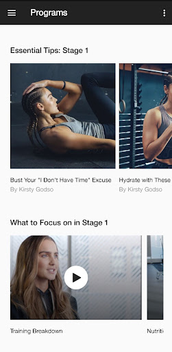
Nike’s workout mobile app makes it easy to roam around the app and get to your workout right away — either from the home page or by selecting a program or saved workout within the drop-down menu.
Footer Menu
Not everything belongs at the top of the page. Prioritization in your site navigation strategy is important. Where some of your pages are essential for UX because customers use them most often, others are not, such as your public relations pages, military discounts or career information. However, these pages do need to appear on your website for those who will use them. Introducing: the footer navigation menu.
Let’s take a look at Samsung’s website. While the banner menu bar up top has nine sections and many different subheadings, the footer has 49 — a couple that wouldn’t even fit below the fold. This comprehensive footer navigation gives users the chance to directly click on some subcategories they can find in the banner and find other pages that would not be relevant to every visitor.

8 Website Navigation Best Practices
As you can see, there are a lot of options to choose from and only one or two may be the best for your brand. Here are a few website navigation best practices to keep in mind to help you optimize your UX design. Whether you’re working on small improvements or an entire website redesign, these suggestions can prove invaluable.
1. Measure What’s Working
Taking a step back and looking at what’s already working for your website is a great place to start. While this step may not be the most technical of them all, it’s one of the most important.
Ask yourself some of these questions:
- How are users finding your site?
- Which landing pages do they arrive on?
- What keywords are attached to those landing pages?
- How long are users generally on your site?
- Where are they spending most of their time?
- Which CTA buttons are they using most?
- Where does your website rank on SERPs?
The point here is to uncover the roadblocks that are keeping your website from succeeding online. Is it easy or difficult to navigate through each page? And is your website optimized for painless crawling? Use Google Analytics to create a report on your website’s health and user patterns. Consider also integrating other tools, such as heat maps or even Google Maps listings if you have a physical location, to better understand how people interact with your content and site navigation.
2. Plan Your Website Structure
Your website visitors have something in common: They want to know what you have to offer. You can use a simple sitemap creator to mock up your website navigation so each category has its place. A cohesive navigation structure can help visitors connect the dots quickly.
Another method is called card sorting. Write down some of your navigation sections and subcategories on their own card. Ask your coworkers to come in and categorize each card under a subsection they think makes the most sense. Look for patterns and common pairings until your team can formulate the backbone of your IA. By planning effectively, you’re more likely to develop a good website navigation that supports user needs.
3. Follow Industry Standards
By doing a bit of research on your competitors in the industry, you’ll pick up on common standards and terms to use in your menu. While you’ll want to remain as loyal to your brand as possible, customers will likely have certain expectations depending on the business. Aligning with these expectations helps you develop navigation options that reflect consistent patterns and reduce confusion.
Look for where to place your menu and how to indicate its function through recognizable icons like the hamburger drop-down button. As you implement these common standards, remember that a clear navigation design helps reinforce your brand’s credibility.
4. Keep Your Menu Consistent Throughout Your Site
Whether you use a responsive menu like CNN or you provide the same menu throughout like HydroJug, make sure users know where to go no matter where they are.
Your users should never feel like they’ve gone too deep into your website’s rabbit hole without a way out. (Even Alice in Wonderland got kind of tired of the chaos and wanted to take a nap under the flowers again!) Whether you choose a hamburger drop-down or a footer navigation, on a desktop or a tablet, users should always have a way to return to where they started. Maintaining consistent labels, icons or text ensures that navigation elements feel intuitive no matter which page visitors land on.
5. Declutter
Consider the most important topics and subcategories that will help users find what they’re looking for and stick to those. Using white space here will help keep users focused on where navigation starts and ends. Lower-priority menu items could live in the footer banner to help reduce clutter in the top navigation bar as well. Keeping fewer navigation items at the top improves clarity and encourages effective navigation throughout your site.
6. Include a Search Bar
After a bit of scrolling, a user may just want to type in a keyword to find what they’re looking for. Ensure that your site has a robust search bar to make this effort as easy as possible. Usually, a search bar is found on the top right corner of a menu banner and either has a space to type right away or expands. Including this in your header navigation is often a key element of good website navigation since it provides direct access for users to quickly locate content.
7. Link Your Logo
We always need to know the way home. Not only should your logo appear in the same place across your site, but it should also be clickable as a way to get back to the home page. It’ll act as a reset button when a user has gone a little too deep into the weeds of your website. This small but significant navigation link helps maintain a seamless user journey, contributing to an overall user experience that feels natural.
8. Consider Mobile Users
Of the 331.9 million U.S. population, 85% own a smartphone. The archaic scrolling from side to side on your phone to read a single paragraph is a quick way to cause users to bounce off your site. As you evolve your website design, consider developing a specific mobile-friendly primary menu. A responsive or vertical navigation can be perfect for smaller screens, providing an easy and effective way for visitors to find what they need without unnecessary zooming or scrolling.
What Makes for a Great Navigation Menu?
Improving website usability and accessibility will take some digging and user research. The key is to always ensure that users (and SERP bots) can navigate through your site, find what they’re looking for and understand the relationship between each page. The best website navigation examples typically minimize confusion and maximize clarity.
You’ll know you’ve hit the finish line when you see conversion rates go up online and users spending more time on your site. Whether shopping or exploring, friendly guidance is appreciated and necessary. Ensuring the right balance of navigation elements, like secondary navigation or a vertical navigation layout for certain pages, can keep visitors engaged.
Website navigation can greatly improve the user experience. Although it takes a bit of work, all you need is the proper strategy. By structuring your main navigation menu and footer navigation effectively, and working in any additional tools such as breadcrumb navigation when needed, you create a cohesive environment where website users can easily find what they need.
From detailed product pages to content marketing assets, a well-thought-out navigation structure is essential for helping visitors get from point A to point B on your site without confusion.
Updated May 2025