

Image by Editor | Midjourney
While Python-based tools like Streamlit are popular for creating data dashboards, Excel remains one of the most accessible and powerful platforms for building interactive data visualizations. Using built-in Excel’s features, you can build an interactive dashboard that rivals popular data science web apps.
In this tutorial, we will show how to create an interactive data science dashboard in Excel in minutes without Streamlit. We will demonstrate using a simple e-commerce sales dataset.
Step 1: Preparing Your Dataset
We will split this step up into subcomponents and tackle each one by one.
Set Up Your Data
To set up the Excel workbook we will be using, follow these steps:
- Open a new Excel workbook
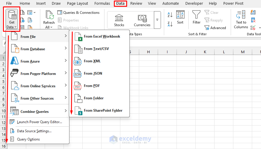
- Import your data into Excel
- Go to the Data tab >> select Get Data >> select your file type
- Perform any dataset cleaning or maintenance that may be required
Convert to Excel Table
Next, let’s convert our data to an Excel table. Tables make it easy to build formulas, PivotTables, and dynamic ranges.
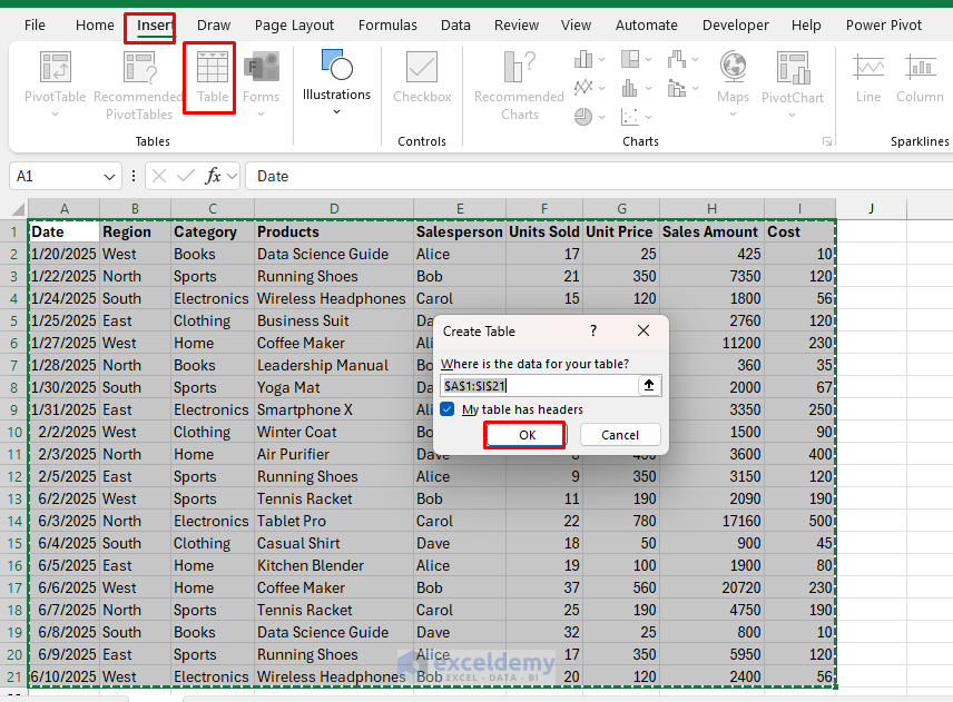
- Select your entire dataset
- Go to the Insert tab >> select Table (or press Ctrl+T)
- Ensure My table has headers is checked
- Click OK
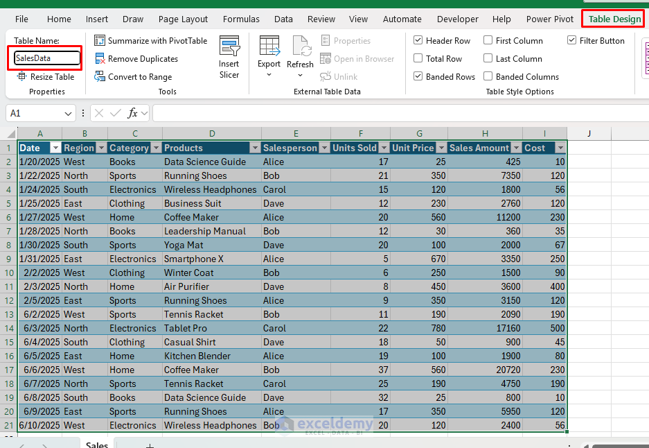
- Name your table SalesData:
- Click anywhere in the table
- Go to the Table Design tab >> select Table Name >> type SalesData
Step 2: Create Interactive Pivot Tables
Create Pivot Table:
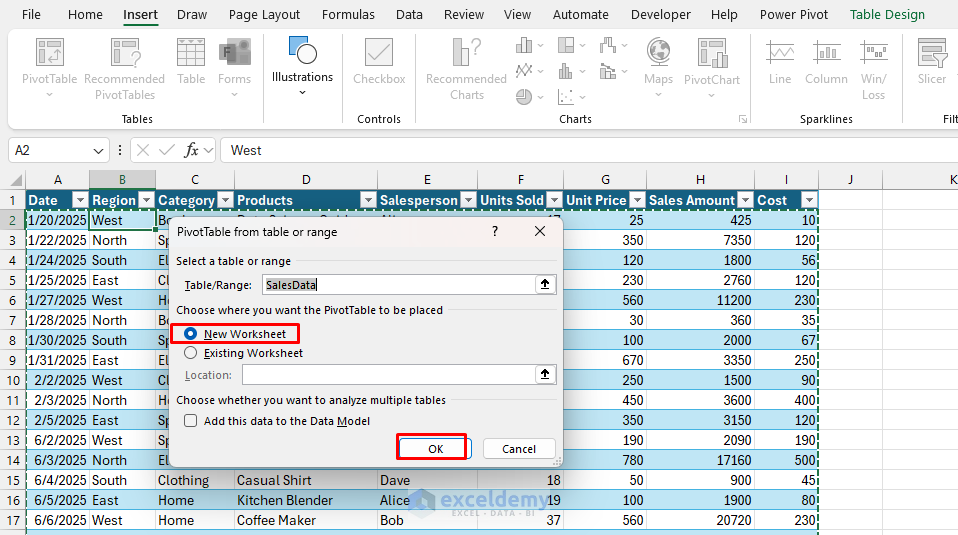
- Select any cell in the SalesData table.
- Go to the Insert tab >> select PivotTable.
- Select location: New Worksheet.
- Click OK.
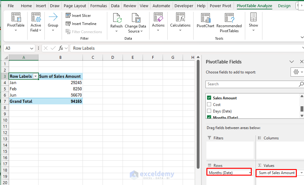
Revenue by Month:
- In the PivotTable FieldList:
- Rows: Date (group by Months).
- Values: Sales Amount.
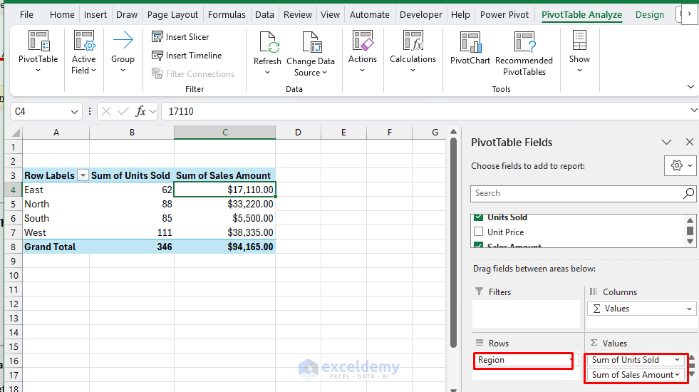
Regional Performance:
- Insert another PivotTable.
- In the PivotTable FieldList:
- Rows: Region.
- Values: Sales Amount, Units Sold.
- Format: Currency for Sales Amount.
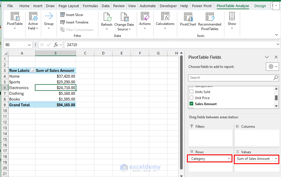
Product Category Analysis:
- Insert another PivotTable.
- In the PivotTable FieldList:
- Rows: Category.
- Values: Sales Amount.
- Sort: Descending by Sales Amount.
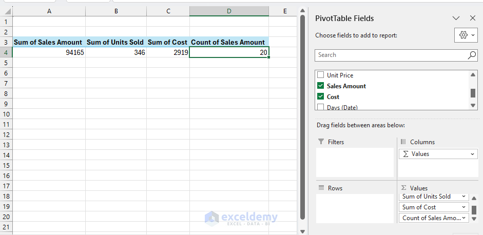
KPIs Pivot Table:
- Insert another PivotTable.
- In the PivotTable FieldList:
- Values:
- Sum of Sales Amount.
- Sum of Units Sold.
- Sum of Cost.
- Count of Sales Amount (for average calculation).
- Don’t add any Rows or Columns (this gives us totals).
Step 3: Create Dynamic Charts
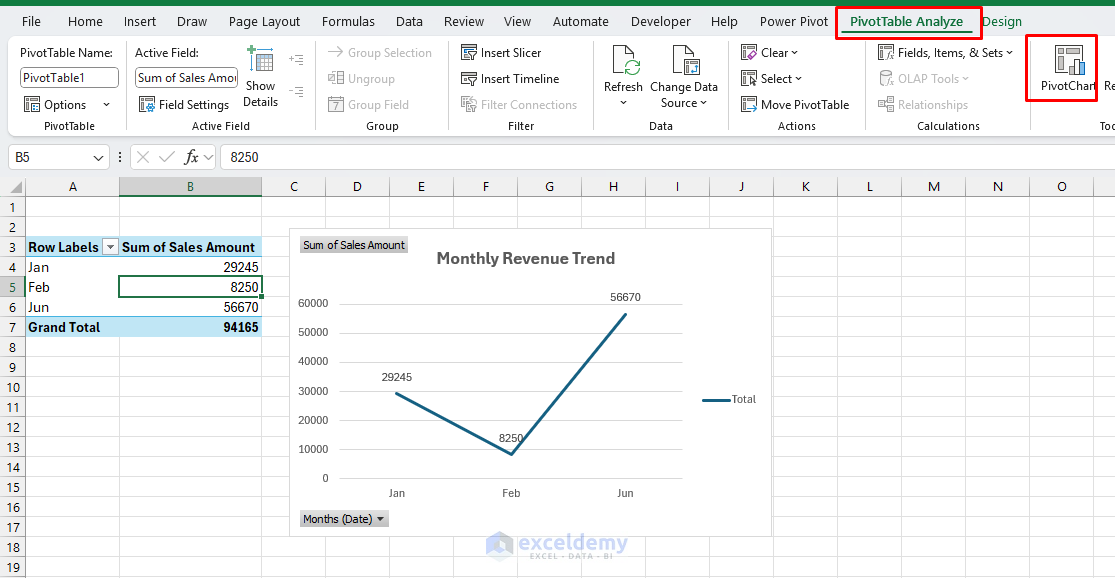
Revenue Trend Line Chart:
- Select the Monthly Revenue pivot table.
- Go to the PivotTable Analyze tab >> select Pivot Chart >> select Line Chart.
- Format the chart:
- Chart Title: Monthly Revenue Trend.
- Add data labels: Expand Chart Elements >> click Data Labels.
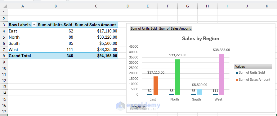
Regional Performance Column Chart
- Select the Regional pivot table.
- Go to the PivotTable Analyze tab >> select Pivot Chart >> select Clustered Column.
- Format:
- Title: Sales by Region.
- Different colors for each region.
- Data labels on top of columns.
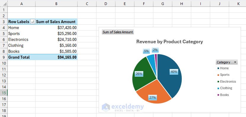
Product Category Pie Chart
- Select the Product Category pivot table.
- Go to the PivotTable Analyze tab >> select Pivot Chart >> select Pie Chart.
- Format:
- Title: Revenue by Product Category.
- Show percentages.
- Use distinct colors.
Step 4: Add Interactive Slicers
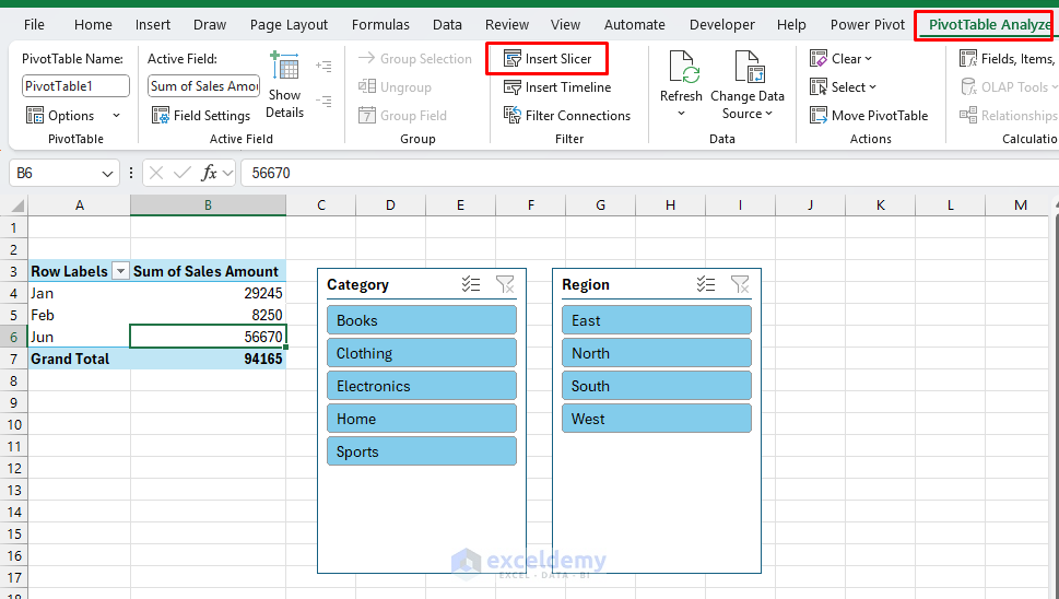
Insert Slicers:
- Click on any pivot table.
- Go to the PivotTable Analyze tab >> select Insert Slicer.
- Select these fields:
- Click OK.
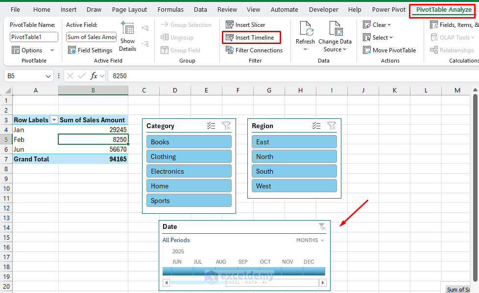
Insert Timeline:
- Click on any pivot table.
- Go to the PivotTable Analyze tab >> select Insert Timeline.
- Select Date.
- Click OK.
Connect Slicers to All Pivot Tables:
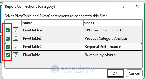
- Right-click any slicer >> select Report Connections.
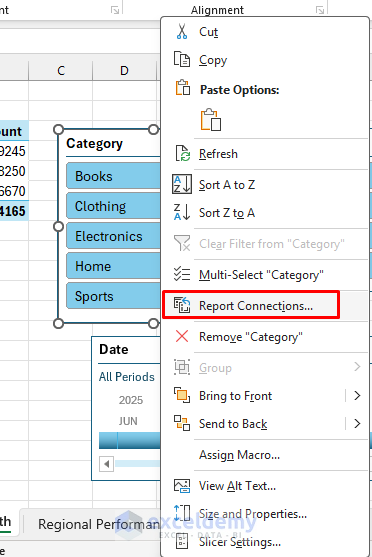
- Check all pivot tables.
- Click OK.
Repeat for each slicer to ensure they all control all charts.
Step 5: Build Dynamic KPI Cards
You can calculate KPI metrics directly in the Dashboard or later place it in the Dashboard sheet.
Now create KPIs that reference this pivot table:
Total Sales:
- Select a cell and insert the following formula.
=GETPIVOTDATA("Sum of Sales Amount",'KPIs from Pivot Table Data'!$A$3)
Average Order Value:
- Select a cell and insert the following formula.
=GETPIVOTDATA("Sum of Sales Amount",'KPIs from Pivot Table Data'!$A$3)/GETPIVOTDATA("Count of Sales Amount",'KPIs from Pivot Table Data'!$A$3)
Total Units Sold:
- Select a cell and insert the following formula.
=GETPIVOTDATA("Sum of Units Sold",'KPIs from Pivot Table Data'!$A$3)
Profit Margin %:
- Select a cell and insert the following formula.
=(GETPIVOTDATA("Sum of Sales Amount",'KPIs from Pivot Table Data'!$A$3)-GETPIVOTDATA("Sum of Cost",'KPIs from Pivot Table Data'!$A$3))/GETPIVOTDATA("Sum of Sales Amount",'KPIs from Pivot Table Data'!$A$3)
Total Order:
- Select a cell and insert the following formula.
=GETPIVOTDATA("Count of Sales Amount",'KPIs from Pivot Table Data'!$A$3)
Format KPI Cards:
- Apply borders and alignment.
- Format numbers:
- Revenue: Currency format.
- Percentage: Percentage format with 2 decimals.
- Bold the labels and add background color.
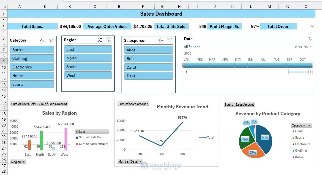
Step 6: Create the Dashboard Structure
- Create a new sheet and name it Dashboard.
- Hide Gridlines:
- Go to the View tab >> select Show >> uncheck Gridlines.
- Insert Dashboard title.
- Place KPI metrics at the top.
- Insert Slicers and a timeline.
- Place charts at the bottom.
- Insert a data table if required.
Refresh and Automate: Right-click PivotTables/Charts >> select Refresh.
Step 7: Test Your Dashboard
Functionality Tests:
- Select Books category + North region + Bob salesperson from Slicers.
- Select Jan 2025 from Timeline.
- Verify that all charts update simultaneously.
- Check that KPIs are recalculated correctly.
- Ensure no errors appear.

Troubleshoot Common Issues
- Charts Not Updating: Check slicer connections (right-click slicer > Report Connections). Ensure all pivot tables are selected.
- Formula Errors: #REF! or #VALUE! errors in KPIs. Check table references (ensure SalesData table name is correct).
- Performance Issues: Dashboard is slow to update:
- Reduce the number of pivot tables.
- Simplify complex formulas.
- Use manual calculation (Formulas > Calculation Options > Manual).
Conclusion
By following the above steps, you can create an interactive data science dashboard in Excel in minutes. These steps will help you create sophisticated dashboards that provide real business value without touching a single line of Python code. The best part is that your stakeholders can interact with and modify the dashboard themselves, making it a truly collaborative business intelligence tool.
Shamima Sultana works as a Project Manager at ExcelDemy, where she does research on Microsoft Excel and writes articles related to her work. Shamima holds a BSc in Computer Science and Engineering and has a great interest in research and development. Shamima loves to learn new things, and is trying to provide enriched quality content regarding Excel, while always trying to gather knowledge from various sources and making innovative solutions.