
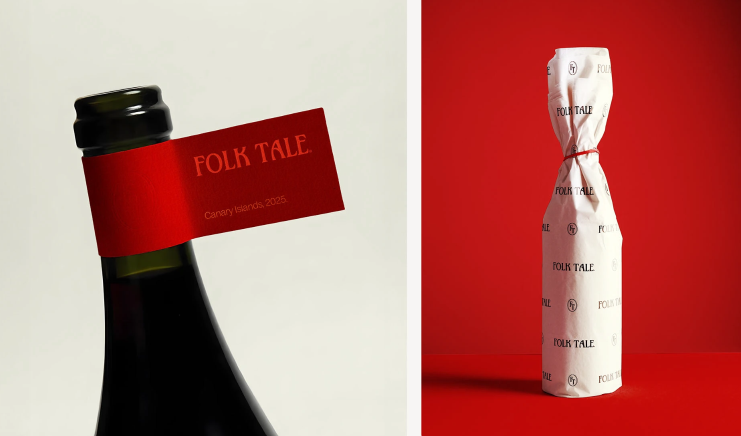
In the world of natural wines, Folk Tale stands out not just for its flavors but for its rich storytelling essence. Born in the Canary Islands and crafted for the world, each bottle is a tribute to myths and traditions, transforming every pour into a narrative experience.
Designer Tiare Payano was tasked with creating a visual identity that captures the untamed spirit of nature, culture, and heritage while ensuring global appeal. The result? A poetic, adaptable branding system where every label is a chapter, and every bottle tells a tale.
The Brief: Crafting a Brand Rooted in Storytelling
The challenge was to develop a visual identity system that embodies Folk Tale’s essence—wine as a vessel for generational stories. The design needed to resonate across international markets while maintaining a distinct, literary-inspired aesthetic.
Key objectives included:
- Embracing cultural heritage through layered narratives.
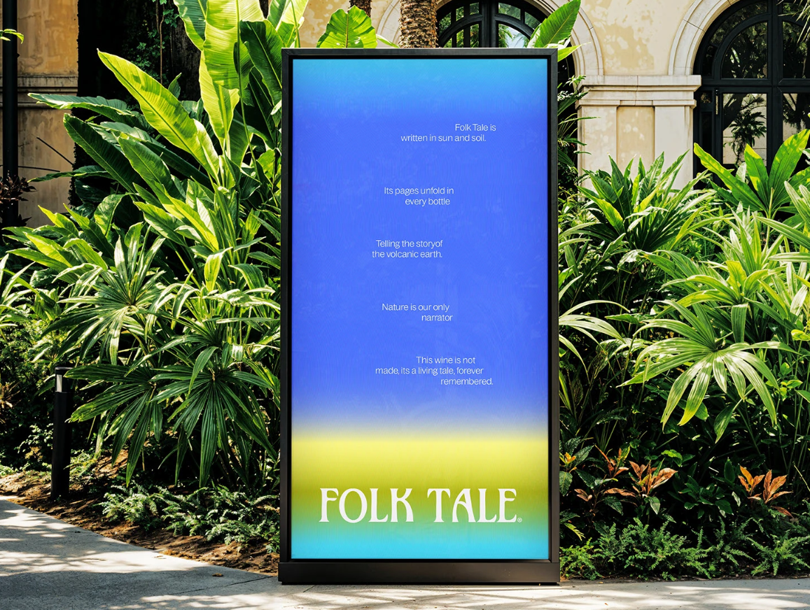
- Reflecting natural winemaking—sun, soil, and climate as key influences.
- Ensuring retail visibility in a market dominated by minimalist, white-label designs.
Nature as the Narrator: Design Inspired by the Elements
Much like winemaking itself, Folk Tale’s design is shaped by nature’s rhythms. Payano translated these organic influences into visual patterns that symbolize:
- The passage of time (fermentation as both a chemical and sensory journey).
- The sun’s movement, represented through circular motifs.
- The layered complexity of wine, mirrored in gradient designs that evoke a library of stories.
These elements ensure the brand feels timeless yet dynamic, much like the tales that inspire it.
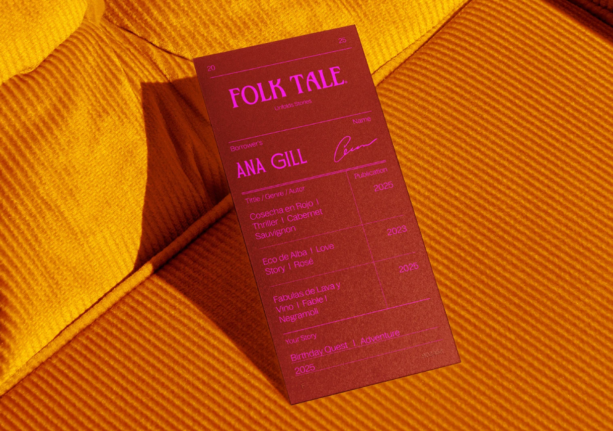
A Literary Aesthetic: Typography & Symbolism
To reinforce the storytelling theme, the design incorporates:
- A custom logo inspired by mid-century storybooks.
- A mix of Serif and Sans Serif typefaces for a balanced, literary tone.
- Circular motifs that nod to wine stains (a mark of shared moments) and the sun’s cycles.
The labels are designed like book spines, creating a cohesive yet distinct look for each varietal while ensuring standout shelf presence.
Color as Emotion: Each Wine Tells a Different Story
Every Folk Tale wine is linked to a unique narrative—whether love, adventure, mystery, or magical realism. This is reflected in a color-coded system:
- Deep reds for passion.
- Earthy greens for adventure.
- Moody purples for mystery.
This approach not only differentiates the wines but also invites consumers to craft their own stories with each sip.
Beyond Design: A Homage to Heritage & Purpose
Folk Tale is more than a brand—it’s a celebration of tradition, land, and the stories that connect us. The design doesn’t just sell wine; it preserves culture, making each bottle a bridge between past and future generations.
Final Thoughts: Why Folk Tale’s Branding Works
- Storytelling as a differentiator – In a crowded market, narrative-driven design stands out.
- Nature-inspired yet structured – The balance of organic motifs and clean typography keeps it sophisticated.
- Adaptable & ownable – The system works across varietals and markets while maintaining a distinct identity.
Folk Tale’s branding proves that great design isn’t just about aesthetics—it’s about emotion, heritage, and the magic of a well-told story.
Would you raise a glass to this design?
About the Author
