
I could debate the “timeless versus trend” pursuit for hours in home design. But where I almost always land is this philosophy: keep hard finishes (flooring, windows, tile) high quality and simple/special, and then layer on the wild style/trends (to make sure it’s not boring). This is not everyone’s pursuit, nor am I saying it’s the right/only way to go, but I don’t ever want to renovate the same house twice in one lifetime. (P.S. I love being inside a hyper on-trend time capsule of a home/restaurant when it’s well done, so if that’s you, go for it). More on that below, but to kick us off here, my brother’s house has a hilarious amount of built-in bench seats, which means as their ad hoc decorator, who is heavily invested in making this house look incredible (not just “done”), that I needed to design a lot of bench cushions. Anne Usher, the architect, designed said benches while laying out the house to add elevated architectural interest and make sure that this new build didn’t look too cheap and contractor grade, not just square rooms with four walls. Plus, all the benches have storage drawers, so they serve multiple functions. Selfishly, I just love that they give me an opportunity to add color, pattern, texture, and softness. For a big house with a lot of glass and wood, textiles become your best friend and add an incredible amount of warmth, something this house needed. Now, I could have piecemealed it together, buying fabric from a lot of different sources, which was the plan. But while at our upholsterer’s shop, picking up a piece of furniture, I saw a lot of rich cut velvety patterned samples that I LOVED. When I realized they were all from the same company, Pollack, I decided to reach out and see if we could swing a trade. This blog post wasn’t even part of the deal; I just love the fabric that much and love the female-led design-forward company even more. Such an incredible patterned fabric resource! I was so excited because, selfishly, again, it meant that I could make these rooms look even better, spread any remaining budget further, and get my hands on these truly stunning fabrics. Good design elements make me look good 🙂
Why The Odd Amount Of Excitement For Patterned Fabric?
We needed some pattern in this house. If you think I’m trend/risk adverse (which I am), you should meet my brother and SIL. To avoid “trendy hard finish regret” in 15 years, this house has a lot of pared-back elements, intentionally. All the flooring, tile, and windows are simple and high quality, which I think is a fantastic foundation for a contemporary house like theirs. This was always the plan – to layer on all the color, pattern, current style, and warmth through furniture, wallpaper, textiles, and decor. But I had a pretty strong feeling that patterned sofas or even patterned window treatments were going to be too risky for them. So what would be left? Cue the BENCH SEATS. These seats act visually as furniture (because they are big and obviously can be sat on), but they are far less risky (a few hundred dollars for a new slip cover should they really not like my choices). So I begged them for free rein here, and they let me have it, while definitely doubting some of my choices along the way. But I felt so strongly about some of the bolder ones and kept pushing and pushing, with a lot of “trust me’s!!”
I Was Greedy With Samples
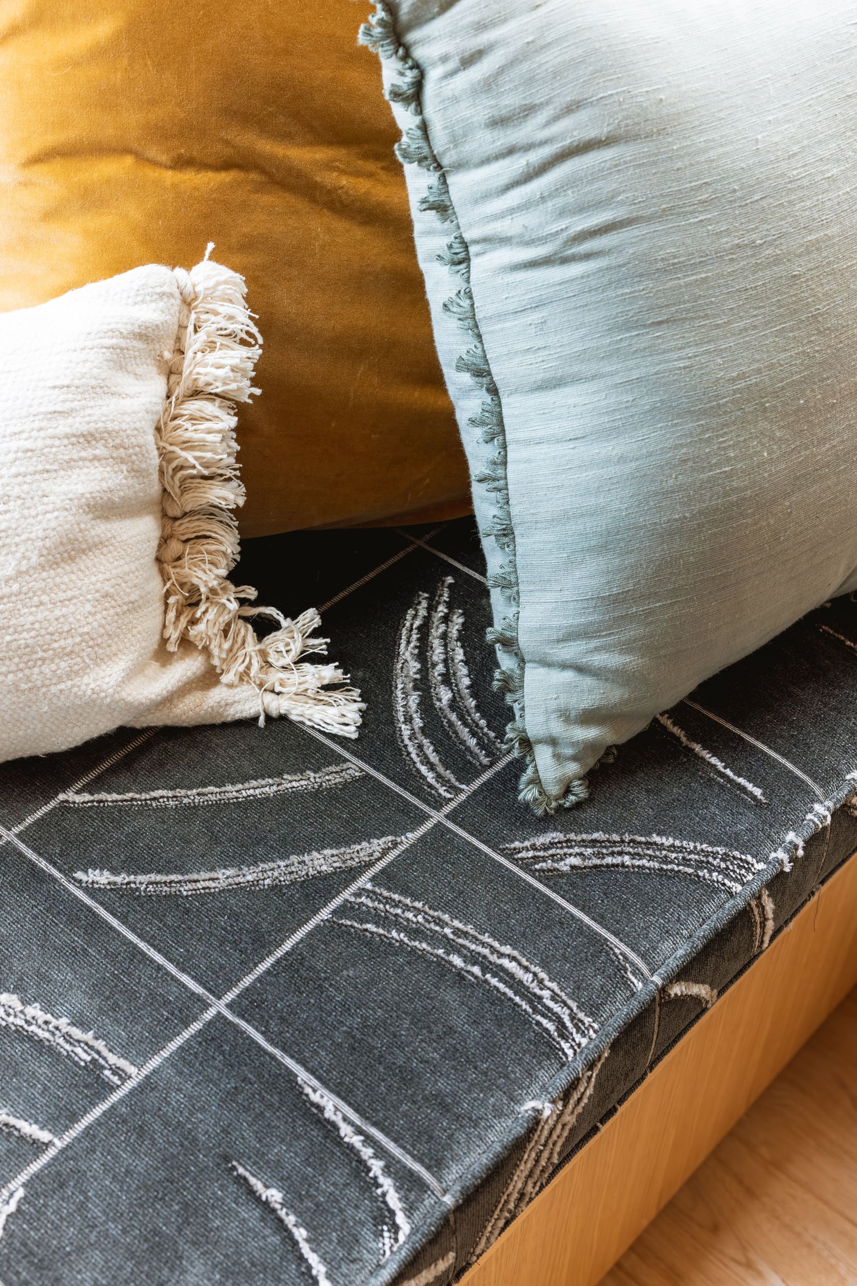
I had to request the samples, and I got so greedy. There simply aren’t that many great, weighted, patterned velvety upholstery options on the market (lots of solids, but like I said, this house needed some texture and patterns). Some of these patterns are so not typical for me, but I LOVE them. After paring them down, I took them over, and room by room we chose what would work (over time).


Phantom | Embellushed Plush


Phantom | After Hours | Ankara


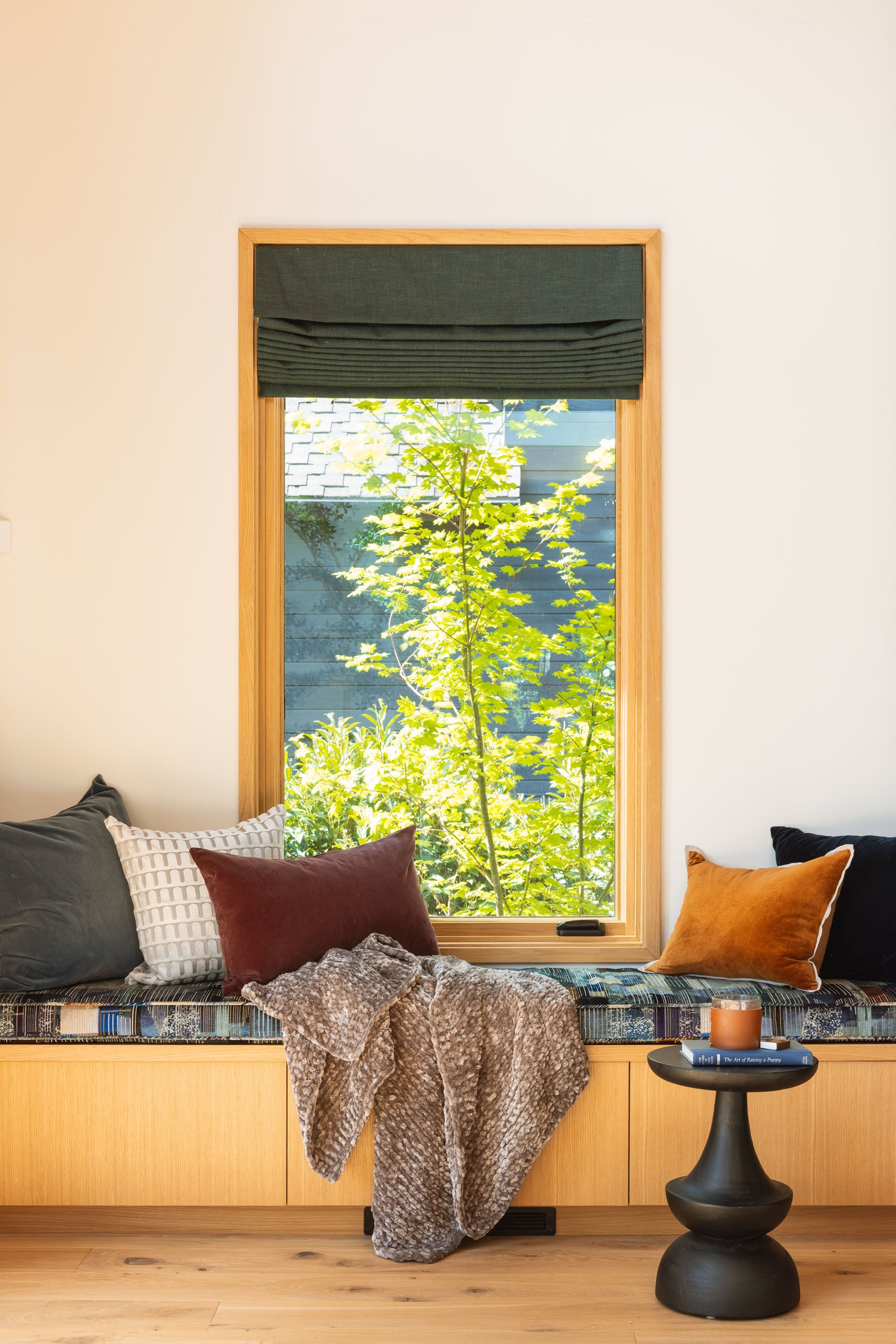
from: river house primary bedroom reveal
This is where it all started, what I was looking for the day at the upholstery shop. Boxing Day was the pattern that I thought would be perfect in their bedroom (and was the first room with benches that we completed). I loved the linear but still interesting pattern, the textural difference (cut chenille, not printed obviously), and the color palettes. I would put this on a sofa in a second – it feels both safe and special. Originally, I wanted the black taupe color-way, but they were out of stock of it, so I chose this as a backup. Turns out this one was my brother’s favorite anyway, and it’s absolutely perfect in here.


I designed the guest bedroom really fast (goodness, I love a guest bedroom), with the wall color and the bench seat being the two driving design elements. I love a warm pink with a blue (as you know), and this royal blue is so punchy and vibrant. The pattern itself has some late 80s, early 90s vibes, which scared Ken and Katie when looking at the sample. But the quality of the velvet with the raised texture and the richness of the blue makes it feel really contemporary and design-forward in the best way (they love it). It’s not risky in a big, bold, high contrast way, but it’s high impact and unexpected. They also have it in a few different colors (one chosen for the dining below, as you’ll see).
The living room fabric was the one I was going to die on the sword for. I felt with 99% assurance that it was PERFECT for this room and I wanted it so badly for them (and me). It would tie together all of the colors and tones, without being too busy, but with being unexpected and rich. All parties (even Gretchen!) besides me were doubtful and unsure it was right. I usually acquiesce to such doubt (because I usually have a lot inside me as well) and choose something everyone feels good about, but not this time. I swung this partnership; if they didn’t like it, there was no financial risk to them – just let me do it! As you know, I like a curated color palette, which is not for everyone (you do you). Because with life mess on top of everything already in a room, I find that keeping the color palette tighter makes your eyes/brain/life less chaotic. This fabric had every single color in it!! So I bullied them into letting me do it. And you guys, once you see the whole room come together, I have to hope you’ll agree with me (they do now – they LOVE it and even Gretch was like, “ok, I was wrong”). Let’s just say I made a lot of snarky, “Well, which one of us won Design Star, again?” jokes (as if that gave any sort of actual expert credentials, lol).
Now this pattern is definitely 80s leaning and contemporary, and again, in a low-quality weave, printed weirdly or in bad colors, the pattern itself could be very, very cheesy (thus the risk). But Pollack does it so perfectly, with such rich colors, high-quality velvet weaving, and with a slight shine that is anything but gaudy. It’s so beautiful, warm, and soft.

For the dining room, which you can see from the living room, of course, I wanted a color to pull your eye over there, but not to compete with the view or the fireplace. And since it’s next to the fireplace, I didn’t want anything too linear (like a stripe). So I chose the green version of the guest bedroom pattern. Again, it’s a pattern and texture (the white part is raised) while not being busy or loud. Once layered with pillows, it’s just so warm and inviting. I also wanted something not too light in here (and the whole house really) since kids live here and I don’t trust their marinara-covered fingers 😉

In the family room, I introduced a different color that works holistically in the house and contrasts with all the blues and greens so well – this “aubergine” which could also be called burgundy or wine. The wall color is that incredible Evergreen Fog, and the sofa is in a mink velvet, part of our upcoming collection (ahem… if you are reading this super closely you deserve an easter egg :)) I wanted to shake it up and not just do another neutral or blue/green and the pops of this rich warm tone is incredible in here. It really goes to show that sometimes it’s not the color, it’s the quality of the piece and the richness of the color that makes something. What I mean by that is I wouldn’t have chosen any burgundy cotton or linen in here, but this burgundy with the cream contrasting weave added the perfect darkness with hits of lightness. It’s linear, but again not just a stripe. This allowed us to really expand our color palette in here, and I’m pretty dang obsessed with how it turned out.
Now, Pollack is “trade only”, which means that consumers can’t go to JoAnnes (RIP) to buy it. It is mostly for custom furniture pieces, so if you are in Portland, you can go to Alexander Matthews. I don’t even have a resale license anymore (because I don’t have typical paying “clients”), so if you don’t have a designer, I found a few websites that carry them. They are a boutique design company that’s known for its wide-ranging textile collection that is marked by sophisticated design, intricate construction, and nuanced color palettes so they do have a higher price point ($100 – $300/yard). But of course high-quality design and construction simply cost more, and the knock-offs of these patterns are not going to have the same appeal. They also use the top weaving mills in the world which we can see and feel. So if you are looking for incredibly special fabrics, I can’t recommend Pollack enough. Can’t wait to show you the rest of the house! xx
*Photos by Kaitlin Green