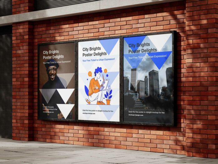
Advertising posters are everywhere—bus stops, subway walls, billboards—fighting for a split second of your attention. While posters remain a powerful communication tool, their sheer abundance forces brands to get creative to stand out. The challenge? Capture attention instantly while delivering a clear, compelling message.
So, how do you design a poster that breaks through the noise? Here are 11 key strategies to create a visually striking and effective poster.
1. Define Your Marketing Goals Before Designing
A successful poster starts with a clear objective. Ask yourself:
Who is your target audience?
- Study their preferences—but avoid stereotypes (e.g., pink isn’t mandatory for female audiences).
- Align design aesthetics with their tastes.
What tone should you use?
- Humorous, edgy, or serious? Match your brand voice while staying engaging.
What are you promoting?
- A product launch, event, or sale? Tailor content and design accordingly.
Where will it be displayed?
- Billboards, social media, or street marketing? Adapt the format for each medium.
Answering these ensures your poster is on-brand, audience-focused, and purpose-driven.
2. Prioritize Key Information
Less is more. Include only essentials:
- Logo
- A catchy slogan
- Minimal, impactful text
- A high-quality visual
Avoid clutter—use size, color, and positioning to highlight key elements (e.g., promotions or calls to action).
3. Choose the Right Poster Format
Size matters. Consider:
- Bus stop ads vs. window posters vs. large billboards
- Placement constraints (e.g., a banner partially hidden in a store).
Pro tip: Work with a professional designer to avoid post-print regrets.
4. Select a Striking Visu
Your image is the poster’s backbone. Test it:
- Remove text and logo—if the message still reads, you’ve nailed it.
- Use photos, illustrations, or icons that reflect your brand and stick in memory.
5. Craft a Memorable Slogan
A sharp tagline should:
- Be concise and catchy (think Nike’s “Just Do It”).
- Work across all mediums (posters, social media, radio).
“If your headline doesn’t sell, you’ve wasted 90% of your budget.”
—David Ogilvy, advertising legend
6. Follow the “Z-Pattern” Eye Flow
Western audiences scan posters in a Z-shaped path:
- Top-left → Top-right
- Diagonally to bottom-left → Bottom-right
Design tips:
- Place critical info (e.g., logo) in the bottom-right.
- Avoid clutter in the center.
- Never use outward-pointing arrows—they divert attention.
7. Use Leading Lines for Focus
Lines and perspectives guide the viewer’s eye:
- Diagonal lines create dynamism.
- Foreground elements (even if off-center) grab attention first.
8. Pick a Strategic Color Palette
Colors shape perception. Best practices:
- Stick to 2–3 colors (too many = visual chaos).
- Align with brand colors.
- Use tools like Coolors.co for harmonious palettes.
9. Optimize Typography for Readability
Fonts should be:
- Limited (2–3 max).
- Legible (avoid overly decorative fonts).
- Hierarchical (e.g., bold for headlines, simple for body text).
10. Test for Clarity
Before printing:
- Can the message be understood at a glance?
- Is the call-to-action unmissable?
11. Work with a Professional Designer
For a polished result, collaborate with experts. Platforms like 99designs or Behance connect you with top talent.
Final Thought: Simplicity Wins
A great poster balances creativity and clarity. By focusing on hierarchy, visuals, and audience needs, yours will cut through the noise—and leave a lasting impression.

