
Hello Robo is a New York based digital product design agency that turns complex technology into intuitive, usable interfaces. We work with forward-thinking teams to create market-ready digital products that are easy to use and hard to ignore.
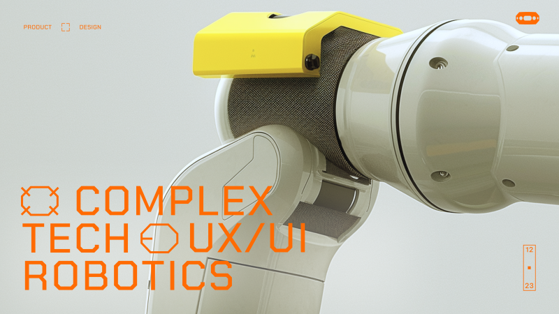
Earlier this year, the design team at Hello Robo decided to update our brand and website site to speak the language of our current clients — AI, space, aviation, and robotics — after realizing the old, “startup-y” look sold us short.
The new design and copy showcase our ability to tame complex systems with clear thinking and precise interfaces, signaling to deep-tech teams that we understand their world and can make their products make sense.
We wanted our site to do only 2 things but well:
- Have the design language to appeal to our existing and new target clients
- Most of our work is not allowed to be shared. Our second goal was to let design, motion and interaction give our visitors a sense of what we are great at.
Research
Before we sketching a single screen, our design lead on this project Daria Krauskopf, did what we do before we starting any project at Hello Robo. She decided to talk with our customers. We asked every existing client two questions:
- What do you think we do?
- What’s one thing you think we’re absolutely great at?
The replies were almost word-for-word:
“You do excellent product design—not crazy, unachievable vision design, and not MVPs either. You’re absolutely great at taking complex, technical systems and turning them into beautiful interfaces that our users actually love to use.”
That became the foundation for how we approached the new site.
Design & Art Direction
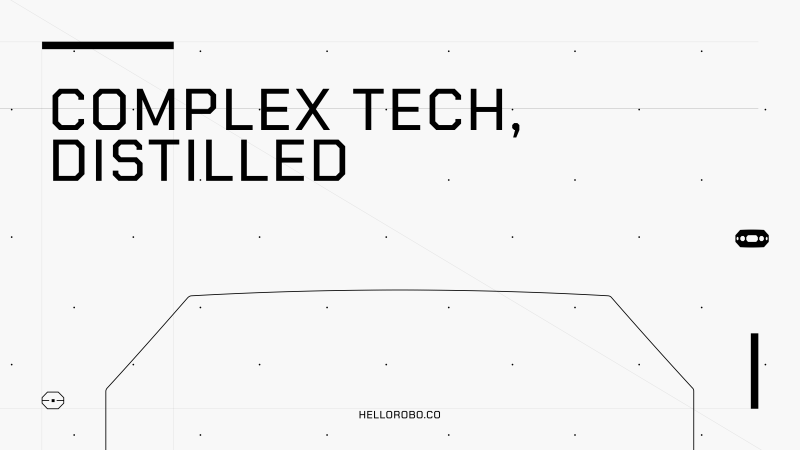
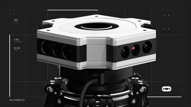
We love robots—and robotics inspires everything we do. For the new site, we moved away from soft colors and rounded corners and leaned into a more hi-tech visual language: dark backgrounds, thin lines, sharper shapes. Daria wanted the design to feel more precise, more engineered—something that would resonate with the kind of clients we work with in aviation, robotics, and defense. Every visual choice was about clarity, control, and intention.
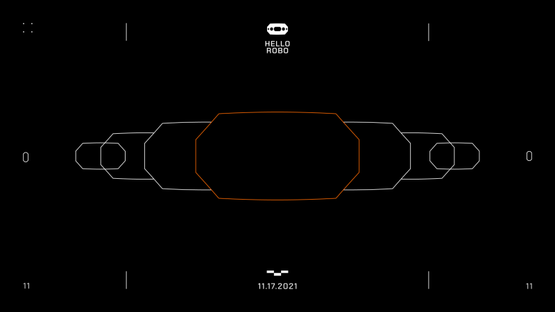
A few boards from Hello Robo new brand, reimagined by our design Hanna Shpak
Animation and Interaction
All of our interface work is rooted in interaction and motion—because real-world products aren’t static. They always change and respond to users input and actions. We wanted the site to reflect that. Not with flashy effects or distracting transitions, but with just enough subtle animation to guide, respond, and feel alive. Everything moves with purpose—quiet, responsive, and smooth.
Case Studies
We didn’t want our case studies to be just a scroll of pretty images. Each one is built as a story—showing not just what we made, but how it worked and why it mattered. We walk through key features, the thinking behind UX decisions, and the problems we solved for each client. It’s less about showing off visuals, and more about showing how we think.
Final words
In the end, we got what we set out to build: a clearer visual and verbal language that reflects who we are and who we work with. The site feels more aligned with the complexity and ambition of our clients—and with the way we approach design: thoughtful, precise, and grounded in real product work. It’s not trying to impress with noise. It’s built to resonate with the kind of teams who care about clarity, systems, and getting things right.
Credits
Web designer: Daria Krauskopf
Brand design: Hanna Shpak
UX design: Vlad Duhnov
Webflow development: Miron Umantsev
Design director: Shakir Dzheyranov