As a lover of all things pattern and color in interior design, I’m most often asked for decorating advice and help from the people in my life who have neutral homes. The most common complaint I get hit with that I’m enlisted to help solve is: How do I make my room interesting? It would be easy to tell them just to add some color or fun art or pattern, but that’s not really what they’re looking for. So, I did the work for those in my life and readers of this blog to unlock the one thing I think every *good* neutral room sports: quiet pattern. Look, I’m not here to try to convince anyone that they need to colorblock and pattern-drench their home in the name of “interesting;” rather, I’m here to help explore what makes a warm, welcoming, interesting room, whether that’s a colorful *or* neutral space.
For some reason, when designing with neutrals, non-professionals and enthusiasts tend to overlook how much impact can be added to their space with some pattern, all while not amping up the energy, the key is the “quiet” part of the equation.
So, what exactly is a quiet pattern? Well, it’s a pattern that isn’t loud (obviously). It’s either subtle and neutral in color or created simply out of texture rather than contrast. It can come into play through building materials (like the image from 1stDibs below), or via fabrics, textiles, and furnishings in a space.
Let’s take a look at this image above I found through the 1stDibs account. It was designed by Nina Farmer and is a perfect example of the magic of “quiet patterns.” It’s a room that feels so alive, so complex, yet devoid of any non-neutral colors from this vantage point besides the rust vase and the artwork. Interest comes through via the texture and “pattern” of the brick fireplace, the wall paneling, the edged rounded square on the surface of the coffee table, the neutral plaid on the sofa fabric, and even the heavy texture of the rug.
Here are a few more all-around examples, plucked from the EHD archive:
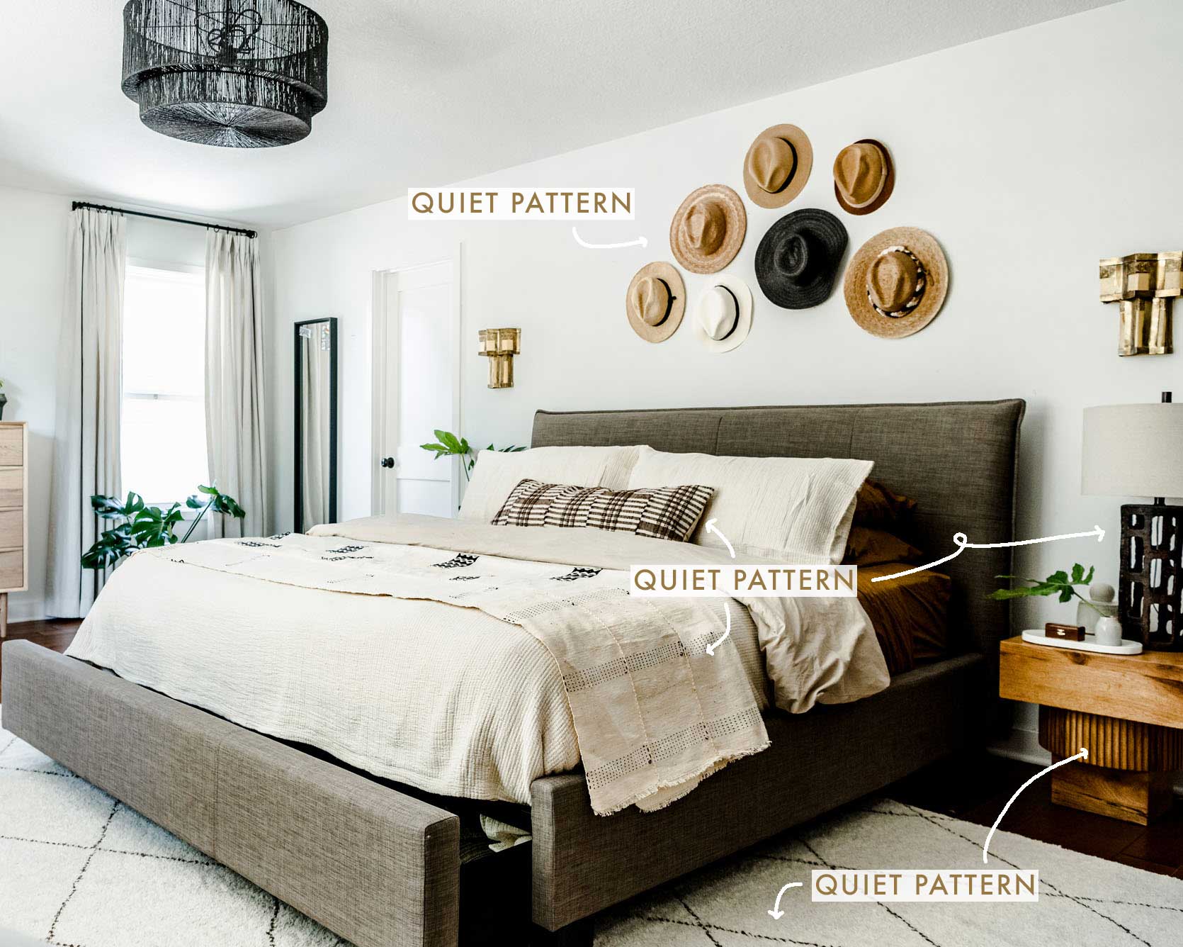
While that Nina Farmer image above was jam-packed with “quiet pattern,” sometimes, all you need is one or two injections of it to deliver a homey vibe to an otherwise stripped back room, like the Portland Project primary bedroom above. Without the hushed pattern of the bedspread (and even the speckling of the rug), it may have felt a bit too one-note.
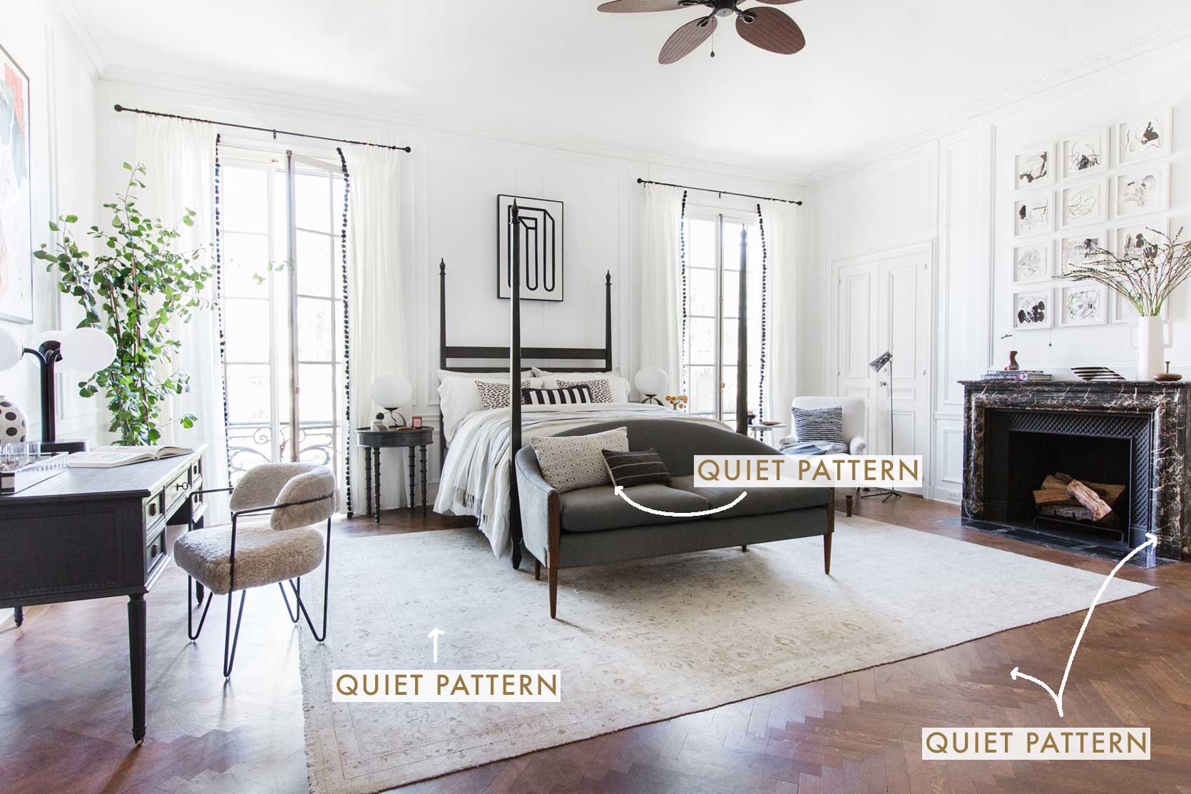
Throwing it all the way back to the Sotheby’s Parisian suite for those that have been around for over a decade. There’s a lot of contrast in this black-and-white boudoir, which certainly helps, but the quiet pattern moments just bring it home, including the herringbone floor, the hushed design on the rug and other textiles, and even the marbling of the fireplace surround.
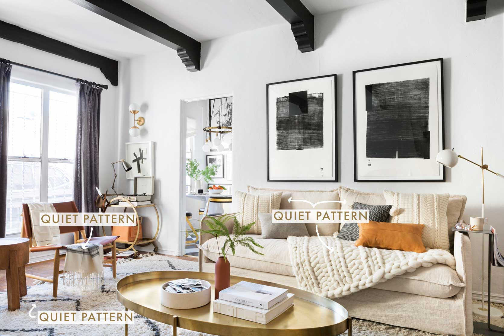
EHD alum Brady Tolbert is the kind of quiet pattern and interesting neutral rooms. Here in his previous living room, texture drives a lot of the interest, but the patterns created by said texture in the throw pillows and blanket bring in that movement and distinct punch that only pattern can deliver. The chevron of the shag rug, stripes of the side chair throw blanket and a few other details complete the story.
This bedroom by our stylist buddy Lea Johnson showcases some different quiet pattern moments to consider as well, including the pattern created by the table lamp, and even the fluting in the nightstand.
Alright, now that we’ve established what “quiet patterns” are and seen them in action in neutral rooms, let’s break down each element further and do a little shopping.
Quiet Pattern Detail #1: Rugs
One of the loudest ways to bring in quiet pattern (ha) is via a rug. It’s a large stretch of floor space that tends to be very grounding to a room. It can easily be a one-and-done situation if you don’t want to think too much about any other quiet pattern element in your room.
Case in point, this beautiful entryway (or possibly hallway?) by Studio Lifestyle. If you take your hand and cover up the rug, it’s still a stunning room, of course, but you can see how much life and warmth is introduced when you move your hand away and re-reveal the rug.
Another one from our friend Brady, this time of his current home (I believe he has since restyled, but it wouldn’t be Brady if his home weren’t in constant creative motion). I love this example because of the dual pile rug that creates a checkerboard. No other color is needed to make the pattern, but it adds so much interest without stealing the show from anything else.
Even more subtle is this rug in a very monotone room, by Rob Johansen. The maze-like motif at floor level breaks through the nearly entirely cream color palette. Genius (like that wildly interesting sofa that I’m sure costs more than what my husband and I collectively owed in student loans at the end of our college careers).
Now, some shoppable picks at a variety of price points:
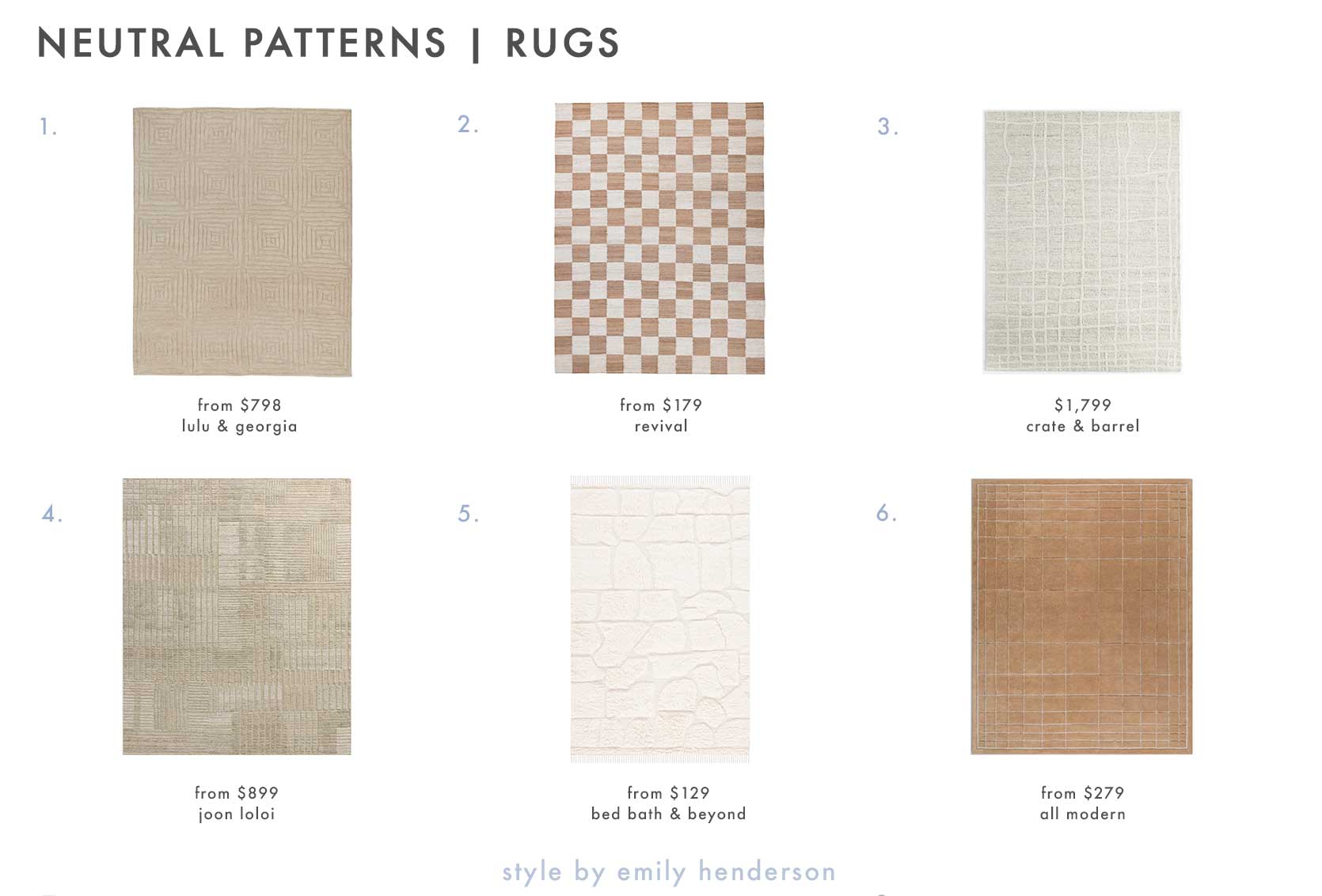
1. Metz Hand-Knotted Wool Rug | 2. Checkered Hart Jute Rug | 3. Agen Wool Handwoven Grid Ivory Area Rug – 8’x10′ | 4. Barlow Hand-Knotted Rug | 5. SAFAVIEH Handmade Kenya Pisti Southwestern Wool Rug | 6. Mallory Hand Tufted Area Rug
Quiet Pattern Detail #2: Curtains
I love a good rug, but perhaps my favorite way to bring in some quiet pattern is via the window. It’s one of those more unexpected moments I find so interesting. Even something as simple as a barely-there pinstripe can make you take notice.
I’m not sure why, but this little vignette is so charming to me. The way warm sunlight filters through a wispy, whispering, patterned curtain feels like magic. Thank you, Husband Wife for the moment of visual relief.
Amber Lewis of Amber Interiors is a virtuoso of warm neutral spaces, and she utilizes quiet pattern like a master baker uses sourdough starter: it would be good bread made with yeast instead, but man, is it special this way. For the sake of this room to finish the analogy, the dining area wouldn’t lack any beauty if the curtains were just solid beige, but the block print just takes it to the next level.
A punchy yet neutral nursery by Mindy Gayer Design checks a lot of “quiet pattern” boxes here, but I just love the curtains against the wallpaper. Sweet (and cool).
Here are a few of my favorite neutral patterned curtains (yup, even a pair from IKEA that’s about $20 a panel):
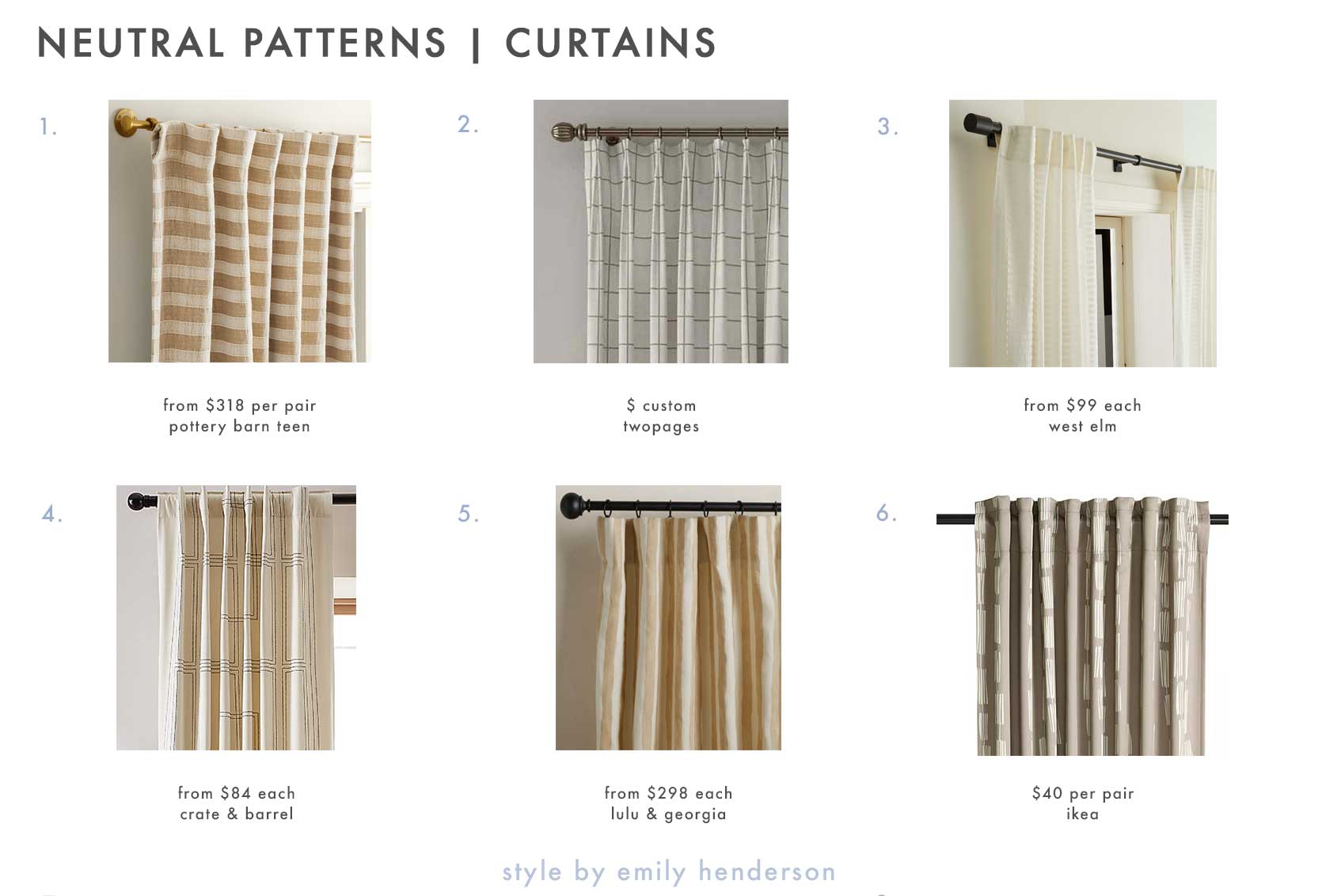
1. Heritage Strip Blackout Curtain, Set of 2 | 2. Stefana Silber Print Linen Blend Curtain Drapery Pleated | 3. Linen Cotton Ladder Sheer Curtain | 4. Embroidered Craftsman Ivory/Midnight Navy Organic Cotton Sateen Window Curtain Panel | 5. Painterly Stripe Linen Curtain Panel by Sarah Sherman Samuel | 6. HÄCKBERBERIS Room Darkening Curtains – 1 Pair 50″x98″
Quiet Pattern Detail #3: Wallpaper
Em’s farmhouse loves a quiet pattern wallpaper moment (remember this post??), and to me, it packs a very similar punch as a rug. Big area cover = big results.
Another one by Mindy Gayer (who did the previously shown nursery). There’s a bit more color in here thanks to the green upholstered bench, but to my eye, it’s still a neutral space made charming through a quiet wallpaper.
A bit more formal is this dining room by Lilly Taylor Interiors that introduces movement through the fern print on the walls.
And again by Lilly Taylor Interiors. I love a window seat moment in general, but I’m particularly smitten by this one due in large part to the wallpaper.
A polka dot will never not be the right choice for a room, as proven here by Rita Konig.
Below, you’ll find some picks for your walls, including #3 which is in Emily’s entryway.
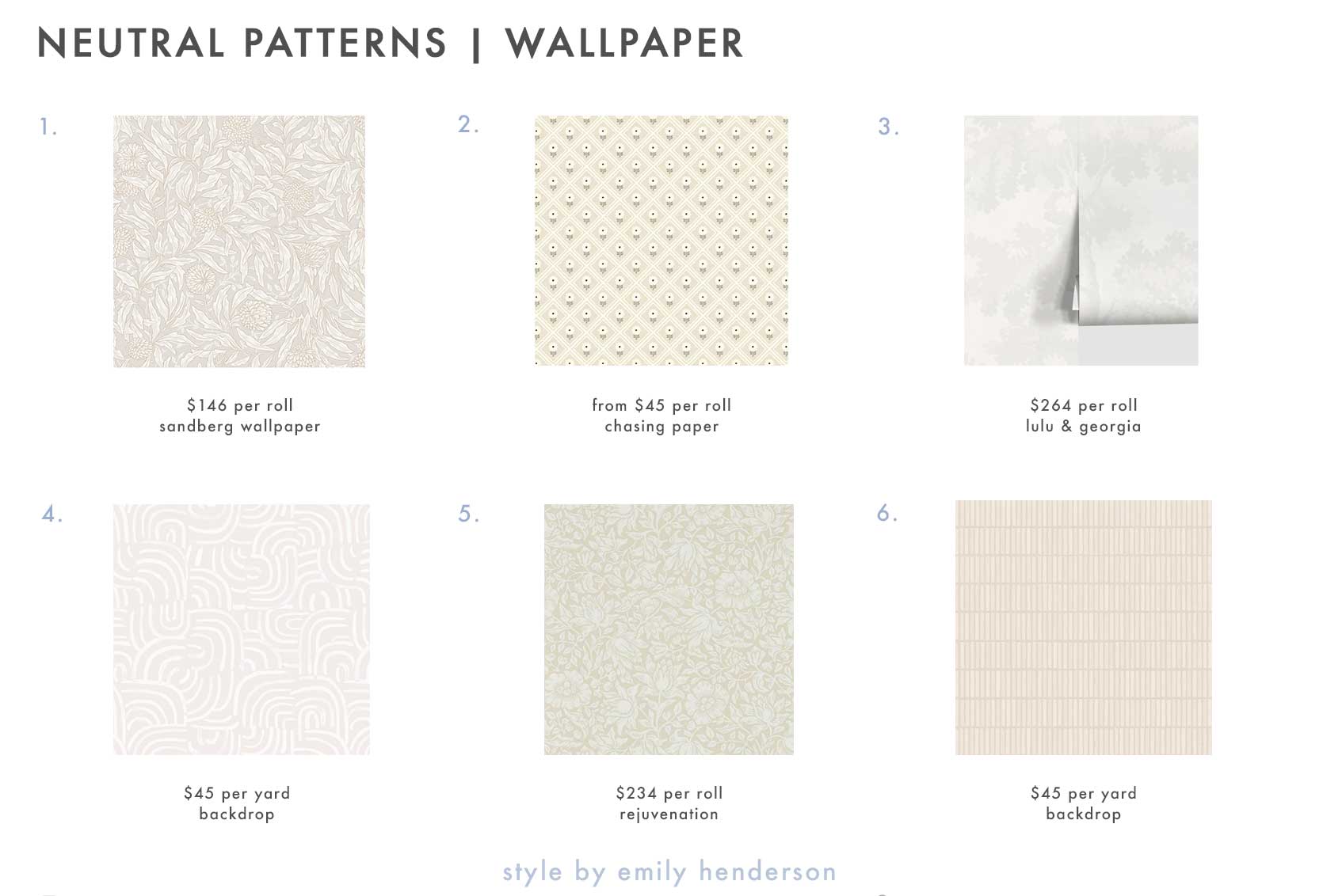
1. Olof, Sandstone | 2. Dahlia Peel-and-Stick Wallpaper | 3. Raphael Wallpaper by Scalamandre | 4. New Beat in Light Beige | 5. Mallow Morris & Co. Wallpaper | 6. Wabi-Sabi in Light Beige
Quiet Pattern Detail #4: Pillows & Throws
Want the smallest commitment in the quiet pattern arena? Pillows and throws, my friend. Typically affordable, easy to play around with, and still impactful for sure.
Okay, this is technically a bedspread, but it’s still in throw territory, so I’m gonna let it slide (same with the next image). While a distinct, high-contrast stripe maybe isn’t so “quiet” to most of us here, it’s still a neutral pattern, and in my eyes, gives the same energy: adds interest and movement without injecting any overbearing noise or color.
Wow, does Husband Wife know how to pack a wallop with just a few key elements. Never have I ever needed a crocheted blanket or bedspread, but well, now perhaps I do??
The pattern mixing between the throw pillows and the sofa upholstery is fabulous (the room was shot by Nicole Frazen for Space Exploration).
I found it much easier to find pillows and throws in the very trendy “warm neutral” color palette or darker creams, beiges and even brown-toned mustards, but I plucked a few cooler neutral picks for anyone in that side of the neutral spectrum:
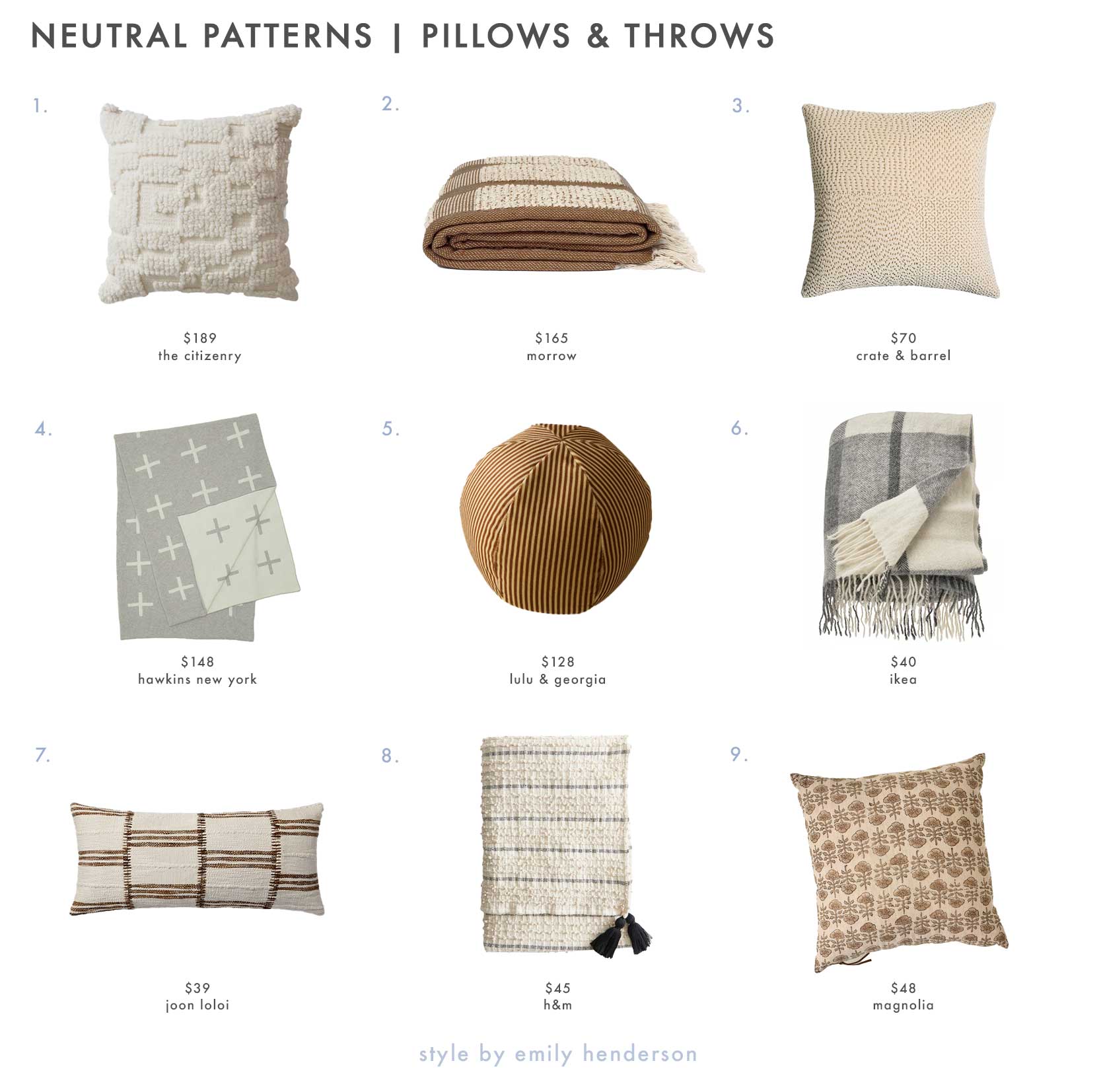
1. Lola Pillow | 2. Luella Throw Blanket | 3. Sashiko Organic Cotton Velvet 20″x20″ Travertine Beige Throw Pillow with Feather Insert | 4. Cross Knit Throw | 5. Striped Velvet Ball Pillow by Sarah Sherman Samuel | 6. Myrull Throw, Light Gray, 51″x67″ | 7. Paccia Pillow Ivory Brown 12″x27″ | 8. Cotton Throw with Tassels | 9. Flora Natural Printed Pillow
Quiet Pattern Detail #5: Furniture
And finally, we’ve reached furniture! This is the least obvious detail of all the quiet pattern moments, but I find it to be the most interesting. If you’re wondering how furniture (besides upholstery) can be a pop of pattern, read on.
Prime example: burlwood veneer. A heavy wood grain on any casegood, particularly burlwood like on this cabinet in a catalog shot by Jenni Kayne Home, is a gorgeous way to introduce pattern with more sleight of hand.
This squiggle metal furniture was made famous by Design Frères (it’s the Méandre design). You can see a similar table in this room by Nate Berkus and Jeremiah Brent, shot by Nicole Frazen.
Here is the chair version of that stool (first slide only). The soft, wavy pattern created by the metalwork pulls a lot of weight to inject personality into the vignette.
And yes, of course, upholstery in a hushed print—like this buffalo check bench in a room by Kelly Bergin Design—is a surefire way to bring home that quiet pattern requirement of an interesting neutral room.
From sofas to benches to dining chairs and casegoods, here are some gorgeous “patterned” furniture picks for your perusal:
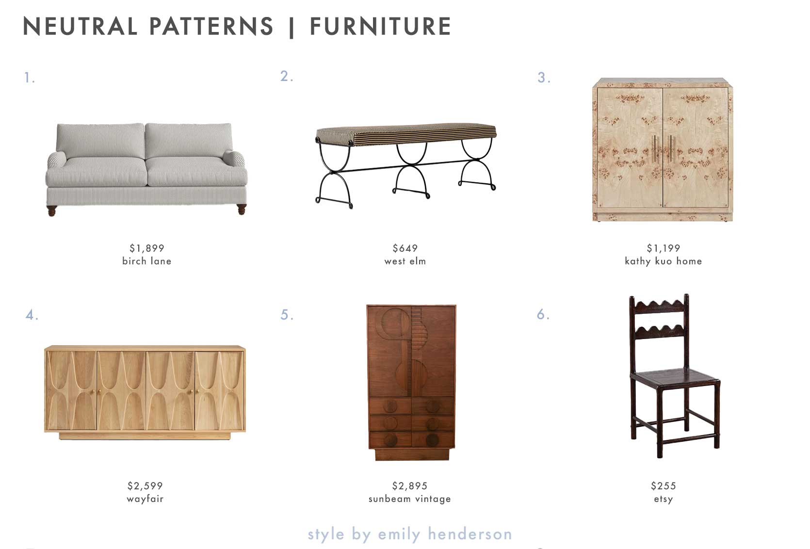
1. Walters 82” Upholstered Sofa | 2. Pierce & Ward Iron Bench | 3. Briella Modern Classic Light Brown Burl Wood 2 Door Sideboard | 4. Myers 72” Sideboard | 5. Xavier Brutalist Armoire – Vintage | 6. Tarang Dining Chair
—
I hope by this point, you feel good and confident about how to bring a neutral space to life. Of course, there are many other factors (varied tones and textures being paramount), but this is one talking point I find that is often overlooked and simply not talked about. If colorful rooms aren’t quite you but minimal neutral rooms have never hit the spot, perhaps this post is a guided path to something more in your lane.
Until next time, friends…
Opening Image Credits: Design by Emily Henderson Design | Photo by Tessa Neustadt | From: Staging my Dream Parisian Hotel Suite with Sothebys