
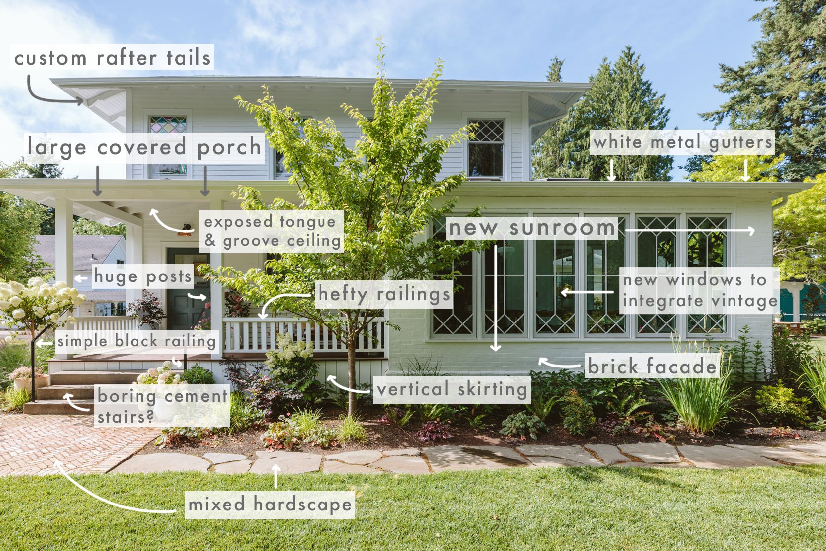
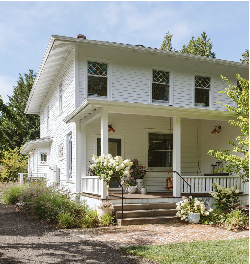
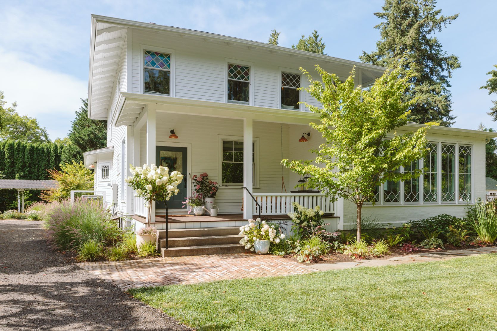
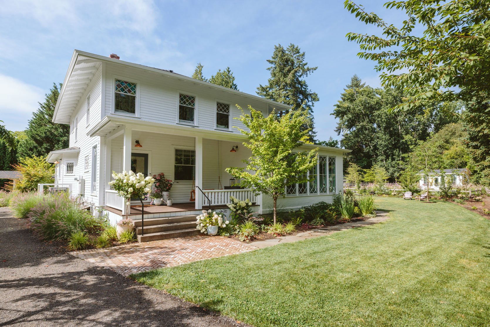
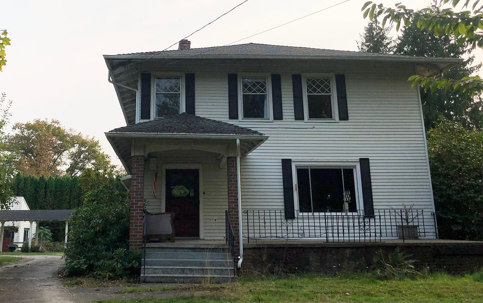
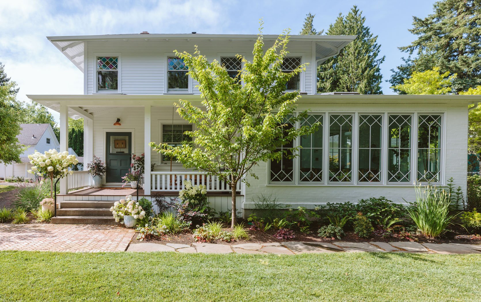
The other day I realized I’ve never shown you the full front of the house – nor did you get the play-by-play of the 10 million decisions we made to get here (a huge shout-out to ARCIFORM – my goodness, do they know how to nail classic design so well). Every time I drive up, or anyone does, really, it’s hard not to be impressed with how truly pretty this view is (far more of a grownup house than I ever imagined I’d own). But it wasn’t always beautiful or charming. Like many 100-year-old houses, it started simple/basic, then over the years people made repairs and judgment calls – both good and bad. So today I’m very excited to walk you through what it looked like when we bought it, what we did to it to make it this classic, charming home we have now (PLUS, what two things I have yet to add to it when the budget magically arrives, lol).
These were all of the things we knew needed some help with the house and curb appeal…
…and these were all of the things we did to achieve that:) Now, come read alllll about it!
The Addition – A New Sunroom
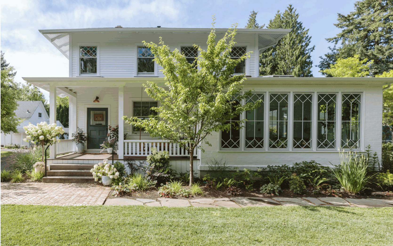
First things first, ARCIFORM designed my beloved sunroom to help the house look like it had a wraparound covered porch. It looks incredibly original. Thank you, Anne! The house was totally fine, a classic 4-square (where the main living areas are on the first floor, all bedrooms above). Of course, they had added a wing in the 60s, so already that style had changed, but the addition of the sunroom created the sense of this wraparound porch, which just added so much charm.
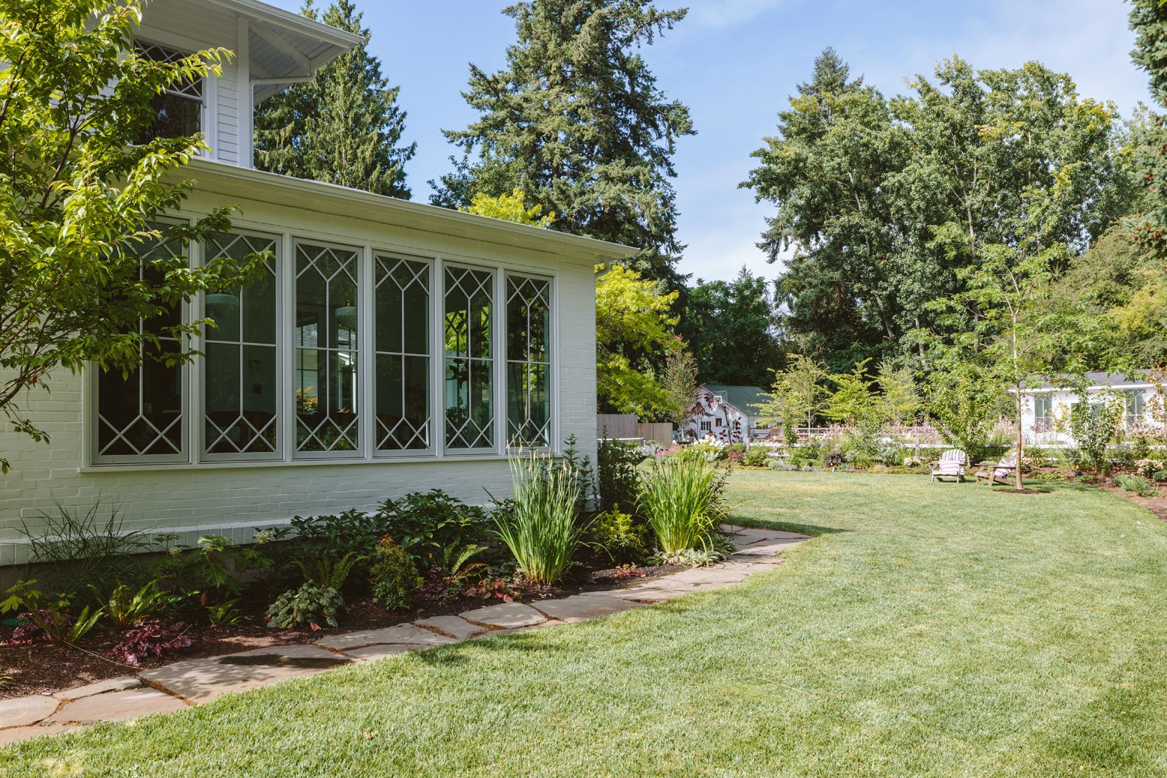
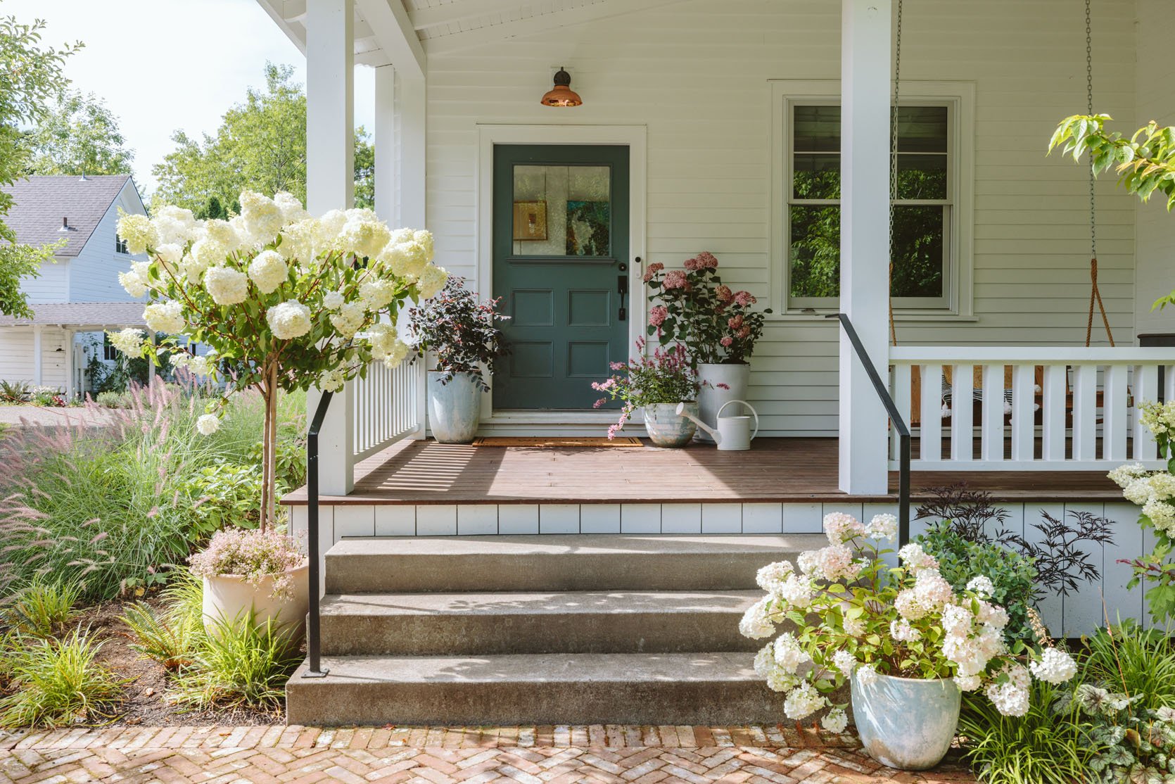
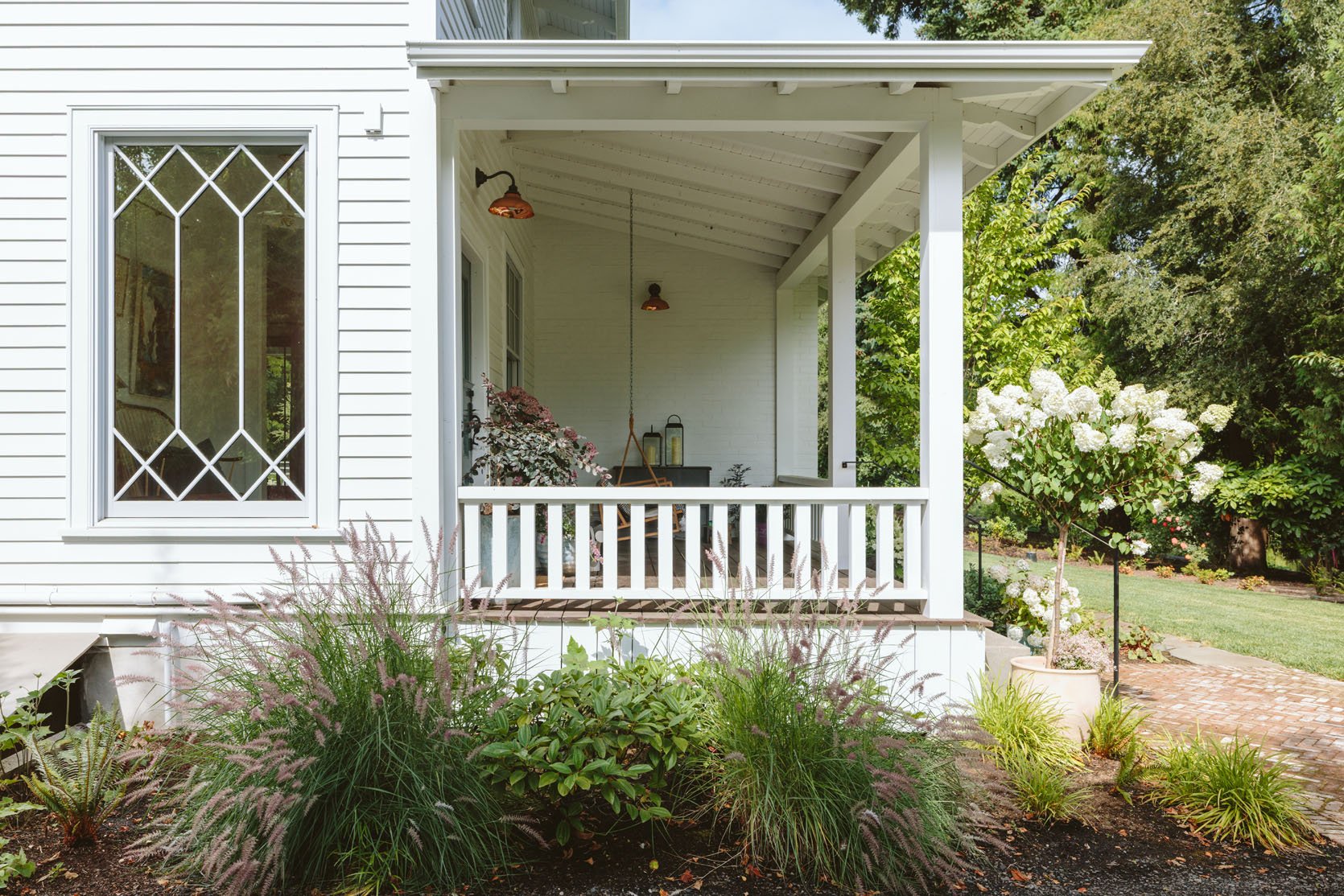
I designed the sunroom windows to marry the original diamond windows (upstairs) with the newer classic grid. The only reason we didn’t do all the new windows like this was due to design and budget constraints. The sunroom windows are absolutely gorgeous, IMHO, and so having these and the entry window be custom-made felt like the right move.
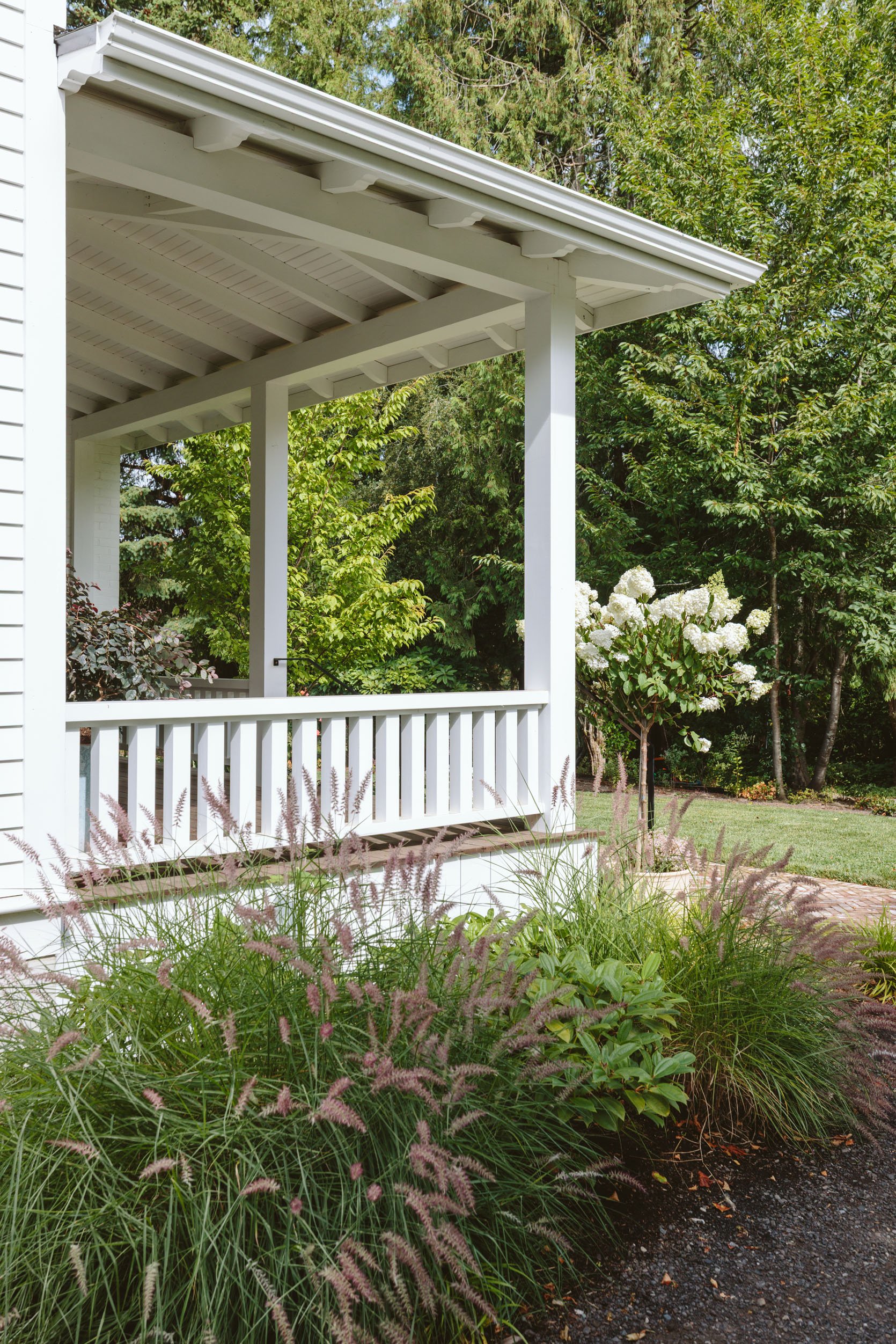
The Hefty Porch Railing
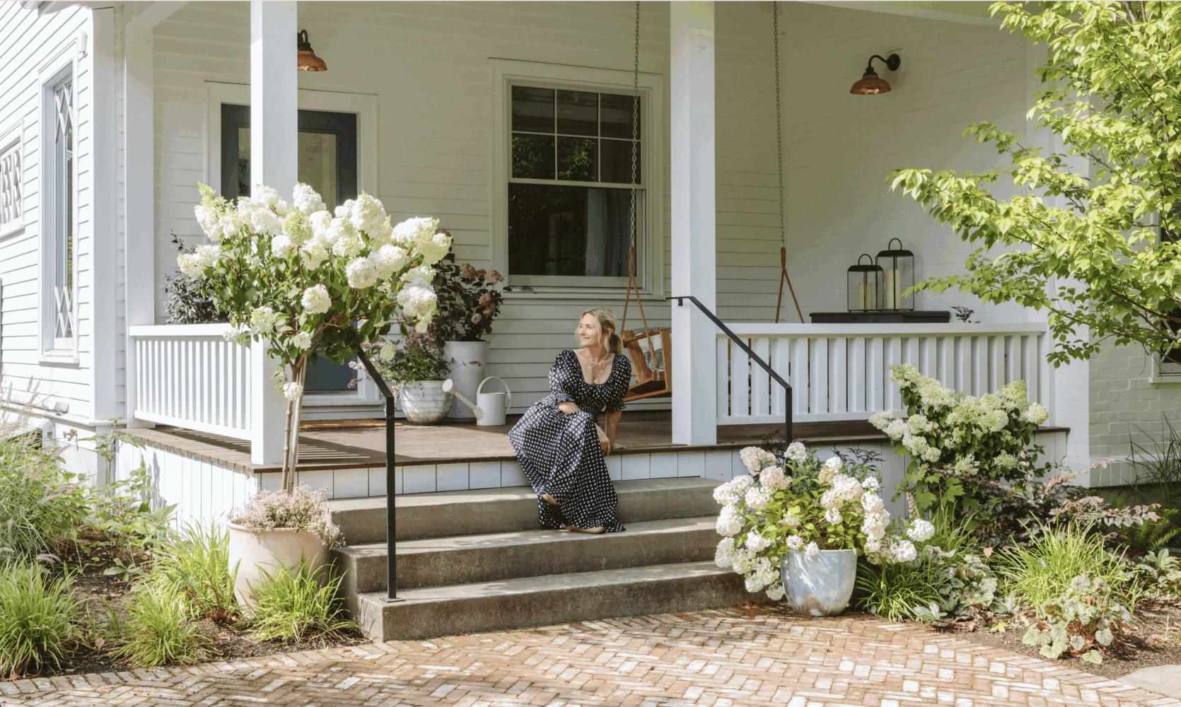
We went round and round about the porch railings. Classic white wood railings felt basic and, dare I say, boring to me, but I couldn’t find an alternative that made sense (that wasn’t going to be custom welding metal work, which is crazy expensive). Ultimately, I trusted ARCIFORM that this was the appropriate thing to do for the age and style of the home. As far as the size, we wanted them to be a height that people could rest their butts on (we landed at 28″ high), but I thought that these were going to be too chunky, thick, bulky. I was so wrong. ARCIFORM kept telling me that with the scale of the house, we’d need big posts and big railings. They were right!! I love how they look. Our railings are 6″ wide on top with 3″ vertical square railings and 7″ square posts.
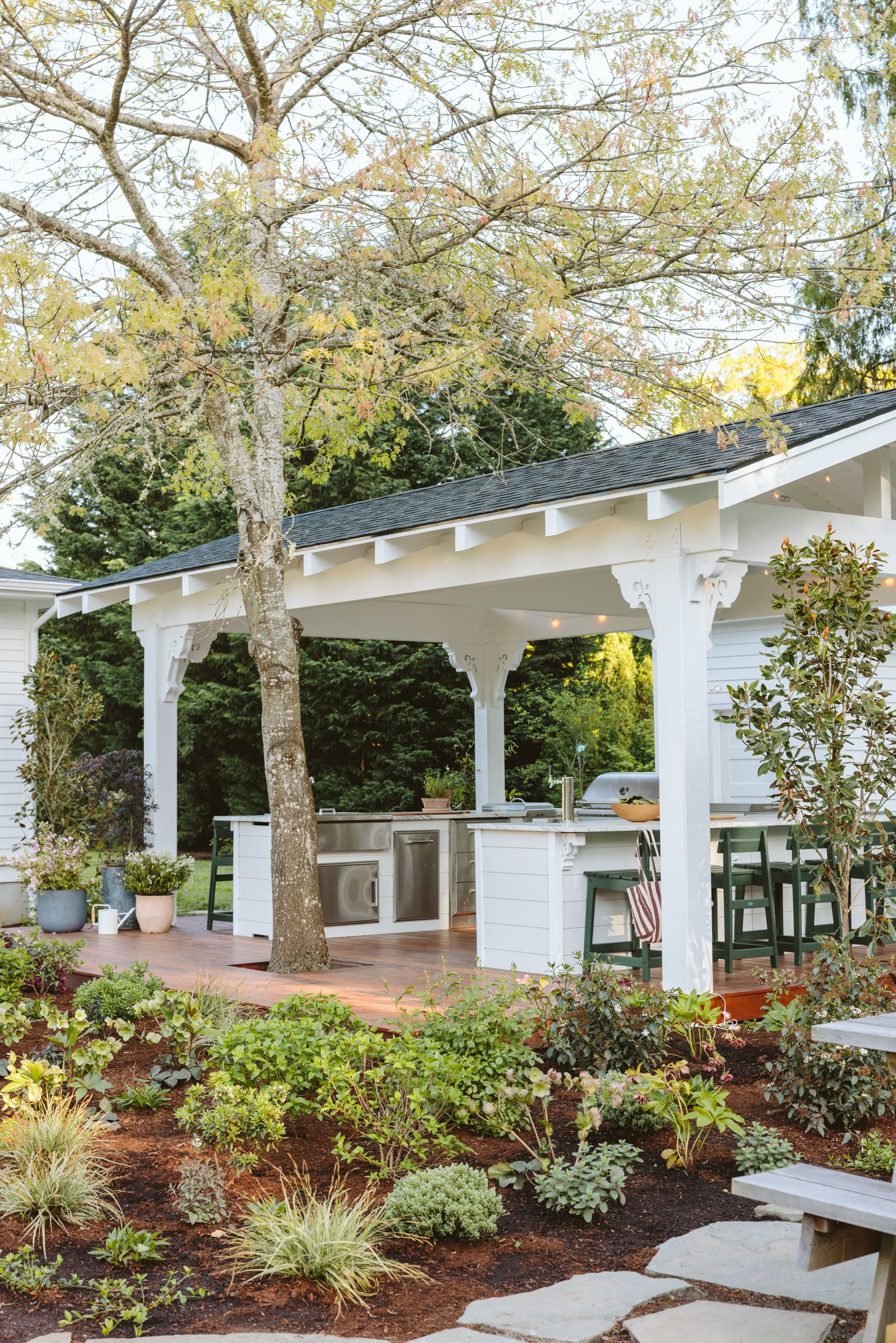
Ceiling Beams And Rafter Tails
I learned a ton about classic porches thanks to ARCIFORM. We chose a tongue and groove ceiling with beams that were 18″ apart, with custom rafter tails to match the original roofline rafter tails (which we tried to replicate on the gazebo but were floored by the pricing – $$$$$$). The pretty carved detail at the end is, of course, gorgeous, but very expensive. Here, you’d have to do it to match. Now I thought we were leaving these rafter tails exposed (so you could see them from the front of the house, with the gutters going on top of them) but they were covered with a piece of wood (is that called skirting when it’s up there, too?) that covered them and then they attached the gutter to that piece of wood. Ultimately, I didn’t have them redo it, but it was something that bummed me out at first. They said that the gutters worked much better this way, and with the rain in Portland, I respected that as we want the best water management here. Now I’ve gotten used to it and heck, maybe all the exposed rafter tails would have been too busy throughout the entire property? Just Google “exposed rafter tails” if you want to see what I’m talking about – it’s a different look.
Cement Stairs And Black Metal Handrails

Another two details that I sweated over were the cement stairs and the black handrails. We were told over and over that we can’t have wood railings or wood stairs exposed to the rain – they are sure to rot (maybe not for 10-15 years, but still!). So I looked on Pinterest for hours/days/weeks of what we could use that wasn’t wood, and I either found crazy decorative custom stuff (too $$$) or just simple/boring. I was both overwhelmed and underwhelmed, so I designed them to be thin and wide and hoped that they would just go away. I hoped that the house was so pretty that these didn’t need to be anything special. Thank god, I was right about this because even though they were simple, they still cost thousands of dollars since we needed 10 of them around the house at every entrance/exit (by code). Same with the cement stairs – cement is so boring! But because we had so many entrances (front door, mudroom, our bedroom, and the kitchen), we couldn’t really do brick or anything special due to budget. Just the cement was $10k, so imagine had we chosen to do real masonry…ANYWAY, that’s all to say in retrospect. These are the things you don’t notice – the house is so pretty, and these simple and classic elements just disappear in a good way.
Vertical Wood Skirting + Horizontal Siding
We chose real lap siding (not hardy board), which I think we did because it was a more authentic thing to do, but we did our garages in hardy board and you can barely tell the difference, TBH. Our siding is a 5″ reveal (so I’m assuming it’s 6″ lap siding, where the top of the first inch is covered by the next board). Super classic. Now, the vertical skirting underneath the porch threw me at first, but it makes sense as it contrasts with the horizontal siding nicely.
What About Copper Gutters?
Oh, you bet we thought about copper gutters, but the price difference was pretty nuts. Now I don’t remember for sure, but I think our white vinyl gutters were around $5k and the copper ones would have been $30k (or something like that – a CRAZY Difference). And the more we thought about it, the more we actually felt that our bright white house didn’t want copper gutters – that they’d get too much attention. I love seeing them on Chris Loves Julia’s house (and they broke down the process so well) as their house is so classic and moody and their patinated gutters look so good. But for our white house, having you not notice the gutters really works. Of course, the copper sconces really pop in a way that I love (and I love how they work so well with the brick landing pad, which is an architectural call back to the kitchen patio).
On Mixing Stone And Brick Hardscape
The hardscape gets complicated, but the reason we did a herringbone brick anywhere on the property in the first place was because of the covered walkway on the north side of the house, which was long and skinny. It felt like it needed to be a linear pattern (not organic like flagstone). And doing a rectangular flagstone didn’t sound pretty enough to me. The reason we didn’t do herringbone brick everywhere was due to the extreme cost of both the material and the install (which is saying a lot because the stone is also shockingly expensive). So we decided to mix the finishes – a more formal herringbone brick and casual/rustic bluestone. My philosophy was and remains that with older houses like ours, there is something charming about not having all the finishes match or be the same. My feeling is that over time, people in different eras added on different style choices, and that as long as they are all high quality and well executed, the hodge-podgeness of it is actually charming and feels collected over time. I think I’m right for this house, but I wouldn’t do this for a contemporary house – I would likely curate all hard finishes, with some custom details, but I wouldn’t do organic flagstone next to herringbone brick just anywhere.
The Landscaping
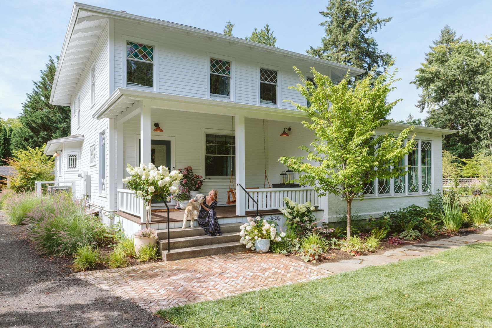
While the house is gorgeous, it’s still simple (white on white, pops of copper/brick but nothing too whimsical). At times, I was so worried that it would be boring (should the windows have been a color? The trim a color? The whole house a color?), but I kept reminding myself that once the landscaping grew in, it would be surrounded by different tones of green and darker aubergine/pinks. Cali (Studio Campo) originally selected the plants/trees for here and they have already changed a lot since install (those amarlylis just showed up this year and I should probably get rid of them before they take over). I added the hydrangeas from Dennis’ 7 Dees), but that statement cherry tree (thanks to Big Trees Today in Oregon) and all the plants really added a ton of color.
Two Things I Want To Add (Eventually)
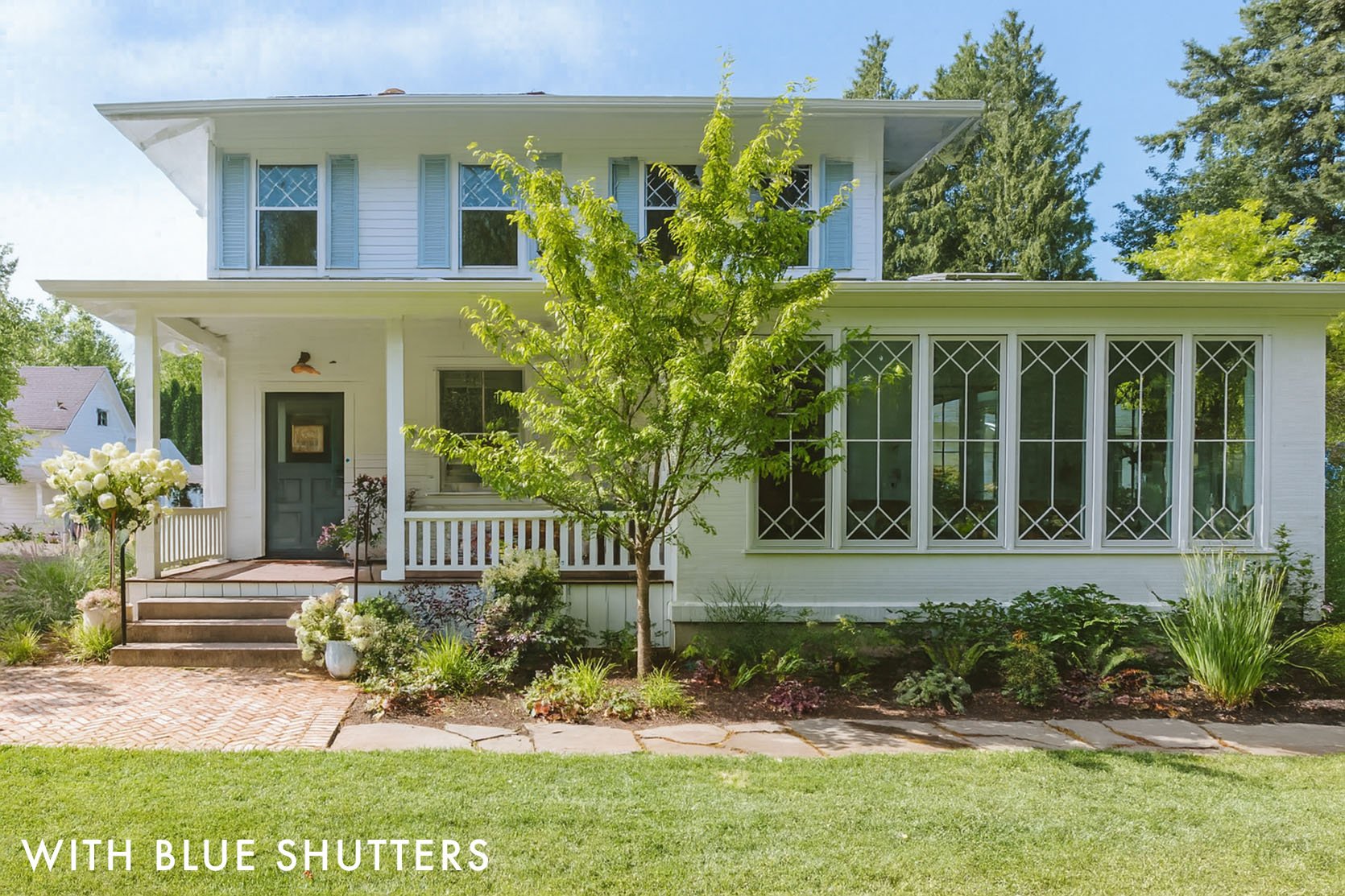
I truly love our home, so much. But if I could snap my fingers and add two things, I’d add blue shutters on the bedroom second floor and custom corbels (like we did on the gazebo). I know we went round and round about shutters, here, and it was very polarizing, but I really think that this house can handle real shutters (NOT these renders, they would be the right size and REAL), with pretty black hardware in the same blue as the garage doors (Sherwin-Williams Dutch Tile Blue). And it’s not abnormal to have them only on the second/bedroom floor (since they wouldn’t work on hardly any of the first floor windows). When I had them quoted before, they were $25k (!!!), and I was on the fence, so we didn’t do it. But I do wish we had them, and I might play the lottery and go for it 🙂
And then re the corbels, Purl made the most beautiful corbels for our gazebo, so I’m going to hire him to add some to our porches ($400 each + install, so not nothing but architecturally worth it to me).
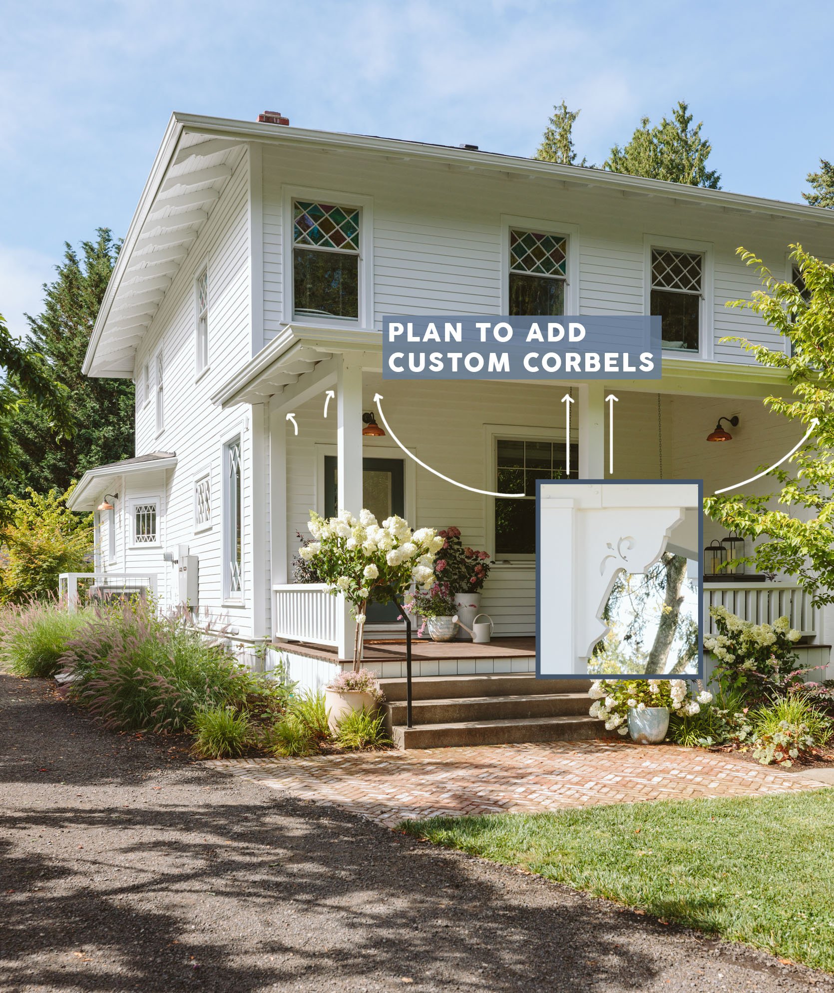
Anyway, we’ll see if I get around to either of these things (both financially and time-wise). The corbels feel easier to execute (and I love supporting Purl and his artwork), but the shutters feel like a lot. I’ve got other fish to fry (i.e., a carriage house to restore). Thanks, ARCIFORM, for helping us make such classic decisions on the architecture of our home. Everyone thinks that the front was original, and they can’t believe that we didn’t have a porch or the sunroom. Ask me questions in the comments!!
*Design by ARCIFORM and Emily Henderson (me!)
**Photos by Kaitlin Green