
When it comes to iOS 26, Liquid Glass and legibility have been the subject of much discussion around the iPhone software redesign. On the Mac, however, app icon decisions have stirred up a lot of feelings for macOS Tahoe users. One change in particular arguably makes the Mac harder to use.
From Finder to Macintosh HD
It started with the app permanently fixed to the first position on the Dock: Finder. Apple threw decades of precedent out of the window in macOS 26 beta 1 when it flipped the usual color order on the blue and white Finder face(s) icon. That was soon remedied with the second developer beta.

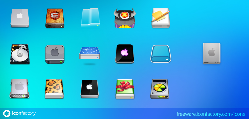
More recently, it’s the lesser viewed Macintosh HD icon change that has caused a commotion. In macOS 26 developer beta 5, Apple discontinued the legacy icon that depicted a classic spinning platter hard disk drive in great detail.
While it was an attractive icon on its own, the metaphor broke down long ago when Apple shifted to solid state drives. By that logic, though, perhaps it’s as illogical to use a classic telephone glyph for the Phone icon, but let’s not overthink this one.
For greater accuracy, Macintosh HD should probably read Mac SSD or Apple Drive since it’s not actually a hard disk drive. I wouldn’t vote in favor of modernizing the name, though, at the risk of losing the last official use of the Mac’s full title.
There are two actual complaints that are resonating with the new Macintosh HD icon.
First, Mac users are confused about why the drive has holes. The USB-C shaped hole makes some sense, but the three headphone jack-shaped holes are just decoration for the sake of detail. Of course, a more literal Mac disk icon would resemble a computer chip instead of what looks like a common Samsung external SSD — but with holes.

The other piece of feedback commonly shared is that the perspective of the drive icon isn’t consistent with the perspective of the Apple logo. The drive itself is tilted so you can see the top and front, but the Apple logo looks as if the drive was viewed from the top only.
Admittedly, my first reaction was “oh, neat, Apple should sell that as an external SSD,” but actually, no, Apple’s internal SSD upgrade prices are enough to dissuade me.
Mac users can “fix” drive icons
The Macintosh HD icon situation isn’t quite as dramatic as the Finder change though.
For starters, the Mac operating system doesn’t display Macintosh HD on the desktop by default like it did years ago. This means only people who choose to display it on the desktop will see it. You can toggle it on/off from Finder’s Settings panel.
macOS also allows you to customize any drive icon, including Macintosh HD, so you can always save the old icon and switch it back for nostalgia’s sake if your heart so desires.
Finder, on the other hand, is always present on the Dock and can’t be customized by the user.
Some users see blurry icons
Setting aside Finder and Macintosh HD, the Mac operating system does share some of the legibility discourse with Liquid Glass on iOS and iPadOS. That’s due to the glass layer effect used on many of Apple’s app icons that are largely shared with the iPhone and iPad now.
While these icons are visually more impressive when blown up, the more detailed drawings can appear blurry when scaled down to sizes in actual context. The level of blurriness is really up to how well the icon can be perceived by the viewer.
Someone with very sharp vision can probably make out the level of detail at smaller sizes. I’ve never had great vision, and I’m definitely in the camp that perceives Apple’s new icon style as a bit murky and eye-strain-inducing.
Apple’s first shot at the Photos app icon was the worst offender, but cranking up the saturation helped in recent betas. The worst instances, for me, involve the automatic changes Apple is making to third-party app icons.
Apple’s gray box strategy punishes Mac users
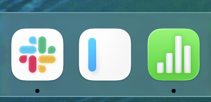
Apple wants to encourage developers to update their app icons for the new layered glass style. macOS Tahoe also forces every icon into the same squircle shape. App icons that use a different squircle or don’t fit in a rounded square shape at all get placed inside a gray box.
Like on iOS 26, macOS Tahoe automatically applies a layered glass look to some third-party app icons. Slack and iA Writer are two examples in my Dock. Slack could benefit from the same saturation increase to look less blurry to me, and maybe that change will happen after the beta period. Apple’s Numbers app icon also looks blurry and not Retina resolution due to the automatic effect added, but it will hopefully be optimized when iWork apps are updated for macOS 26.
As for the gray box that non-conforming icon shapes get thrown into, I think those are way worse than either the original Finder icon or the new Macintosh HD icon. The strategy is surely to motivate Mac app developers to adopt the uniform shape, but bringing out the shame box on day zero is really aggressive. I hope Apple doesn’t ship it in macOS 26.0.
Aside from being visually ugly, it makes the Mac harder to use for the Apple customer. App icons are automatically scaled down in size to fit inside the gray box, making them harder to discern when placed in realistic sizes on a Dock with more than a few other apps. The gray box also visually changes the app icon enough, without the developer’s intent, so users may not visually identify an app as easily.
Like with drive icons, app icons can be customized by the user to lose the gray box. I’ve done this with Chrome and Pixelmator Pro while living with macOS Tahoe in beta. Having the user source and change to correctly-shaped app icons is a big ask though.
Apple apps like Final Cut Pro and GarageBand will surely update soon after macOS 26 arrives to fix the gray box issue, but there’s no guarantee that shaming third-party app icons so aggressively on day one will force every Mac app developer to conform. The Mac user endures the brunt of that punishment.
Check out these great accessories
FTC: We use income earning auto affiliate links. More.