
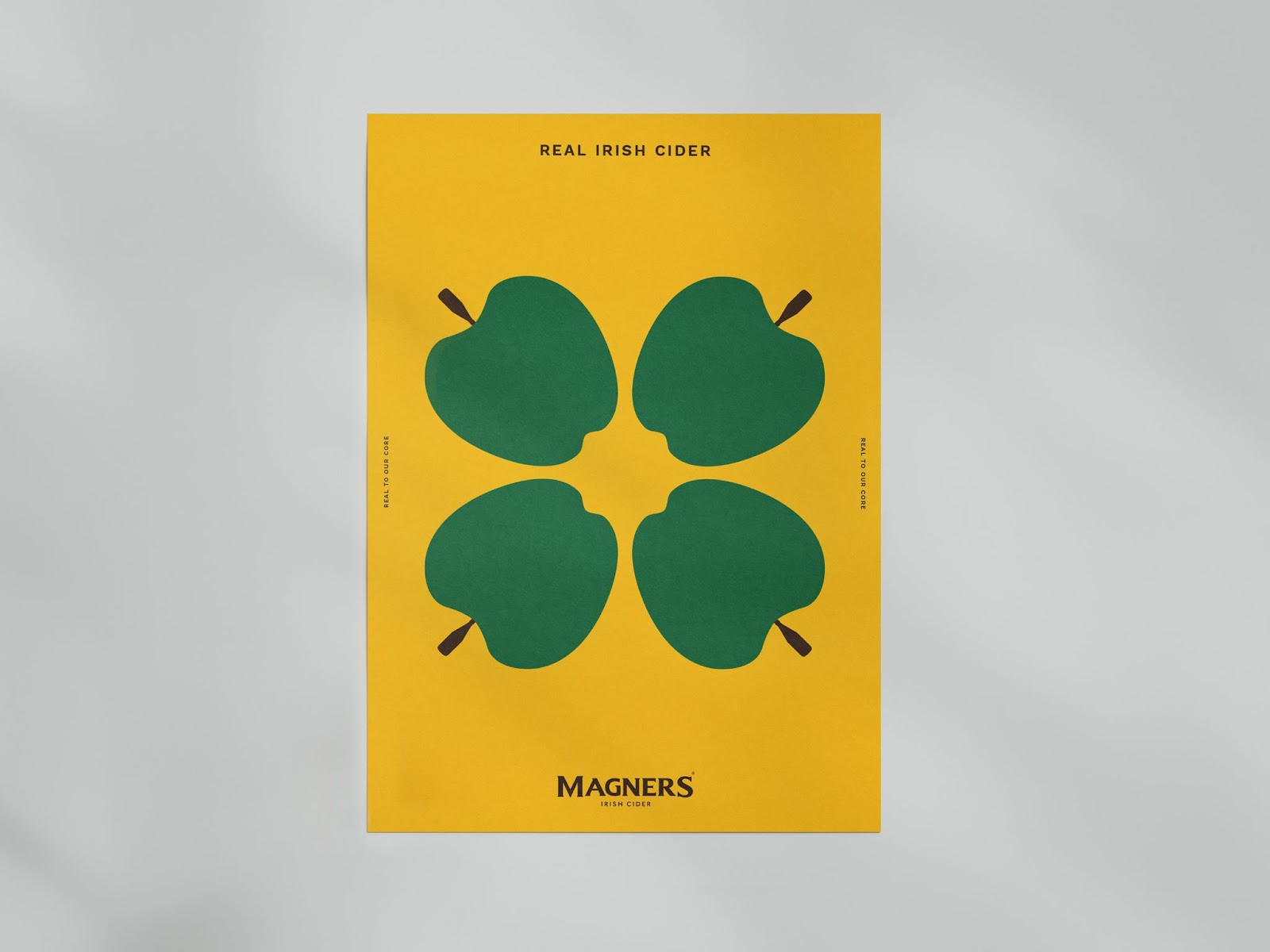
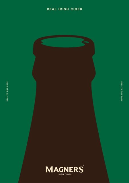
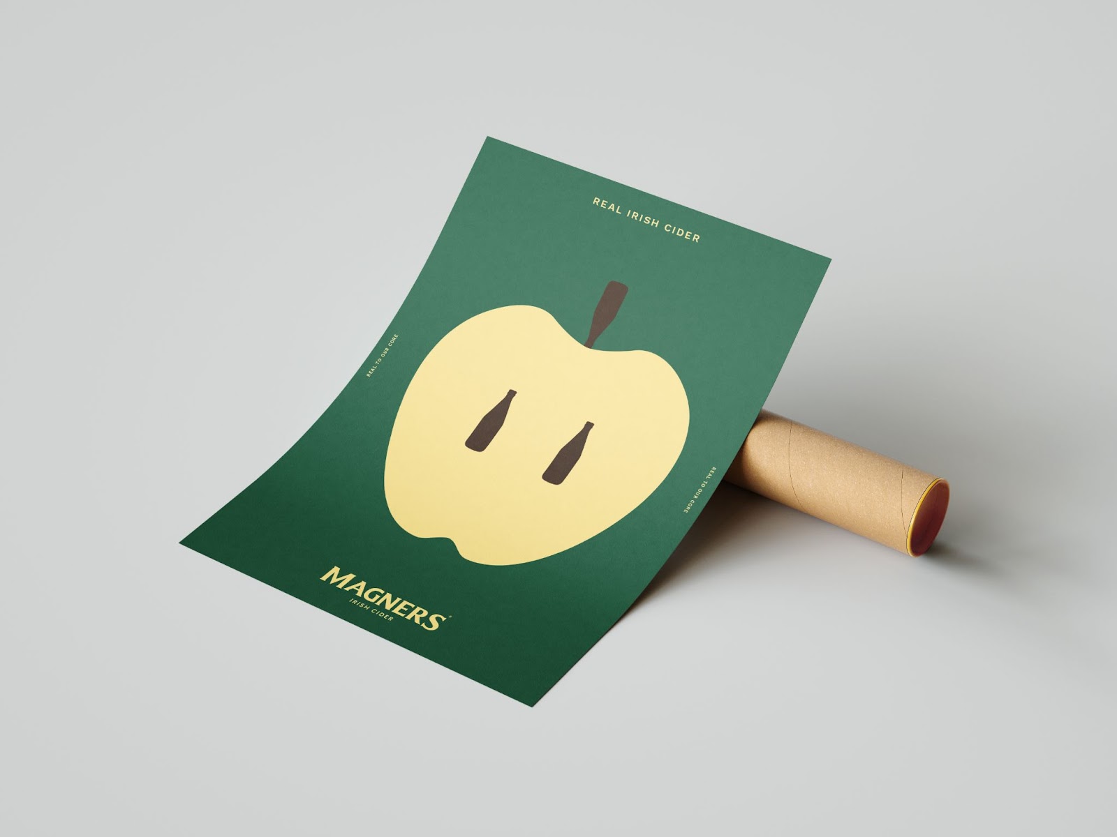
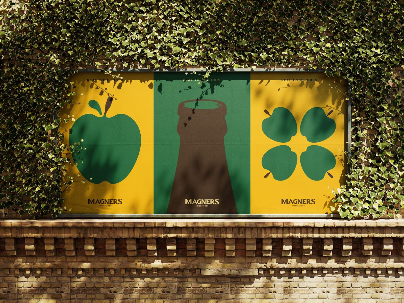
Irish cider brand Magners has unveiled a bold new visual identity, blending contemporary design with the rich, rustic charm of its heritage. The rebrand—crafted by Chris Rowson—reimagines Magners’ storytelling through vibrant typography, earthy textures, and a refreshed color palette that nods to tradition while feeling unmistakably modern.
Rooted in Irish Craftsmanship
Magners’ legacy stretches back to 1935, when the first bottles were crafted in Clonmel, Ireland. The redesign pays homage to this history with hand-drawn illustrations of apple orchards, subtle woodcut-inspired detailing, and a bespoke wordmark that balances rugged authenticity with clean, approachable lines. The result? A brand that feels both timeless and fresh—like a crisp sip of cider itself.
A Palette of the Irish Landscape
Gone are the stark greens of old; the new Magners leans into warm, natural tones—deep amber, mossy greens, and creamy off-whites—evoking the orchards where its apples grow. The packaging features matte finishes and tactile embossing, inviting consumers to feel the craftsmanship before they even take a sip.
Typography with Character
The custom lettering strikes a careful balance between pub-friendly boldness and refined elegance. The wordmark’s slight unevenness mimics the imperfections of hand-painted pub signage, while the supporting typefaces ensure readability across digital and print.
Why It Works
This isn’t just a facelift—it’s a strategic revival. By grounding the design in Irish agricultural heritage while sharpening its contemporary appeal, Core Design ensures Magners stands out in a crowded market. The rebrand speaks to both loyalists and new audiences, proving that tradition and modernity can coexist beautifully.
About the Author
