
Here we explore the evolving world of line charts and how they’re shaping the nature of modern data visualization.
Line charts are a cornerstone of data storytelling. However, their design continues to evolve to accommodate our ever-demanding and real-time data needs. From monitoring financial results and app usage to mapping academic research, they are an essential tool. This piece examines how line charts are adapting and changing within today’s dynamic data environment.
This chart was created using this free line chart maker.
Line charts are great for showing how data changes over time, which helps everyone make better decisions. If they’re done right, the lines flow nicely and make it easy to spot trends and differences. Bonus points if they help spot outliers and abnormalities. That clarity makes line charts super useful for all sorts of things, from business reports to science stuff.
Subtle Interactions in Modern Line Charts
Micro-interactions are transforming how time-series data is presented. Subtle animations and dynamic updates should respond to user engagement. Hovering reveals detailed data, sliders adjust time frames, and tooltips should present comparisons across categories for easy analysis.
Other interesting features increasing the usefulness of these charts are the ability to group by time period. Sampling data based on days, weeks, months, and years. This is particularly useful for financial data that quickly needs to be summarized. Selecting a time frame by dragging over a targeted area of the chart is an increasingly used method for filtering time periods.
Area Charts Grow In Popularity
Area charts, especially for cumulative data, are experiencing a resurgence. Their filled aesthetic emphasizes crucial insights, directing attention to key metrics effortlessly. This bold and dynamic visual, ideal for tracking revenue growth or trend variations, remains highly popular for its ability to present data powerfully without cluttering the view.
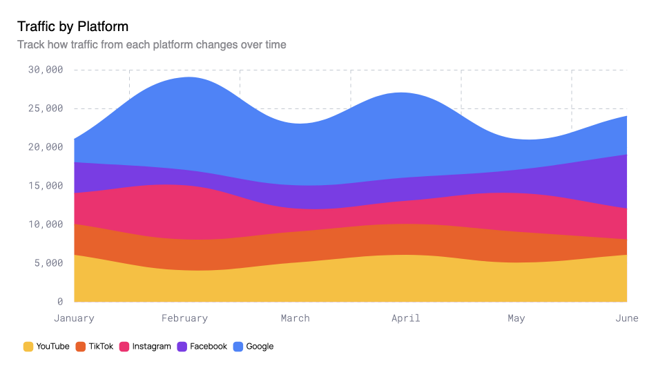
While area charts certainly have their place, their signal-to-noise ratio can be comparable to pie charts. Powerful when presenting primary data, but blundering and distracting when misused. Normal line charts certainly lack the eye-drawing potential, but their subtileness makes them preferable for accompanying other visualizations.
Dark Mode Preferred
The trend of dark mode persists strongly in 2025, seeing ever-increasing adoption in data visualization. Dark mode enhances readability, particularly in dimly lit settings, by delivering superior contrast and lessening eye fatigue. For line charts, where sharp lines and strong contrast are crucial for optimum clarity and effect, dark mode is an ideal choice.
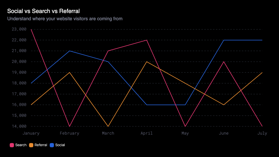
While, of course, darker visualizations are a popular design trend, it’s worth pointing out their frequent legibility issues. If your audience has any visual impairment issues, rethink darker chart themes.
Designing Modern Line Charts
Line chart trends are evolving beyond static data visuals into dynamic tools for interactive and engaging data narratives. Trends such as micro-interactions, area charts, and dark mode themes are reactions to the changes in our data analysis needs. Following the positive elements of these line chart trends will help meet the needs of today’s data-driven audiences.
The incredible adaptability of line charts highlights their fundamental importance in our data analysis needs. Are there any noteworthy line chart design trends that haven’t been mentioned? Please share your insights!
About the Author
