
You’re likely familiar with the infinite scrolling marquee effect – that continuous horizontal scroll of content that many websites use to showcase their work, testimonials, or partner brands. It’s a lovely and simple effect, but in this tutorial, we will spice it up by creating a marquee that moves along a custom, funky SVG path. We’ll be using React, Typescript and Motion (formerly Framer Motion) for the animation, so let’s get started!
You can also find this component in Fancy Components, the growing library of ready-to-use React components & microinteractions.
Preparation
First, we need to create an SVG path that will serve as the guideline for our marquee. You can create one using any vector-drawing tool, code it programmatically, or even draw it by hand using SVG path commands. For this tutorial, I used Figma to create a simple curved path that crosses over itself.
The magic that will make our elements move along the path is the `offset-path` and `offset-distance` properties.
The
offset-pathCSS property specifies a path for an element to follow and determines the element’s positioning within the path’s parent container or the SVG coordinate system. The path is a line, a curve, or a geometrical shape along which the element gets positioned or moves.
The
offset-distanceCSS property specifies a position along an `offset-path` for an element to be placed. (Documentation on MDN)
Let’s start by creating a simple React component that will render an SVG path and a div element. The div will use the offset-path CSS property to follow the path. This path comes from our SVG’s d attribute.
Also, let’s add a CSS animation that will animate the offset-distance property of the div from 0% to 100% in an infinite loop:
See the Pen
cd-marquee-01-preparation by daniel petho (@nonzeroexitcode)
on CodePen.
💡 Notice how we set the SVG’s parent container in our CSS file to match the dimensions specified in the SVG’s viewBox attribute. This creates a fixed-size container that will maintain the exact proportions of our path. While this works for now, we’ll explore techniques for making the marquee responsive later in the tutorial.
And that’s the core of our effect! While this basic version works, we can make it fancier with interactive features like speed controls and scroll-based animations. To implement these, and have better overall control over the animation, let’s switch from CSS animations to Motion.
Animating with Motion
First, let’s install the Motion package:
npm i motionWe’ll use three key hooks from Motion to make this work:
1. useMotionValue: Creates a value that we can animate smoothly. We’ll use this to track our position along the path (0-100%). Think of it as a reactive value that automatically triggers visual changes without causing re-renders (docs).
const baseOffset = useMotionValue(0);2. useAnimationFrame: Gives us frame-by-frame control over the animation. On each frame, we’ll update our position based on a desired velocity, which we will call baseVelocity. This is perfect for continuous animations like our marquee (docs).
const baseVelocity = 20;

useAnimationFrame((_, delta) => {
  const moveBy = (baseVelocity * delta) / 1000;
  baseOffset.set(baseOffset.get() + moveBy);
});
3. useTransform: Creates a new motion value that transforms the output of another motion value. In our case, it ensures our position (baseOffset) stays within 0-100% by wrapping around. We will also use a handy wrap function to do the wrapping (docs).
/**
 * Wraps a number between a min and max value
 * @param min The minimum value
 * @param max The maximum value
 * @param value The value to wrap
 * @returns The wrapped value between min and max
 */
const wrap = (min: number, max: number, value: number): number => {
  const range = max - min;
  return ((((value - min) % range) + range) % range) + min;
};

//...

const offset = useTransform(baseOffset, (v) => `${wrap(0, 100, v)}%`);
Putting it all together, this is how our `MarqueeAlongPath.tsx` component looks:
import {
  motion,
  useMotionValue,
  useTransform,
  useAnimationFrame,
} from "motion/react";

import "./index.css";

type MarqueeAlongPathProps = {
  path: string;
  baseVelocity: number;
}

/**
 * Wraps a number between a min and max value
 * @param min The minimum value
 * @param max The maximum value
 * @param value The value to wrap
 * @returns The wrapped value between min and max
 */
const wrap = (min: number, max: number, value: number): number => {
  const range = max - min;
  return ((((value - min) % range) + range) % range) + min;
};

const MarqueeAlongPath = ({
  path,
  baseVelocity,
}: MarqueeAlongPathProps) => {
  const baseOffset = useMotionValue(0);
  const offset = useTransform(baseOffset, (v) => `${wrap(0, 100, v)}%`);

  useAnimationFrame((_, delta) => {
    const moveBy = baseVelocity * delta / 1000;
    baseOffset.set(baseOffset.get() + moveBy);
  });

  return (
    <div className="container">
      <svg
        width="100%"
        height="100%"
        viewBox="0 0 588 187"
        fill="none"
        xmlns="http://www.w3.org/2000/svg"
      >
        <path d={path} stroke="black" fill="none" />
      </svg>
      <motion.div
        className="marquee-item"
        style={{
          offsetPath: `path('${path}')`,
          offsetDistance: offset,
          offsetRotate: "auto",
        }}
      />
    </div>
  );
};

const path =
  "M0 186.219C138.5 186.219 305.5 194.719 305.5 49.7188C305.5 -113.652 -75 186.219 484.5 186.219H587.5";

const App = () => {
  return <MarqueeAlongPath path={path} baseVelocity={20} />;
};

export default App;
Plus the modified index.css file:
body {
  margin: 0;
  width: 100vw;
  height: 100vh;
  display: flex;
  align-items: center;
  justify-content: center;
  overflow: hidden;
  background-color: #e5e5e5;
}

.container{
  position: relative;
  width: 588px;
  height: 187px;
}

.marquee-item {
  position: absolute;
  top: 0;
  left: 0;
  width: 32px;
  height: 32px;
  border-radius: 15%;
  background-color: black;
}
Now we have the same result as before, only using Motion this time.
Adding Elements
Until now, we were animating one element along the path. Let’s modify our component to support multiple ones. While we could use an items prop to configure which elements to show, I prefer using React children because it allows us to simply nest any elements we want to animate inside our component.
We’ll also introduce a repeat prop that controls how many times the children should be repeated along the path. This is particularly useful when you have a low number of elements but want them to appear multiple times to “fill” the path.
import React, { useMemo } from "react";

//...

type MarqueeAlongPathProps = {
  children: React.ReactNode;
  path: string;
  baseVelocity: number;
  repeat?: number;
};

//...

  const items = useMemo(() => {
    const childrenArray = React.Children.toArray(children);

    return childrenArray.flatMap((child, childIndex) =>
      Array.from({ length: repeat }, (_, repeatIndex) => {
        const itemIndex = repeatIndex * childrenArray.length + childIndex;
        const key = `${childIndex}-${repeatIndex}`;
        return {
          child,
          childIndex,
          repeatIndex,
          itemIndex,
          key,
        };
      })
    );
  }, [children, repeat]);

//...
Let’s also create an inner Item component that will render the actual element. We also need to offset the position of each element based on the index of the item. For simplicity, let’s just distribute the items evenly along the path:
type MarqueeItemProps = {
  baseOffset: any;
  path: string;
  itemIndex: number;
  totalItems: number;
  repeatIndex: number;
  children: React.ReactNode;
};

const MarqueeItem = ({ baseOffset, path, itemIndex, totalItems, repeatIndex, children }: MarqueeItemProps) => {
  const itemOffset = useTransform(baseOffset, (v: number) => {
    // Distribute items evenly along the path
    const position = (itemIndex * 100) / totalItems;
    const wrappedValue = wrap(0, 100, v + position);
    return `${wrappedValue}%`;
  });

  return (
    <motion.div
      className="marquee-item"
      style={{
        offsetPath: `path('${path}')`,
        offsetDistance: itemOffset,
        offsetRotate: "auto",
      }}
      aria-hidden={repeatIndex > 0}
    >
      {children}
    </motion.div>
  );
};
Then, let’s just use the items array to render the elements inside the main MarqueeAlongPath component:
{items.map(({ child, repeatIndex, itemIndex, key }) => {
return (
<MarqueeItem
key={key}
baseOffset={baseOffset}
path={path}
itemIndex={itemIndex}
totalItems={items.length}
repeatIndex={repeatIndex}
>
{child}
</MarqueeItem>
);
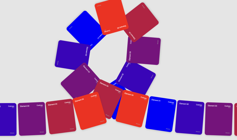
}}You can use any element as children: images, videos, custom components, etc. For this exercise, let’s just create a simple Card component, and use it as the children of our MarqueeAlongPath component:
const Card = ({ index }: { index: number }) => {
  return (
    <div className="card">
      <div className="card-header">
        <div className="card-number">Element {(index + 1).toString().padStart(2, '0')}</div>
        <div>
          <div className="card-brand">Codrops</div>
          <div className="card-year">2025</div>
        </div>
      </div>
      <div className="card-footer">Marquee</div>
    </div>
  );
};

const App = () => {
  return (
    <MarqueeAlongPath path={path} baseVelocity={5} repeat={4}>
      {[...Array(5)].map((_, i) => (
        <Card key={i} index={i} />
      ))}
    </MarqueeAlongPath>
  );
};
Finally, let’s just hide the SVG path by setting the path stroke="none" inside the main component for now. And that’s it! We now have a working marquee along a path with our own elements!
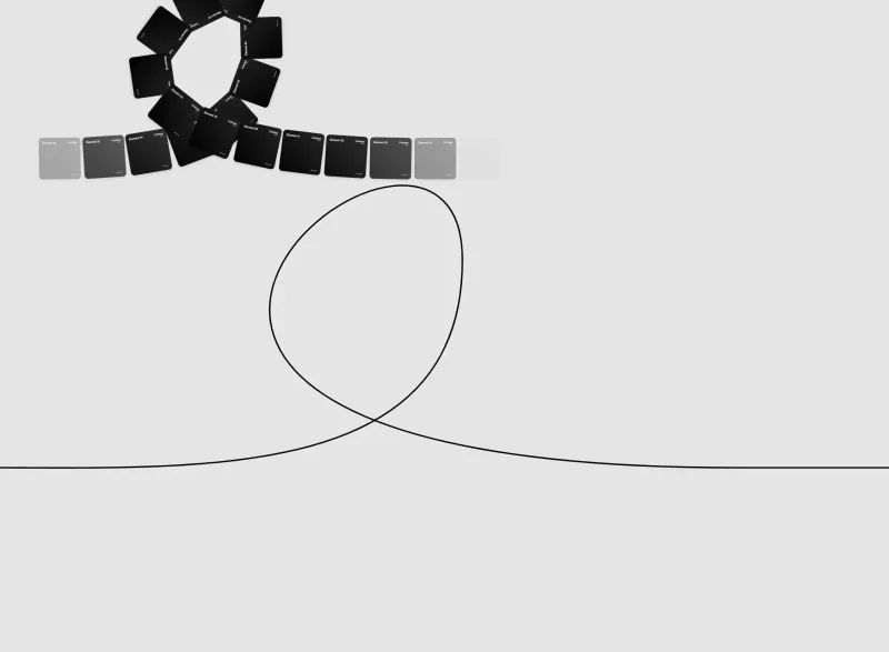
Z-Index Management
If you look closely, you may notice something off at the self-crossing part of the path – elements appear to randomly overlap each other rather than maintaining a consistent front-to-back order. I recolored the cards for illustration purposes:
This happens because our marquee items are rendered in DOM order, so elements that appear later in the markup will always be rendered on top of earlier elements. When an element that was added later circles back around and crosses paths with earlier elements, it incorrectly renders on top, breaking the illusion of proper depth ordering along the path.
To fix this visual issue, we need to dynamically adjust the z-index of each marquee item based on its position along the path. We can do this by using the itemOffset motion value we created earlier, which gives us each item’s progress (0-100%) along the path.
We’ll add a zIndexBase prop to our component to set the starting z-index value. Then, we’ll create a transform that converts the percentage progress into an appropriate z-index value – items further along the path will have higher z-index values. For example, if an item is 75% along the path and we have a zIndexBase of 0, it would get a z-index of 75.
const MarqueeItem = ({
  path,
  baseOffset,
  itemIndex,
  totalItems,
  repeatIndex,
  zIndexBase,
  children,
}: MarqueeItemProps) => {
  const itemOffset = useTransform(baseOffset, (v: number) => {
    // Distribute items evenly along the path
    const position = (itemIndex * 100) / totalItems;
    const wrappedValue = wrap(0, 100, v + position);
    return `${wrappedValue}%`;
  });

  const zIndex = useTransform(itemOffset, (v) => {
    const progress = parseFloat(v.replace("%", ""));
    return Math.floor(zIndexBase + progress);
  });

  return (
    <motion.div
      className="marquee-item"
      style={{
        offsetPath: `path('${path}')`,
        offsetDistance: itemOffset,
        offsetRotate: "auto",
        zIndex: zIndex,
      }}
      aria-hidden={repeatIndex > 0}
    >
      {children}
    </motion.div>
  );
};
And now it should be fixed:
Changing Velocity on Hover
We can make this marquee more interactive by introducing a few features, which will allow us to change the speed interactively. Let’s start with a simple one, where we will slow down the marquee on hover.
First, let’s track if any of the elements are being hovered over. I prefer to use a ref instead of state to avoid unnecessary re-renders.
// In the main component
const isHovered = useRef(false);

//...

// In the marquee item
<motion.div
  key={key}
  className="marquee-item"
  style={{
    offsetPath: `path('${path}')`,
    offsetDistance: itemOffset,
    offsetRotate: "auto",
    zIndex: zIndex,
  }}
  aria-hidden={repeatIndex > 0}
  onMouseEnter={() => (isHovered.current = true)}
  onMouseLeave={() => (isHovered.current = false)}
>
  {child}
</motion.div>

//...
While we could simply change the baseVelocity prop when hovering, this would create an abrupt transition. Instead, we can create a smooth animation between the normal and hover states using Motion’s useSpring hook (docs).
The useSpring hook allows us to animate a motion value with spring physics. We’ll create a motion value to track the hover state and use a spring to smoothly animate it between 1 (normal speed) and 0.3 (slowed down) when hovering:
const hoverFactorValue = useMotionValue(1)

const smoothHoverFactor = useSpring(hoverFactorValue, {
  stiffness: 100,
  damping: 20,
})
Now, we can use this value to multiply our moveBy value, which will make the marquee move slower when hovered over.
useAnimationFrame((_, delta) => {
  if (isHovered.current) {
    hoverFactorValue.set(0.3);
  } else {
    hoverFactorValue.set(1);
  }

  const moveBy = ((baseVelocity * delta) / 1000) * smoothHoverFactor.get();
  baseOffset.set(baseOffset.get() + moveBy);
});
The difference is subtle, but these small details are worth taking care of too.
Scroll-based Velocity
We can also influence the marquee’s velocity based on the scroll speed and direction. We can use useScroll to track the absolute scroll position in pixels (docs). You might want to add a container where you want to track the scroll. Otherwise it will just use the page scroll, which is fine for us now. Then, we can get the velocity of our scroll position with the useVelocity hook (docs), by passing the scrollY value as a parameter.
Now, to avoid the abrupt changes in scroll velocity, we’ll use a spring animation again with useSpring to smooth it out. If you use Lenis or some other smooth-scroll library, you might skip this step.
// Scroll tracking
const { scrollY } = useScroll()

const scrollVelocity = useVelocity(scrollY)

// smooth out the scroll velocity
const smoothScrollVelocity = useSpring(scrollVelocity, scrollSpringConfig)
The scroll velocity’s value can be pretty high, so let’s map it to a lower range with a useTransform hook.
const { scrollY } = useScroll()

const scrollVelocity = useVelocity(scrollY);
const smoothScrollVelocity = useSpring(scrollVelocity, springConfig);

// map to a reasonable range
const scrollVelocityFactor = useTransform(
  smoothScrollVelocity,
  [0, 1000],
  [0, 5],
  { clamp: false }
)
Let’s also reverse the movement direction for the marquee when we change the scroll direction too. For that, we will track the direction in a ref:
const directionFactor = useRef(1)Then, we just need to use the scrollVelocityFactor value to multiply our moveBy value:
useAnimationFrame((_, delta) => {
  if (isHovered.current) {
    hoverFactorValue.set(0.3);
  } else {
    hoverFactorValue.set(1);
  }

  // we need to multiply the base velocity with the direction factor here too!
  let moveBy = ((baseVelocity * delta) / 1000) * directionFactor.current * smoothHoverFactor.get();

  if (scrollVelocityFactor.get() < 0) {
    directionFactor.current = -1
  } else if (scrollVelocityFactor.get() > 0) {
    directionFactor.current = 1
  }

  // apply the scroll velocity factor
  moveBy += directionFactor.current * moveBy * scrollVelocityFactor.get();
  baseOffset.set(baseOffset.get() + moveBy);
});
That’s it, now our marquee is influenced by scroll velocity and direction!
Mapping Other CSS Properties
Another interesting feature we can add here is to map other CSS properties to the progress on the path. For example, we can map the opacity of the marquee items to the progress along the path, so that they will fade in and out at the edges of our path. We can use the same useTransform hook to transform the progress value with the following formula:
f(x) = (1 − |2x − 1|¹⁰)²
Don’t worry if this function looks complex. It’s just a nice curve that goes from 0 to 1 super quick, holds at 1 for a while, then goes back to 0. We can visualize it with a tool like GeoGebra:
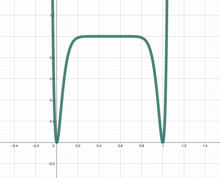
Here is how the formula translates to code:
//...

const opacity = useTransform(itemOffset, (v) => {
  const progress = parseFloat(v.replace("%", "")) / 100;

  // this is just a nice curve which goes from 0 to 1 super quick, holds at 1 for a while, then goes back to 0
  // makes the items fade in and out at the edges of the path
  const x = 2 * progress - 1;
  return Math.pow(1 - Math.pow(Math.abs(x), 10), 2);
});

return (
  <motion.div
    className="marquee-item"
    style={{
      offsetPath: `path('${path}')`,
      offsetDistance: itemOffset,
      offsetRotate: "auto",
      zIndex: zIndex,
      opacity: opacity, // <-- add this line
    }}
    aria-hidden={repeatIndex > 0}
    onMouseEnter={onMouseEnter}
    onMouseLeave={onMouseLeave}
  >
    {children}
  </motion.div>
);
And the result:
Responsiveness
First, let’s just change back the SVG path’s stroke to black to see what’s happening.
Now, making the SVG element itself responsive is quite easy, we can just set the SVG’s container to have a width of 100% and height of 100%, and do the same for the SVG element itself as well. We can keep the viewBox attribute unchanged, and the path element will scale with the wrapper:
<div className="container">
  <svg
    width="100%"
    height="100%"
    viewBox="0 0 588 187"
    fill="none"
    xmlns="http://www.w3.org/2000/svg"
  >
    <path d={path} stroke="black" fill="none" />
  </svg>
  {/* ... */}
</div>
And the `index.css` file:
.container {
  position: relative;
  width: 100%;
  height: 100%;
  margin: 0 auto;
}
Now this is great for scaling the SVG path itself, but there’s a catch – the marquee items’ offset-path property still references the original 588×187 coordinate space! This means that while our SVG and its container visually scales, the path in the offset-path CSS property will still be in the original coordinate space.
We have a few options to solve this:
1. Multiple Path Variations
Create multiple SVG path variations for different viewport sizes. While this gives control over the path at each breakpoint, it requires maintaining multiple path definitions and can be pretty tedious.
2. Scale the Container
Scale the marquee items’ container proportionally using CSS scale transforms. This maintains the original coordinate space but also scales everything inside the container.
const wrapperRef = useRef<HTMLDivElement>(null);
const marqueeContainerRef = useRef<HTMLDivElement>(null);

useEffect(() => {
  const updateScale = () => {
    const wrapper = wrapperRef.current;
    const marqueeContainer = marqueeContainerRef.current;
    if (!wrapper || !marqueeContainer) return;

    const scale = wrapper.clientWidth / 588;
    marqueeContainer.style.transform = `scale(${scale})`;
    marqueeContainer.style.transformOrigin = 'top left';
  };

  updateScale();
  window.addEventListener("resize", updateScale);
  return () => window.removeEventListener("resize", updateScale);
}, []);

return (
  <div className="container" ref={wrapperRef}>
    <svg
      width="100%"
      height="100%"
      viewBox="0 0 588 187"
      fill="none"
      xmlns="http://www.w3.org/2000/svg"
    >
      <path d={path} stroke="black" fill="none" />
    </svg>
    <div className="marquee-container" ref={marqueeContainerRef}>
      {/* ... */}
    </div>
  </div>
);
This works well, but comes with some important gotchas. Since we’re scaling everything inside the marquee-container div, any dimensions you set on your marquee items (like width: 80px) won’t reflect their true final size – they’ll be scaled along with everything else. This scaling can also cause unwanted distortions, mainly with text elements, which can look ugly in some cases.
3. Scale the Path
A more sophisticated (and somehow cleaner) approach is to scale only the SVG path itself (what’s inside the d attribute), leaving other elements at their original size. Then, you can define how your inner elements should behave on different viewports.
While implementing this ourselves would be complex, there is an awesome article by Jhey Tompkins on the how-to. I really recommend you go through it! It’s really worth it, and he does a much better job of explaining it than I do. For this reason I’m not going to go into too many details, i’ll just give you a quick rundown of how we will port the same logic to our marquee.
Let’s install the D3 library, as we will use it to parse and transform our SVG path.
npm i d3 types/d3First, we need to process our SVG path to get the actual points for later. For this, we’ll create a temporary SVG element with the help of d3, and use the getTotalLength() method to get the total length of the path. Then, we’ll use the getPointAtLength() method to sample points along the path (docs). If the path is too long, we’ll sample only a subset of points, defined in the maxSamples parameter. Adjust it if the scaling takes too long.
/**
 * Parse SVG path string into coordinate points using D3
 * This extracts the actual coordinates from the path for scaling
 */
const parsePathToPoints = (pathString: string, maxSamples: number = 100): Array<[number, number]> => {
  const points: Array<[number, number]> = [];

  // Create a temporary SVG element to parse the path
  const svg = d3.create("svg");
  const path = svg.append("path").attr("d", pathString);

  // Sample points along the path
  const pathNode = path.node() as SVGPathElement;
  if (pathNode) {
    const totalLength = pathNode.getTotalLength();

    // If the path is too long, sample only a subset of points.
    const numSamples = Math.min(maxSamples, totalLength);

    for (let i = 0; i <= numSamples; i++) {
      const point = pathNode.getPointAtLength((i / numSamples) * totalLength);
      points.push([point.x, point.y]);
    }
  }

  return points;
Then, we create a function that takes the original path, the original width and height of the path container, and our new container dimensions which we have to scale to. In the function, we use d3’s scaleLinear() function to create a scale that will map the original path points to the new container dimensions. Then, we just use the line() function to create a new path from the scaled points. We also use d3.curveBasis() to smooth out the new path. There are a bunch of other options for that, have a look at the docs.
/**
 * Create a scaled path using D3's line generator
 * This is the approach recommended in the CSS-Tricks article
 */
const createScaledPath = (
  originalPath: string,
  originalWidth: number,
  originalHeight: number,
  newWidth: number,
  newHeight: number
): string => {
  // Parse the original path into points
  const points = parsePathToPoints(originalPath);

  // Create scales for X and Y coordinates
  const xScale = d3.scaleLinear()
    .domain([0, originalWidth])
    .range([0, newWidth]);

  const yScale = d3.scaleLinear()
    .domain([0, originalHeight])
    .range([0, newHeight]);

  // Scale the points
  const scaledPoints = points.map(([x, y]) => [xScale(x), yScale(y)] as [number, number]);

  // Create a smooth curve using D3's line generator
  const line = d3.line()
    .x(d => d[0])
    .y(d => d[1])
    .curve(d3.curveBasis); // Use basis curve for smooth interpolation

  return line(scaledPoints) || "";
};
Lastly, inside the component, register an event listener for the resize event, and update the path whenever the container dimensions change. We will do it in a useEffect hook:
//...
  useEffect(() => {
    const updatePath = () => {
      const wrapper = wrapperRef.current;
      if (!wrapper) return;

      const containerWidth = wrapper.clientWidth;
      const containerHeight = wrapper.clientHeight;

      // Original SVG dimensions
      const originalWidth = 588;
      const originalHeight = 187;

      // Use D3 to create the scaled path
      const newPath = createScaledPath(
        path,
        originalWidth,
        originalHeight,
        containerWidth,
        containerHeight
      );

      setScaledPath(newPath);
      setCurrentViewBox(`0 0 ${containerWidth} ${containerHeight}`);
    };

    updatePath();
    window.addEventListener("resize", updatePath);
    return () => window.removeEventListener("resize", updatePath);
  }, [path]);

  return (
    <div className="container" ref={wrapperRef}>
      <svg
        width="100%"
        height="100%"
        viewBox={currentViewBox}
        fill="none"
        xmlns="http://www.w3.org/2000/svg"
      >
        <path d={scaledPath} stroke="black" fill="none" />
      </svg>
      <div className="marquee-container">
        {items.map(({ child, repeatIndex, itemIndex, key }) => (
          <MarqueeItem
            key={key}
            baseOffset={baseOffset}
            itemIndex={itemIndex}
            totalItems={items.length}
            repeatIndex={repeatIndex}
            zIndexBase={zIndexBase}
            scaledPath={scaledPath}
            isHovered={isHovered}
          >
            {child}
          </MarqueeItem>
        ))}
      </div>
    </div>
  );

//...
In both cases, you could implement a debounced resize event listener since continuously resizing the path can be a bit laggy. Also, for a cleaner implementation you can also use ResizeObserver, but for the sake of simplicity, I’ll leave the implementation of these up to you.
Final Demo
And there you have it! For the final demo, I’ve replaced the cards with some beautiful artwork pieces. You can find attribution for each artwork in the final source code below:
Final thoughts
Performance
- The animation complexity increases with both the number of elements and path complexity. More elements or complex paths will impact performance, especially on mobile devices. Monitor your frame rates and performance metrics carefully.
- Keep your SVG paths simple with smooth curves and minimal control points. Avoid sharp angles and sudden direction changes. In my experience, overly complex paths with too many control points can result in choppy or rigid animations.
Resources
Some helpful resources I used while researching and building this effect, if you’d like to dig deeper: