Thanks to OZ’s Hannibal Brooks for sharing a commentary about how brands are shifting from “playful” to “serious.”
In Design Week, Alec Mazzetti of Mother Design calls it a response to “fun fatigue.” For the past decade or so, brands have leaned on pastels, soft and friendly fonts, colorful cartoons, and cuddly mascots to make themselves appear safe, relatable, and fun.
Although it sounds a little conspiratorial, one designer suggests this aesthetic masked the reality that life was becoming increasingly brutal, especially for younger consumers. In other words, let’s make ‘em smile while we’re reaching into their increasingly shallow pockets.
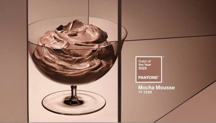
But now there seems to be a design trend back toward more seriousness. As we are urged to return to the office and as more formal attire eases back into the mainstream, brand design is following suit. Welcome back, serif fonts! Color palettes are growing richer. Simplicity and scalability are no longer paramount.
Even Southwest Airlines, a famously fun and egalitarian brand, seems to think the best way forward is to emulate the big legacy carriers, with no more Wanna Get Away fares, traditional approaches to boarding, and bag fees. First-class seating and airport lounges may not be far behind.
What do you think is driving this shift? Why are people fatigued with fun? Is it just a natural pendulum swing in the marketing world or is there something deeper happening in the culture?
