
A few weeks ago, we revealed my living room and my closet speakeasy, and I’m happy to report that I have one more space to share with you – my dining room! You might’ve seen a sneak peek or two if you saw the last two blog posts, since all the spaces are adjacent to each other – but now it’s time to take you on a full tour of this funky little space and share everything I did.
As a reminder, this apartment is a total GEM – perfect location, walkable to a ton of fun spots, month-to-month, vintage charm, and original tile in the kitchen and bathrooms, but almost every room was in need of a good dose of TLC when I showed up. Let me show you…
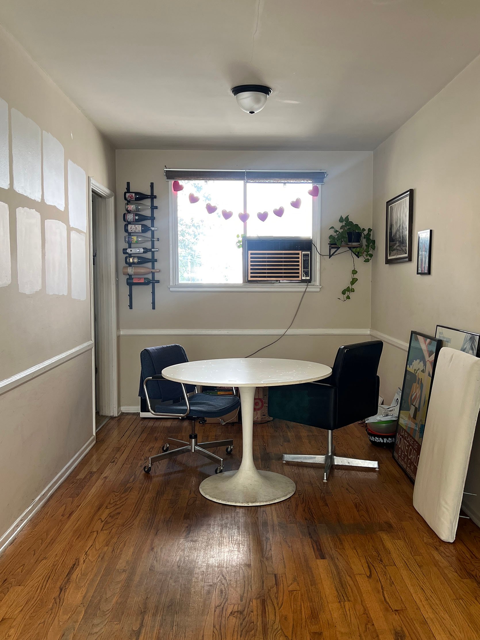
DINING ROOM BEFORE
Yeah, so it wasn’t a totally turnkey move-in situation…but my boyfriend, Austin, and I gave the entire apartment a quick paint job. It’s proof of why you should never underestimate the power of a fresh, white paint:
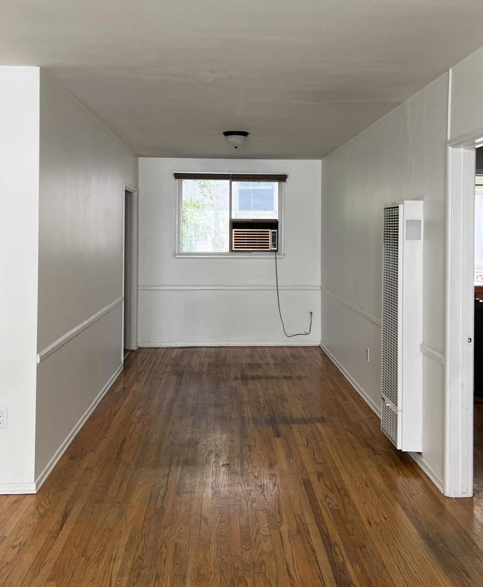
So much better, right?! The beige-y brown walls were just not it. Plus, they were pretty banged up if you looked closely, so this made a MASSIVE difference. It did, however, make the flooring imperfections more noticeable. We’re lucky to have the original hardwood flooring in our apartment, but it’s also pretty banged up. But I knew I could just cover it up with a rug and a big, long dining table, so it wasn’t a huge deal (because refinishing hardwood floors in a rental is where I personally draw the line).
I explained the design direction for my apartment in great detail over in my living room reveal, but the TLDR is this: we’re going for “single grandma that’s back out on the streets and ready to party.” I know you’re probably like, “Mallory, what does that actually mean??” A simpler way of putting it: a touch of vintage, a touch of modern, and a whole lot of feminine energy – that’s the vibe!
Also, see that ancient AC unit? It’s so old-looking, I didn’t even try to see if it worked (I just figured it was broken since it looked broken…like it’s missing buttons and is overall super sketchy lol), so when Austin and I painted this entire place last summer, it was about 90 degrees, and we never even turned it on. I laughed SO hard when I finally just pushed the button and realized that thing actually cranks…I was honestly in shock. All this to say I knew I wanted to find a way to cover that puppy up but still make sure it was functional…it’s quite the eyesore after all.
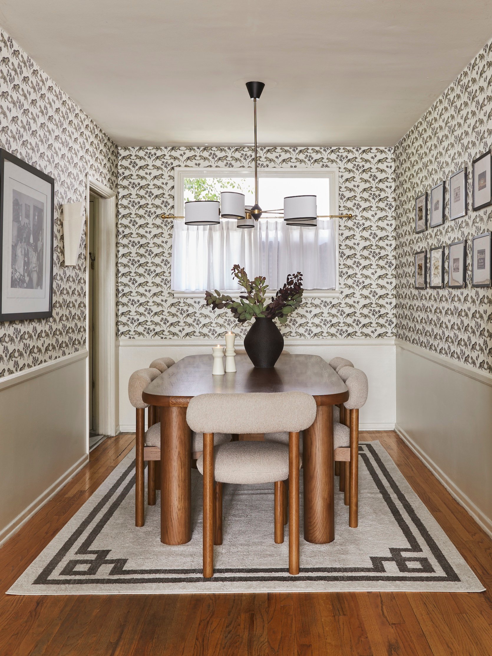
If you’ve been following me for a while, you know I have a thing about leopard and/or tiger wallpaper. Just take a look at the bathroom from my old studio apartment – I’m still obsessed with those walls. Something about the coolness and the sheer amount of personality the leopards add…I just think it’s so fun. So I sampled tons of different wallpapers, but ultimately had the Sarah Sherman Samuel x Lulu and Georgia tiger jacquard grasscloth one in my heart (and have since the moment this pattern dropped). Originally, I was going to go with the darker yellow one, but then realized this room is already fairly dark during the day – and while it’s a great idea to go to dark in a room without a ton of natural light – I work from home in here all the time and knew it would be a lot for me to be in a dark yellow room for hours everyday, so we went with the creamier white ish one. And I put it up myself!!
DINING ROOM PROGRESS
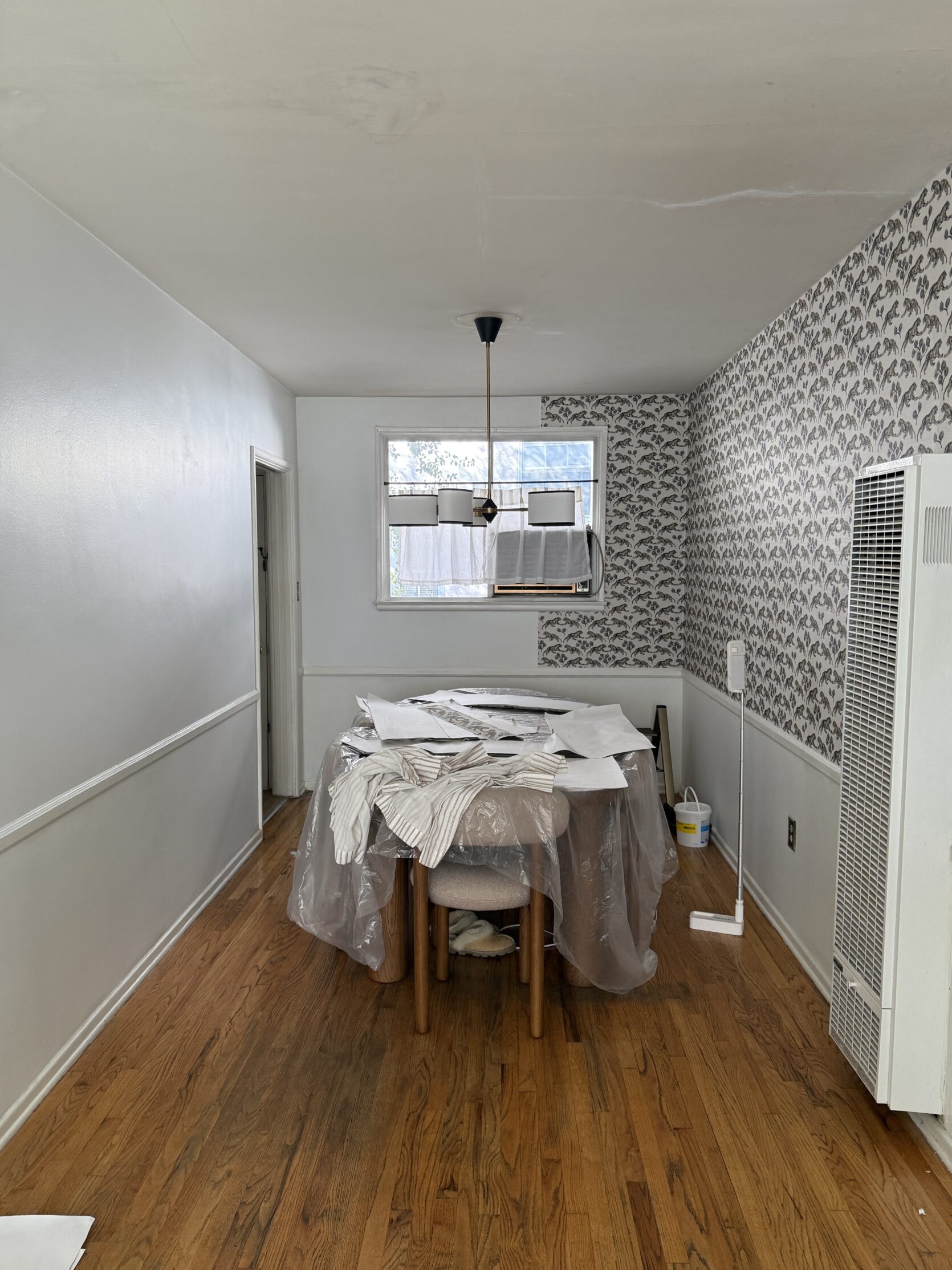
Obviously, this wallpaper isn’t peel-and-stick – so I basically just installed regular wallpaper on the walls, but did two things to make it easier to take off later: 1. I overlapped the panels a bit so that I could easily lift off the corners and sides, and 2. I used way less glue than I would have if this were a place I owned. Ideally, the next tenant will want to keep the wallpaper up, so I’m hoping I won’t have to remove it, but if I have to remove it, it’s not a huge deal – you just use a steamer and a scraper, and yes, it takes a bit of elbow grease, but it comes off. The wallpaper in my last apartment wasn’t peel-and-stick either, and it took about 3 or 4 hours to remove, but I got my security deposit back, no problem.
Wallpaper can be a big investment (time and money-wise), depending on the type you get, but it truly makes the biggest impact, in my opinion. I mean, just see for yourself…(REVEAL INCOMING!)…
Rug | Dining Chairs | Dining Table | Wallpaper | Chandelier | Sconces | Art Print | Vase | Candle Holders | Paint Color
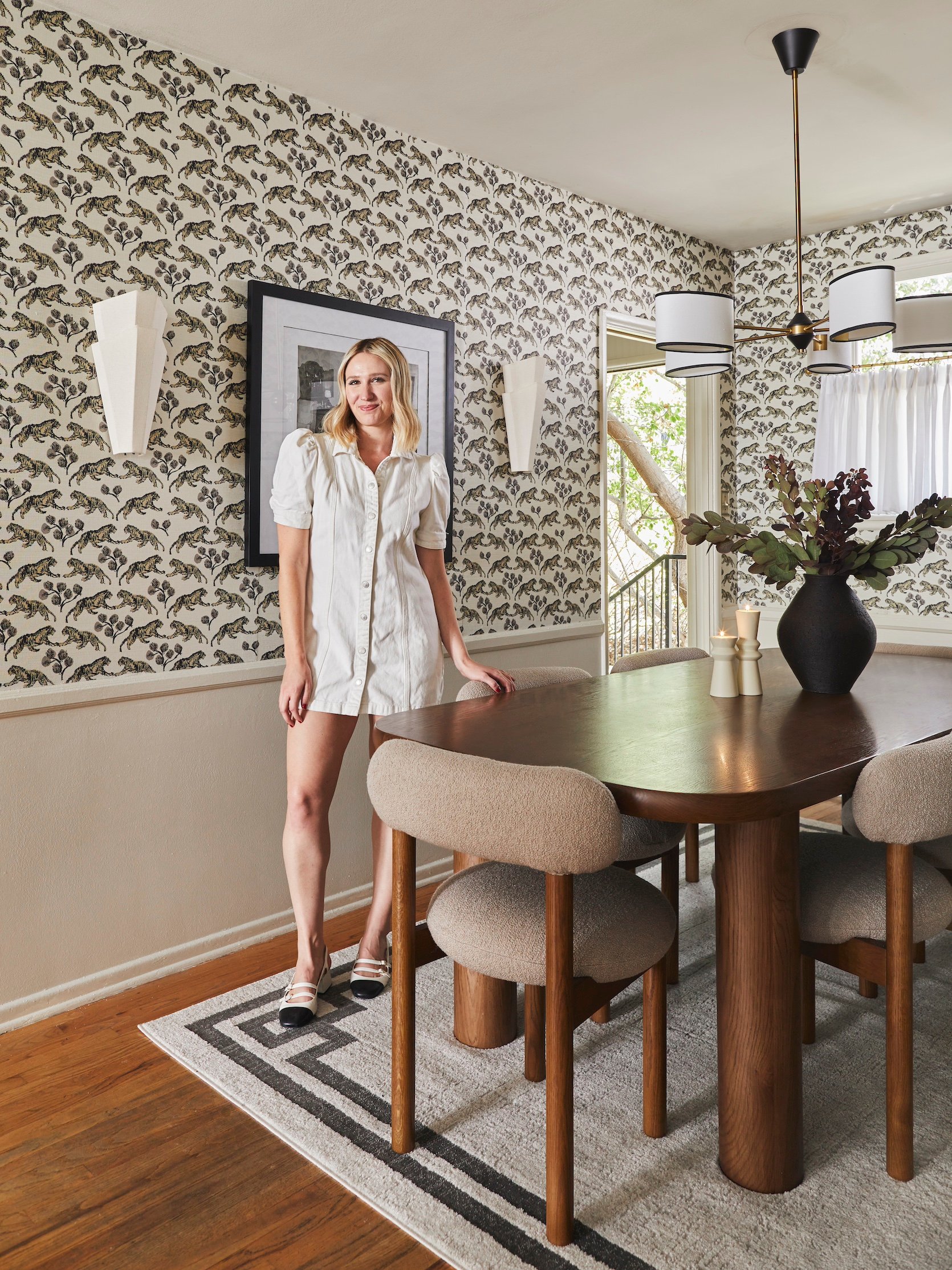
There she is!! My dining room in all her glory. Once the wallpaper was up, I sampled a ton of colors and found the perfect shade to complement – Shaded White by Farrow and Ball. It can lean sort of tan sometimes and sort of mauve other times, and it’s just so gorg in every light! Then I thought about adding in a fun moulding under the chair rail, but I might do that for phase 2, or might not do it at all, since it’s a rental and I’m not sure it’ll be worth the bang for the buck.
The dining table and chairs really grounded the entire space – I love the contrast of their modern shapes with the more traditional feeling wallpaper. I wanted to have a good mix of old and new (read: sexy grandma). I swapped out the boob light (of course) to this gorgeous Soho Home chandelier, which has the perfect traditional/modern mix, and I had been eyeing it for literally years.
Now let’s chat about that ugly AC unit in the window…
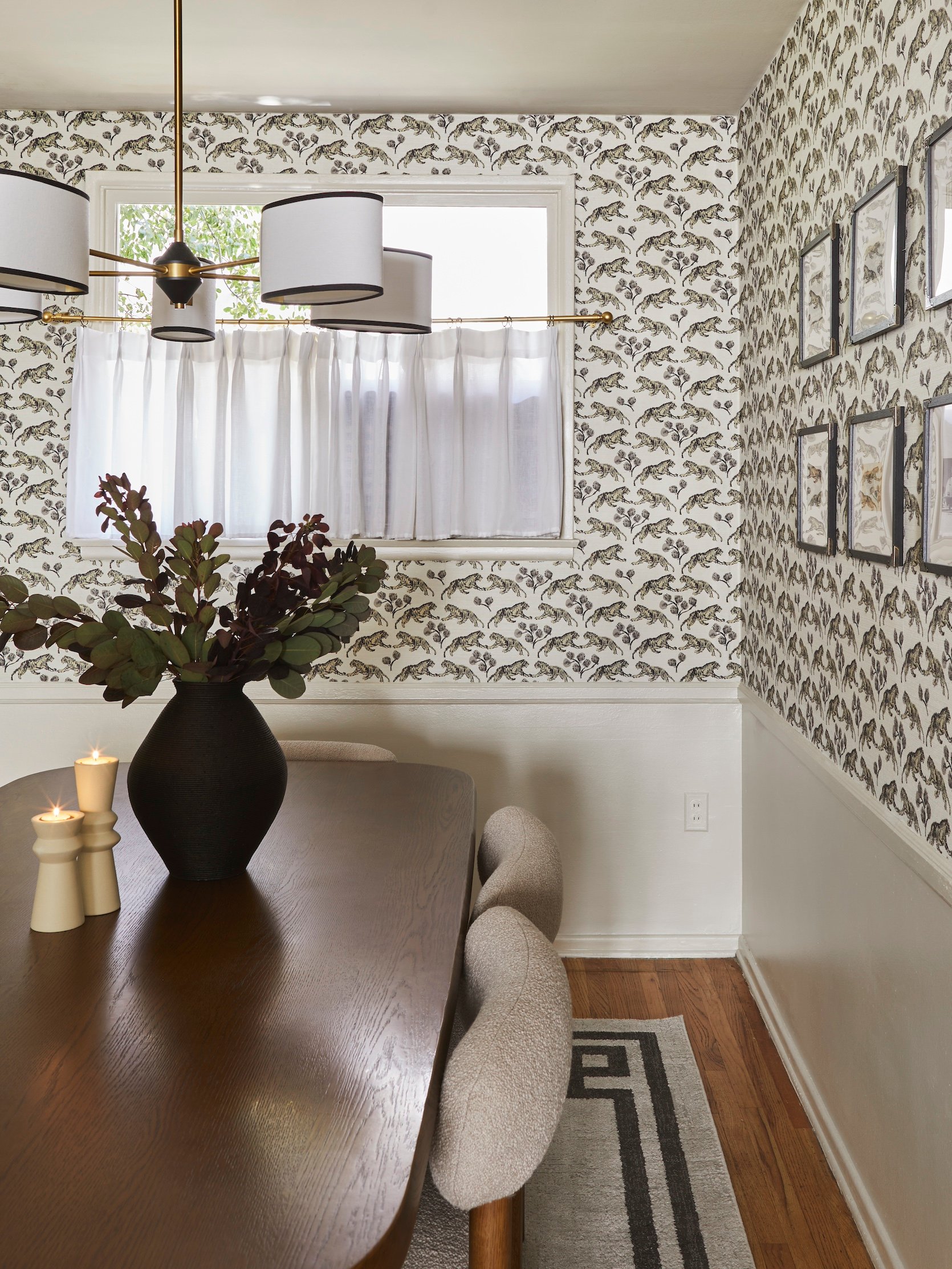
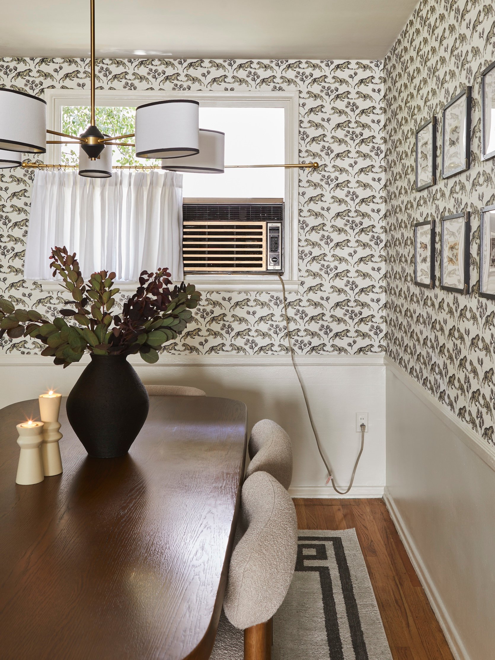
My quick and easy fix to cover up that window AC unit was to pop in a cafe curtain. Functionally, it’s perfect – you can slide it to one side if you want to let in some light from the window, and you can slide it to the other side to use the AC unit in the summer. It helped SO much with the eyesore that was this ancient box in the middle of the window. In a perfect world, I wouldn’t have to have that AC and would’ve done some gorgeous pinch-pleat floor-to-ceiling curtains so the cafe curtains wouldn’t be in the same eye-line as the chandelier, but the AC unit is so functional and I actually like being comfortable in my own home, so we had to keep it 🙂
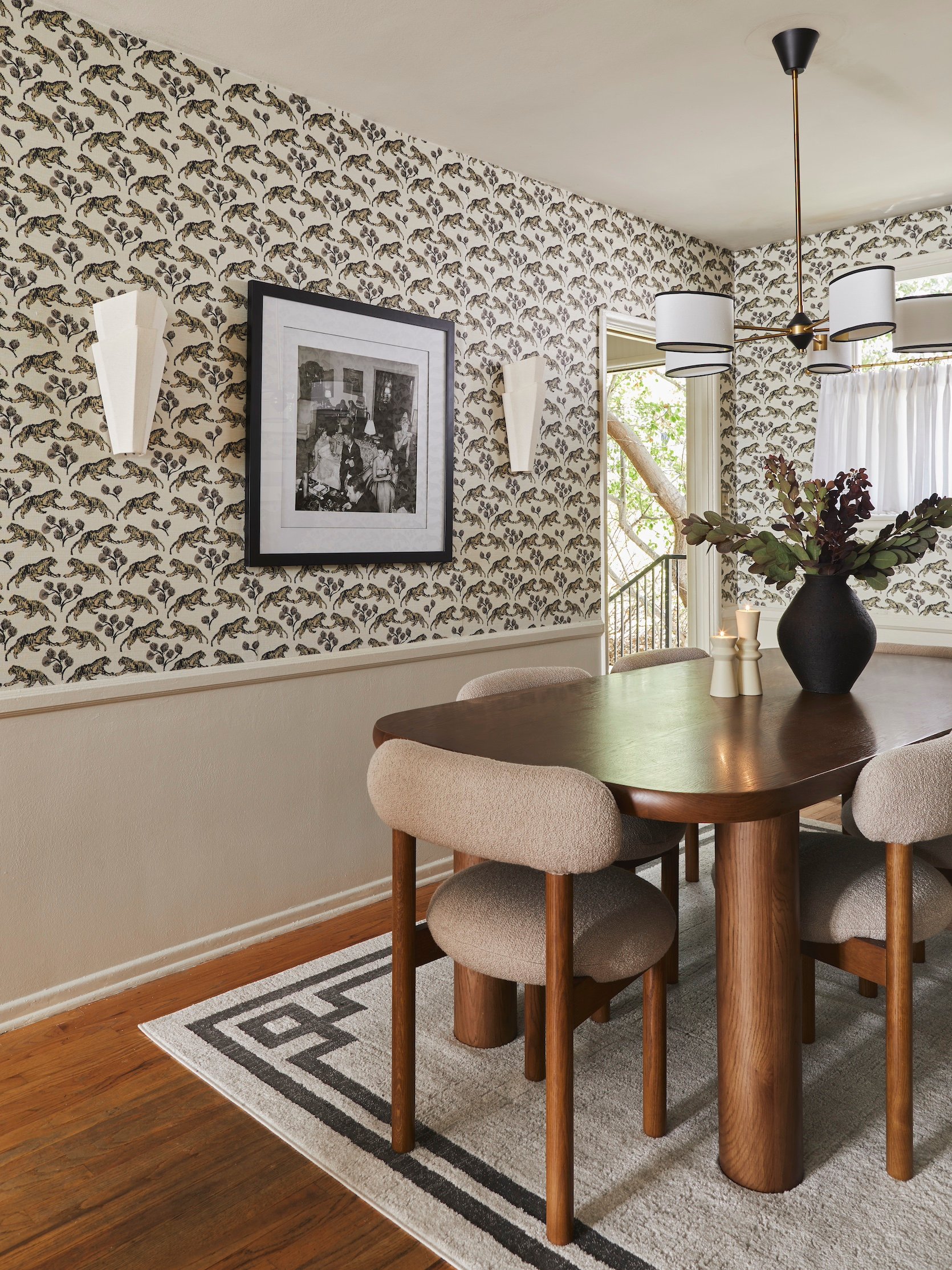
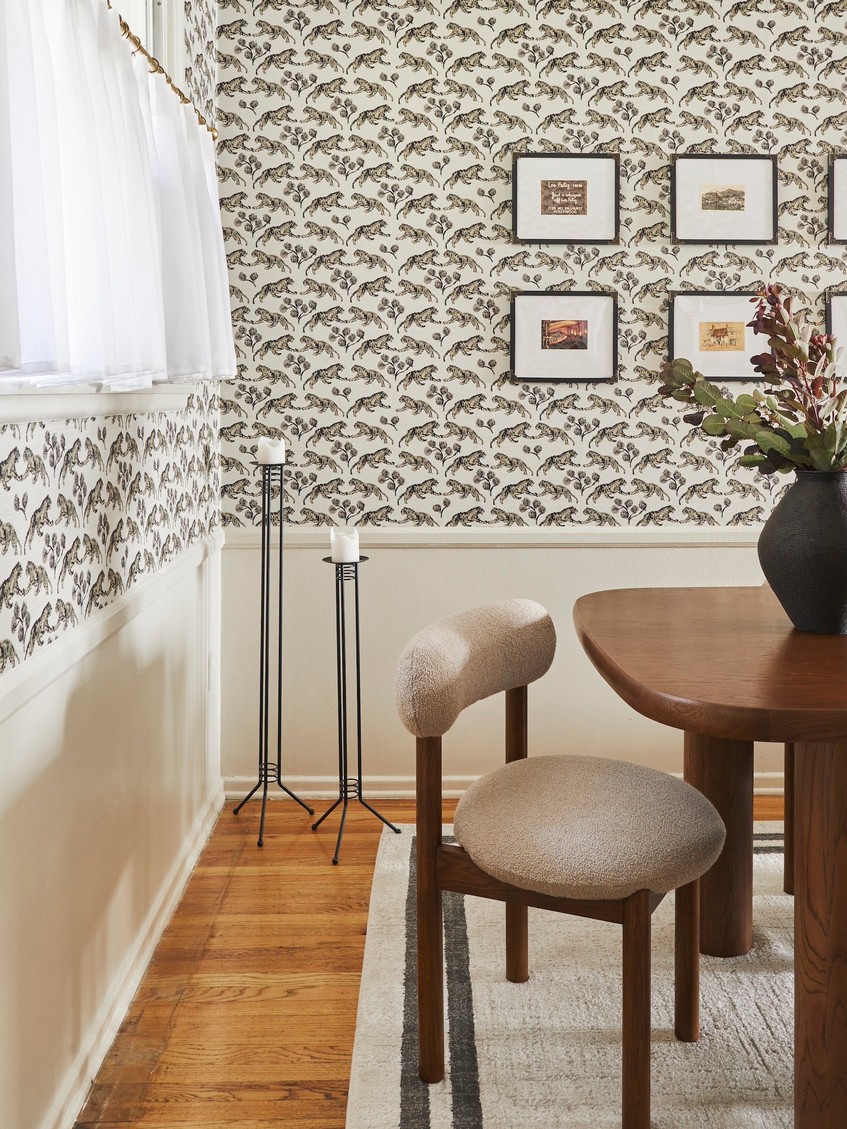
This rug was SUPER affordable – I needed a strange size (7×10) and I didn’t want to invest too much into it. When I found this one, I knew it was perfect for the space. Those sconces are hardwired sconces, but I don’t have a junction box here, so I just put rechargeable light bulbs in them, and I’m truly in love. They’re from the Crate and Barrel x Athena Calderone collab, and I’d been eyeing them for a long time as well. I like investing in lighting that I’m planning to take with me, and the lighting in this space will definitely come with me to my next place or project.
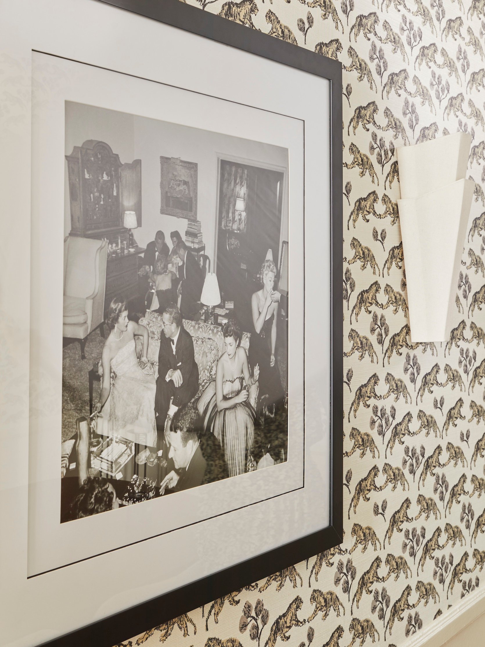
I needed some large art for this space, so I went through some Slim Aarons prints (my favorite photographer – I always love putting his work in my projects). I got this 20×20 print and put it in a 30×30 frame – then I did a little DIY to make the framing look more expensive. I got a 24×24 mat with a 20×20 cutout and then two 30×30 mats with a 24×24 cutout. I took one of the mats and drew a black outline with Sharpie around the edge of it – then I put the second 30×30 mat on top so it covered any imperfections. Note the black outline is on all sides – it’s just the angle of this photo that only shows 3!
Sconces | Art Print
I might want to swap this frame to be a gold/bronze antique-looking frame – but I haven’t found one I love yet, and frames can be big investments. So for now I’m using this one, which is actually really great quality (and it’s real glass – it’s hard to find a large, affordable frame that doesn’t use acrylic), and it isn’t a total arm and a leg for how big it is.
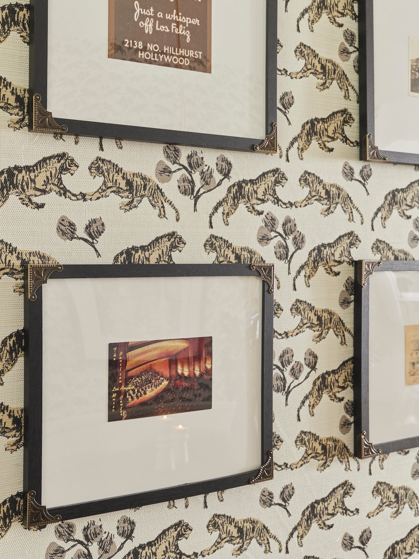
Frame | Gold Corners | Music Center Vintage Postcard | Los Feliz Vintage Postcard | Candle Holders (Vintage)
On this wall over here, I created a gallery of vintage LA/Los Feliz postcards, and it was crazy affordable. Let me show you the breakdown…
The frames were sold in bulk and averaged to be about $3 a piece (I got 9×12 in a pack of 3), and they don’t come with a mat, so I bought those in bulk too (in a pack of 10 for $30), and then I cut them each down to size. I ended up just taping the vintage postcards on top of the mat because they obviously didn’t have a cut out for the postcards, and in the end you they look great. Then each postcard was between $3 and $15, and I found them all on eBay.
Frame | Gold Corners | Music Center Vintage Postcard | Los Feliz Vintage Postcard
Then I wanted to make the frames a bit more interesting – so I added on these gold corners, which were only $10 for a pack of 12. To fill my entire wall, I needed 8 frames – so here’s how much it cost:
- $3-$15 per postcard
- $3 per frame
- $3 per mat
- $3 per frame to add gold corners
So each piece of art + framing cost me between $12-$24, and after I did the math, I spent a total of $170 on the entire wall, which is EXCELLENT in my opinion, considering how much space this gallery wall takes up! If you’re looking for art – I highly recommend doing this 🙂
Leather Chair | Living Room Rug | Drink Table | Dining Chairs | Mirror | Dining Room Rug | Wallpaper | Coffee Table | Chandelier | Sconces | Cafe Curtains | Curtain Rod | Curtain Rings | White Paint Color
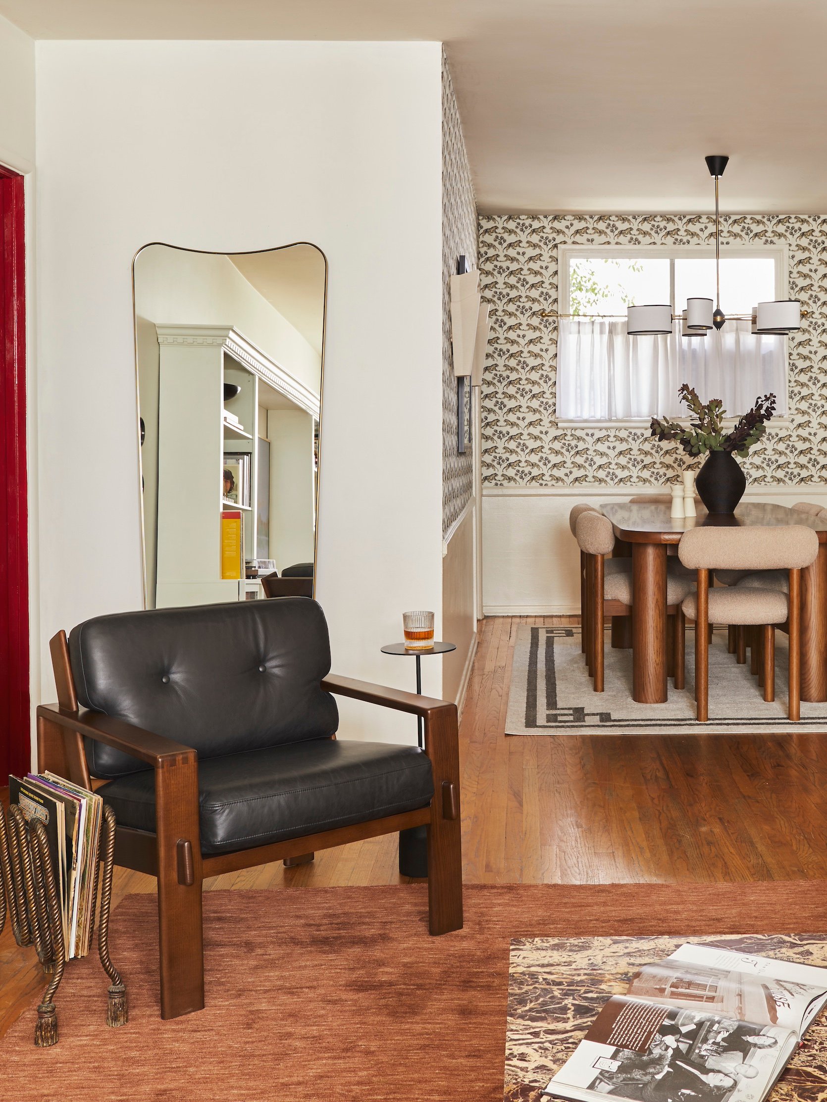
Okay, as we’re wrapping up – here’s the shot that shows where my living room/speakeasy are in relation to the dining room, just to give a bit more context. I just love this photo – and that mirror is so perfect & bounces the light around in the best way.
Here’s a reminder of the crazy transformation!

Dress | Shoes
There I am! I just wanted to say thank you to everyone for taking the time to read this and look at all the photos. And if you saw my other reveals as well, THANK YOU! Means the world to get to do this and I’m so appreciative. See you in the comments!!
*Design by Mallory Wackerman
**Photos by Sara Ligorria-Tramp